Budapest, indeed Hungary as a whole, was an important centre of that which today is known as Art Nouveau, or Szecesszió to be more precise, if an expression of Art Nouveau, Szecesszió, that all too often tends to get overlooked by the expression of if its near neighbour Vienna. But a Szecesszió which one can't overlook walking through and around Budapest.
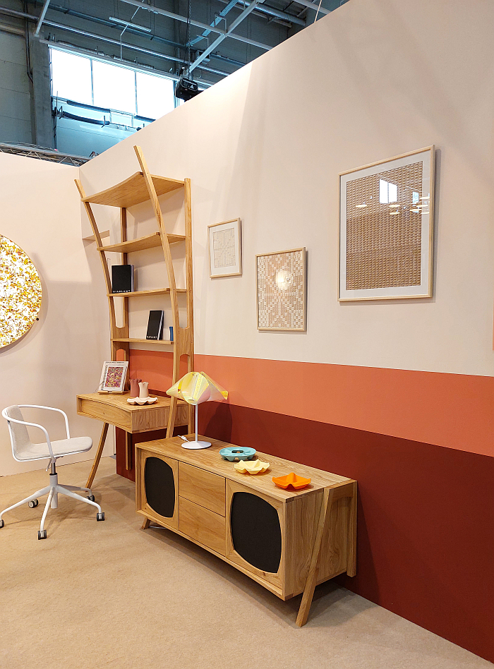
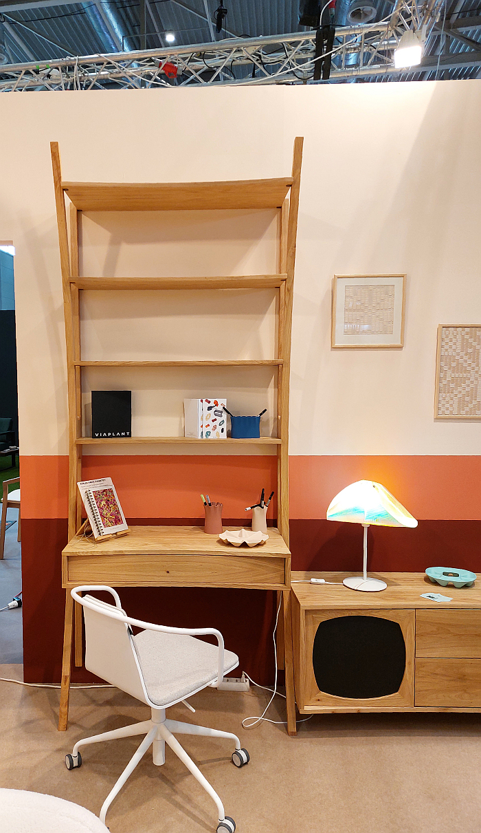
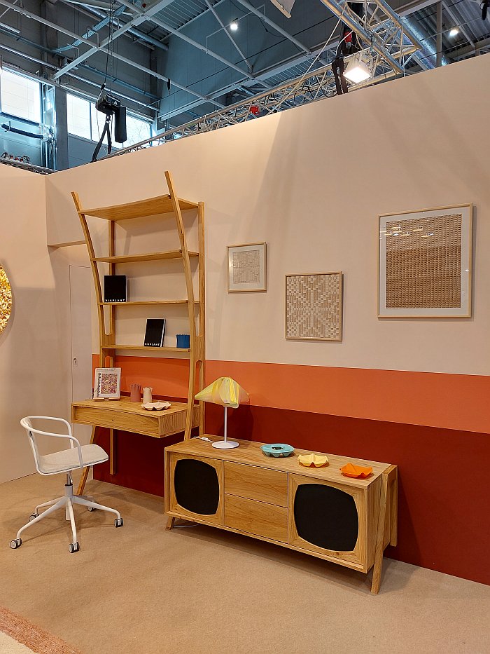
Nor can one overlook Szecesszió standing in the immediate vicinity of Polc íróasztallal by Budapest based Woodoo a.k.a. Nagy Dömötör and Pintér Dávid as presented in context of Magyar Design 2024: not a Szecesszió stuck in an idealised early 20th century Budapest, Europe, rather one seeking to find its place in early 21st century Budapest, Europe.
Here is sadly not the time nor place for a full discussion on the intricacies and nuances of Szecesszió, we wish it were, but it can't be, that must wait, sadly; here we have but time and place to allude to the glorious Szecesszió-esque swing of Polc íróasztallal, or just Polc — Polc íróasztallal translates as "shelf with desk" which is what it is, but which isn't a name, we were very busy trying to develop a name for it, then decided that was a bit cheeky, it's not ours to name, and so in what follows, for reasons of readability, and structure, we will stick with Polc, Shelf, which also isn't a name, but... — here we have but time and place to allude to the glorious Szecesszió-esque swing of 'Polc': a swing from earth to sky, an organic curving motion from roots to bloom, an arc from the early 1900s to early 2000s, that would not have looked out of place in the living rooms, dining rooms, studies, et al of that long since departed Budapest. But wouldn't have been, couldn't have been, understood in those living rooms, dining rooms, studies, et al
For it is also a curve, a swing, an arc, a path, from the decorative to the functional.
A swing that for all it is aesthetically very pleasing, easy on the eye, also enables, empowers, the shelves to become progressively deeper as one move upwards. Which, no, isn't what shelving normally does, you're right, shelving, if it doesn't stay the same depth, tends to get shallower as it gets higher, partly due to statics, stability, and also because the deeper the top shelf is the harder things towards the back of that shelf are to reach. A state of affairs which tends to mean that the top shelf is often unused, underused. Apart from by dust, who tend to congregate there. However, is the toppermost shelf not ideal for those things one rarely needs but needs close at hand, such as, for example, folders of tax records, folders with insurance policies, rental contracts, warranties, and the like, shoe boxes full of old photographs and unorganised bank statements, and similar things of folder depth. 'Polc' through its application of a Szecesszió swing creates a toppermost shelf on which to store such conveniently out of the way but readily accessible, without the requirement to have the whole unit at folder depth. A Szecesszió swing that also allows for, enables, a desk that doesn't take up more floor space than it itself needs, simply in order to accommodate folder deep shelving. And thereby a Szecesszió swing that, in addition to the visuals that have long been valued, allows, enables, a physically and visually light shelving unit, allows, enables, a practical and functional shelving unit, with desk, in your space that, appears, to need no space of its own. Which is a very neat trick.
In addition, we can well imagine, we have however only experienced 'Polc' in context of the spatial idiosyncrasies of Hall G at Hungexpo, but we can well imagine that sat under/within 'Polc' creates a space perceived as closed, a room-within-a-room without actually dividing, far less seeking to divide, the room. Again something attributable to the swing of the frame. And which is another very neat tick. And, and as with the physical and visual lightness, very welcome if you don't have a living room, dining room, study, et al of a scale to be found in an average Szecesszió Budapest apartment.
Whereby, yes, we have ignored the possibility of placing 'Polc' in the hallway. Until now. For we can well imagine 'Polc' will also work excellently there: the implied roof of the toppermost shelf we imagine, we don't know, again we imagine, allowing it to work as an informal booth, a hub if one so will, around which to organise the management of not only the hall but the household, a task in which the drawer will prove as useful and responsive as it will if used in a living room, dining room, study, et al. And you can hang your dog leads over the extensions of the curve. Nice.
Beyond such considerations we particularly like the fact that the back legs don't touch the ground, another neat trick, avoiding as it does the myriad problems rear legs on wall-mounted units with open bases invariably bring with them; if yes, it does probably mean 'Polc' needs an extra couple of screws to hold it firmly and stably in place amongst the chaos that is your home. But, we'd argue, a price well worth paying for the increased usability.
Speaking of screws and stability and firmness, with 'Polc' you've clearly got a cantilever that has to be supported....... but you've also got a swing, you've got a curve, you've got an arch. Look at the architecture of a Pier Luigi Nervi and tell us that doesn't work. Look at the architecture of Witold Lipiński and tell us that doesn't work. Look at the architecture and furniture design of Szecesszió. No, the swing alone isn't the answer, there's a lot to consider, but the curve can be an important, integral, part of the solution.
As can the implied stereo record player standing next to it. An implied stereo record player that very clearly doesn't fit in with the Szecesszió motif, unless that is you live in a Fremde Freunde concept à la Wohnen at Klassik Stiftung Weimar. An implied stereo record player that 'Polc' isn't just standing next to, but with which it is joined, as one. And which, we'd imagine aids the stability of the whole. And while having nothing against the combination, indeed seeing a lot of sense in having an open storage space, a desk space (with drawer), a closed storage space and a large surface area all in close vicinity to one another, you do also have to have the space for the two side by side. And so for us, if they could also work as two separate items for those who don't, that would be a positive thing. A request from our side that may or may not be joined in the future by one for a tweak to the design to enable a side element to support shelves simultaneously to the left and to the right and thereby allow extended systems. Which we don't think it currently can. But we're still not sure we want that. If you have, say, three blocks joined to a single wall unit, do you need three desks? And if not, what do put in the lower part? Would a deep shelf at the bottom not contradict the swing? What do you put in the lower part? And does that work? And does a 'shelving with desk—stereo—shelving without desk' triptych work? We'll think on.
As we hope Dömötör and Dávid do in terms of where the take it from here, for 'Polc' is not only a very engaging character, both in its own right and in context of a floor-based, wall-mounted shelving sector that of late has increasingly becoming the exclusive dominion of the Mid-century re-edition, and thereby become increasingly tiresome, but also a work that allows for reflections on what is important, useful, desirable, and not, in terms of floor-based, wall-mounted storage units. And is also a very neatly formulated, very simply phrased, reminder of how that realised in the past, the positions and expressions of the past, can more than ably serve us all today if we remove them from the contexts and realities of the past rather than trying to transpose the past 1:1 into the now. Szecesszió was meaningful 100 years ago. Mid-century modern was meaningful 60 years ago. We live today.
At this stage we'd normally write that, further information can be found at....
......however, if we've learned one thing from the last few days in Budapest it's that Hungarian designer need to be a bit, a lot, more proactive and forthcoming in terms of providing information on themselves and their work on their internet presences, including ensuring that those works currently featured in a physical showcase exist in their virtual showcase. In addition, and while we appreciate the cost differentials, Instagram isn't a substitute for a website. Statements that don't just apply to Woodoo but numerous of the designers featured in Magyar Design 2024. Get websites! Update them!
The Woodoo Instagram channel can be found at www.instagram.com/woodoobudapest
And, yes, we do very, very, much like the name Woodoo (for all native English speakers pronounce the 'W' more as 'V' and you will also greatly appreciate it) Not least on account of the mysticism, and misunderstandings of non-European cultures and traditions, of the late 19th/early 20th century that existed so closely with Art Nouveau/Szecesszió. And, being us, the Woodoo, do(o) wood, play that's going on tickles us immensely.

