We're not saying that Capellagården is the best design school in the world.
But would say it is, without question, one of the most delightful and most engaging and most relaxing to visit, one of the best to visit.
A genuine joy that was denied us during the Covid years.
But one we weren't going to give up on.
In summer 2023 the stars aligned and we ventured once again over the seas to Öland.......
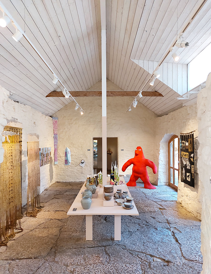
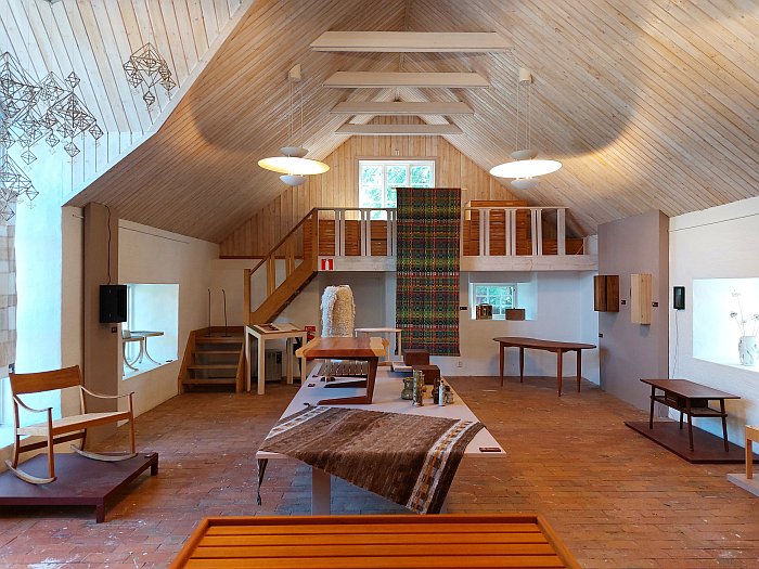
Established in the village of Vickleby1 on the eastern Swedish island of Öland in 1960 by Carl Malmsten, that Grand Doyen of Swedish Arts and Crafts, that cantankerous counterforce to Functionalism and International Modernism in Sweden, that creative whose focus on natural materials, natural forms, reduced constructions, reduced ornamentations, historical models and craft processes can teach us all so much about how and why current popular understandings of design in and from Sweden are so very wrong, Capellagården is, technically, less a design school and more a craft school, focussing as it does on carpentry, ceramics, textiles and organic gardening, the latter being something that was particularly important to Malmsten, and to his decision to establish a school on Öland.
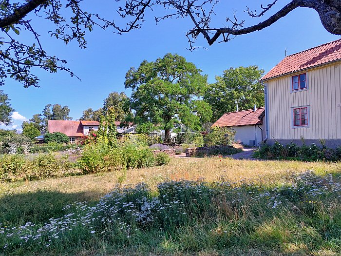
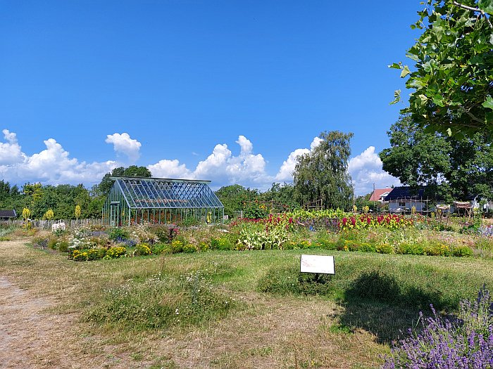
A focus on gardening reflected in the varied and various gardens which define the Capellagården campus.
Varied and various gardens in a region of the world almost devoid of private gardens: the vast majority of the residents of southern Öland preferring to surround their homes with plain grass than with shrubs or flowers or vegetables or anything else one can purchase at Capellagården. One can convincingly argue that the barren wastes of the Stora Alvaret are home to more flora than your average southern Öland front and back yard. Which, yes, is an interesting reality to ponder. And not only in context of Carl Malmsten.
And varied and various gardens at Capellagården that not only in their uniqueness in the region but through their welcoming character and their calm, composed, sense of their own unending transience are a wonderful location to reflect on the various and varied student projects on show at the school's annual summer exhibition.2
As ever, very real limitations of time and space mean we can't discuss every project presented, and not mentioning a project doesn't mean we didn't like it, and we may very well return to here unmentioned projects at a later date. Possibly at Stockholm Furniture Fair 2024 where we will invariably bemoan and bewail not spending more time with one or the other project in Vickleby. And, and as we always reiterate, and will never tire of doing, student projects are never, ever, about the end result, but always about what the individual student got from the project and how the project, the process of developing and realising the project, influenced and informed and altered and confirmed the individual student's positions to and understandings of design and the role of the designer. And that's not something that can be understood in one project but something to be followed through viewing and comparing a number of projects spanning several years. Student projects exists for the student, not for the viewer.
That said, from the works on show at the 2023 Capellagården summer exhibition we did enjoy particularly long and entertaining conversations with the following trio.......
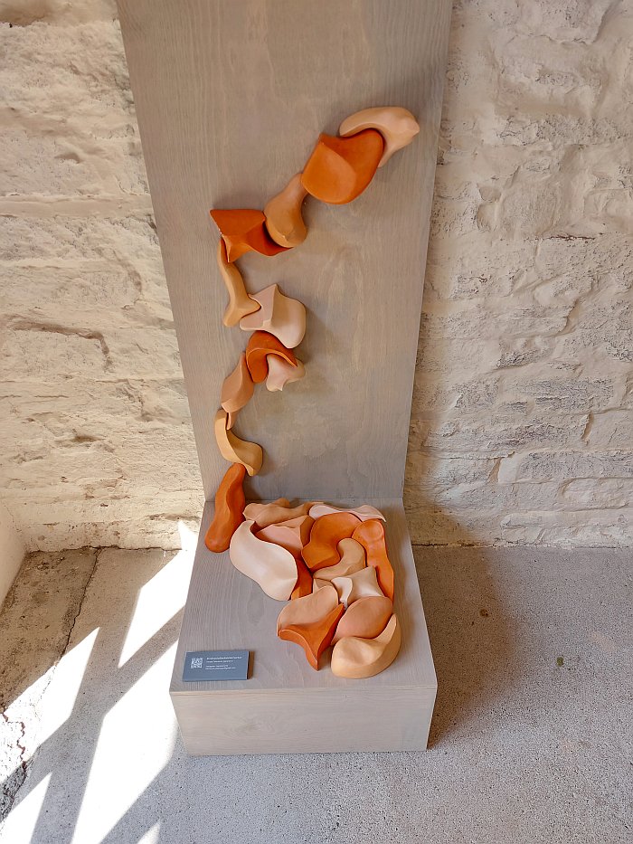
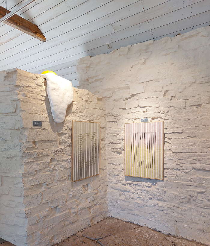
It was invariably the way Hanna Petersson arranged the elements of her project Inverkan/påverkan/samverkan — Impact/Influence/Collaboration [our translation] — crawling up the wall that initially brought forth thoughts of climbing wall grips cast in ceramic before subsequently, and much more satisfyingly, an image of vertebrae, and spines, appeared before us; and which quickly led on to images of hips, shoulders, ankles, toes and all those other joints that compose, define, the human skeleton, and where two, often apparently independent, entities cooperate with a selfless self-evidence to enable a near borderless freedom. Which, yes, does sound like a metaphor, and meaningful model, for global society.
Similarly the individual elements of Inverkan/påverkan/samverkan don't appear to be related to one another, don't even appear to be that interested in one another, but are perfectly happy to unite, indeed appear to take extreme pleasure in cooperating to enable the creation of, we're going claim without knowing, a near limitless array of possibilities. For while we don't imagine that each and every form can fit with/nest/spoon in and with all the others, there does appear to be an extreme degree of freedom in how they can be arranged, an awful lot of curves and slopes and twists and turns that despite not being perfectly aligned can integrate and unite and accommodate with one another, can find the basis of a cooperation, to create ever new compositions. There's that metaphor again. ¿Or is it a new one? ¿A shift from the individual to the collective?
Whereby in context of the apparent freedom of inteconnectability we have no idea how the project was developed, if there is and was any attempt at incorporating a standardised degree, or complimenting degrees, of curvature, or if the (near) endless inter-twineable, inter-connectable, variety is simply the wonder of nature, an expression of geometry as a natural science not an applied science. ¿Can a handful of randomly collected pebbles not be set together as a unified whole? ¿Another metaphor? And considerations on the possible approach that also helps elucidate the difference between the more rationally anchored design approach and a much freer craft/art approach.
And a concept, a collection of freely compatible autonomous entities, that at, and since, Capellagården we have re-imagined in all manner of materials and contexts, have developed innumerable possible projects from; but have primarily questioned why one needs to develop it into a physically functional product, why need it be anything other than what it is? Why can't it just exist for reflection and for the joy of being? Yes, another metaphor.......
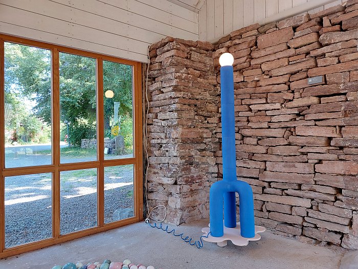
We've not seen lamps 1 to 7 by Johanna Bülow so can't comment on them, nor do we know if there is a 9, 10, 11, etc; but, Johanna Bülow's eighth lamp is a most engaging object. If at first it appears so, very, very wrong. The scale of it and the internal relationships between the various components initially strike you as horribly misjudged. Rushed even.
But then you spend some time with it, and not only does Lampa nr 8's impression of a giraffe trying to hide in the corner of the room win you over with the humour, charm, warmth and honesty of the attempt by the imagined wannabe ungulate, but you also begin to better appreciate the many subtle nuances of the work. And also, and for all, begin to better appreciate the possibilities the form study undertaken in Lampa nr 8 offers and enables.
For while as a giraffe hiding in the corner of the old house at Capellagården Lampa nr 8 cuts a fine figure as a lamp — if we would question the decision to place an object whose height, and whose leg height:neck height ratio, is such an important component of its being, on a pedestal which very obviously distorts its height — we understand the corner floor lamp as but one possible proposal for what is primarily an interplay of ratios and geometries, a study of relationships. Adjusting the scale, the ratios, the context allowing one to re-imagine all manner of scenarios, settings and objects; allowing one to use Lampa nr 8 as a conduit to illuminate new perspectives as much as the room in which it stands. And which in many regards is a more satisfying existence than the very satisfying lamp existence.
Equally satisfying is the ease with which it carries itself, it makes no attempt to deny what it is, doesn't seek to give itself airs and graces; not only does it revel in its uneven, imperfect, surface, a joy almost reinforced by the decision to employ an anti-embellishment engobe coating rather than a glaze, but it freely exposes its construction system of numerous extruded clay elements stacked one on the other; a construction principle that one learns was forced upon it by the spatial limitations of the Capellagården kiln, but which rather than seek to hide, rather than seeking to pretend to be a single entity that it isn't, our shy giraffe wears it scars with pride.
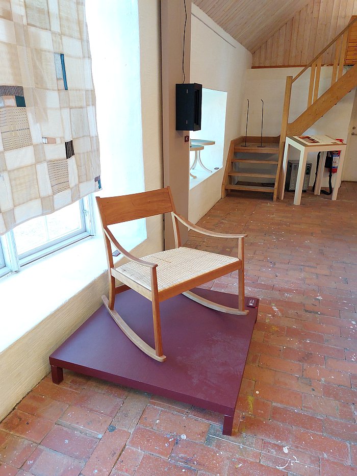
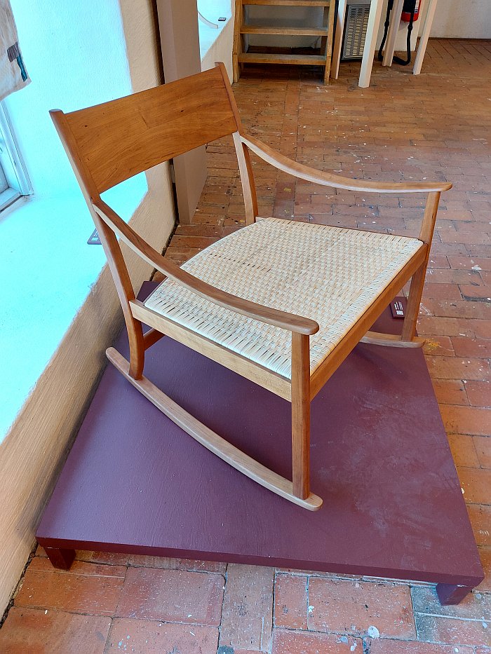
Balanceig is Catalan, as is Joana Garganté, and means rocking, implies a rocking action. Which is very much what the chair Balanceig implies, and one assumes offers: we sadly couldn't sit in it and balancejar. OK we could have, we were alone in the barn at the time, and that for a long period, and are exceedingly cheeky individuals; but decided it was better not to, we're clumsy oafs at the best of times. And so we can't comment on the rocking experience nor the sitting comfort of the rocking wicker seat. But see little reason to doubt either.
What we can comment on, and very much approve of, is on the one hand the width, the scale, of the object, it's a delightfully spacious seat; one not offering room for two adults, but, arguably, an adult and a child or a human animal and non-human animal, certainly room for a human animal (or a non-human animal) and a collection of cushions, blankets and associated textiles. And also, and particularly pleasing, almost certainly allowing sufficient space for an individual to curl up into; it's not a seat you're likely to be restricted to sitting in according to how the designer has envisaged you sitting in it, rather is a seat whose mode of use the sitter actively defines; it is an open invitation to make yourself comfortable according to your physical and mental humour and needs at any given moment. And to change your position as your humour and needs change. Which isn't a freedom offered by all rocking chairs. The vast majority telling you exactly how to sit. And how to rock.
And on the other hand there is a very satisfying formal correspondence between the rockers, the armrests and the rear supports/legs, all of which curve in similar but non-identical manners, each is very much their own curve, but in dialogue with the others, supporting and encouraging one another, aided and abetted by the curve of the backrest; a curvature which the stubbornly straight front supports/legs contradicts, resists, existing very much as the do as the exception in the rocker-armrest-leg quadrat, and thereby preventing the work from drifting into a flippant, tawdry irrelevance, allows it to maintain its poise and elegance. Without ever becoming self-important or egotistical. There is very much an inherent modèstia at the heart of Balanceig.
Full details on Capellagården can be found at www.capellagarden.se
In addition there are, or were when this post was first published, pdfs available introducing the carpentry, textile and ceramic projects presented.
1In one of those perverse twists of fate that allow for such important insights into (hi)story of furniture design, the systematics of IKEA's product names means that one of Sweden's most important furniture manufacturers carries a lamp called Vickleby that is the most truly awful pastiche on Isamu Noguchi's Akari. Thus a village associated with some of the more nuanced aspects of the (hi)story of furniture and interior design in Sweden is reduced by one of the dominant forces in Swedish culture to a cheap tat imitation of one of the more important moments in the development of lighting design. Which is a genuine insult to Vickleby. And Isamu Noguchi. And us all. And a Vickleby/Vickleby comparison that forces one to compare Carl Malmsten with Ingvar Kamprad and from there to reflect in more detail on the (hi)story of furniture and interior design in Sweden.
2Yes, the fact that the powers that be at Capellagården feel a need to charge entry to the summer exhibition does detract somewhat from the calm, and while "only" 50SEK is as regrettable as it is reprehensible, but isn't a reason not to visit. If very much a reason to question what would Carl Malmsten say?