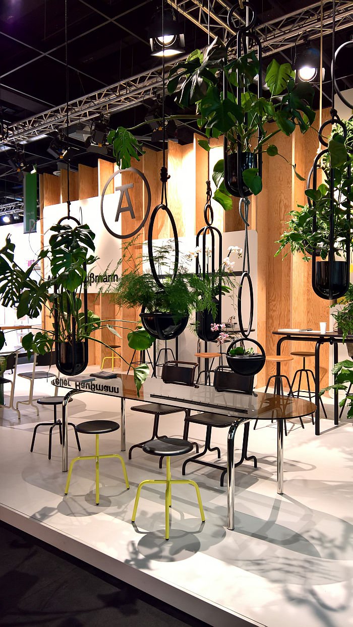
Apart from the chance to peruse and consider the collections and new products of and from a wide variety of manufacturers and labels, one of the real joys of visiting any furniture fair is the opportunity it allows to observe designers in conversation with manufacturers and labels. For all in pairings that currently don't formally exist. We never eavesdrop on such conversations, that would be rude, and to overplay our prowess as spies; but we do enjoy imagining what may arise from those conversations, imagining the enthralling objects and brave new world that awaits us all.
A brave new world that far from being a refuge from our contemporary world in many regards helps sharpen our focus on the contemporary world that surrounds us, the collections and new products of and from a wide variety of manufacturers and labels laid out for our consideration and perusal.
New products that may have begun as an informal conversation on a trade fair stand. And now look where that's developed.....
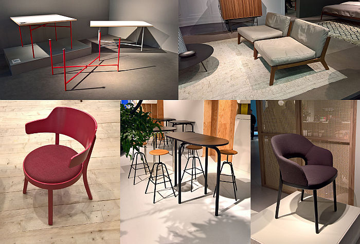
And so, and with our customary caution that we have invariably missed one or the other gem, which in this case we know we did, but which we plan to make up for later, an IMM Cologne 2020 High Five!!
We've still got a few outstanding posts from our 2019 #campustour in the pipeline, however one of the more memorable from the 37 design school summer exhibitions we visited, if not for the best of reasons, was the 2019 Summaery exhibition at Bauhaus University Weimar: normally a genuine highlight of any #campustour but in 2019, ironically, utterly ruined by the unfathomable decision to let German TV station ZDF commandeer the opening evening for their ZDF@Bauhaus concert series. And Bauhaus Uni Weimar consenting. ??? Still makes our blood boil, even though we let of a lot of steam in our previous post.
One of the consequences of the shenanigans that evening was that the setting up of the presentation of the class Anschluss – Collaborate was delayed, and thus we missed the newest instalment in one of the genuine highlights of any Summaery, any #campustour: the annual Bauhaus Uni Weimar class that challenges 2nd semester students to develop a desk/workstation. A class which, as we're prone to opine, not only always, but always, produces genuinely joyous and engaging interpretations and understandings of the desk, but also helps underscore just what a thoroughly underdeveloped, almost neglected, genre the desk is, that there is so much scope and possibility for any designer brave enough to drag themselves away from chairs and cocktail cabinets.
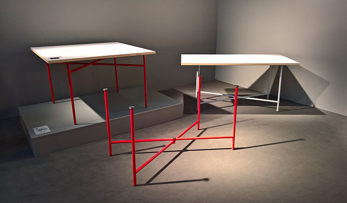
And missing Anschluss – Collaborate meant we didn't get the chance to experience LEVI by Marie Kurstjens & Iva Coskun
A stupidly, stupidly simple concept, as in a celebration, LEVI, in effect, connects two trestles at a central pivot joint, thereby allowing them to rotate around one-another and thus enabling not only an effortless variety of configurations, but also an effortless ease of transport and storage.
100% tech-free, 100% stress-free and 100% pretension-free LEVI is, we're arguing, not a 100% new concept, but is a functionality that Marie and Iva have very astutely and intelligently fashioned into a very intuitive, sensible, articulate, contemporary, yet forward looking design. One which while very easy to pitch as an object for students or Start-ups is, we'd argue, just as valid and interesting for more established institutions in search of an uncomplicated flexibility. If one we're assuming will have to be renamed before being commercially pitched to anyone. Especially if they decided to append a number on LEVI.........
And a project which beyond its own merits, stands as an excellent example of the sort of projects one can find at the Bauhaus Uni Weimar Summaery exhibition. Unless ZDF and their security guards are in charge of proceedings...........
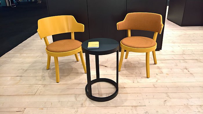
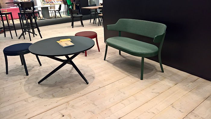
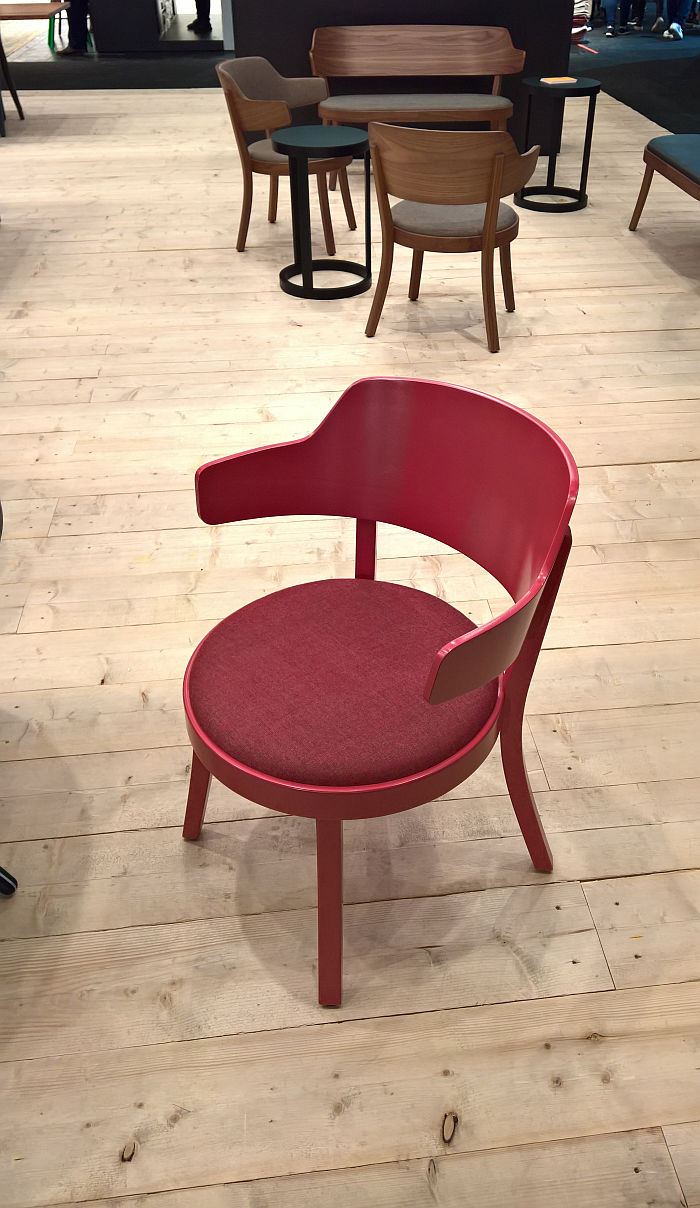
Based on the western shore of Lake Zürich, a corner of the world as delightful as it sounds, Horgenglarus have been making wooden furniture since for ever, time only officially recording their activities since it arrived in that corner of the world in 1880: Le Corbusier, a man who famously had little good to say of his native Switzerland, was a fan; the company helped the protagonists of the Swiss Werkbund influence furniture design in the early decades of the 20th century; and many a Horgenglarus work exists today as an archetype of Swiss furniture design. Laurels one could rest on, but which Horgenglarus choose not to, preferring instead to regularly hand those laurels to contemporary creatives with a request to freshen them up, and that with some very pleasing results: Daniel Hunziker's 2014 re-imagining of Jürg Bally's 1954 S.T. Tisch being one of our genuine highlights of 2014. And of 2015. And with Seley Swiss designer Frédéric Dedelley has now re-imagined and re-positioned the longer tradition of Horgenglarus chairs.
And although we technically lost interest in chairs that cocoon the sitter a couple of years ago, Seley's slightly non-committal, but still sincerely offered, cocooning, invited us in.
Tracing its lineage all the way back to Horgenglarus's 1918 1-380, that forbearer of most all early 20th century wooden chairs, and taking more than a passing glance at Werner Max Moser's 1-370 from 1934 as it moved into the 21st century, Seley is a deliciously compact, almost squat, stubby work, which we mean positively, the proportions and scales making perfect sense, and a composition aided and abetted by the delightful balance, the real unity, between the seat and backrest, while the wide embracing swing of the backrest provides both ample space to sit and relax, and convenient, comfortable, armrests should you need and/or want them. They are very much optional.
The upholstered seat softens not only the sitting experience but also the visual, a pleasingly and satisfyingly light visual which belies a very real, but not unduly, mass, a mass that is as important as the century of Horgenglarus's construction know-how in bequeathing Seley its stability and security, and ensuring it remains both.
We believe we skipped our way from the Horgenglarus stand......
In context of our contemporary digital world we often opine that we need new forms of seating, new forms which are more appropriate and responsive to our regular, incessant, use of tablets, smartphones etc, etc etc, Such opinions normally seeing us demanding low down seats and thus seating positions which naturally project the knees upwards and in doing so enable, enforce, a natural usage position for contemporary devices. Be that in the office, the home or the home office
The Sova Lounge chair by Hamburg based [more] offers an alternative take on achieving that.
While being so much [more] (Apologies)
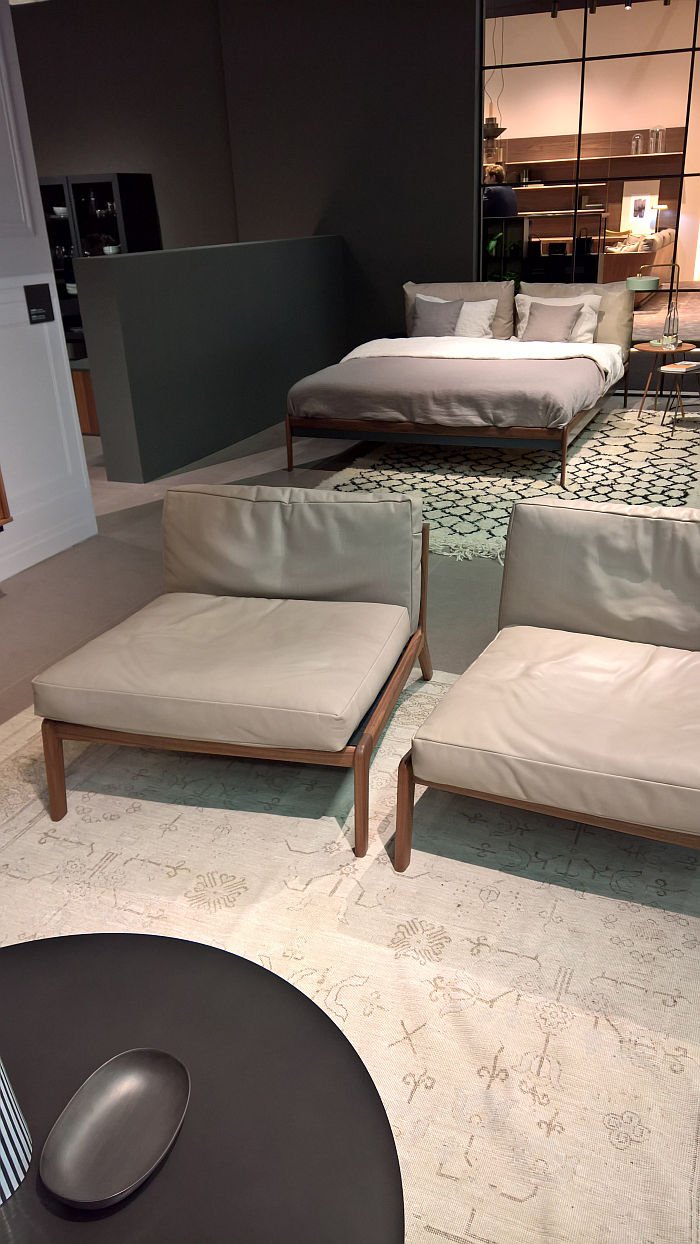
Although a lounge chair, Sova is actually a bed, and one gets the feeling was reluctant to become a lounge chair, was happy as a bed. But, we suspect, Bernhard Müller sat down with it, possibly in a neutral location, and over a beer or two, a curry, another beer or two, they talked things through, Bernhard explaining it could remain a bed, being a bed is a fine and noble thing, but it should really consider how much more it would have from life as a lounge chair. A day bed? Sova asked by way of compromise. A day bed!! replied Bernhard, any bed can do a day bed, but only you can do a lounge chair. And slowly it came round to the idea.
Thankfully!
A joyously expansive but still very understated and pleasingly proportioned object, the sheer, decadent, length of the seat means the Sova lounge chair actively forces you to slouch, and that at various angles, we discovered three, possibly four, and suspect the better you get to know the work, the more you'll discover; and importantly they are all active slouching positions, positions which not only allow but support reading, writing and contemplative activities, be they analogue or digital, professional or personal, brief or extended. Which, yes, sounds unlikely, but did the ancient Greeks not spend their days lounging, slouching, around, while establishing the foundations of contemporary civilisation.....?
In addition, the form, for all the low backrest, invites you to sit sideways, to make the backrest a siderest, a very pleasing, satisfying position for, for example, telephone calls, reading short communiqués or simply contemplating the world. While we suspect, we didn't try, taking our shoes off seeming like an affront to the others present, but we suspect that one could also happily, comfortably, sit cross-legged on it. In addition there is more than enough space for two, and anyone under 1.50m should be able to curl up on it, and yes we are also thinking of children, dogs, cats and wombats. And all coming together to make Sova a thoroughly interesting, charming and responsive object for the home, the office or the home office.
Our only fear is that someone will try to take it outside, to create a version for the terrace or pool side. Don't!! Beds belong inside. Beds don't make sense outside.
![Sova Lounge chair by Bernhard Müller for [more], as seen at IMM Cologne 2020](https://www.smow.com/blog/wp-content/uploads/2020/01/Sova-Lounge-chair-by-Bernhard-Müller-for-more-IMM-Cologne-2020.jpg?w=3840)
![Sova Lounge chair by Bernhard Müller for [more], as seen at IMM Cologne 2020](https://www.smow.com/blog/wp-content/uploads/2020/01/Sova-Lounge-chair-by-Bernhard-Müller-for-more-IMM-Cologne-2020-1.jpg?w=3840)
![Sova Lounge chair by Bernhard Müller for [more], as seen at IMM Cologne 2020](https://www.smow.com/blog/wp-content/uploads/2020/01/Sova-Lounge-chair-by-Bernhard-Müller-for-more-IMM-Cologne-2020-2.jpg?w=3840)
[caption id="attachment_64059" align="aligncenter" width="700"] Sova Lounge chair by Bernhard Müller for [more], as seen at IMM Cologne 2020[/caption][caption id="attachment_64056" align="aligncenter" width="700"] Sova Lounge chair by Bernhard Müller for [more], as seen at IMM Cologne 2020[/caption][caption id="attachment_64057" align="aligncenter" width="700"] Sova Lounge chair by Bernhard Müller for [more], as seen at IMM Cologne 2020[/caption]
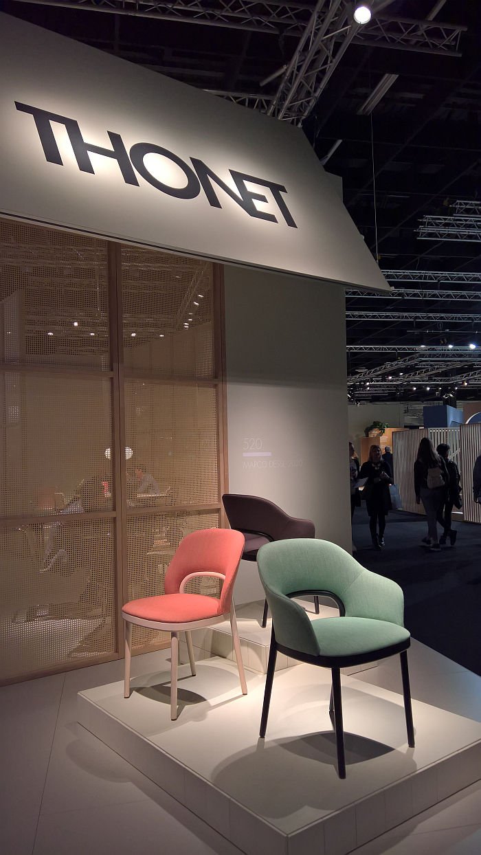
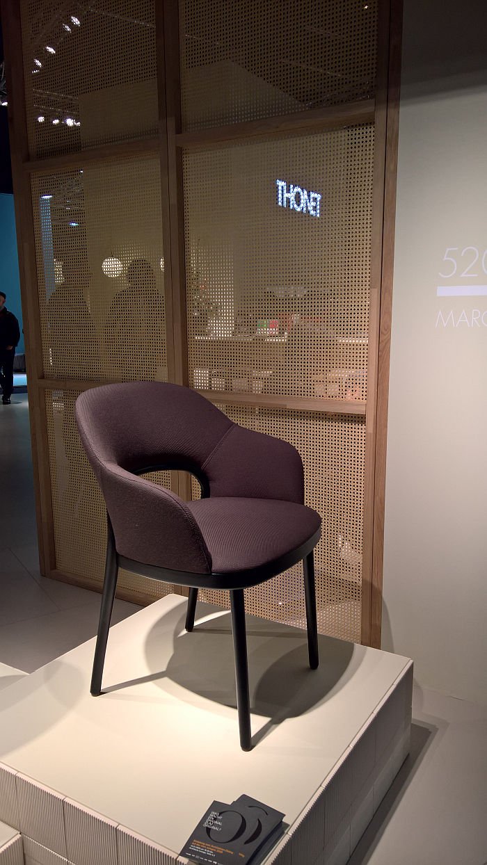
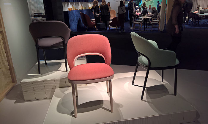
For all the associations of bentwood furniture with open, airy, reduced forms, as the exhibition Bentwood and Beyond at the MAK Vienna neatly explains, in their early years Thonet produced a lot of upholstered bentwood furniture. An awful lot. Something they don't do today. Or didn't. With the 520 by Marco Dessí they once again do.
According to Marco Dessí a major influence for the 520 is the Thonet 209 from 1900, a work which audaciously sends an armrest ring sweeping down from the top of the backrest, and while we get the association with the 209, we're also sensing the spirit of some of Adolf Schneck's early 20th century works for Thonet, and also something new. We could be wrong, we often are, but the relative docked, abbreviated, rear leg section, the brevity of the gap between seat and curve of the rear leg section is new, certainly in terms of bentwood, for us reflects and quotes works such as those Günther Eberle was creating for Thonet from moulded plywood in the 1950s, but is new in bentwood. In bentwood the backrests invariably rising much, much higher. As we say we could be wrong, but we do very much like it. Or at least do in an upholstered work, are uncertain if it would work so elegantly unupholstered; but upholstered the decision for the shorter rear leg section very pleasingly frees the upholstery from the corset of a bentwood frame, and thus allows a much more expressive work than would be the case with a bentwood frame. Thonet's historic upholstered bentwood chairs were bentwood chairs with upholstery. The 502 is an upholstered chair with bentwood. It's a small, but important, difference. Not least as it allows for a differentiated understanding of a bentwood construction, of the relationship between bentwood and chair.
Available as a side chair or an armchair the 502 is a pleasingly simple yet communicative work, a work which formally doesn't do that much new, and does so with a great deal of grace and decorum, is a Regency chair without airs and graces, a well proportioned and neatly scaled work which invites one to sit. And once you have accepted that invitation the firm upholstery allows for a robust, secure sitting experience, the armchair version allowing enough room to sit without feeling crowded and hurried.
While certainly a chair with potential for the home, we're imagining it will find itself much more utilised in restaurant and hotel settings, or as seating for representative meeting and conference rooms.
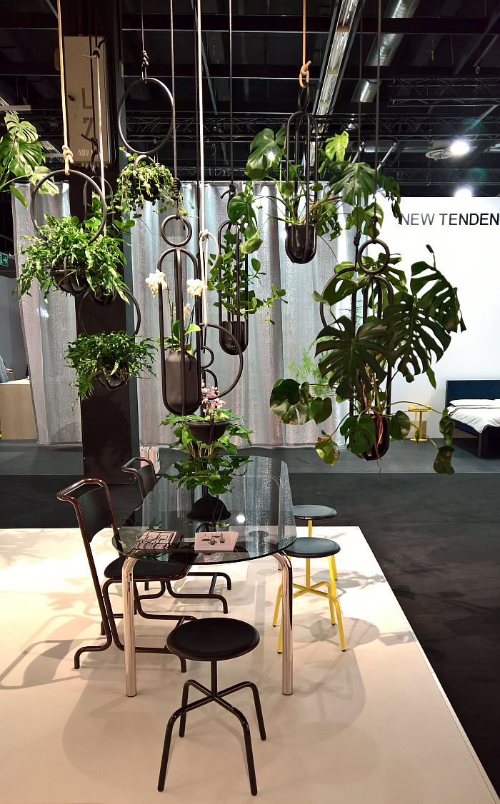
Much as Marcel Breuer (allegedly) looking at his bicycle handlebars and (allegedly) having his eureka! moment is celebrated as the beginnings of his exploration of steel tubing in furniture; Mart Stam's joining of gas pipes, with gas pipe joints, as the start of his exploration of steel tubing in furniture goes largely uncelebrated. Which we've never really understood, apart from in context of Marcel Breuer having the much better organised, much louder, lobby. However, in its readymade, arguably Surrealist inspired, abstract simplicity Stam's gas pipe chair, with its gas pipe joints, is arguably the more pleasing construction. And one that makes him in context of Jasper Morrison's Essay The Poet Will Not Polish, the first New World Constructor
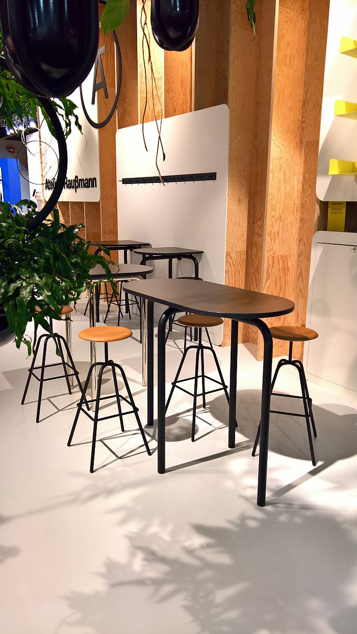
For his Piombino table system Andreas Haußmann was equally inspired by utility pipes, or perhaps better put the joints which link utility pipes, and specifically the large round flanges which link, for example, those networks of pipes that pump water to and from building sites in German cities, or those which link the confusion of pipes in oil refineries, such as those found in Piombino, on Italy's Tyrrhenian coast. Only a designer can think of the Italian Mediterranean and associate it with oil refineries.
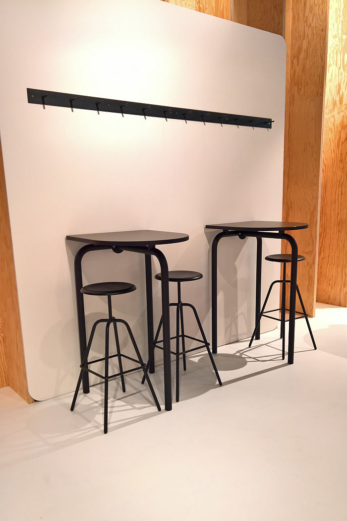
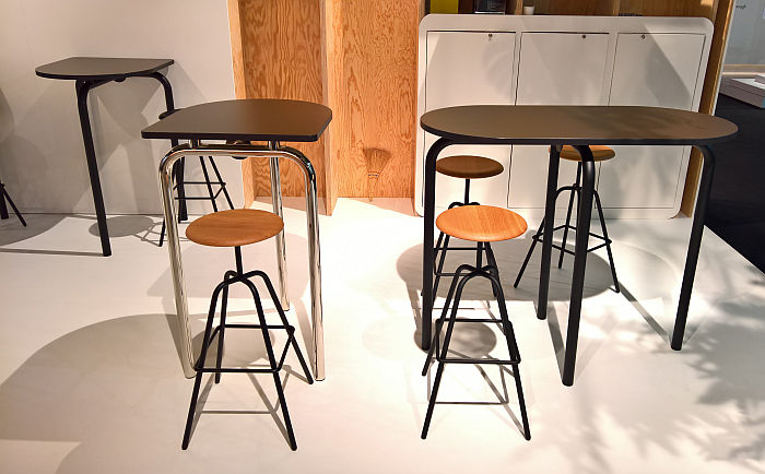
Crafted from 45mm tubular steel Piombino's large round flanges not only allow for the table tops to be intuitively and stably attached to the frame, but in their logical and easy combination with numerous pipe sections allow for the creation of a near endless variety of table formats; whereby our attention was particularly caught by the half, truncated, version: caught by it both visually and as an object that not only made sense in its logical position against a wall, but also in its less logical, but still very natural, free-standing position.
Available in a high, Piombino Alto, and low, Piombino Basso, version, the reduction and standardisation of the system to a limited number of components enables not only an ease of construction, deconstruction and reconstruction, but also of transport and storage and meaning a basic collection of components can service a wide range of needs; and while a system that is very much focussed on the contract and project sectors, where the unified visual across a wide range of scenarios offers a compositional harmony in any space, we'd also argue is very much a system that could, should, work in domestic spaces. Or oil refineries. Italian or otherwise.
