Belgium is uncharted territory for us. Not literately, we're in Belgium fairly frequently. Indeed so frequently that we are often asked why we don't move to Belgium. Because we've been to Belgium, we reply (JOKE!!))
But Belgium is uncharted territory in terms of our annual #campustour: the design school summer showcases in Belgium tending as they do to run parallel to those in London, and that in previous years we've had good reason to be in London at that time, we've, logically, not been in Belgium. This year 'twas different, we had absolutely no reason to be in London and every reason to be in Belgium, which, yes, does sound like a metaphor. Isn't, but does sound like one...... And so took the opportunity to visit a trio of Belgian design schools, technically a quartet, but legally a trio......
In 1919 Walter Gropius famously replaced Henry van de Velde as Director of the Großherzoglich Sächsischen Kunstgewerbeschule Weimar, which, even more famously, subsequently became the much more conveniently monickered, Bauhaus Weimar. Less famously is that Heny van de Velde, declared persona non grata in Germany, returned (via Switzerland) to his native Belgium where in 1926 he was founding Director of the Institut supérieur des Arts décoratifs, which soon afterwards became L'École nationale supérieure des arts visuels de La Cambre, or La Cambre for short. Which isn't to say La Cambre is a Belgian Bauhaus, it ain't, but is to say La Cambre's early history is an indication of what Henry van de Velde would have done in Weimar had he been allowed to stay. (Gropius would have then gone to Frankfurt, established Bauhaus am Main, and Dessau would today only be known for Junkers aircraft, Kurt Weill and.... no, best not go down that particular path.....)
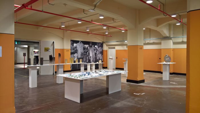
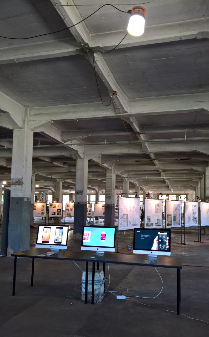
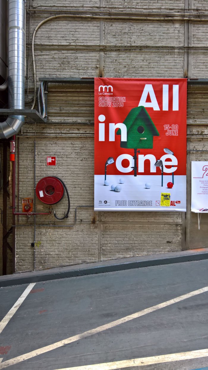
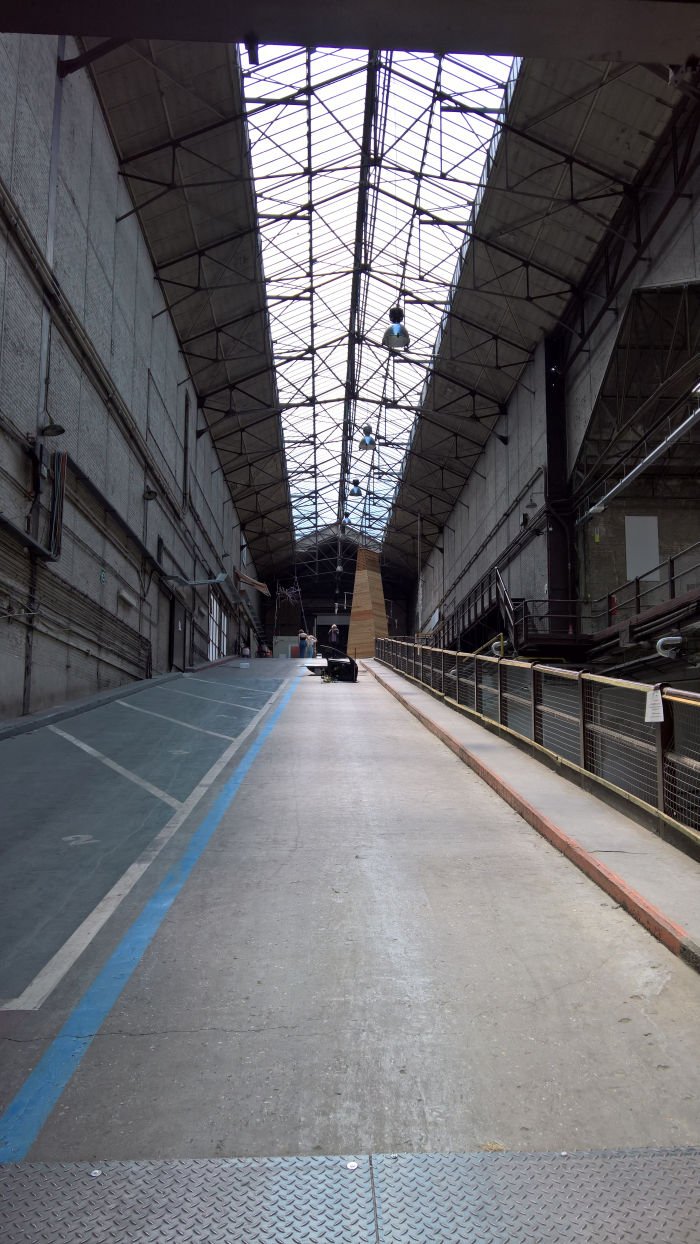
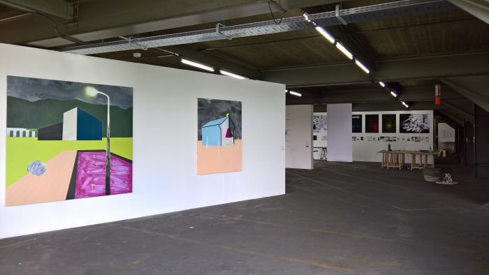
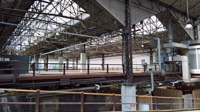
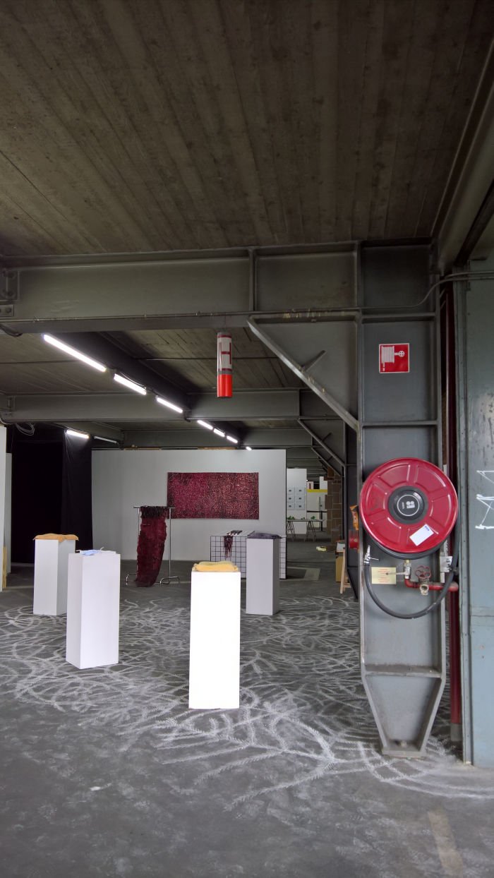
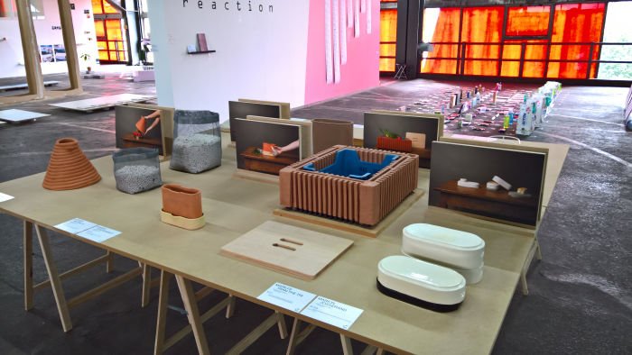
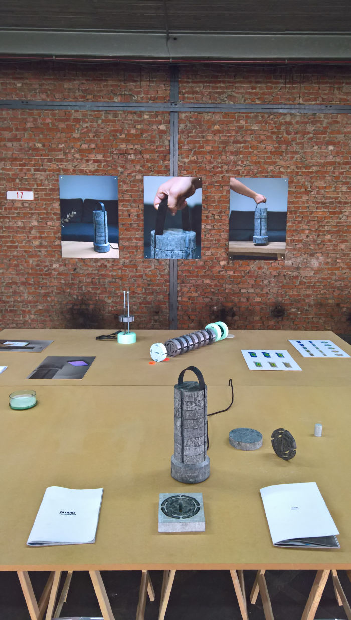
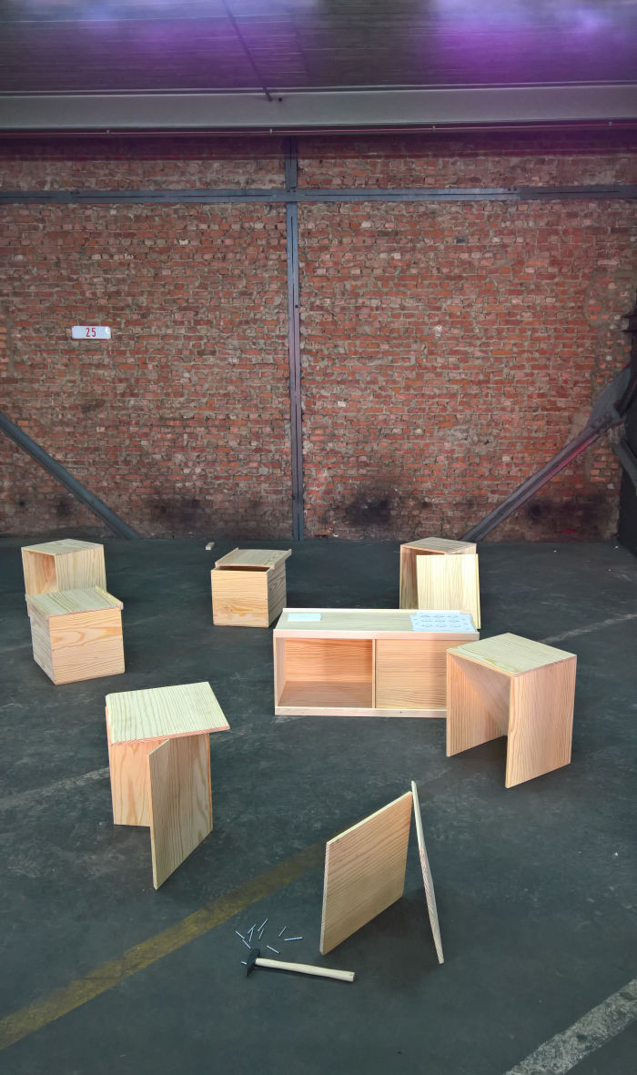
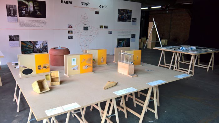
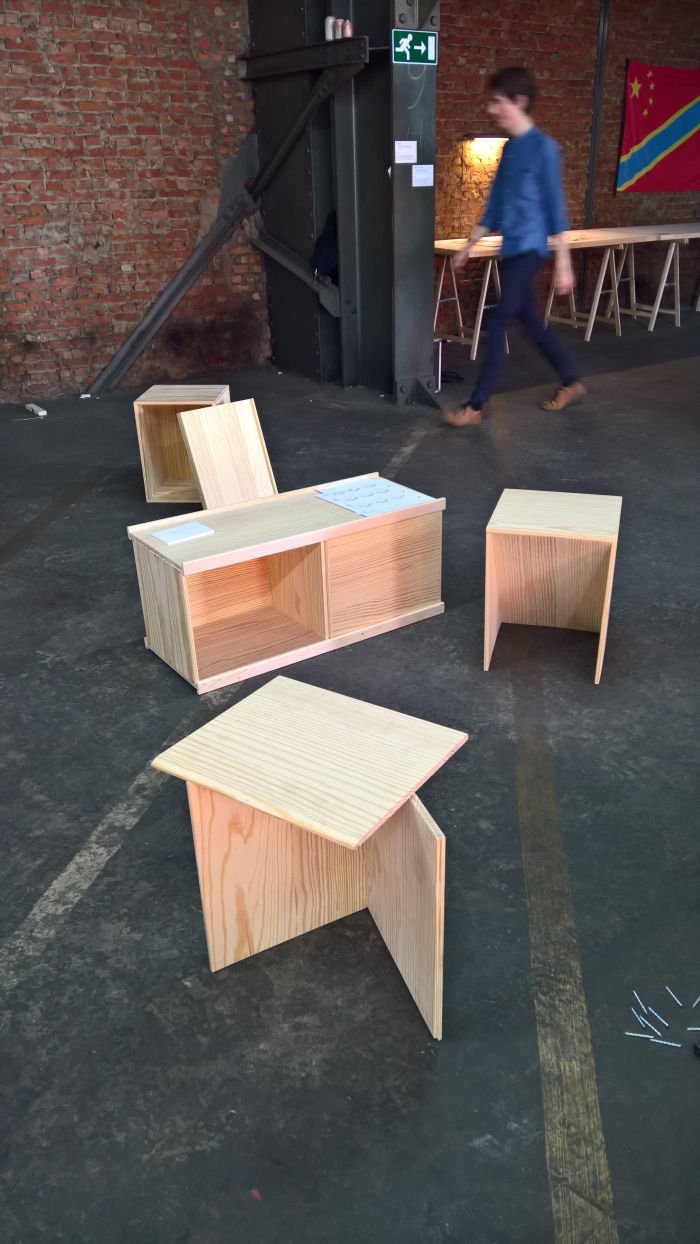
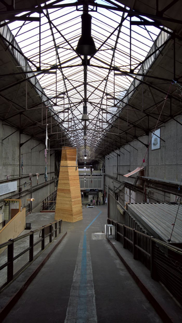
And La Cambre's most recent history? That's a subject for another day, but its most, most recent history could be viewed at the 2019 graduation showcase, All in one, a showcase staged in the decaying-industrial grandeur of Kanal, a former Citroën factory and showroom built in 1933/34 by a Franco-Belgian alliance of Maurice-Jacques Ravazé, Alexis Dumont and Marcel Van Goethem as a glass and steel cathedral to progress. And which in the coming three years will be renovated, cleaned, modernised and transformed, progressed? into a glass and steel cathedral to culture, specifically a multi-venue museum and event platform with as its lead a new Brussels dépendance of Le Centre Pompidou. Prior to the start of renovations the location hosted a year of cultural events under the title Kanal Brut, as in Kanal Raw not Kanal Dry, which certainly All in one was anything but, presenting as it did graduation projects from across the La Cambre programmes, including Urban Space, Book and Paper Design, Ceramics or Industrial Design: the latter featuring projects such as the furniture system Tadam! by Vahé Bedrossian which began with considerations on transport boxes used when moving flat, and subsequently made those boxes the basis for, Ta-da!!, a very simple, as in easy, accessible, untroubled, modular furniture system. Or Ollaire in which Bérénice de Salvatore used the natural thermic properties of soapstone - high thermal inertia, slow heat release - as the basis for a thoroughly charming mobile radiator, a work which not only reminds formally of ye olde lantern, but also a brings a touch of nature to the domestic environment, in a very pleasingly unobtrusive, almost subversive, fashion.
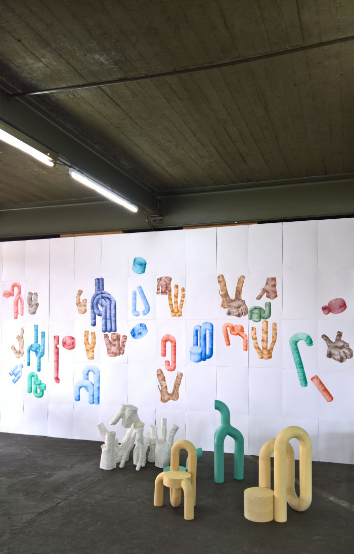
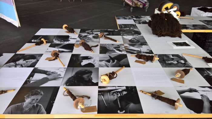
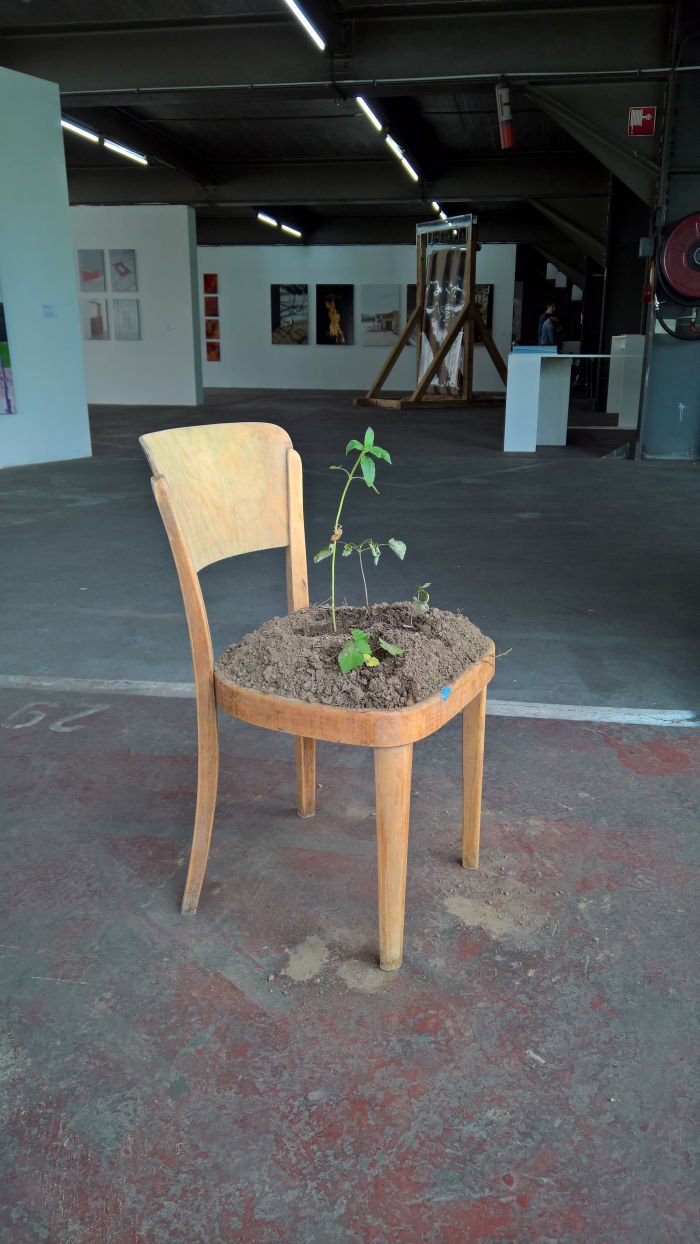
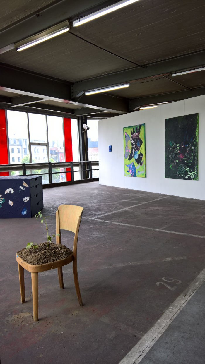
Elsewhere, with 1030 Blackwool Textile Design graduate Pauline Dornat initiated a project to utilise local wool for local production in the Brussels district of Schaerbeek and thereby attempted to employ production of goods as the basis for increased local affinity and cohesion; Hybrides saw Interior Design graduate Pauline Ravier develop a multi-faceted project which materialised as a series of furniture objects, highly graphic works crafted from wood and 3D printed plastic, highly graphic forms which could be mistaken for being random, yet which have sufficient propriety to suggest that they are very structured, and highly graphic objects which in their uncompromising openness, and inherent variability, steadfastly refuse to define their function, can and could be anything, and also any scale. We can well imagine them working much larger or much smaller. While with Asseyez-Vous Alexane Sanchez not only provided an interesting tip for reusing that old wooden chair you can't be separated from i.e. use it as plant pot; but being as it was a painting master project recalled thoughts of Ray Eames' claim that in swapping painting for furniture she simply changed palette. Alexane combines the two. Playfully and uncompromisingly.
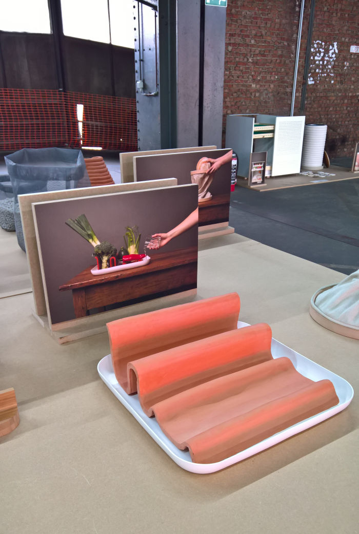
Beyond the graduation projects All in one also presented the results of two Industrial Design Masters' semester classes: Towards the non-disposable, which sought new, plastic free, packaging and service solutions for the Belgian coffee/sandwich shop chain EXKI, and proposed, amongst other suggestions, a stainless steel fork/spoon combo object by Damian Jodorowsky, a (more or less) PET bottle free fruit juice sales and serving system by Marion Jossrand, or the ceramic and stainless steel Calda soup terrine which, so its developer Esther Bapsalle, keeps soup warm without the need for electricity; and a use of ceramic for food storage that linked neatly to the second project Hors du Frigo which sought, ceramic, solutions for fridge-free food storage. And which produced largely solutions for vegetables, but also others dealing with bread and cheese and which together neatly reminded us that much as electric household goods have revolutionised domestic management, they also revolutionised electricity demand, and if we want to reduce our electricity use, which arguably we must, we need to consider not just the efficiency of our domestic electrical goods, but the necessity.
Further information on La Cambre can be found at www.lacambre.be
Thomas More is most famous as the author of Utopia, or to give his 1516 work its full title, "A little, true book, both beneficial and enjoyable, about how things should be in the new island Utopia".
An island albeit known only to the old sea dog Raphael Hythloday. And an island whose name translates from Greek as "Nowhere". And so one which exists? And does the Thomas More University of Applied Sciences Mechelen exist? Or are we a contemporary, virtual, Raphael Hythloday weaving yarns from the confusions of our minds, a detachment from reality precipitated by years of constant travel and lack of routine? Is what will follow a true account of true events, or an idealised vision of a design school exhibition that the human ego and its craving for power, wealth and status could never allow?
And while Utopia is Nowhere, "The perfect place", that which many people erroneously believe Utopia means, is the homophone, Eutopia, i.e. the perfect place is EU-topia. Try telling that to the Daily Express!
But we digress......
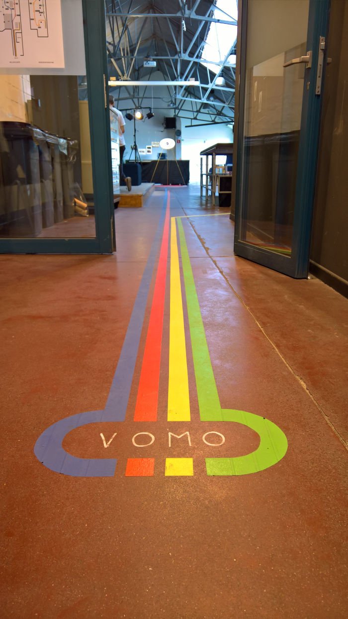
Within the department of Interieur, Design & Architectuur the Thomas More University offers courses in interior design, applied architecture, space & service design, chicken husbandry and furniture design, the later taught within VOMO, in many regards an institute within an institute, and where we begin...
We don't know why "Track Two". When we were in Mechelen we just assumed that, at some point, there had been an exhibition VOMO on Track. And this was now the second one. But that doesn't appear to have been the case. And so we don't know why "Track Two". Could be nasty typo. Or maybe there is a Harry Potter-esque magic train from platform 2 at Mechelen station. We know no. But we no need know.
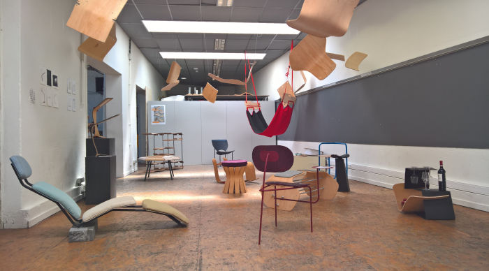
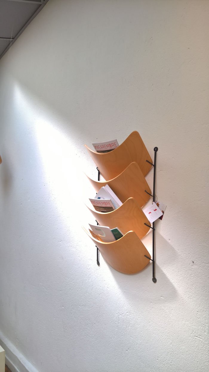
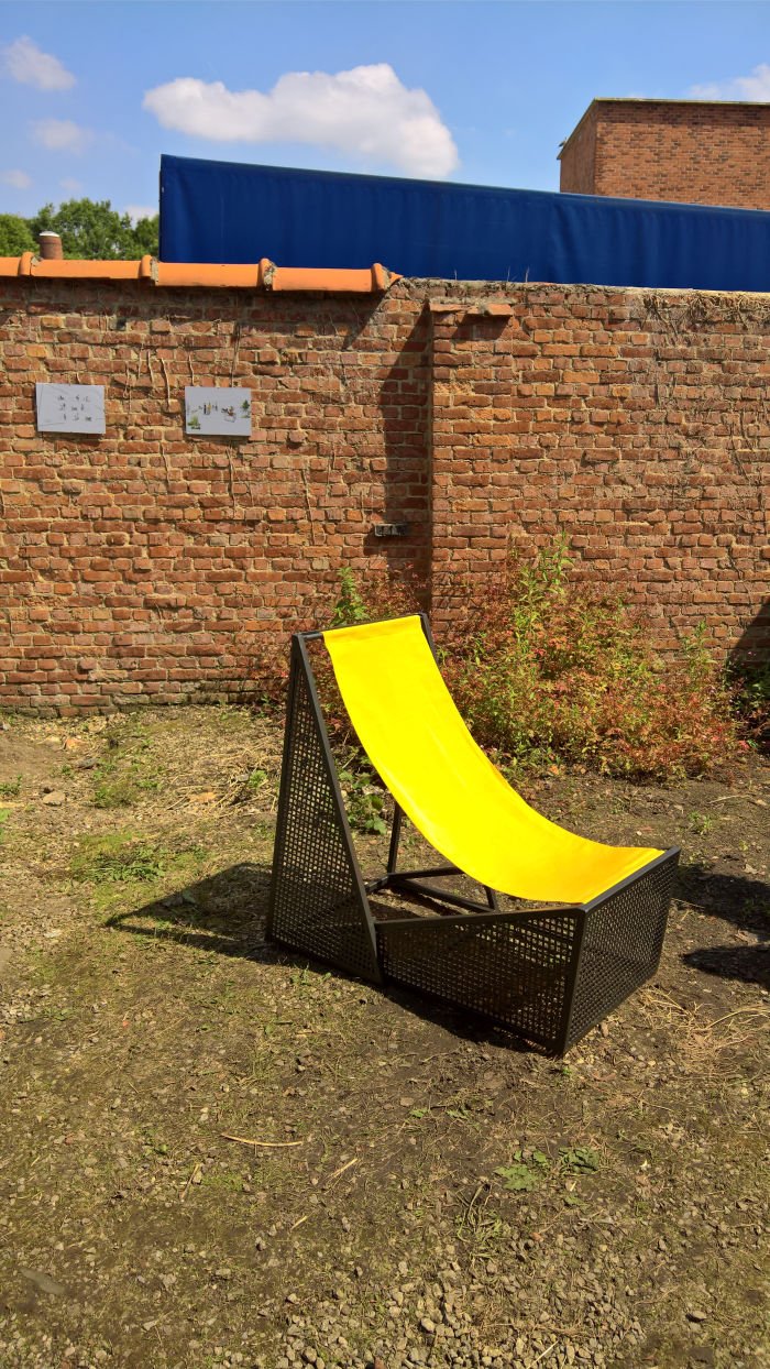
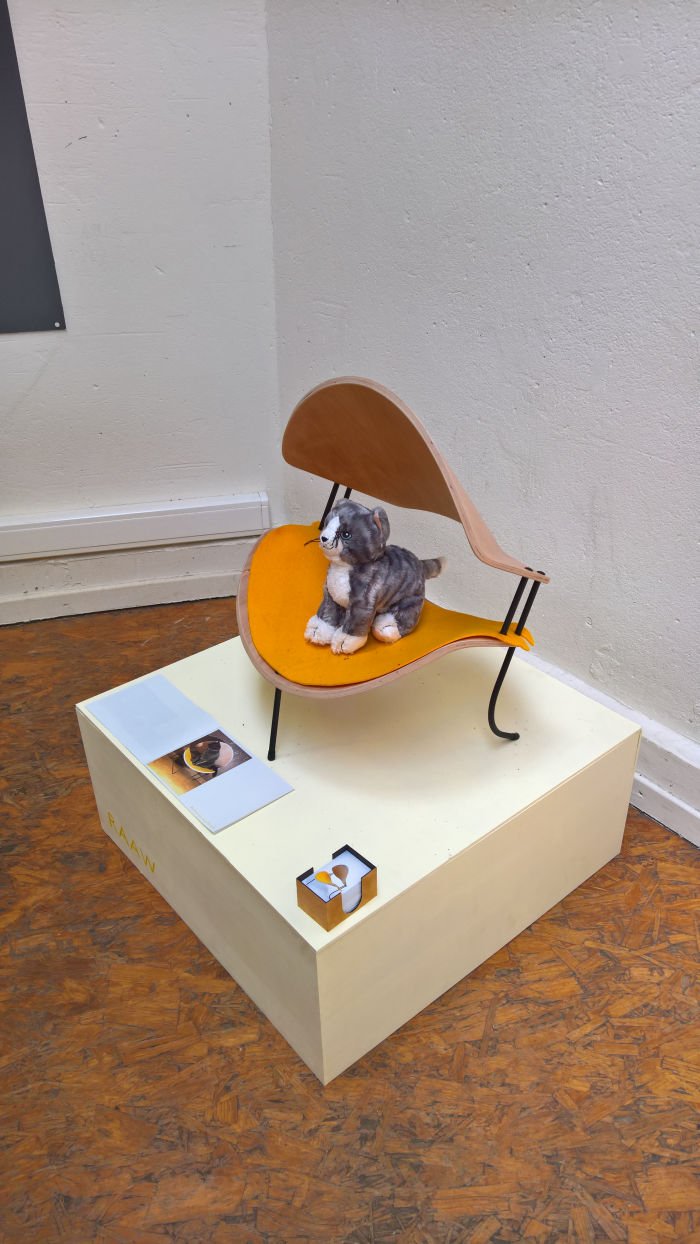
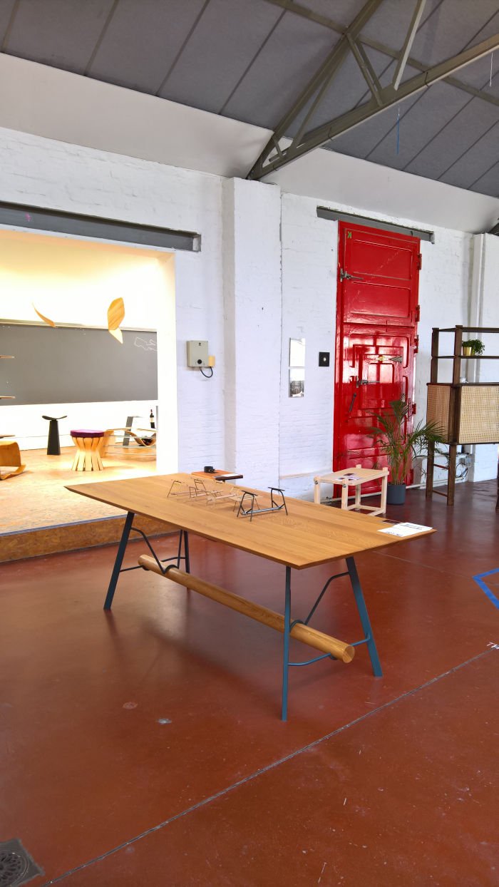
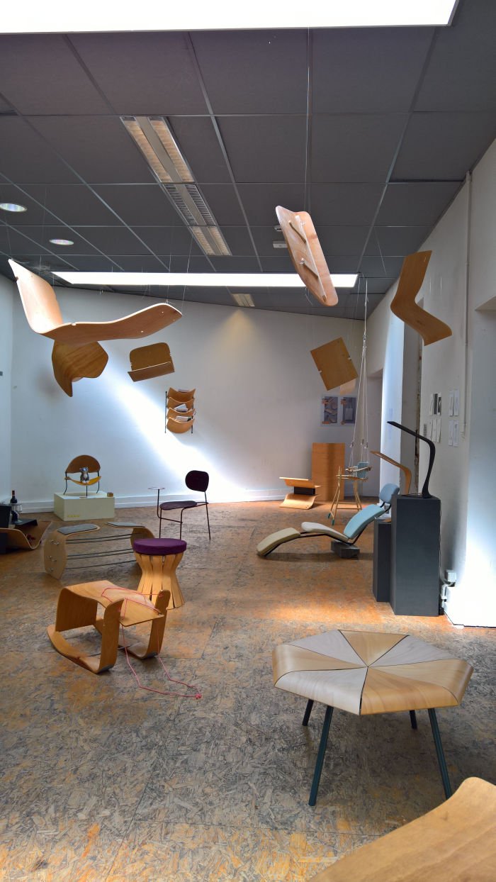
All we need know is that Track Two led us to a diverse range of projects from which our attention was caught by, and amongst others, the outdoor furniture system Tilt by Roxanne Van der Perren, a collection of triangular-ish objects that can be combined or used individually to create a wide range of sitting and table solutions and thus a system most applicable for contract and/or catering environments that require flexibility; with On_Log Thomas Jonckers developed, essentially, a trestle table system, but much, much more, and a system in which the log between the end-pieces not only provides stability but also allows the whole to come across a little less mechanical, a little more rustic hut, if allowing it to retain something vaguely industrial, but not faux. Oh no! And also gives you somewhere to rest your feet. Which is always important be that at dining table or desk. And something, as with desk drawers and shelves on coffee tables, maliciously ignored by contemporary furniture manufacturers. In addition to the individual projects Track Two also presented the results of a semester class which may, or may not, have been called Opdracht, but did involve finding new uses for no longer required plywood backrests and seats supplied by the Belgian manufacturer Drisag, and which produced a number of appealing proposals including the magazine rack Back to Rack by Laura Schellen, and thereby a name every bit as appealing as the object, and RAAW by Shari Meersman, officially pitched and presented as cat furniture, no honest, but which with a few tweaks and twists could be re-imagined as an interesting piece of hallway storage furniture for scarves, gloves, dog leads etc... And in which a cat could still sit/sleep. You try stopping it.....
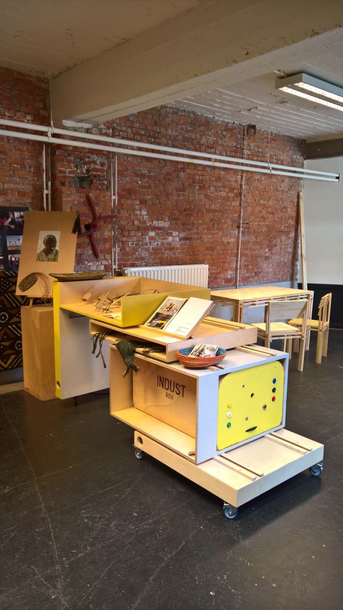
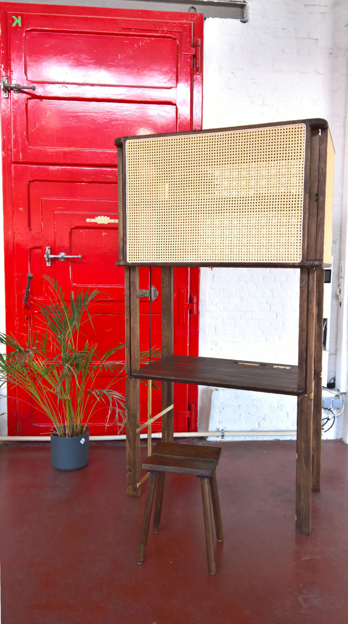
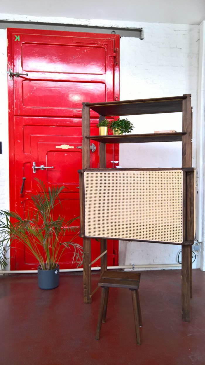
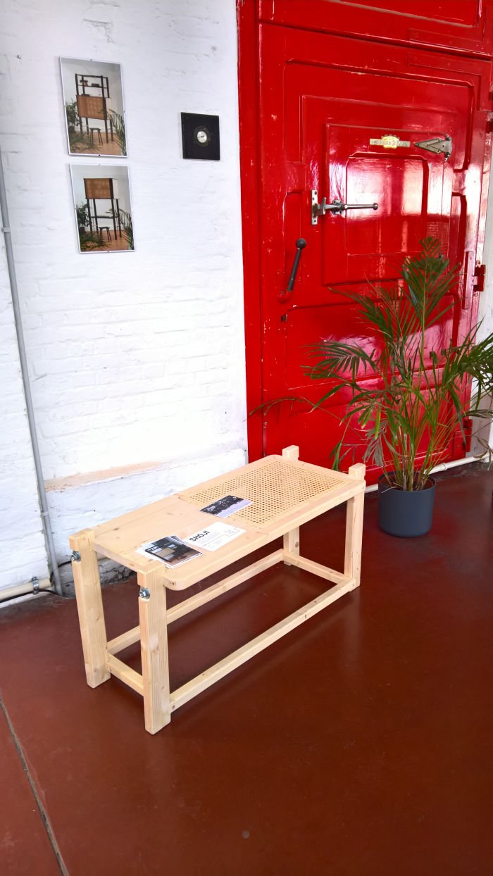
An object for all those who need a home desk but don't want a desk at home: with the central section raised one can work, with it lowered work vanishes and you have a rattan walled sideboard. And when closed you could always leave a light on for me..... no... stop.... that's Belinda Carlisle.... when closed you could always leave a light on inside and thus create a little atmospheric background lighting.
Although very much approving of Shoji, standing in front of it, we felt it a little too dominant, a little too, not large, but chunky, assertive, it was unquestionably there. And that despite being a neatly proportioned, reduced and scaled object, an object which in many regards needs to be that scale to be taken seriously, to have any effect. And an object of which we very much approve and whose acquaintance we were delighted to make. Why we thus felt a little uneasy in its presence, we couldn't and can't quite put our fingers on.... maybe there is room for further reduction, maybe in an alternative material, maybe a little less brutalist in construction, or maybe it's just us. Which is always possible. And certainly probable in an object that awakens imaginations of a colonialist's villa, not that such associations should in any way guide or influence your approach to such a genuinely charming and engaging object.
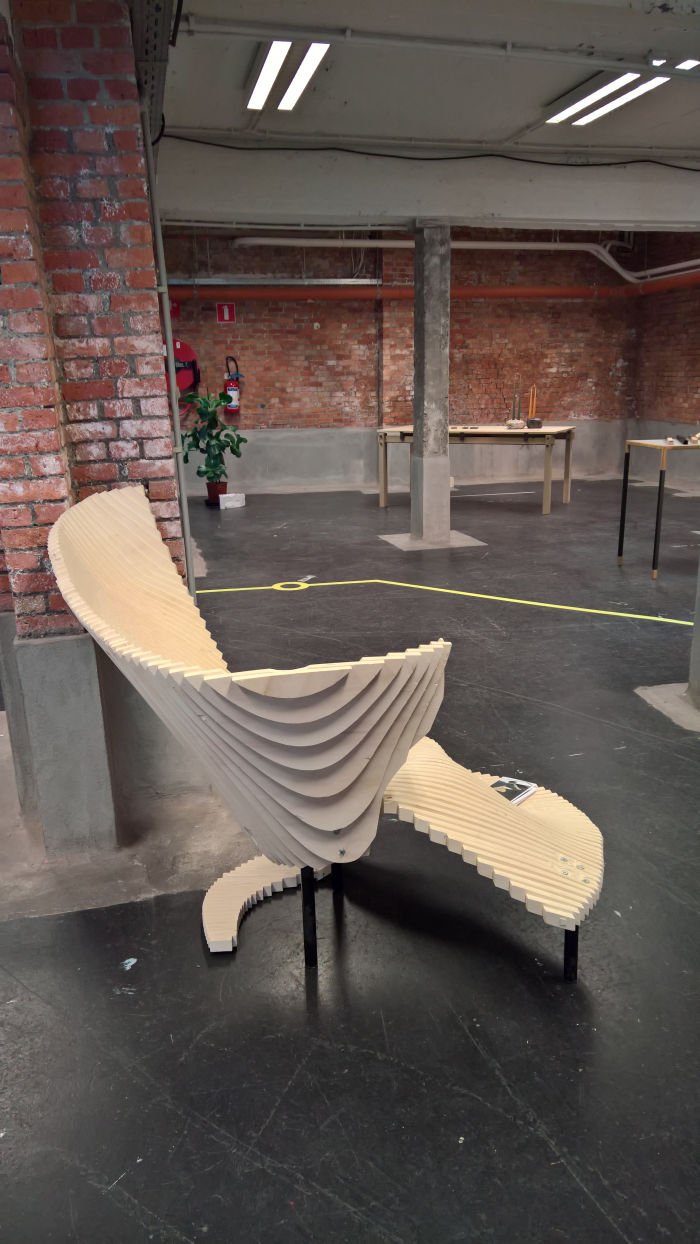
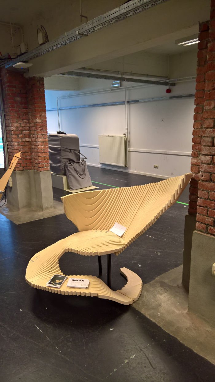
Amongst the peoples of the Scottish lowlands "Ya Dancer!" is an expression of extreme delight and elation, and that was exactly what we experienced upon seeing Charlotte Decavele's graduation project. A graduation project which we're thus, invariably, now calling Ya Danser!
Our first thought on setting eyes on Ya Danser! was Bruno Munari's series of "Searching for comfort in an uncomfortable chair" images, not because Ya Danser! looks uncomfortable, but because it seems to offer the myriad sitting positions proposed by Munari, just in a deliberate, and thus one hopes, comfortable stylee. Charlotte herself speaks of four seating/lounging positions, we'd argue, without having tried it, that the movement between the four positions, from a let's say, curled up, knees in the chest, self hug to an elongated lounge, is a continual, fluid, progression through different positions. And with a bit experimentation you will find more. Of that we're certain, Ya Danser! is one of those objects one learns to use, learns by doing. Possessing a satisfyingly dynamic visual impression and a logical flow and silhouette, our biggest problem is/was the legs. They need to be worked on. As does the material, whereby the correct materials could automatically solve the issue of the legs. Our biggest fear is that someone will upholster it. Don't. That would very much a case of Ya Numpty!
Further information on VOMO Mechelen can be found at www.vomo.be and all current graduation projects at www.vomo.be/VOMO_20
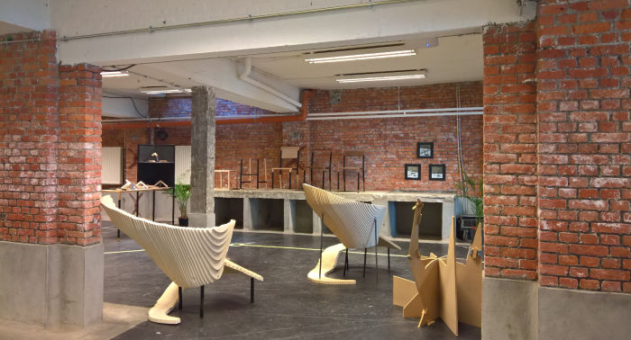
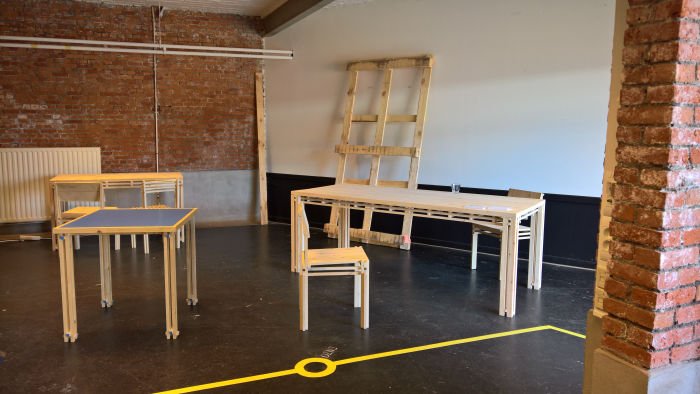
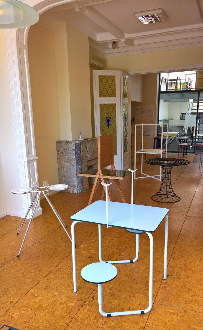
Whereas VOMO were on Track Two next door in the Interieur, Design & Architectuur showcase the students were at Table Two. Or more accurately put, the Interieur, Design & Architectuur showcase presented the results of the interior design project Tafel - Reflectie, Table - Reflection, in context of which students were challenged to create a table for two based on their considerations on reflection, and which produced a pleasingly diverse mix of the improbable and the impractical, and thus directed both the viewers, and, one hopes, the students, reflections to the probable and the practical. Elsewhere.....

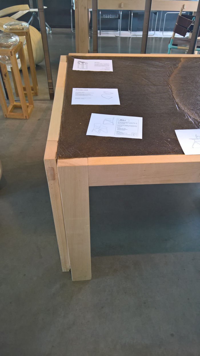
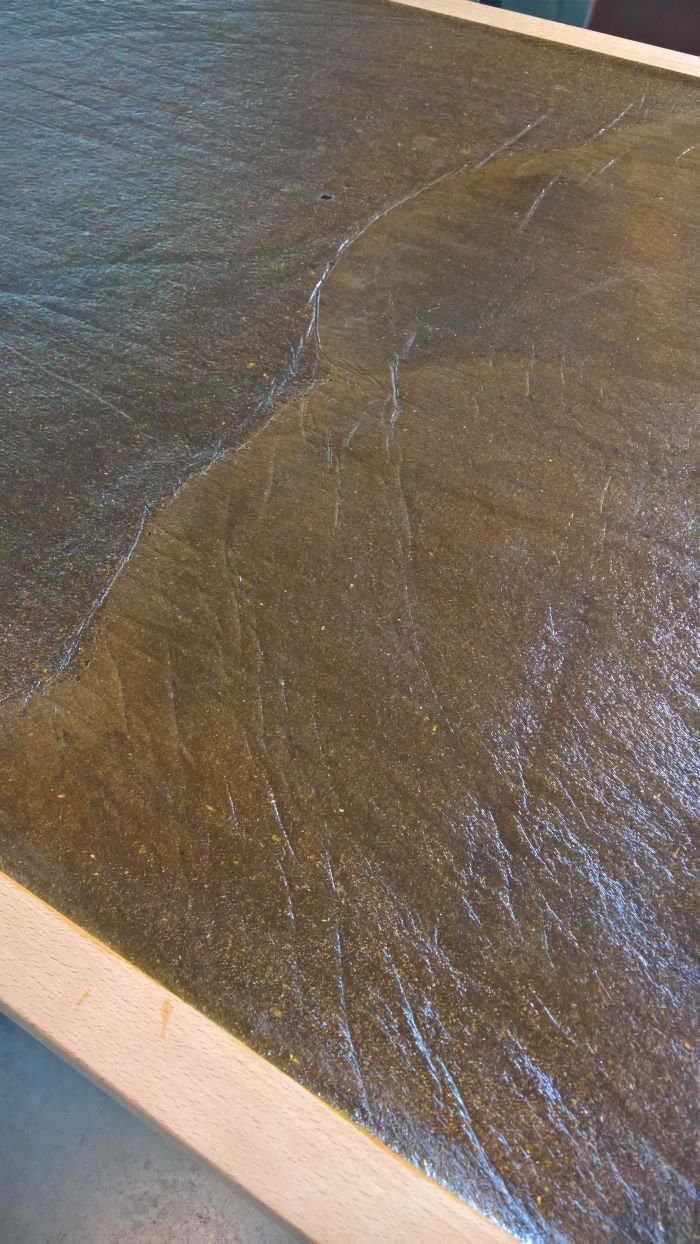
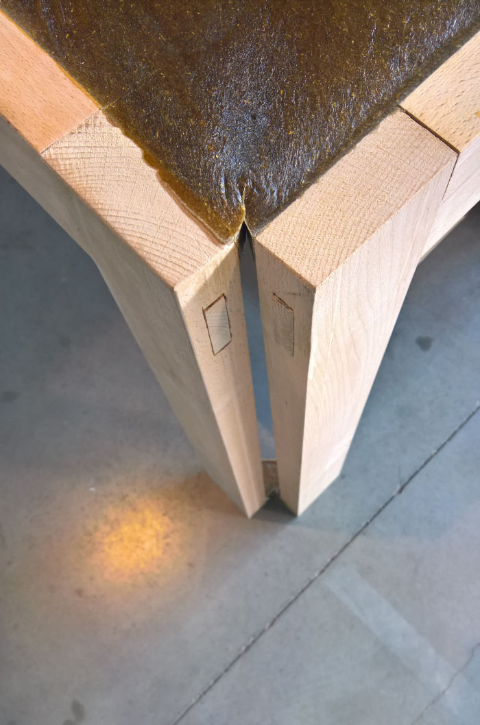
Combining a solid beach frame with a table top comprising sawdust and bone glue, Dries Voet's furniture graduation projects represents a further use of that particular combination of (waste) materials encountered on our 2019 #campustour. And although, and as noted in context of the sawdust/bone glue chair Residue by Hanna Carlsson at Vårutställning Malmö, we are firmly of the opinion that new materials should be utilised to develop new forms, which a table top clearly isn't, the nature of the production process arguably is. Or at least new-ish. Certainly specific to the composite. Cutting to the chase, with ComposTable Dries proposes setting the still moist sawdust/bone glue composite in a loose frame, the whole construction shrinking as the composite dries. The shrinkage, logically, pulling everything together and bequeathing the table its ultimate stability. Still not vegetarian friendly, but then neither is Belgium; however, a very nice use of shrinkage, a process 14th century wheelwrights knew to exploit and which has lost nothing in either its fascination nor its ability to produce highly durable objects with a minimum of joints and external interventions.
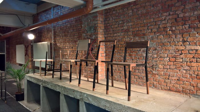
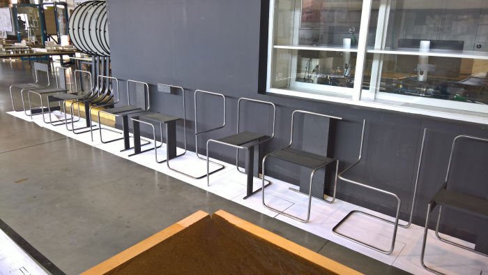
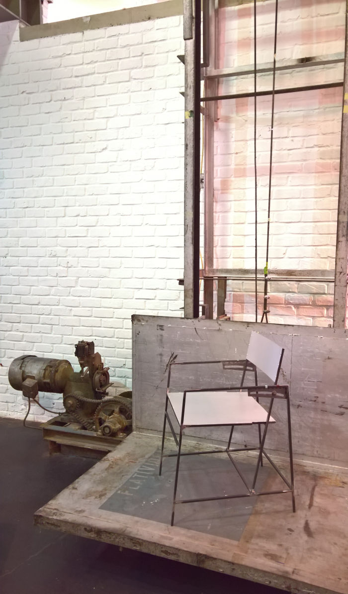
We're not 100% sure in exactly which context Thijs Smits created his metal chair, other than in context of the history of furniture design. But we're 100% glad he did. Crafted from metal stabs, admittedly improbably thin metal stabs, but we trust the statics of the construction have been considered in appropriate detail, and presented in Mechelen in a very satisfyingly brutalist guise, fully exposing its workings, logic and soul, the central feature of Alom is the adjustable backrest. Whereas is a work such as Erich Dieckmann's unnamed 1925 chair the backrest section alone swivels to allow the sitter to adjust their sitting position, in Alom the entire backrest moves, thereby allowing, we presume, we didn't/couldn't try it, a much more natural, and for all supportive sitting experience: you don't just change your angle of inclination, but your whole posture is forced into an optimal, correct, position. Be that with the backrest vertical, at its maximum backward tilt or at any point in between. It's very active seating and very much in the spirit of Josef Hoffmann's Sitzmaschine. As an object barely existent, with very obvious constructivist overtones and an almost impudent character, as a chair a genuine joy and very much, one feels, and as we're sure Thomas More would concur, "how things should be".
Further information on Interieur, Design & Architectuur, Thomas More Uni, Mechelen can be found at www.ideamechelen.be
While VOMO were happily rolling along from Mechelen on track two, Genk station is the end of the line. There is no train beyond Genk. And is Genk therefore also a cul-de-sac? Possibly. But not if one has an EXIT strategy. But would those developed by the students of the LUCA School of Arts suffice?
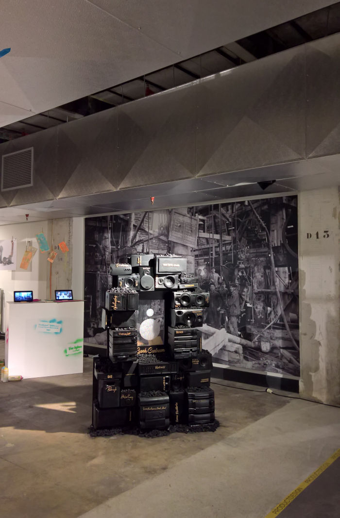
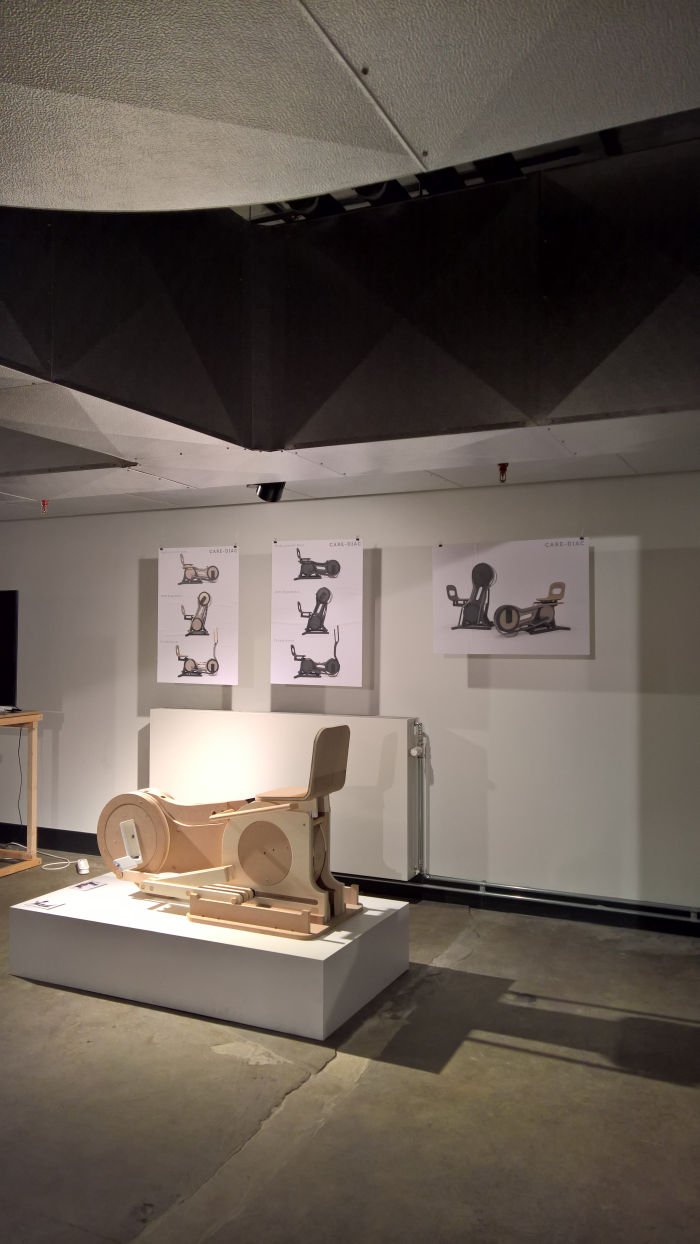
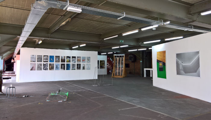
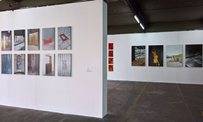
Staged in the so called Thor Central in Genk's Thor Park, a reclaimed and re-naturalised former mining site on the edge of the city, and thus the edge of the known world, after Genk it's just swamps and darkness, EXIT presented graduation projects from across the schools 2D and 3D courses of study; the latter including, and amongst others, Anke Van Asbroeck's considerations on using food waste as the basis for pigments, Dries Putzeis's re-imagining of the multi-function cardio-fitness machine, while with her project Unicité.id Femke Van de werf sought to transform Genk into 1980s Compton. OK not exactly, but in the course of her considerations on how downtown Genk could be bequeathed a much missed identity, a sense of being, Femke began to focus ever increasingly on Citétaal, a language (more or less) unique to Genk and which fuses Dutch with all manner of external influences, for all Italian and Turkish. And which thus serves as a very natural basis for establishing connections between disparate groups, connections Femke sought to strengthen through the medium of Hip Hop. Or to quote N.W.A, peoples of Genk you must Express Yourself. Or perhaps better put... whatever Express Yourself is in Citétaal, we sadly can't find a dictionary. Which of course reminds us that while language can serve as an identifier, it can also be a source of isolation, and potentially mistrust and tension, if you can't coherently Express Yourself to others.
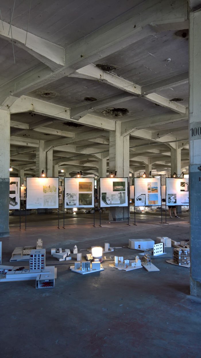
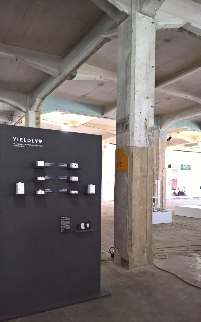
Amongst the architecture projects the various LUCA Genk studios produced proposals for, and amongst many other scenarios, transforming the Kempische Steenweg, a main thoroughfare in near-by Hasselt, into a more "liveable" space, the redevelopment and regeneration of the Landbouwbeland former industrial site in Maastricht, and considerations on the adaptive reuse of an historic Beguinage in Antwerp, and that for all in context of the Beguinage's historic role as a place of commune and community. And whereas normally Interaction Design fails, well, to interact with us, the three projects on show at EXIT 19 did all cause us to stop and reflect a while. With Yieldly Laurent Verbanck developed a modular lamp which uses a combination of gamification, peer pressure and what Laurent, somewhat sinisterly, refers to as "persuasive technologies", to help students overcome their... oh look a picture of a cat, cute, we really need a coffee, must tidy our desk, wonder what's happening in Westminster,....where were we, oh yes, to help students overcome their procrastinations; with EcoWays Bente Verjans proposes, in effect, a hallway car key storage device that keeps hold of your car key if there is a better option for your particular journey, and thus not only forcing you to use alternative transport methods, but in the long-term normalising your mobility decisions away from the car, which can only be good; while with Pet Movin’ Tine Favoreel considered, well, how to keep your pet moving, for all how to keep your dog moving while your are at work. Tine's solution is a motorised ball linked to an app via which you can, remotely, set it in motion. Your dog, instinctively, chasing after it. And which hopefully your dog is going to be happy about. Not that they're secretly happy that your out and they can snooze rather than constantly going for boring walks!!
And while we don't want in any way to take anything away from the LUCA Genk student's works, one of our highlights of EXIT 19 was the public WiFi SSID in the Thor Central. What would you call the guest SSID for Thor Central, which wireless network should those from outside use....???
Visi-THOR.
And the login user name? ActivaThor
Were it in our power we'd give whoever came up with those a years paid holiday. Sadly it's not. Sorry!
Further information on LUCA School of Arts, Genk can be found at www.luca-arts.be
