If the recent history of Germany is one of East and West, the longer history is one of North and South; a history which, and simplifying to the point of falsehood, saw the rivalry and conflict between the Hanseatic League and the traders of the southern states become a rivalry and conflict between Prussia and the realms of Baden, Württemberg, Hessen and Bavaria: the latter being the most reluctant to ratify the 1870 November Treaties and join the new Deutsches Reich. A reluctance expressed not only by the then Bavarian parliament's protracted deliberations on, and initial rejection of, the Treaties, but Bavaria's then King, Ludwig II, he of the fairytale castles, absence from the formal proclamation of the Kaiserreich in January 1871.
Yet despite Bavaria's long, deep, and (arguably) continuing, resistance and hostility to the union, it is Weißbier, Lederhosen and FC Bayern, and fairytale castles, which stand representative for many a non-German's understanding of German identity.
Conversely, while Bavaria has contributed much to the development of contemporary design in Germany, not least through the efforts of, and amongst many others, the late 19th/early 20th century Vereinigte Werkstätten für Kunst im Handwerk, Die Neue Sammlung as one of the oldest and largest dedicated design museums, the Munich born and based designer Konstantin Grcic or Stuttgart born but Chiemgau based design publisher Nils Holger Moormann, the popular understanding of "Designed in Germany" lies outwith the Freistaat, in the realms of gute Form, largely developed in Ulm and arguably most popularly understood through Braun; in Stuttgart's Porsche or Wolfsburg's Volkswagen; or, and this year of all years, by Bauhaus, an institution which as we noted in context of our 2019 smow Song Contest coverage, was very, very Prussian in its make up, students from Bavaria being outnumbered by those from Mars. More or less.
But what can Bavaria's design schools contribute to altering such a position? To raising the profile of Bavarian design? We can't offer any concrete prognosis, or at least not here, logistic realities meaning that we only visited two Bavarian design schools, technically three but we'll get to that, at length; however, from the two (three) we did visit......
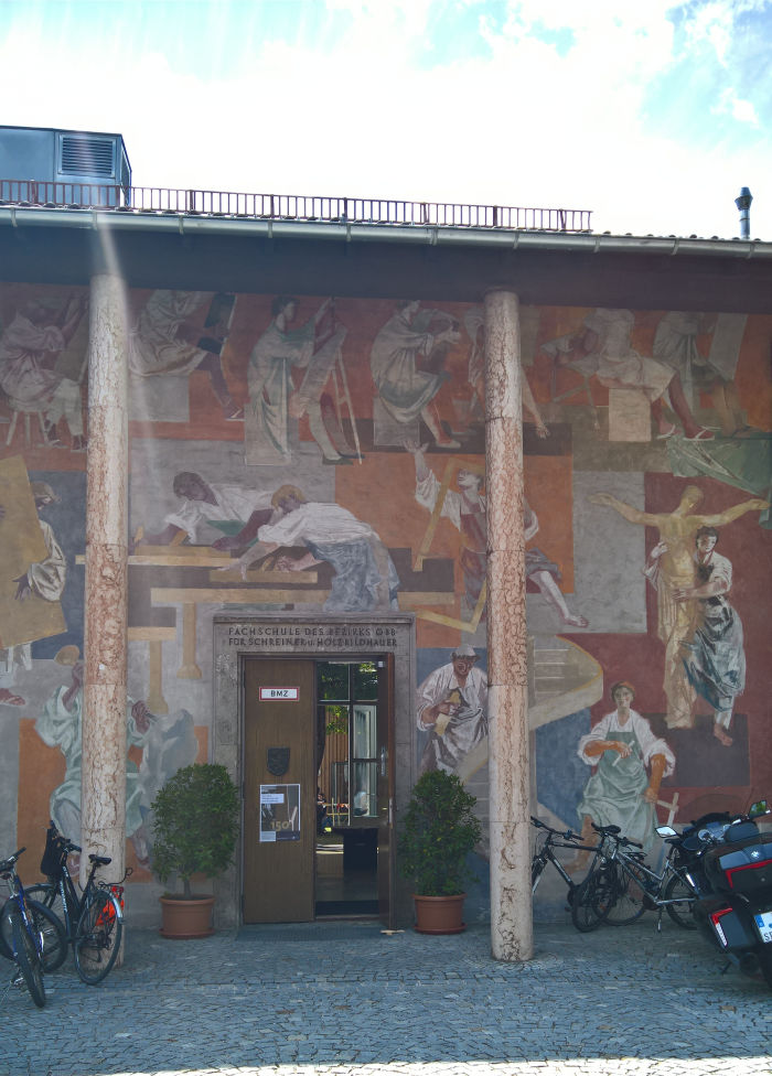
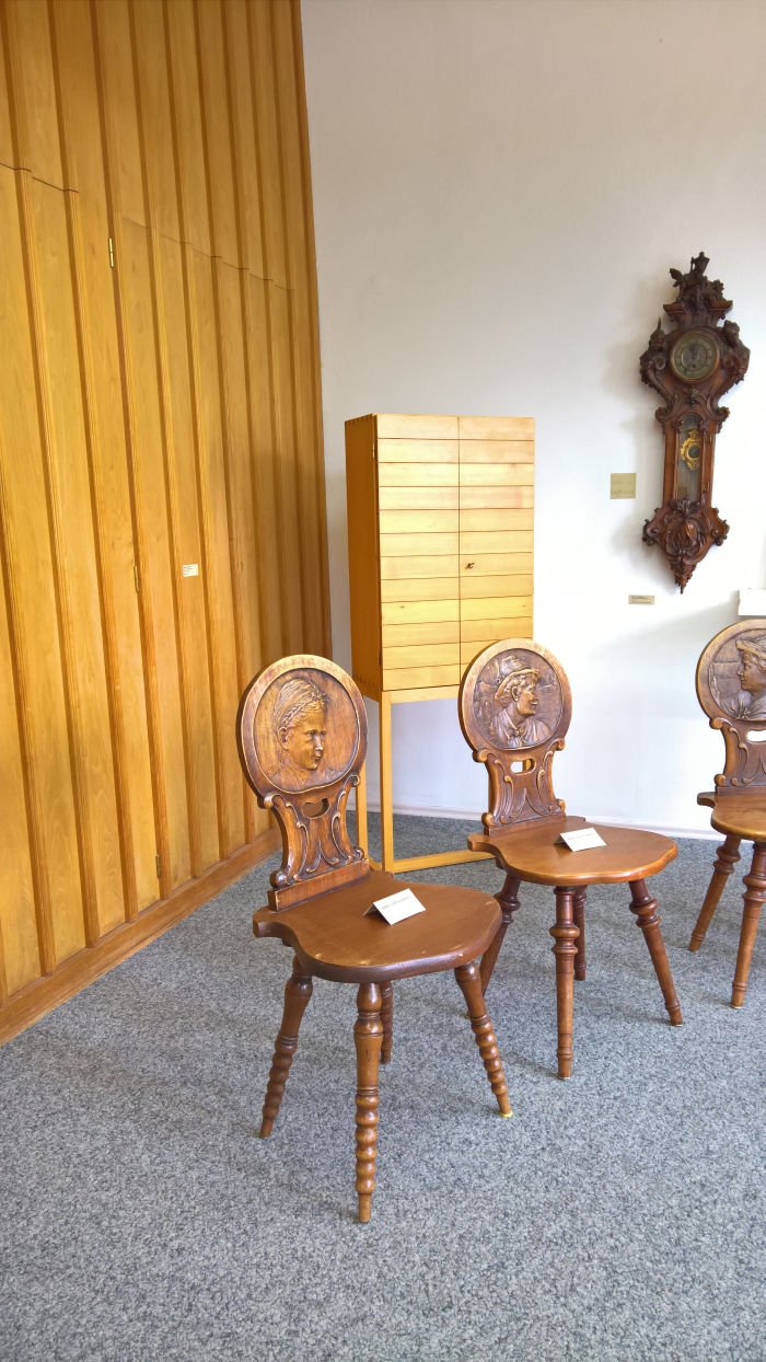
Established in 1869 as a regional draughting and wood carving school in Partenkirchen with draughting departments in Garmisch, Oberammergau & Mittenwald, the contemporary Schulen für Holz und Gestaltung, SHG, Garmisch-Partenkirchen is, as the name implies, a family of schools, specifically five: an Academy for Room and Object Design, a Carpentry Meisterschule, colleges für carpentry and wood sculpting and a Krippenbauschule, a nativity modelling school, whereby for all the latter indicates that while a lot has changed not only in the school, but in Garmisch, Partenkirchen and Bavaria, since the schools' founding, a tangible connection to the past remains.
By way of celebrating that connection, but also elucidating what has changed, the schools' 2019 summer exhibition was both a presentation of contemporary projects and also a review of the past 150 years; a review which aside from neatly introducing the school(s) also underscored the prominence of schnitzen - wood carving - in the early days of the school(s): back then the carpenter's craft being understood as being as much, more?, about the application of ornamentation as it was about the form or function of an object. And an understanding of the carpenter's craft against which many of the developments in architecture and design since the schools' founding have been explicitly positioned. And which to judge by the contemporary objects presented the school has resisted. Not in a stubborn, inflexible, way, but more in a way that underscores the differences between woodworking and working with wood: in the former the focus is the material and the final object a technical expression of how the material can be made functional. In the latter the focus is functionality, the properties of the material being employed more than the material itself.
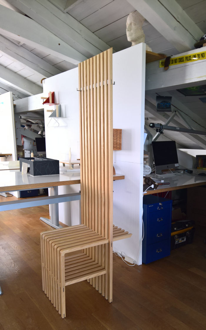
Something neatly underscored in the SHG by the comparison between the apprentice pieces in the carpentry college/Meisterschule and the graduation projects in the Academy for Room and Object Design. Yes, we're simplifying for the sake of brevity, but whereas in the former the focus was very much on creating something from wood, something which regardless how well crafted and thought through, stood largely by itself as an expression of itself: in the latter the focus was creating something functional, something which sought a solution, or something which proposed an alternative understanding. The latter being particularly pleasingly expressed by Matthias Koschel's seat-cum-coatrack combo Singlemodul. Formally standing proudly in a tradition that stretches over Art Nouveau all the way back to the Renaissance, and arguably further, Singlemodul effortlessly integrates a whole host of functionalities into a satisfyingly simple, unassuming and accessible wooden slat construction, and into a formal tradition much more about representation than function; quite aside from the intuitive, varied, practical, storage options, the fact that the hooks can be freely placed on the front or back makes it yieldingly responsive to not only the individual users needs but to variations in those needs, similarly, devised as it is as a freely extendable system, Singlemodul is suitable for both contract and domestic environments. And formally should work in both. And thus while a single module, is anything but monosyllabic. The photo of Singlemodul in the academy's yearbook, and indeed those on Matthias's homepage, depict two slats extending horizontally from the lower front section and clearly intended for resting your foot on while tying/untying your laces. Which is genius. Or rather would be if they are retractable. Otherwise your going to bang your shins a lot. Which is ridiculous. We certainly weren't aware of them when we met Singlemodul en persona and so suspect they were rigid and have now, advisably, vanished. But a retractable solution is surely possible. And genius.
That our oversimplification automatically leads to falsehoods being very neatly demonstrated by Kevin Gerstmeier's 2017 Schreiner Meister project Steharbeitsplatz. A very natural, satisfying, combination of steel tube and wood into a neatly proportioned and intelligently balanced object, where the tension between the metal and wood induces an uneasy but irrepressible restraint, Steharbeitsplatz is conceived less for the laptop based work most standing workplaces are conceived for, but rather for draughting and sketching, something underscored by the larger draws for storing paper as well as utensils. Yet despite its very focused intention is an object that clearly can be used in much more general senses, is a very responsive object which understands life's rich tapestry, and an object which despite the very obvious desire to place it against a wall, is an object that must, demands to be, be left free-standing in a space. If we've judged things correctly since his Meister Kevin has studied at the Academy for Room and Object Design, which appears a very logical progression, and certainly one alluded to in Steharbeitsplatz.
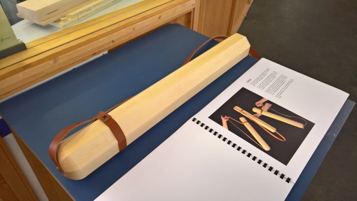
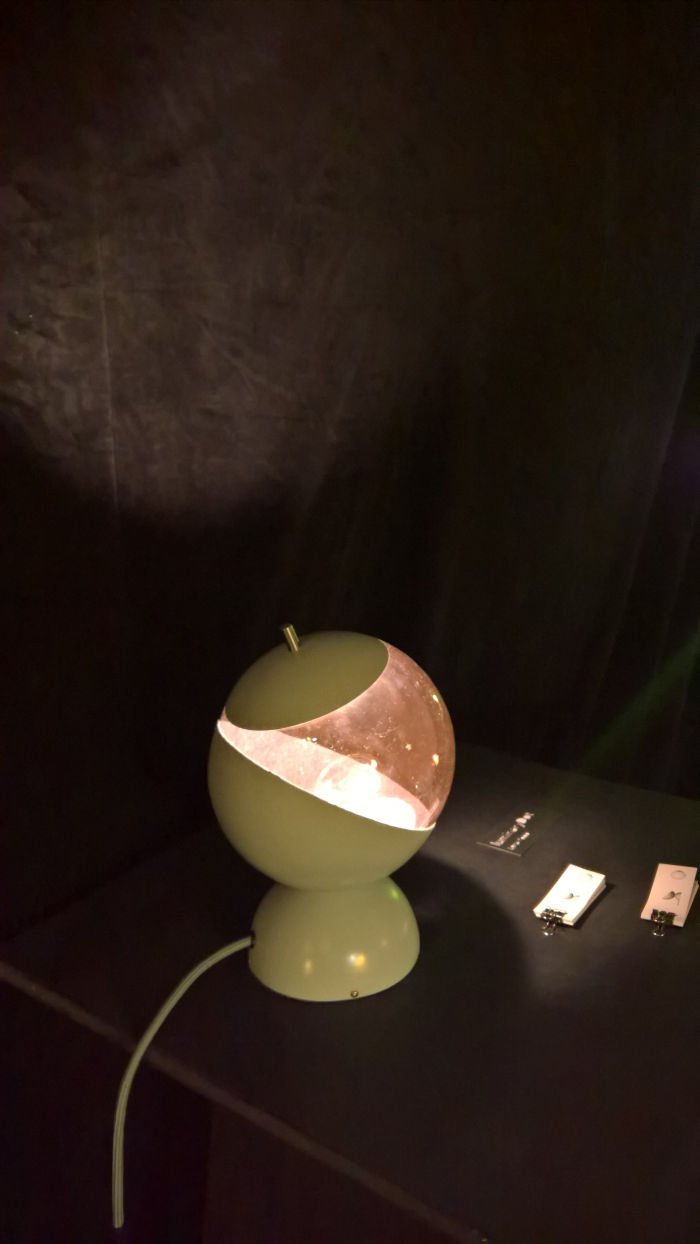
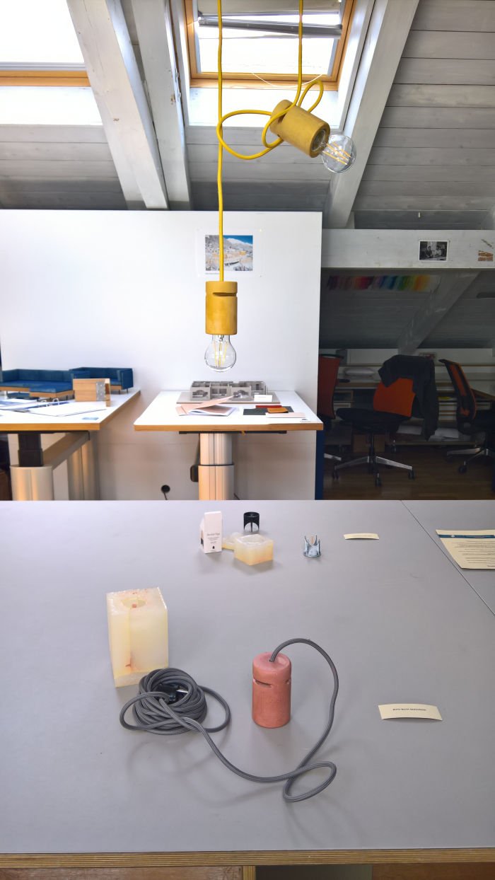
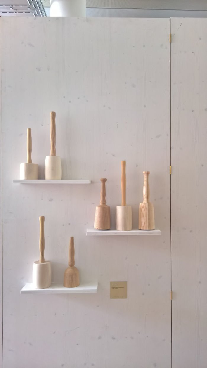
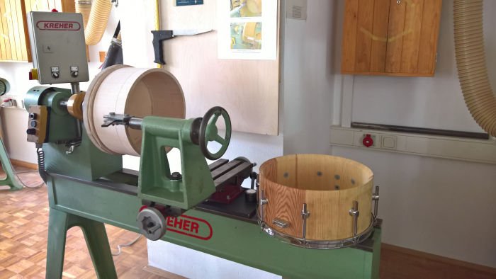
Elsewhere our attention was caught and held by a pendant lamp realised context of the Academy for Room and Object Design's Rapid Prototyping course, and for whom we regrettably don't know who was responsible, a situation were saying isn't our fault, but accept probably is, apologies!, and a pendant lamp which through a trick so simple we can't believe it's original, but also can't prove it isn't, and hope it is, allows for a freely height adjustable lamp; a jig from 2011 by Andreas Pfuhl, presented in context of the Meisterschule's presentation, Best of Jig Construction from the past 15 Years and which allows for the forming of drum bodies on a conventional lathe; the luminaryDot table lamp by Lena Kopp which while arguably playing a little too obviously with a Sputnik aesthetic did represent a very nice application of contemporary technology in a very accessible, universal lighting object; and the wooden poster/blueprint/plan tube created by students Vosding, Hammer, Seeberger, Willibad, Gerl & Kemptner. About whom we know no more, not even their forenames: what we do know however is that, aside from being a very nicely crafted work, and yes one that delightfully blurs the borders between craft and design, the Christmas market season is approaching, and it needn't always be about schnitzen & Krippen in context of wooden gifts from Oberbayern......
Further information on the Schulen für Holz und Gestaltung can be found at www.shg-gap.de
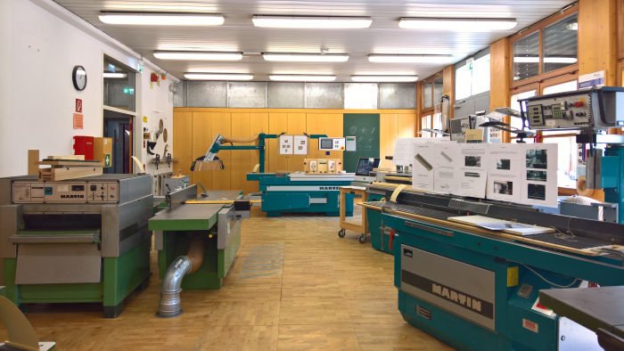
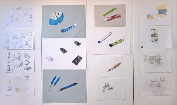
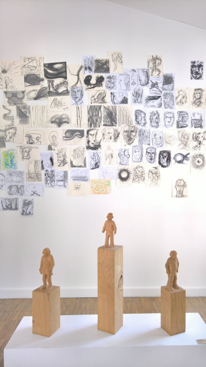
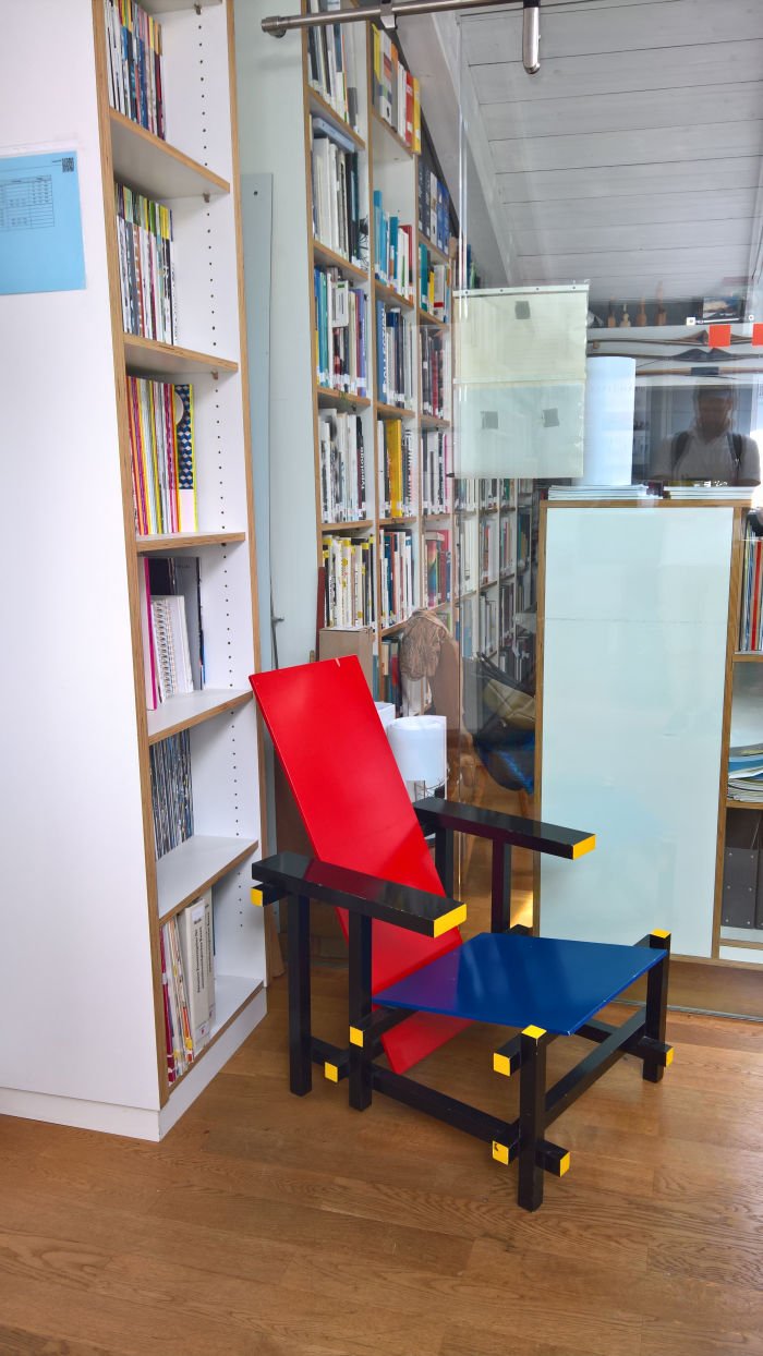
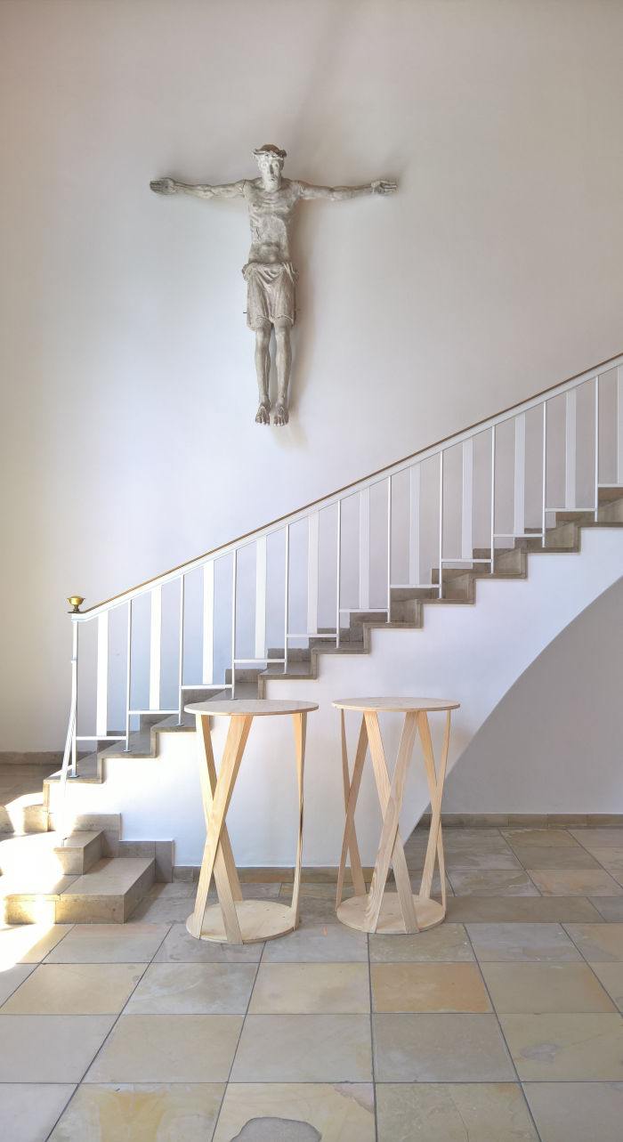
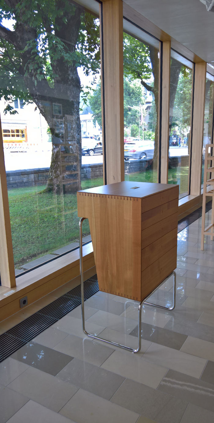
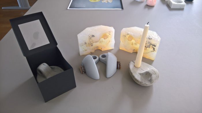
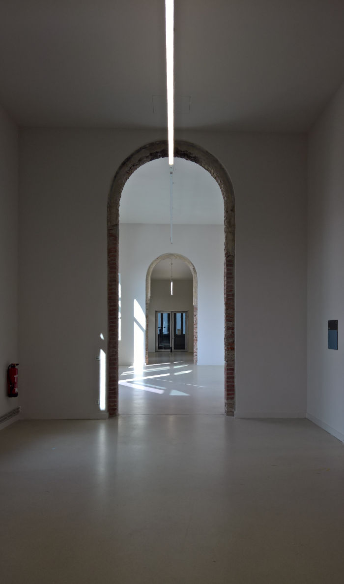
In February 2019 the Hochschule München's Design Department formally moved into their new HQ in the former Bavarian Army's Zeughaus in München's Lothstraße. That Zeughaus, is more or less a synonym for armoury, and thus where weapons are/were stored, serviced and made ready for use, clearly allowing for all manner of metaphors. We'll leave you dear reader to make up your own, we can't do all the work for you, and skip on to what was shown and told by the presentation of semester and graduation projects.
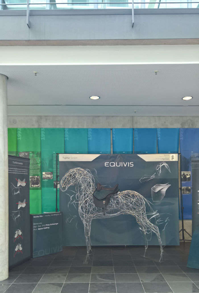
The latter including works such as, and amongst many, many others, Equivis, a re-imagining of the saddle by Monika Otto, and which, according to Monika, not only improves the experience for the rider but also allows the horse to "enjoy a new degree of freedom of movement"; the home office desk Die Arbeitsfläche - The Work Space - by Alexander Siegmann and which via a stupidly obvious system allows not only for working at different heights, but also the, effective, removal of the desk from the immediate environment and thus the removal of work from the domestic environment, an interesting proposal if one we'd argue still has a goodly deal formal development ahead of it; similarly reflecting on contemporary work practices Teresa Naujokat developed with Zwischeräume a proposal for a system which allows for the easy, rapid switch from seating to table to seating to table and thus allowing a degree of flexibility in any public/semi-public space's interior design, satisfying as the solution and system is/were, for us there is something about the way the bit near your feet becomes the desk top that triggers our OCD, but that's just us; while with his conceptual re-imagining of the watch Lukas Heintschel reflected in his project Modern Times not only on watch design but also contemporary relationships to time and how future relationships to time may be organised and visualised: whereby having viewed Time, Freedom and Control – The Legacy of Johannes Bürk at the Uhrenindustriemuseum Villingen-Schwenningen we'd obviously recommend binning your watch as quickly as possible. And your phone.
While the graduation projects were displayed in the foyer of the Hochscule's Rote Würfel, a building incorporated into the school's corporate identity and which appears, formally and through the absence of an architects name in conjunction with the work, to have sprung up by itself overnight, the semester projects were presented across the road in the rooms of the new HQ and thus allowing for a chance to explore the building as much as the works realised therein. Works which in addition to the inevitable automotive design classes, for reasons we can't really explain car design and general automotive themes are very, very prominent at the Hochschule München, Show + Tell presented the results of projects such as, and amongst many others, the introductory course Kitchen Utensil which challenged students to first analyse a kitchen utensil and then create a scale cardboard model of such, a classic early semester product/industrial design course, and a class which is never dull; or Cracking Habits, a project of the school's Biophilic Design team and which tackled conventions around eating, including Tischläufer by Severin Popp and Marianne Sellmaier and which proposes sharing our table with ants, not directly, that would just be having a picnic, but rather while you eat your food ants are wandering through glass tubes with theirs. On the one hand yes, as Severin and Marianne note, an opportunity to better understand the habits of those animals with which we share our planet, and on the other the chance to do that with a delightfully contemporary Baroque flair: in the imperial courts of 17th century Europe one can well imagine lions or ostriches strolling through cages on opulently overloaded tables, today its ants in glass tubes. Then it would have been about displays of wealth and power, today, in our much more humane society, about increasing sensibility and awareness. That said, there are world leaders today who'd probably still go for the lions and ostriches.....
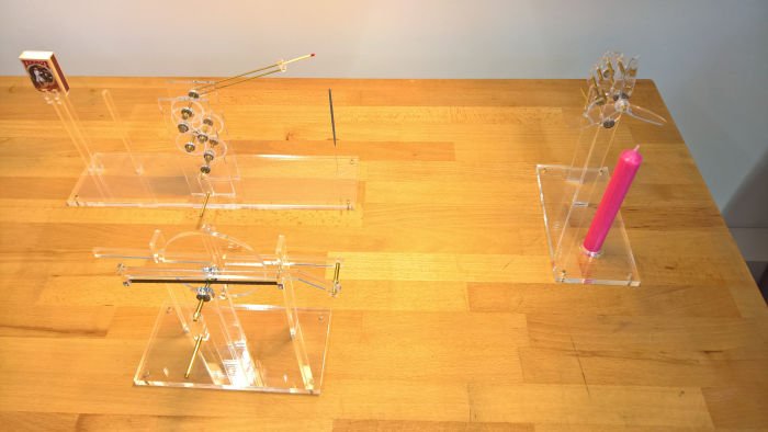
Similarly from the Biophilic Design stable Sophia Schullan presented with her Frustration Machines a series of mechanical contraptions which don't quite work and/or destroy themselves through their functionality and thus are a complete waste of time. And thereby a very nice reflection on much of contemporary design, much of our contemporary world, certainly our contemporary politics, and also a reminder that the Hochschule München is very much a go to institution for boredom and time wasting. In a positive sense one understands. Projects at the school often involving interesting, thought-provoking, inspiring, reflections on boredom and time wasting. Stories of time wasting in a negative sense in Munich coming up real, real, soon.
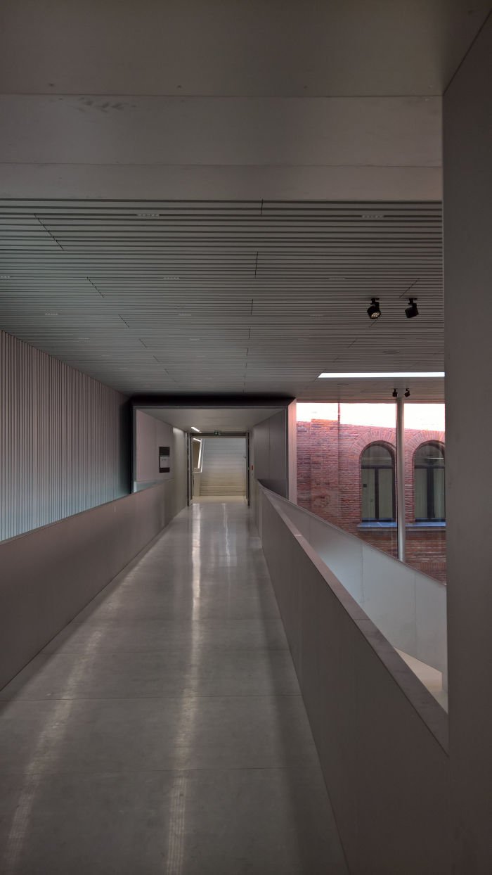
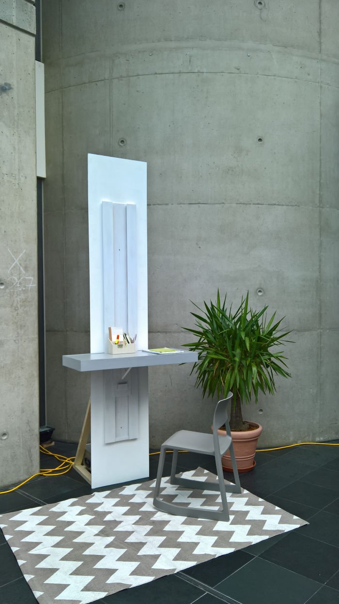
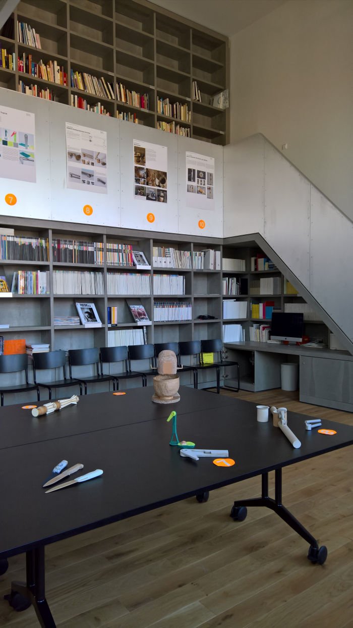
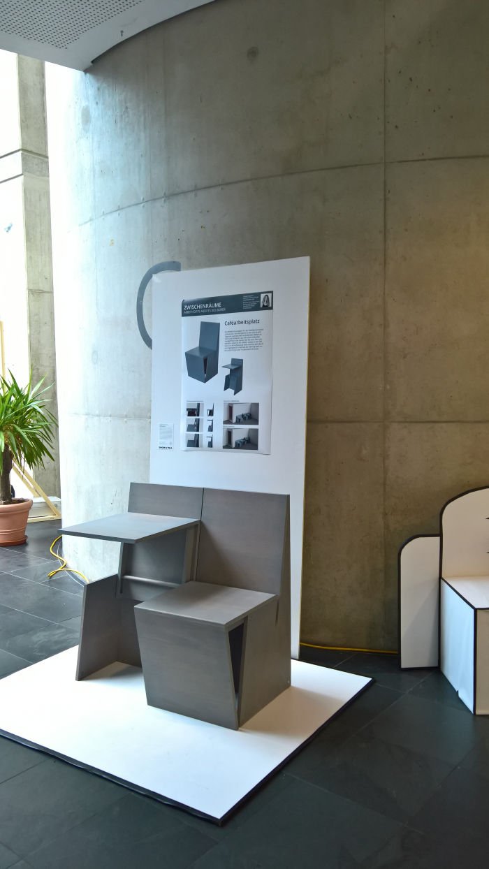
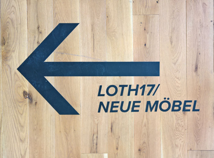
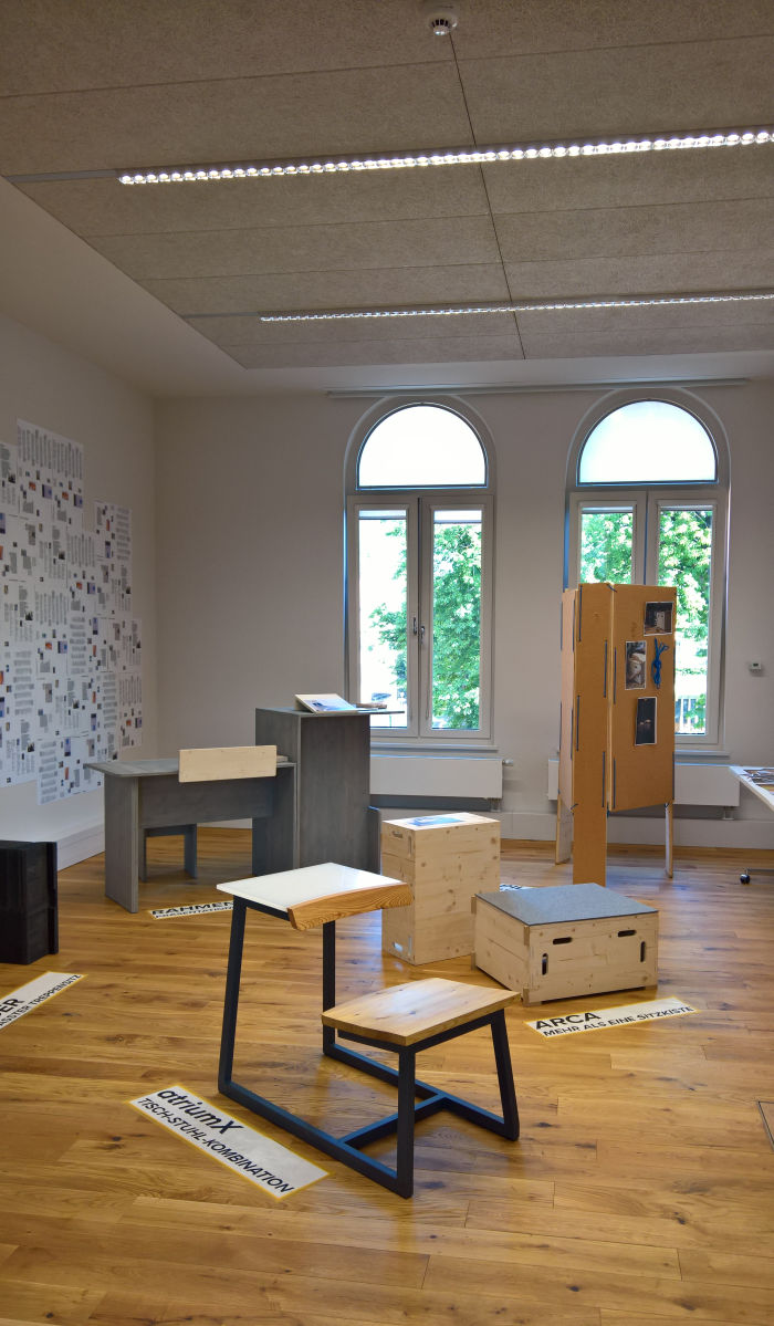
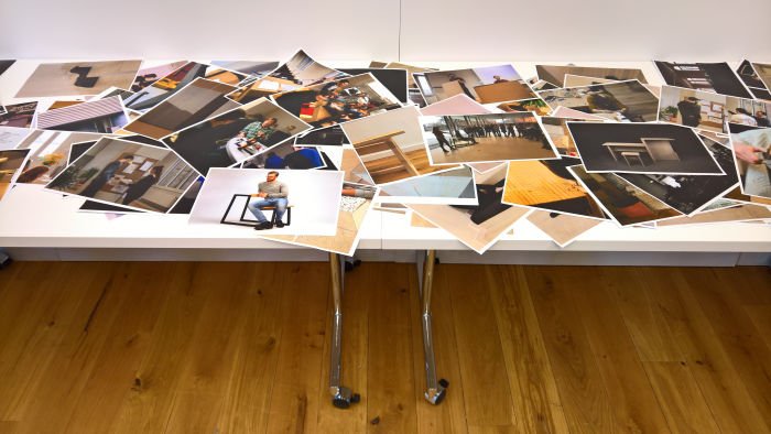
Pleasingly given the newness of the design HQ there were several projects which focussed directly on the school's new home including Kaffeeflecken which reflected on the (near) inevitability that the new building will develop a patina of coffee mug stains, and which sought projects intended either to avoid such or, when not necessarily a celebration, then certainly an active acceptance that such are unavoidable and should be celebrated; and most prominently, and arguably importantly, the project LOTH17/Neue Möbel by and with Prof Florian Petri in conjunction with Vitra and Staab Architects, the architects responsible for the renovations of the building, and which sought to develop new furniture for the new building, for the realities of the daily life of and within the new building, context specific solutions, and a further fine example from the course our 2019 #campustour of Designer, heal thyself!
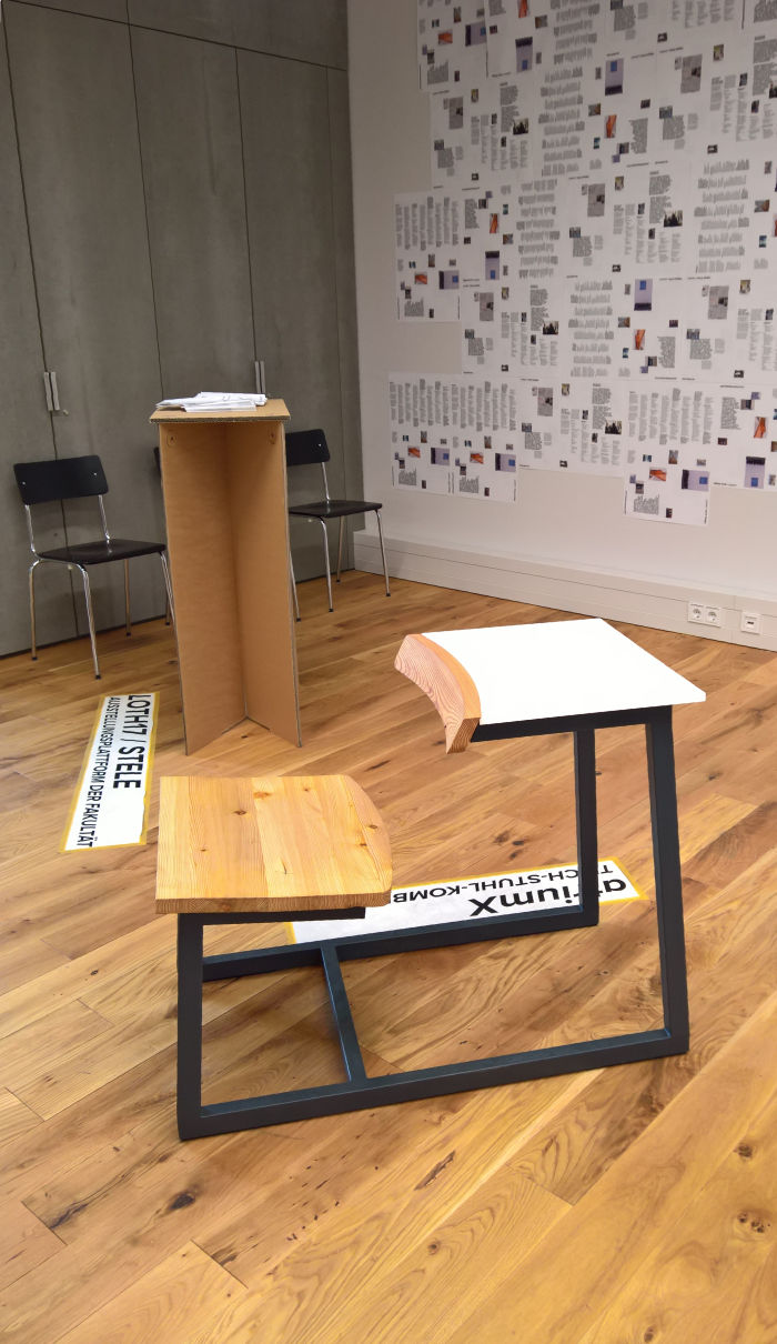
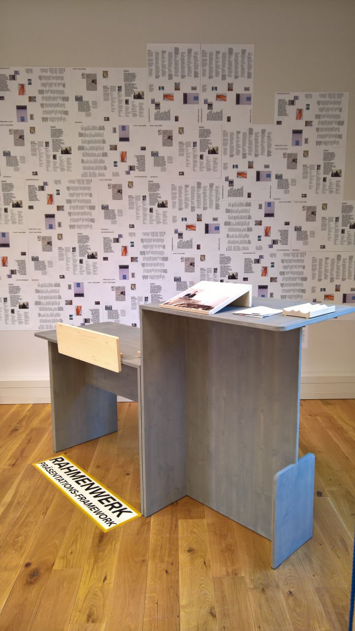
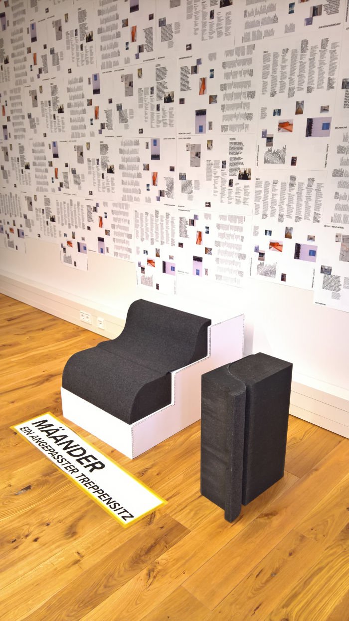
And a project which resulted in a couple of very interesting proposals including Mäander, a seat cushion conceived to make sitting on stairs a more comfortable, upholstered, experience and thus actively allowing for the integration of the stairs as a meeting and workspace; Rahmenwerk, pitched as a presentation framework, whatever that may be, which we're calling a desk, and which appealed to us as the sort of outwardly monolithic, unresponsive, object whose true depth can be only be understood through use and interaction; and atriumX, a low set chair/table combination, and a delicious celebration of the workspace. Essentially a contemporary development of the Victorian school chair/desk combo, atriumX with its slightly forward sloping seat and inviting desk surface not only enables a comfortable sitting, working and/or snoozing position but the curved desk "front" allows for both a bit more comfort while snoozing, but also means it can be used as a side/backrest thus enabling atriumX to be used either for individual sketching/laptop/book work or as seating for group work, discussions, etc. In addition the correspondence between the curve of the desktop and that of the front of the seat helps create a continuity and harmony which bequeaths the whole a very natural, coherent composition. And although very much enjoying the assured self-confidence of the work, we remain unsure about the stubbornly quadratic metal base, yes on the one hand it bequeaths the whole a monumentality and stability, while allowing the proportions and scale of the wooden elements to make sense, factors on which its self-confident assuredness in many regards rests, but ..... Every time we looked at it in Munich, and look at it now in photos, something deep inside of us starts screaming "steel tube! steel tube! steel tube!" but we're not convinced as such the composition would work the way it does with quadratic tubing, certainly not given the diameter of tube one would invariably need. All wood would be just wrong, one-piece plastic? Glass? A sawdust composite? Or the faux-industrial in which it exists. Which of course is the root of our problem, we've seen the interiors of too many faux-industrial coffee shops. And now refuse to frequent such, or contemplate the sort of furniture one could reasonably expect to meet therein ........ But we digress. Clearly as a collection created for use in the Lothstraße 17 building the proof of the LOTH17/Neue Möbel pudding will be very much in the use and so we look forward very much to our next visit to Munich. And, a slight tingling deep in our stomachs tells us, to Orgatec 2020. Although we're still nursing our Vitra engendered broken hearts from Orgatec 2018. Thanks Vitra!
Further information on the Design Faculty at the Hochschule München can be found at www.design.hm.edu
Some school exhibitions take time to explain. Other are much quicker.
Closed.
Locked.
No one there.
Brilliant.
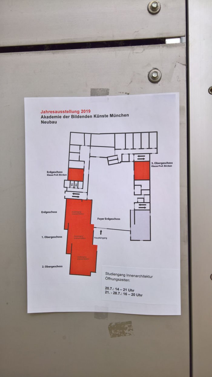
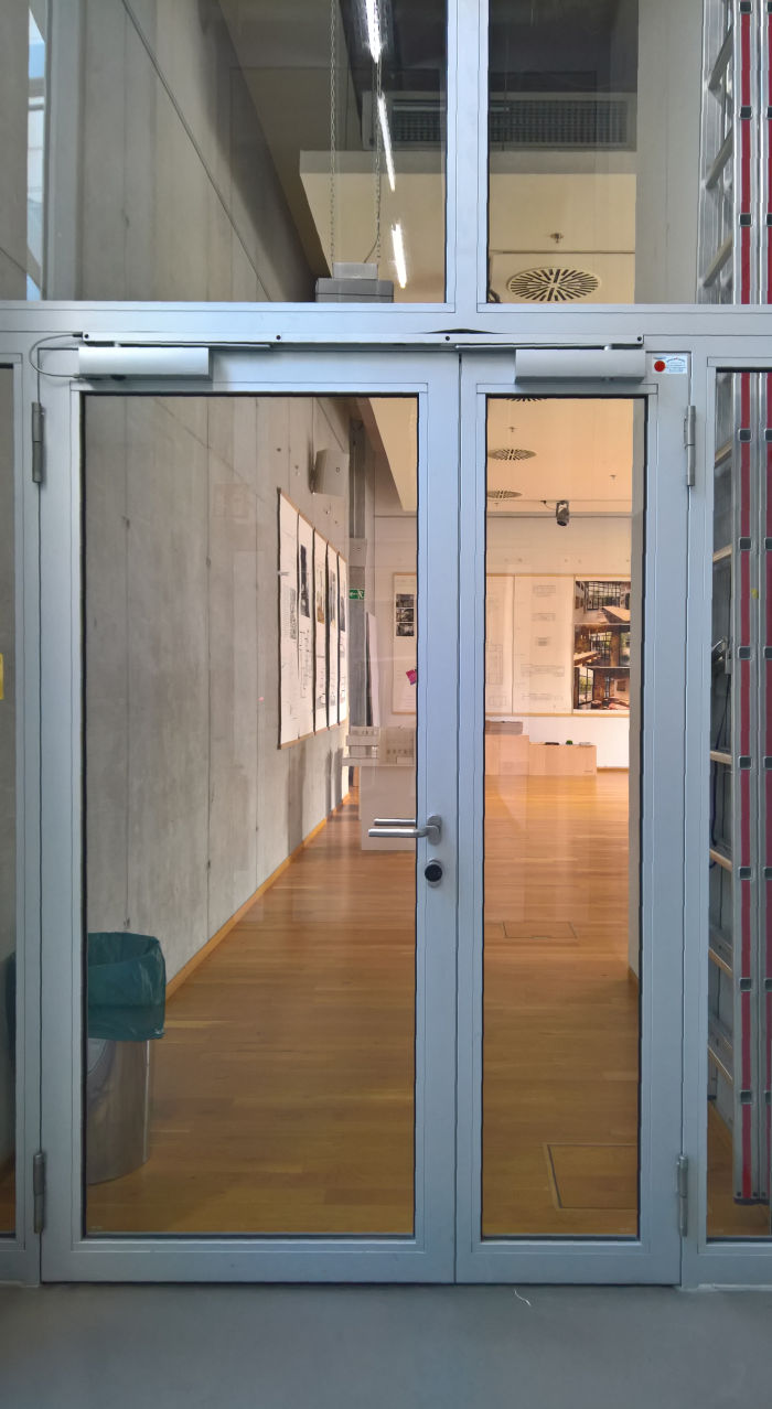
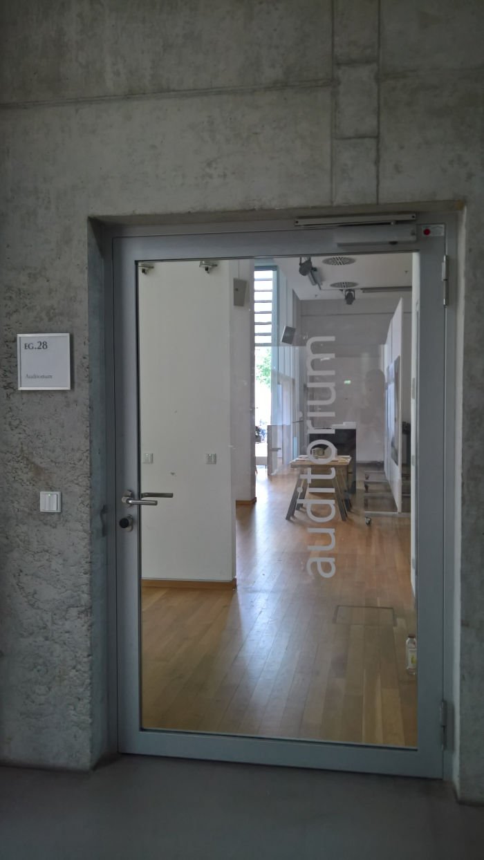
You travel all the way to Munich to view an exhibition. And no-one in Munich can be bothered to open the door. Doors. Three rooms. All locked. OK one wasn't, but clearly should have been. We did go in, turned the lights on and have a quick look at what was (meant to be) presented. We are that brazen.
And OK, we didn't travel all the way to Munich for the Akademie der Bildenden Künste, AdBK's, interior architecture showcase, had we our fury would have known no bounds. But the travel plans, our #campustour timetable, was/were made on the basis that the AdBK interior architecture showcase could be viewed at that time. We didn't have to be in Munich on that day. Actively choose to be. Partly because of the AdBK.
As previously noted we have absolutely no understanding for situations when exhibition rooms that should be open aren't without an indication as to why. If there's a reason, put up a sign. It's very simple. Surely the AdBK have paper, pens and individuals competent in the use such. Everyone understands situations can move unexpectedly outwith one's control. C'est la vie et al. Signs are nature's way of regulating such occasions. Just locking doors and turning lights off during advertised opening hours looks like you don't care. Don't care about those who come to view your work, and indeed about the work itself. There is no obligation to have an end of year show, but if you have one, take it seriously. Others do.
We want to see your work, are genuinely interested in what's being considered and proposed, that's why we do this, and on that Saturday evening we had not only the interest but the time, all we had to do that Saturday evening was view the AdBK showcase, eat a falafel and go to sleep. And would have preferred if our Saturday evening had progressed thus. Rather than extreme frustration and anger at an astonishingly, disrespectful, unprofessional act of ignorance and indifference, a falafel then bed.
The bed was good, the falafel was good, everything preceding them simply awful.
Further information on the Akademie der Bildenden Künste München can be found www.adbk.de
