In these dispatches we once doubted the prevalence of designer furniture in comics, noting and acknowledging the regular appearance of popular furniture designs in other visual media, we, off-handedly, opined, "... Designer furniture in a comic?"
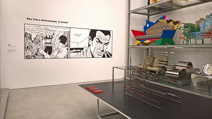
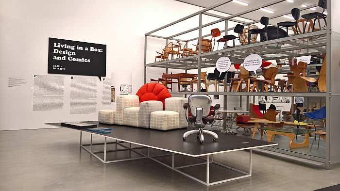
Elegantly proving us very, very wrong the Vitra Design Museum's exhibition Living in a Box. Design and Comics not only explores the use and depiction of designer furniture and lighting in comics, but also considers how comics have contributed to and influenced furniture and lighting design.
As much as being practical objects of daily use, furniture and lighting are also components of a semiotic system, objects rooted in our cultural and sociological psyche and which we can read, which convey information, ideas and assertions; largely self-perpetuating information, ideas and assertions, assertions, ideas and information (often) with no quantifiable validity, but no less a bona fida component of the collective consciousness for that fact.
A state of affairs which on the one hand is why the choice of furniture is bequeathed such an importance when creating "representative" spaces, for all reception areas/lobbies, hospitality or retail locations: what impression do I want to create? Which furniture objects help me achieve that? And is also why whenever you seen an advert for a new housing development pitched by its marketeers as being "high value" or "exclusive", the sales photos are always populated by "exclusive", "high value" furniture objects. Or more often renderings of furniture objects that convey the visual impression of objects a majority of us would classify as "exclusive" or "high value".
Similarly the choice of furniture in film or television (more often than not) being deliberately based on the unspoken message it transmits, its implicit contribution to the scene setting and narrative building; but also in non-visual media such as song, furniture can be used to create a sense of atmosphere and context, for example, and amongst many others, as we noted in our office furniture playlist, when in Time The Avenger Chrissie Hynde refers to the protagonist as being, In your office with your girls. And desk and leather chair, "the "leather chair" tells us all we need to know. As does "girls". We’re dealing here with a powerful executive. And not one of the nicer variety."
It is therefore logical that furniture and lighting should also play a role in comics, for despite the easy/lazy/elitist association of comics with children, illustration is a long established story telling medium, one that extends across cultures, that is much more than playful, anthropomorphic, childrens' capers but one which is employed in all fiction and non-fiction genres, and much as a phrase such as "chair" encompasses a plethora of divergent concepts, so "comic" also embraces a wide array of formats.
And is a genre which as Living in a Box neatly explains, and which we doubted, is prone to using the semiotics of furniture to help tell its tales.
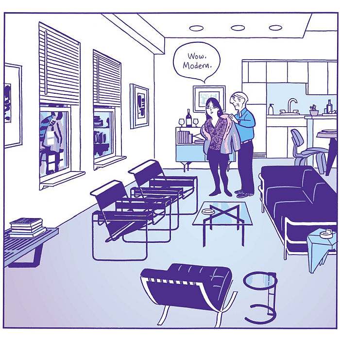
"Wow" notes, Hana Sonnenschein in a scene from David Mazzucchelli's 2009 graphic novel Asterios Polyp, as she scans the eponymous professor's apartment, "Modern"
And with its mix of works by Marcel Breuer, Le Corbuiser, Eileen Gray, George Nelson, Isamu Noguchi, etc, etc, etc, there is no arguing with the apartment's European inter-War and American mid-century modernist credentials. It is very modern. And, yes, very obviously so. One gets the unequivocal impression of a flat a little too carefully choreographed and composed, the vaguest hint of a semiotic veil being hung over the interior: and that, we'd argue, deliberately so, profusion and repetition of a signal being regularly employed tools by which to confirm an intended message. And the message here is that we are dealing with someone whose life is in full concord with those who designed such furniture, here lives a cosmopolitan, avant-garde, open, rational, forward thinking, if slightly obsessive, kinda guy. And a message transmitted more effortlessly and elegantly visually through his choice of furniture than would have been possible with words.
Much more subtle is the use in the 1939 Tintin adventure Le Lotus bleu of Mies van der Rohe's MR10 cantilever chairs in the Occidental private members club, and the passing suggestion that such objects are/were standard in such circles. And thus the sort of assumption, regardless of how true or otherwise it is/was, which unarguably plays an important role in the contemporary fascination with inter-War steel tube furniture. And also helping confirm that Hergé himself was clearly an admirer of inter-War modernism, for as we noted, and almost illustrated, in the aforementioned Jean Prouvé Design Calendar post, Tintin in Tibet features Prouve's Fauteuil visiteur.
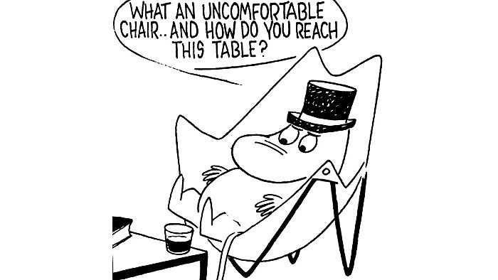
How much a fan of modernism Tove Jansson is/was is much more questionable, not only does Moominmamma in telling Moominpappa not to move an object because "Mr Interior Decorator said it balances the green door", indicate a distrust of the dogmatic inflexibility of the modern leaning interior decorator that developed in the course of the post-War decades, a distrust that even a George Nelson shared, a dogma against which the Eames' reacted with their own home interior, and a position which also reminds of the tale "When Verner Panton decorated [then] Vitra CEO Rolf Fehlbaum's flat"...... a most excellent tale, but one we'll save for another day. In addition Moominpappa's bemoaning that "This is no home!" being a clear rejection of a functionalist living machine understanding of architecture. Even if we do find his criticism of the Hardoy Butterfly Chair a little misplaced and poorly grounded: yes, it is difficult to reach a standard height coffee table while sat in one, but was it developed as a lounge chair to be used in conjunction with standard height coffee tables? Really, Moominpappa? Really?
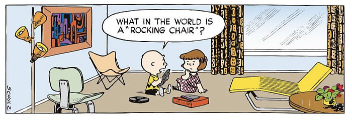
Reflections of a different kind on Modernism come from Charlie Brown who, surrounded by an Eames DCW, a Hardoy Butterfly Chair, and a lounger we simply can't place, asks, "What in the world is a "rocking chair?"" And by extrapolation asks, what happened to the furniture previous generations accepted as the norm? Why is the rocking chair no longer ubiquitous in American homes? The answer Chuck is that times change, society evolves and as it does our furniture changes and evolves to meet the understandings, requirements and aspirations of the new times and new society.
Good grief!
Absolutely. And is in many regards one of the underlying themes of Living in a Box.
Or put another way, as Living in a Box elucidates comics not only reflect, but also, in their own way, help contribute to, expand, the social and cultural registers we call upon when reading furniture. And thereby contribute, when often indirectly, to the development of new approaches to and understandings of furniture.
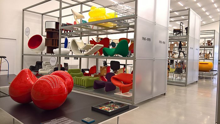
As the 1950s gave way to the 1960s, a new modern arose, one of science fiction, space travel and realities beyond the terrestrially possible. That the new technologies, materials, economics, politics, et al of the 1960s and 1970s influenced furniture design is well acknowledged, and no-one, least of all the Vitra Design Museum, is claiming that comics alone led the charge; however, as Living in a Box helps explain, comics, largey through the freedom, through the detachment from physical realities the format allows, were an important medium in propagating and disseminating ideas of the possible impossibilities of our future society. And thus helped lay a foundation which allowed for much of the poppy, free flowing, improbable, occasionally inadvisable, plastic furniture of the period: furniture and for all understandings of the relationship between form, function, material and production which continue to influence and inform contemporary furniture design. And comic tales which lie partly, largely?, behind the ridiculous, senseless, inexpedient race towards autonomous vehicles. If only spacemen in 1960s comics had cycled more, or occasionally got the bus...... but no, they had to have autonomous flying cars. And thus must we.
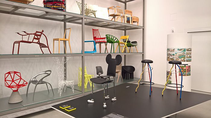
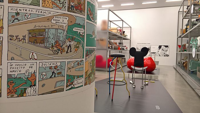
Beyond such wider cultural interactions between comics and design Living in a Box also explores moments where designers have taken their inspiration from comics including, and amongst many other examples, Achille & Pier Giacomo Castiglioni's Snoopy lamp for Flos, inspired by the eponymous beagle's snout; Gaetano Pesce's Tramonto a New York sofa as reflections on the urban world inhabited by the likes of Superman, and also a nice reminder of the almost entirely comic Postmodern era; Nendo's Manga Chairs with their reflections on the format and cultural relevance of, well, Manga. And also moments where furniture design comes directly from comics as exemplified by Javier Mariscal's Dúplex stools, works taken 1:1, or near as makes no difference, from his illustrations or his Garriris chair, inspired by the characters of his 1970's comics. And despite Garriris's prominent, discoid ears, don't call it a Mickey Mouse chair, that is a sobriquet reserved for other areas of the contemporary furniture market, those large, expanding, areas of the contemporary furniture market devoid of a character, a narrative, or a raison d'etre.
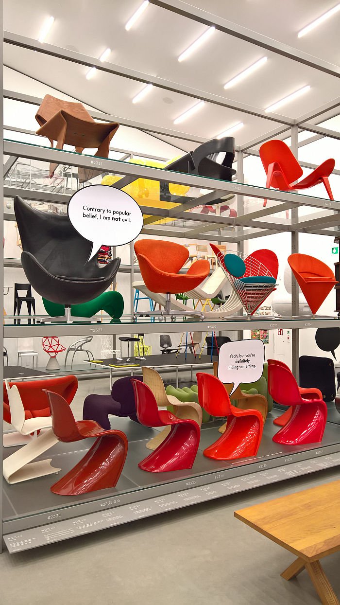
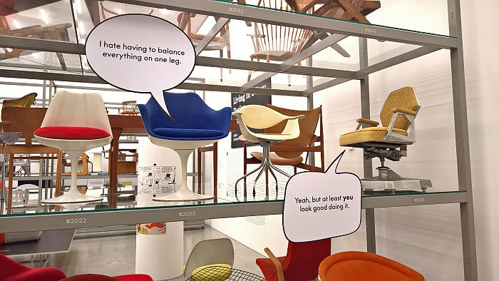
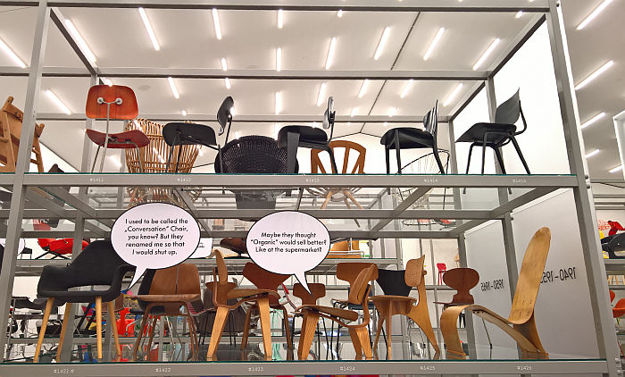
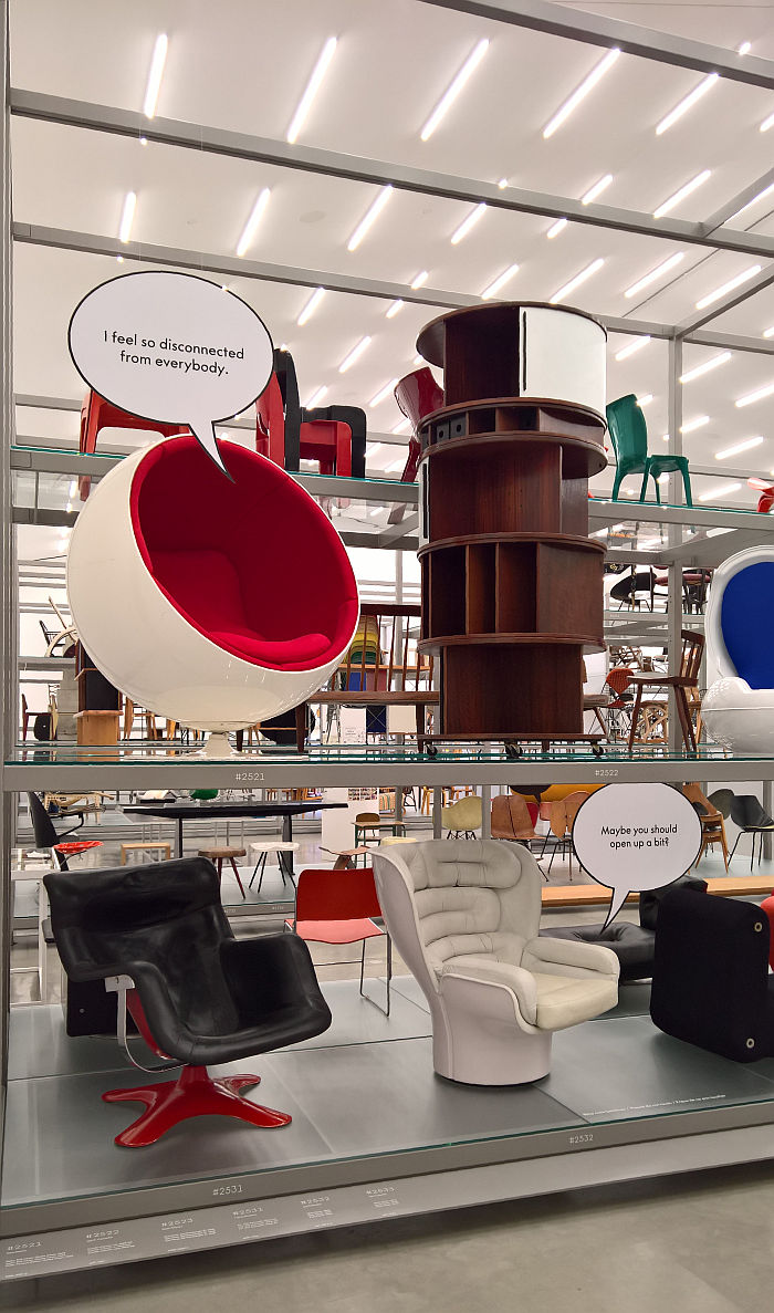
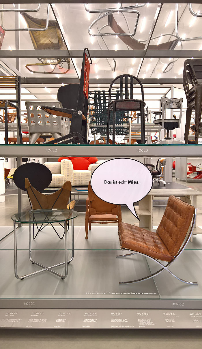
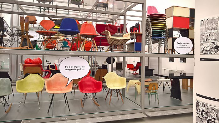
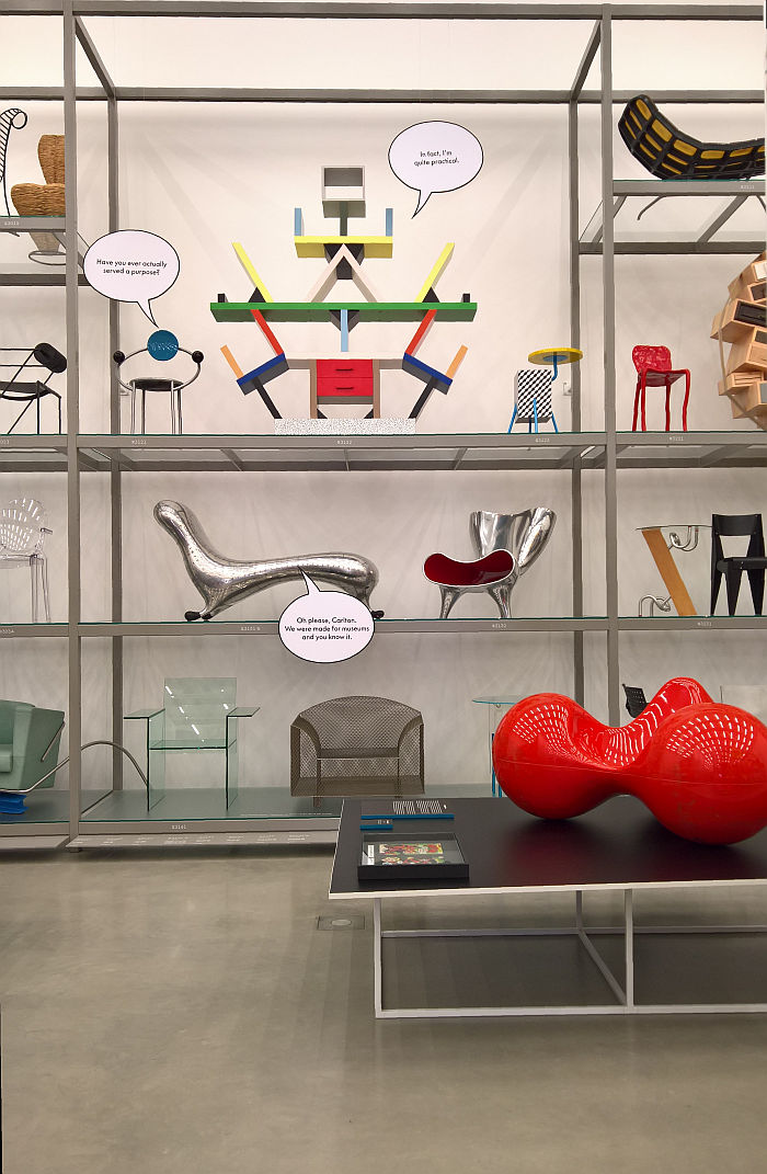
Beyond the exploration of furniture in comics and comics in furniture Living in a Box also takes the opportunity to transform selected exhibits into comic characters, literally putting words in their mouths; words that as with the words spoken by any (good) comic character allow for reflections on not only the theme at hand, but also wider society.
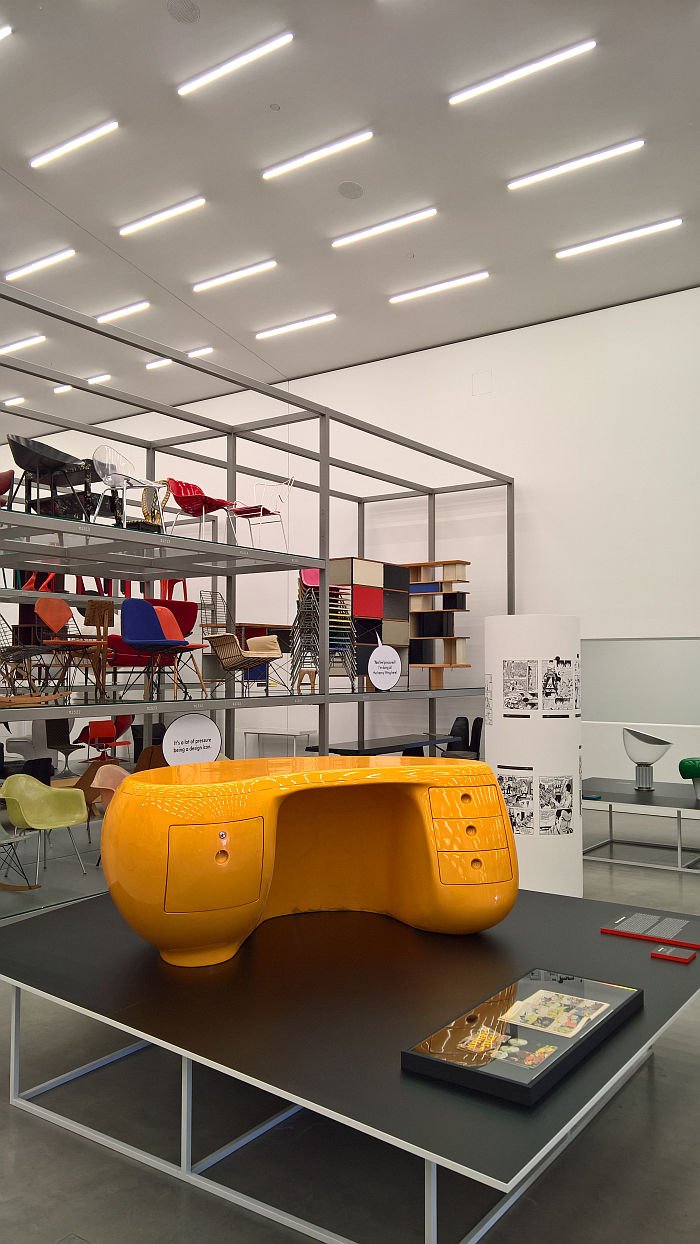
"It's a lot of pressure being a design icon" bemoans, for example, an Eames DAX, alluding to the production process, and the revered status of the Eames plastic shell collection; but in doing so highlighting the obvious reality that the pressure felt by a feted star isn't quite as intense as that felt by a young pretender seeking to establish themself, how many contemporary designers will ever realise a product quite as fetishised, adored and regularly purchased en mass, as an Eames plastic chair? And also highlighting the obscene discrepancy between the pressures of celebrity and, for example, those of the single parent on a zero hours contract.
Problems of less urgent, if no less relevant, nature meanwhile concern the Eames/Saarinen Organic Chair when it reflects that the change of its name from Conversation to Organic may have been so that it would "shut up". Unlikely for not only is it very much an object designed for conversation, but a charmingly and politely reserved object that would never dominate a conversation, would never need to be told to make room for others. Much more probable is the neighbouring Eames LCW's opinion that "Maybe they thought "organic" would sell better? Like at the supermarket"; for even if an organic label tells us nothing about the miles travelled by the product, the working conditions under which it was produced or the fairness of the profit share, nothing sells like organic.
OK one thing sells better than organic.
"Check out these curves!" demands a Thonet Rocking Chair No 1. And its hard not to, voluptuous as they are. Back at Thonet & Design at Die Neue Sammlung Munich we considered that the ostentatious ornamentation of Art Deco or the florid flowing, grasping, tendrils of grape vines may have been the inspiration for Michael Thonet's formal aesthetics, viewing Living in a Box one is confronted by the possibility that Michael Thonet may have been an early adopter of the use of sexual imagery in product design. Improbable, but then again late 19th century Vienna was probably a lot racier than history records.
Pleasing as the above, and similar, dialogues are, technically they are cartoons, not comics. The former being a single, or short series of quickly paced boxes, the latter a story developed over many, many, many boxes. We freely accept mentioning such is splitting hairs, that whether defined as comics or cartoons doesn't detract from the effect and enjoyment of the presentation, and so arguably a hair that doesn't need to be split. But we have. Probably because we're smarting at the Vitra Design Museum correcting us. And regardless of such pettiness on our part, the presentation does indicate that a comic featuring playful, anthropomorphic, furniture objects may be a very valid format for mediating the (hi)story of furniture design and its social, cultural, political and economic connections.

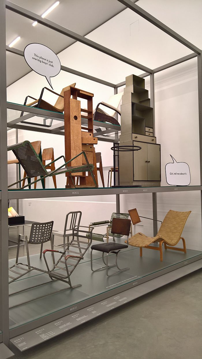
Much as Living in Box is two exhibitions in one, so the exhibition title: Living in a Box not only because that is what comic characters do, but also the objects in the Vitra Design Museum Schaudepot, the industrial shelving exhibition architecture framing the exhibits and defining a layout very much akin to that of a comic. And thereby an association which tends to accentuate the fact that, and as discussed in context of Hella Jongerius & Louise Schouwenberg – Beyond the New at Die Neue Sammlung Munich, when presented in a museum context furniture is irreversibly detached from its intended functionality and becomes an object which although perhaps nice to look at, otherwise has no real purpose: placing an object of furniture in a museum being, to all intents and purposes, the same as placing it in a box.
Something entertainingly alluded to in one of the conversations. "Have you ever actually served a purpose?" Michele de Lucchi's First Chair asks Etorre Sottsass's Carlton room divider, and that, we note, in an unnecessarily pointed, caustic, manner. "In fact, I'm quite practical" replies Carlton. An absolute classic Donald Trump Tweet of answer, not only ignoring the question but in doing so vaingloriously denying all accepted reality, Carlton being universally considered dysfunctional, clumsy and inept, impractical, both in production and use. Marc Newson's Lockheed Lounge being the straight talking voice of resistance to such myth building, "Oh please Carlton. We were made for museums and you know it"
Were they? And if they were then does that........... no, hang on, stop, that's another discussion for another day.
As is the comment by an Eileen Gray sideboard that "This place is just one big boys' club." And while we've admittedly never done the math on the female:male ratio of objects on show in the Schaudepot, we're assuming it's not to female creatives advantage. And so we're taking the statement as a firm indication that the Vitra Design Museum are planning to reflect a little more on the gender balance of not only what they present but also of what they collect. That's our interpretation. It may not be true. But now they've raised the issue it would appear rude not to keep an eye on things.
And it's certainly a rare and welcome joy to find museum exhibits not only questioning their own validity, but also challenging their custodians to justify what they do. Imagine if zoo animals were to do that. Ethnography museum exhibits. Or the objects in your local furniture store.......
Aside from transforming Eileen Gray's work into a cartoon/comic Living in a Box also presents Eileen Gray in a comic, namely the recently published graphic novel Eileen Gray: A house under the sun by architect Charlotte Malterre-Barthes and illustrator Zosia Dzierzawska and in which Eileen Gray and her position to and understanding of architecture and design lead the narrative, and thereby allowing not only for new perspectives and reflections on Eileen Gray and her place in the (hi)story of architecture and design, but more general considerations on contemporary architecture and design. "Isn't the object more important that the way it is made?" Gray opines during a conversation with Jean Badovici. Is it? Really? Moominpappa? And would one pose such a question today? Or is such a question indicative of the way discussions on and understandings of architecture and design have evolved since the 1920s? And regardless of the truth or otherwise of the statement, what does it tell us about her relationship with her near neighbour in Roquebrune-Cap-Martin, Le Corbusier?
Considerations one approaches more naturally and easily because Eileen Gray's claim is presented in the relaxed, informal, context of a comic rather than the more daunting, serious, architectural theory tome; something which may not be to the liking of purists, arguably not to the liking of a Asterios Polyp, but does make the subject matter accessible to a much wider mix of society than the theory books allow, and thereby actively encourages more of us to consider our positions to and understandings of architecture and design. Which can only be a good thing. Especially if those considerations are about the stupidity of autonomous flying cars.
In addition to presenting objects from the museum's collection which either feature in comics or are inspired by comics, and examples of those comics, Living in a Box also discusses through a series of concise, but in-depth, bilingual German/English texts the development of comic art post-War, highlighting some of the leading protagonists and their contributions to the development of comic art, and thus making it as much as an exhibition about comic art as it is about comic art's relationship to design.
And while in no way an exhaustive exploration of the interchange and interrelationship between comics and design, alone the physical limitations of the Schaudepot prevent such, comics can ignore walls and roofs, museum curator's less so, Living in a Box does in a pleasingly accessible, entertaining and engaging manner help explain the close association that exists between the two, that design in context of comics is more than layout, typeface and colour scheme, the contribution design and furniture can make to strengthening and expanding comic narratives, the inspiration and guidance the freedom and independence of the comic format can give designers. But for all that it is a subject worthy of a much more exhaustive exploration. And the comic a genre worthy of greater consideration in developing and encouraging design discourses.
"... Designer furniture in a comic?" Why not..........?
Living in a Box. Design and Comics runs at the Vitra Design Museum Schaudepot, Charles-Eames-Str. 2, 79576 Weil am Rhein until Sunday October 20th
Full details can be found at https://www.design-museum.de
