Designer | Exhibitions and Shows | Office Furniture | Producer | Product | Stockholm Design Week | Stockholm Furniture Fair
As regular readers will be aware, in these dispatches we, very, very occasionally, quietly bemoan a certain monotony at furniture trade fairs, protest that, if you will, we regularly find ourselves wading through an homogenous mass.
On this occasion we will however let someone else make that observation on our behalf.
In his 2015 book Swedish Design: An Ethnography the American anthropologist Keith M. Murphy notes of a visit to the 2006 Stockholm Furniture Fair, "[T]he only problem was, so much of the stuff here looked so similar, and I had a difficult time anchoring myself in the exhibition's plan", continuing later that, "[T]he place is predominantly suffused not with a variety of different kinds of objects, but rather with a variety of different objects of the same general kind."1
So 2006. So 2019.
Though interestingly he does also note that, "one cannot evade the impression that Sweden endures under a tyranny of simple forms and solid bright colours". These days it's more solid pastel tones, but.....
Such isn't exclusive to Stockholm, but can be experienced wherever the furniture industry meet to display their wares. Clearly there are a host of varied, arguably inter-related, causes for such a situation, but here is neither the time nor the space to discuss them; the consequence, however, is that walking through the halls of any give trade fair one finds that while many objects do speak to you, they all tend to do so with a repetition of the same limited vocabularies, often in a very forced, insecure, equivocal manner, and which thus, very quickly, becomes tiresome.
However as Keith M Murphy also notes, "not everything fit [sic] the model" and there are not only always objects to be found with something interesting to say, but which say that in an intelligent, literate and engaging fashion.
And so, and as ever, with the understanding that we have inevitably missed and/or not properly understood several gems, a smow blog Stockholm Furniture Fair 2019 High 5!!
In context of renovations and modernisations of the National Museum in Stockholm, some 20 design studios were commissioned to create new furniture and fittings for the new interior. Which is a fascinating concept: any national museum obviously plays an important role in defining understandings of a national identity, for all in terms of a cultural identity, and that normally through the objects it collects. However, the furniture it commissions is equally, arguably more, representative, being as it is not only part of that collection, but a part the museum has been involved in creating. Has accepted as being appropriate, and therefore as being indicative of, in this case, Sweden 2018. And is, we imagine, a subject to which we will return.
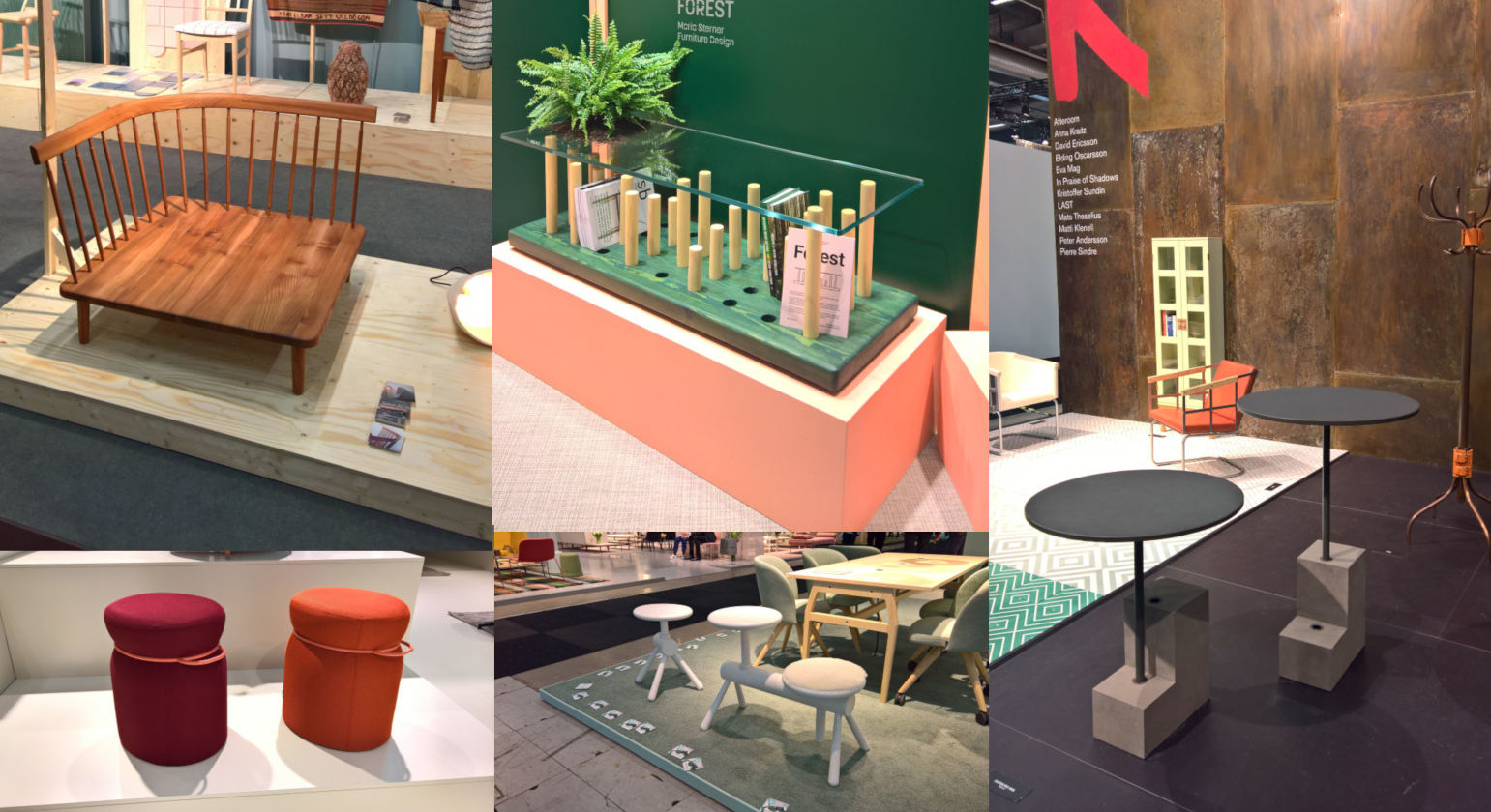
Our impression was the vast majority of the 80 or so new National Museum products were launched as commercial goods at Stockholm 2019, certainly the fair is/was awash with NM& objects, of which for us one of the more pleasing was the Café Table NM by Afteroom.
Stupidly, stupidly simple, Café Table NM is a height adjustable table that works at both cafe and bistro height, the switch being made by unscrewing the table top from the concrete base, inserting it into the alternative hole and screwing it tight. Not so much low-tech as no-tech; the table is firmly and securely held, the very direct aesthetics helping explain the functionality, a functionality which pleasingly does away with the need for different tables for different occasions.
Never let it be said a concrete block can't be intelligent, can't be part of a smart future. Café Table NM proves it can.
On account of its genesis clearly an object primarily for contract environments, however we can well imagine Café Table NM functioning just as happily in domestic settings; ideally the domestic balcony/terrace, something the metal & leather table top tends to negate. But that is easily rectified.
While the fact that Café Table NM was designed by a studio comprising two Swedish based Taiwanese, makes considerations on a National Museum as keeper of understandings of a national cultural identity all the more interesting.
As regular readers will be aware, among the more acute malaises of the contemporary furniture industry is the lack of sofa/side/occasional tables with shelves. Or at least according to us it is.
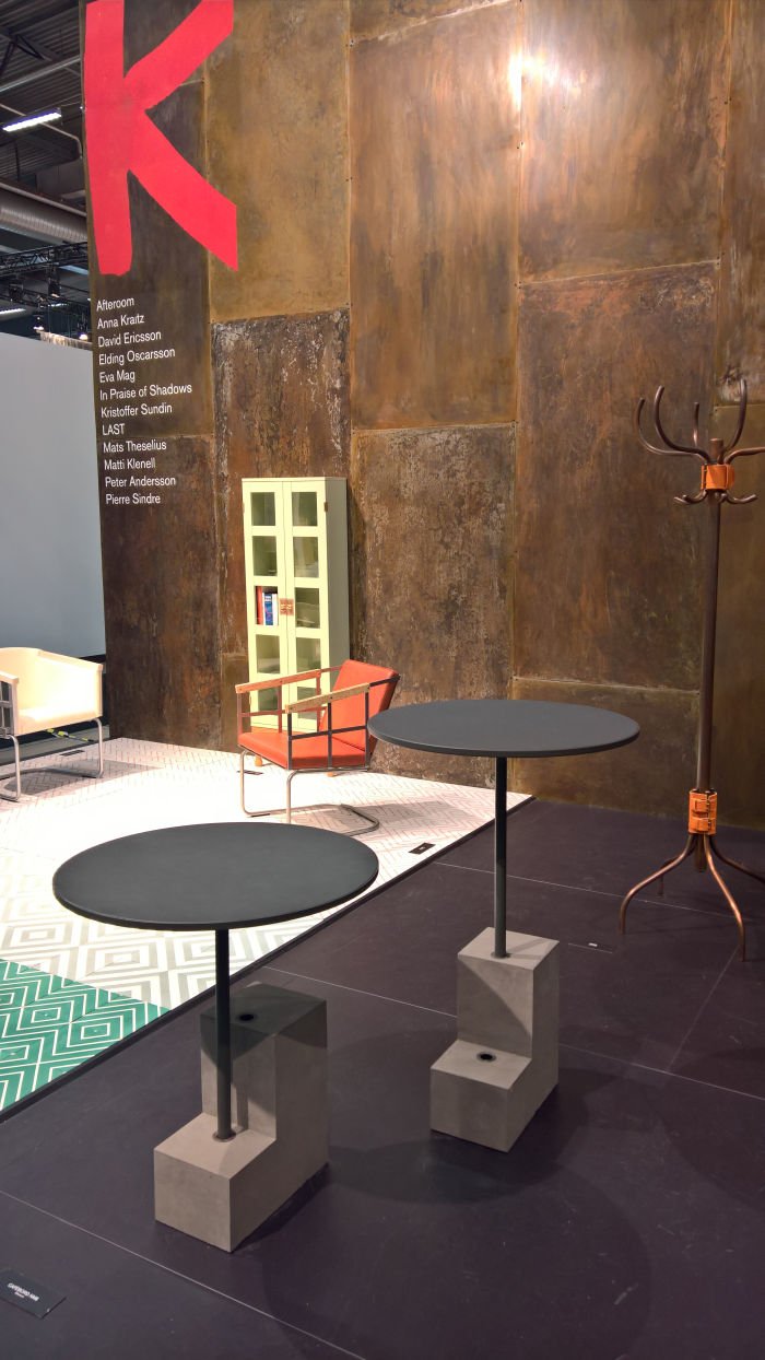
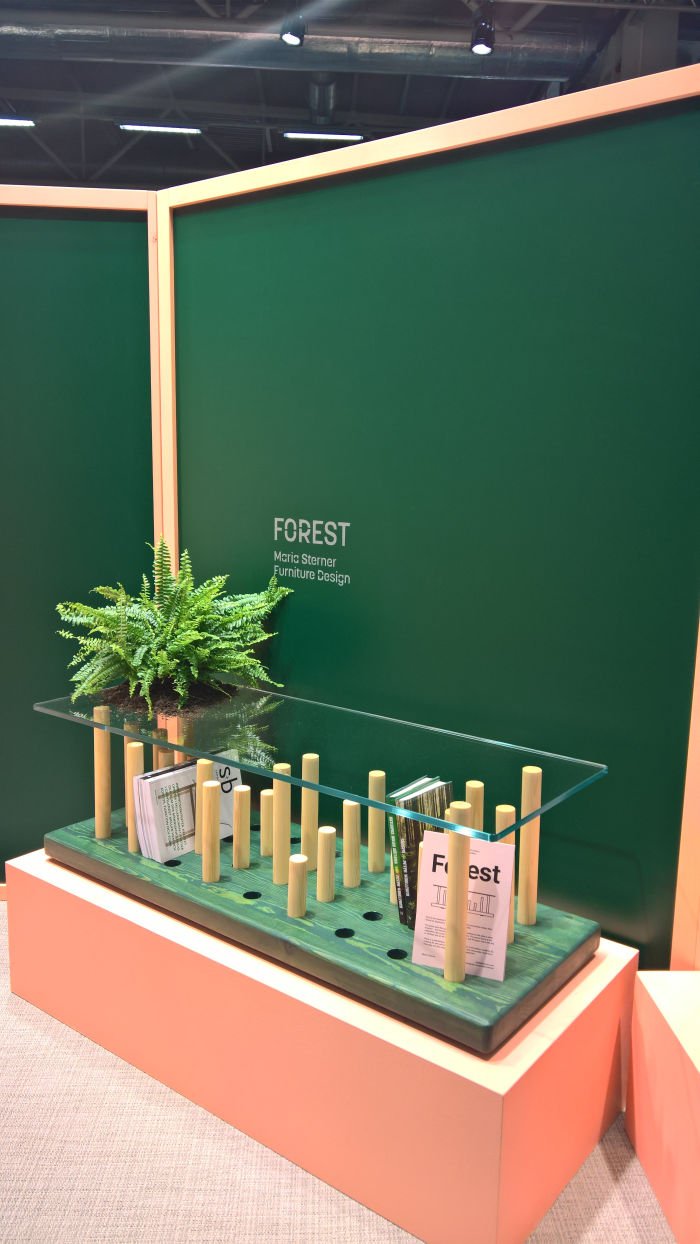
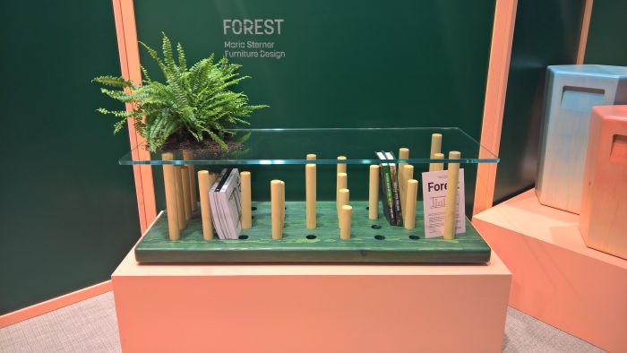
As Forest however teaches us, it needn't be a shelf under your table top, could also be a system to order and arrange those things you need close at hand/haven't got round to throwing out or putting back on the bookshelf.
And that system need neither be complicated nor rigid.
Created by Maria Sterner in context of a third year project at Malmstens Linköping University run in conjunction with Swedish manufacturer Blå Station, Forest features a series of moveable wooden pins, four of which support the glass table top, the rest supporting and/or creating space for that which is under the glass table top. And thereby a freely variable, adaptable space within a space. Which saves space. And a system so logical, we need say no more.
While, we'd argue, there is still a goodly bit of development work to be done, as a proposal Forest is certainly very enticing, and one we hope gets the chance to grow further..... Apologies, that was a pun unworthy of the project.......one we hope Maria gets the chance to develop further.
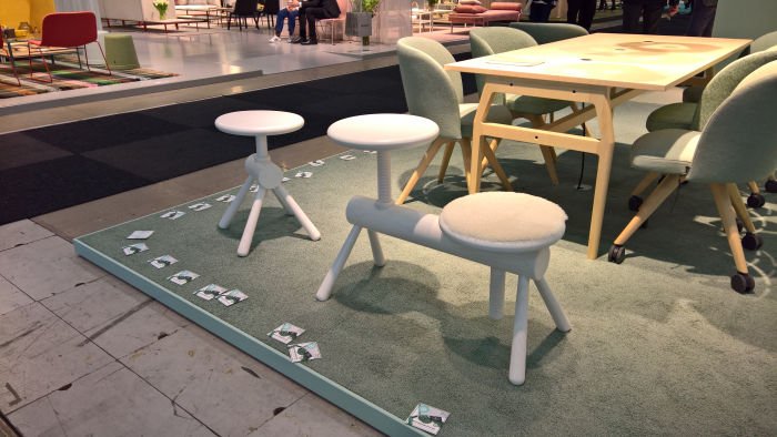
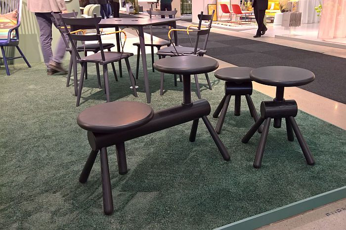
Clearly no-one is arguing, least of all us, that the screw seat wooden stool is new. It ain't. But there is something very satisfying about Mia Cullin's double seated version for NC Nordic Care.
As the company name implies, a specialisation, but in no sense exclusively so, of NC is furnishing's for care and retirement homes. As you get older your mobility suffers, you can't always sit down as far as you used to be able to. And even if you think you can, you can't always get up again. Height adjustable seating therefore makes sense in care and retirement homes, independently height adjustable benches make even more sense, allowing as they do for individuals with different requirements to sit next to one another. And that not just in care and retirement homes but is something as applicable in any public/semi-public space, for example an office, museum, library, bus station. For lest we forget, we're not just getting older individually, but collectively. While, and if we've understood things correctly, Mia's original considerations involved allowing children and adults to sit at the same height, not only a very democratic notion, but one which often makes sense, for all in child care/education facilities, cafes or indeed homes.
An easily accessible, intelligently formed object, offering very stable seating, even at maximum height, and with the added advantage of allowing for a bit of hip rotation while sitting, its a screw you can do a bit gymnastics while chewing the fat. Viewing Orkester we couldn't help thinking such must already exist, so obvious, self-explanatory, intuitive as it is. But haven't been able thus far to track down anything similar. Which would tend to imply that the most obvious solutions are often the hardest to arrive at. And the slowest to reach the market, Mia Cullin designed Orkester in 2014.
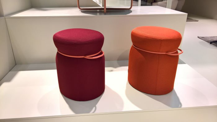
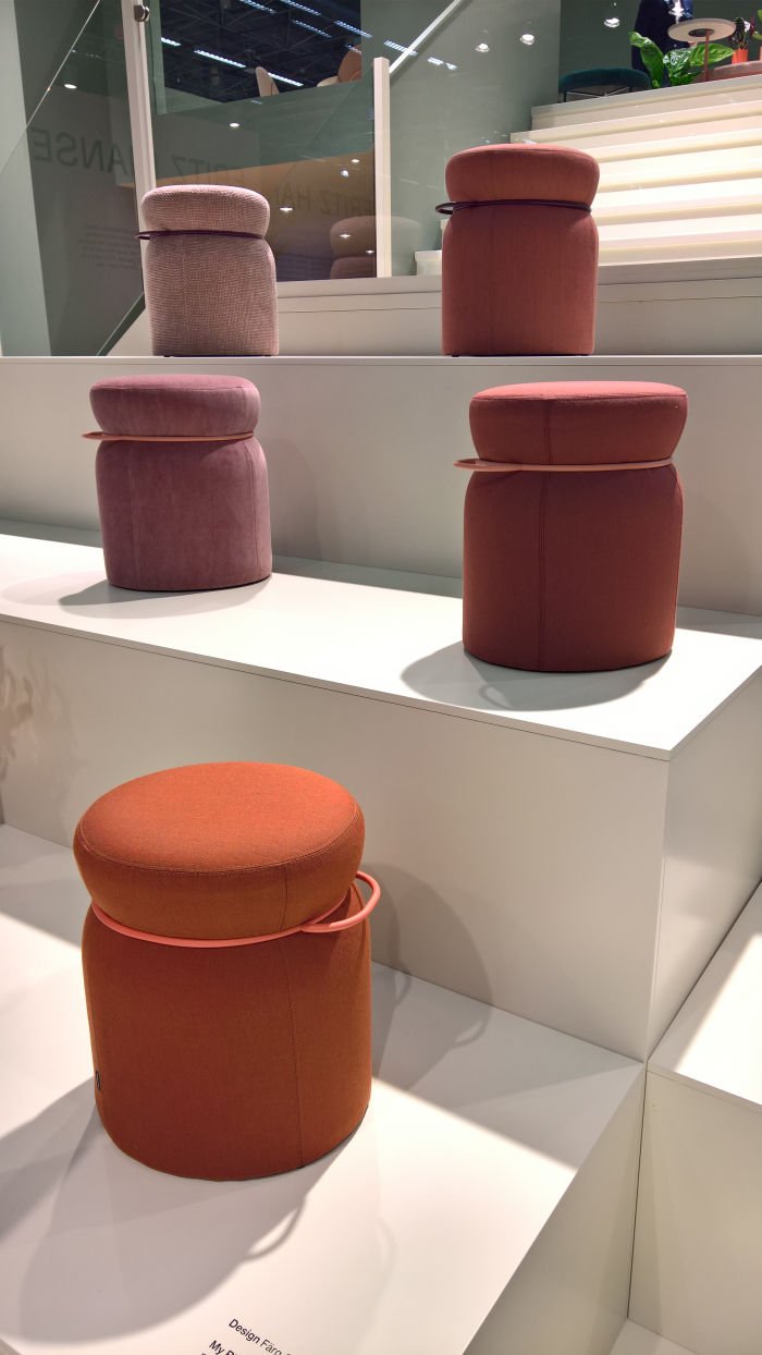
Yes, we did first see Färg & Blanche's My Ring stool for Johanson at their The Baker's House exhibition prior to seeing it at the fair. And so yes, we did have longer to ruminate on it than on other objects on show at the fair.
But.
Still stood out.
In many regards a continuation of the pair's Frankie collection for Johanson in which the metal wire frame wraps its way around the upholstery thereby making itself as much a decorative element as a functional, with My Ring the metal ring not only neatly disrupts the object, dividing it visually into base and seat, and thereby preventing it becoming a monotonous blob, but also extends its functionality. Or perhaps better put, the small ring adjoining the main ring does .... whereby the smaller ring is presumably "my" ring, the bigger ring being the stool's....... but we digress ..... the smaller ring positively inviting you to pick it up. A lightweight object which not only provides for comfortable, stable seating but which hangs very well balanced in the hand, an important consideration when carrying the stool in one hand and a coffee/laptop/wriggling wombat in the other, and a such a satisfyingly simple object not only for the home but also any contemporary office/commercial/public space. Even if we're not really digging the name.
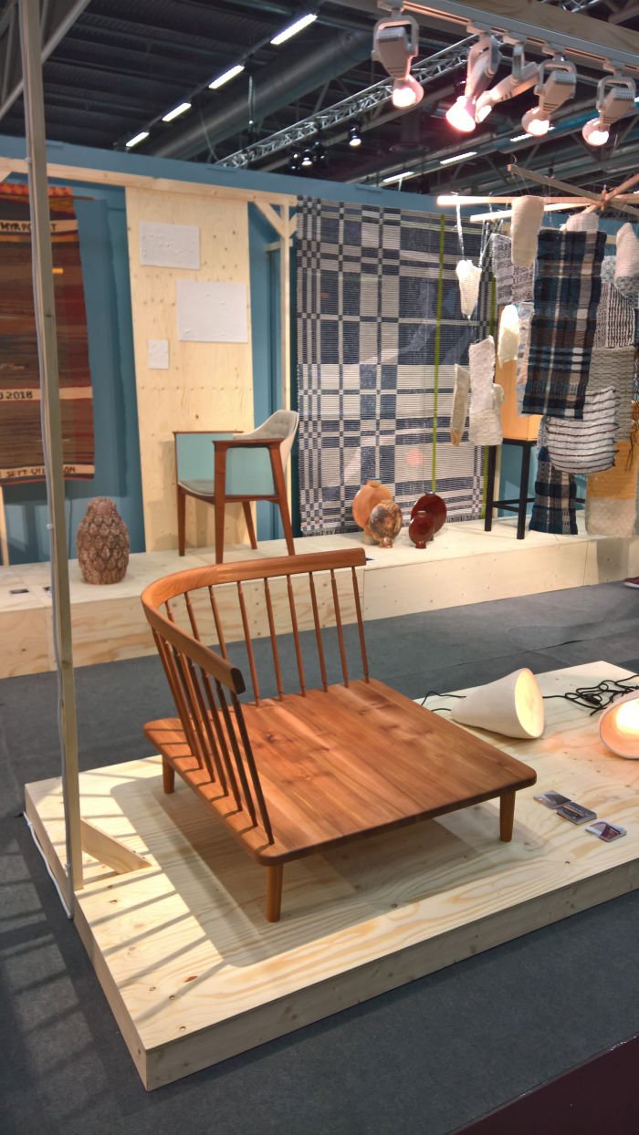
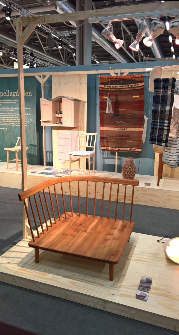
While not claiming to be an encyclopedia on Windsor style chairs, we have seen a few in our time, and read about even more... but can't recall having ever come across such an item; it is however one of those works which cries out that it is based on a traditional vernacular object. Something that arose for specific reasons in a geographically limited area of Sweden, then vanished as changing practices/realities made it superfluous.
We didn't get to speak to Lea herself but as far as her colleagues are/were aware there is/was no historic vernacular predecessor. Which makes it even more endearing. And gives us a new story to invent. What there was however talk of was it being used for meditation, which makes sense, a low, wide platform on which to take up your preferred meditation position. And suddenly it's an Asian form language. How did that happen? One minute it was all Scandinavian and now its suddenly Asiatic.
???
What changed? The cultural context in which you viewed it. And a switch which for us tends to underscore the inherent competence of the piece, the self-confidence to be itself because it understands itself. And doesn't want to be anything else.
Meditation isn't really our thing, but with a few cushions, possibly a blanket, certainly something pleasing to drink, and you've got a charming little corner to read, or simply pass away a little time. And suddenly its gone all Scandinavian again!!!
Created as a second year project at Capellagarden college we can't be certain it is actually called Capellagarden Trä, that's what's written on the card we picked up, but Trä is Swedish for "wood", so we're not entirely sure, nor did we get to try it, and so can't comment on the sitting/squatting comfort, but see no reason to doubt it; however, in terms of form, proportions, scale and freedom of use, a very satisfying, charming and thoroughly engaging object.
1Keith M. Murphy, Swedish Design: An Ethnography, Cornell University Press, Ithaca, New York, 2015