According to the posters to be found liberally distributed throughout the city, IMM Cologne 2019 promised to present "1000 furnishings ideas for your home"
And it may very well have done. We didn't count. Not least because....
What interest the number, if the ideas themselves ain't meaningful? What interest the number, if the ideas themselves ain't logical? What interest the number, if the ideas themselves ain't justifiable?
Or reducing the thought to its essence, what interest the idea if it ain't meaningful, logical and justifiable?
1 meaningless, illogical and unjustifiable idea being every bit as undesirable and harmful as 1000.
As Brexit so poetically underscores.
And so while we can't confirm there were a 1000 ideas, we can confirm that the principle idea at IMM Cologne 2019 was "consolidation", the presentation of familiar lines in different colours, materials, heights, widths, etc....
Which, yes, is a comment we make a lot about furniture trade fairs, one we get the impression we're making ever more often, one we feel will ultimately see us stop attending such; but a comment that, as ever, isn't a complaint, far from it. It needn't, shouldn't, always be new, new, new. If it is it becomes fashion, not furniture. And thoroughly awful.
Whereby one must add IMM Cologne featured some very intelligent, meaningful, logical, justifiable, consolidations. Consolidation ≢ bad.
But there does also need to be new. Because on the one hand technology and materials are ever new, and furniture designers and the, and for want of a better phrase, designer furniture industry, have a duty to respond to those changes; on the other society is ever new, and by extrapolation so are the demands we place on our furniture, be that functionally, aesthetically or environmentally, and furniture designers and the designer furniture industry have a duty to respond to those changes; and on the rare, and especially valuable third hand, in order to advance we need that which we didn' know we needed, that which we could never have imagined being without, even though we could never imagine being with, that which questions the accepted. Responding to such new realities, challenging conventions, presenting solutions based on a singular understanding of the reality, is the basis of what ultimately became the designer furniture industry and the furniture designer, and the future of both can only be found in the same.
Or put another way, the balance between the established and the new needs to remain healthy if the, for want of a better phrase, designer furniture industry, is to remain relevant.
And so, and as ever with the assumption we have missed one or the other delight, and/or not fully understood something we did see, a smow Blog IMM Cologne 2019 High Five!!
Among his many claims to fame Richard Lampert can be considered the re-discoverer of the ex-Bauhäusler Herbert Hirche. OK, since his re-discovery Hirche has remained very much a shadow figure in furniture design history, if for us one of the most interesting and engaging post-War German designers.
And, deliciously, in this year of all years, Richard Lampert re-introduces us all to another "lost" Hirche design, one which, very satisfyingly, doesn't employ any popular Bauhaus grammar, but which rather (more or less) demonstrates that a design education is about developing your understanding of and position to design rather than learning by rote any stylistic patois.
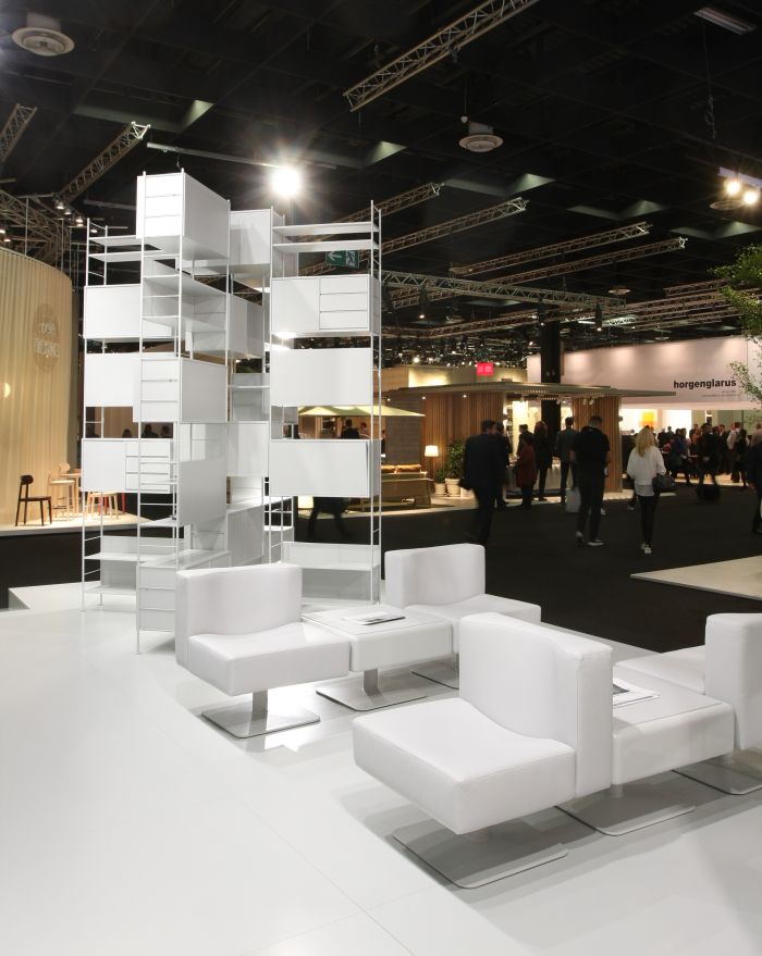
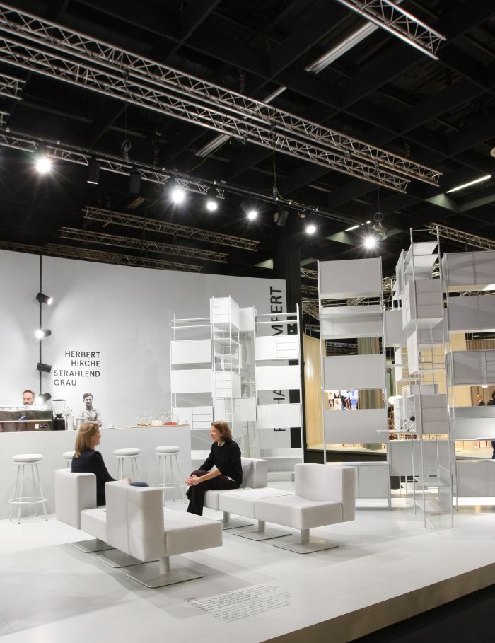
Developed in 1974 for Mauser, themselves a company whose origins in furniture production is to be found in 1920/30s steel tube objects of the type lazily referred today as "Bauhaus", the Hirche 350 is a quadratic upholstered chair, and originally came as part of a system with a range of matching components, including, and also presented in Cologne, a table; and, although on first glance very far removed from the modernist structuralist works with which Hirche is most commonly associated, all the principle components of a Hirche design are there: the clear, briefly abstracted, geometry, the easy accessibility, the material and visual reduction and the slight idiosyncrasy.
Originally intended as an office/waiting room chair, the 350 unquestionably resembles an office/waiting room solution, but needn't be exclusively so, there is something very domesticated about it; maybe not as the main seating in the main lounge, but we can certainly imagine a whole host of uses in the contemporary home. Or commercial, retail or hospitality location. Or indeed office/waiting room.
The story of how it came to be on the Richard Lampert IMM Cologne 2019 stand is one for another day, but suffice to say it is as curious and improbable as any in the Lampert/Hirche canon; the fact that it came to be on the Richard Lampert IMM Cologne 2019 stand tending to underscore the difference between a manufacturer looking to fill gaps in their portfolio and one with a genuine interest in, and position to, furniture.
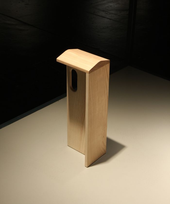
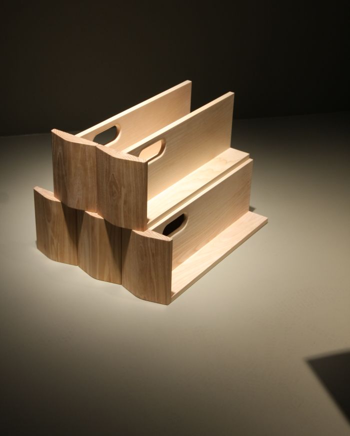
Conceived by Mu Hau Kao as one of 21 prototypes in context of his Masters project at ECAL Lausanne, a Masters project exploring how differing seats affect the physical act of sitting, the Physical Sketchbook model nominated in the Pure Talents Contest is a mobile, temporary stool, principally for public spaces, but equally as applicable, we'd argue, in the office or on the domestic balcony. Or in fact, anywhere in a contemporary flat as a storable, temporary, low maintenance stool.
Despite its apparent precarious character, Physical Sketchbook offers a surprisingly high degree of sitting stability, you probably are supporting yourself with your legs, but it's subconsciously, you probably don't need to, but the fact that you are probably means you are also sitting more upright and ergonomically active that if you weren't; and, more importantly, through the stability one feels very naturally at ease. And imbued with a calm reflective of the form.
Quite aside from the simplicity of the construction and the way the object quietly guides you, we were particularly taken by the unashamed extravagance of the saddle-esque seat. Yes, it does aid the seating comfort, but given the otherwise reduced, clear, uncomplicated object, it is almost a provocation. And one off which we heartily approve.
Stackable and therefore easily stowed when not in use, decoratively so if you were to use coloured versions or versions in differing woods, Physical Sketchbook represents a very nice example of following your nose in the development from idea to object, of taking the most natural route and not allowing yourself to be diverted by all manner of conceptual and functional distractions.
Given the fact that Danish based, Finnish monickered, brand Muuto, are always keen to extol their Nordic origins, including, one assumes, the pure air and soft light of the Scandinavian peninsula, it's strange that the Linear Steel series should represent their first foray out of doors.
But it does.
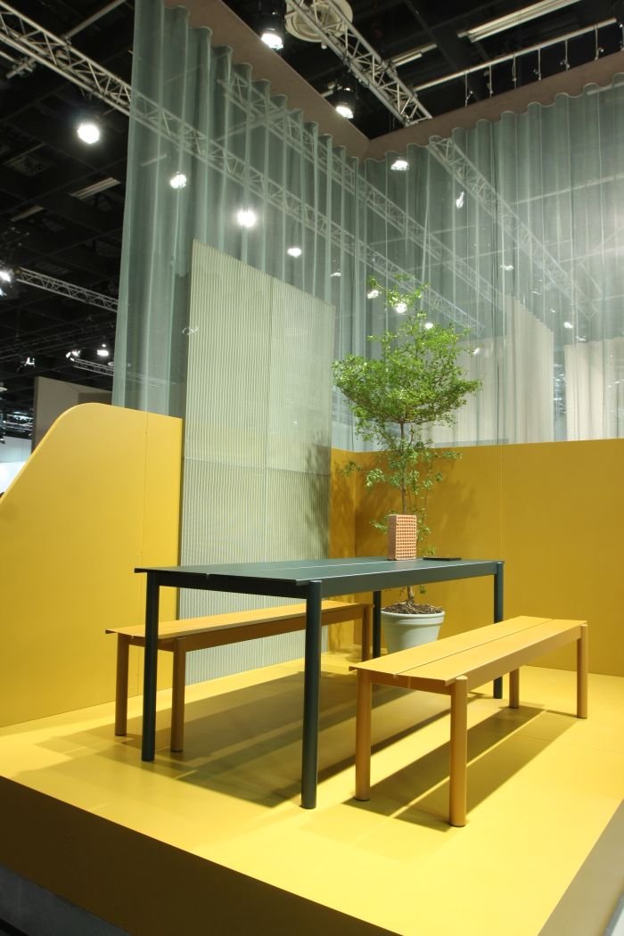
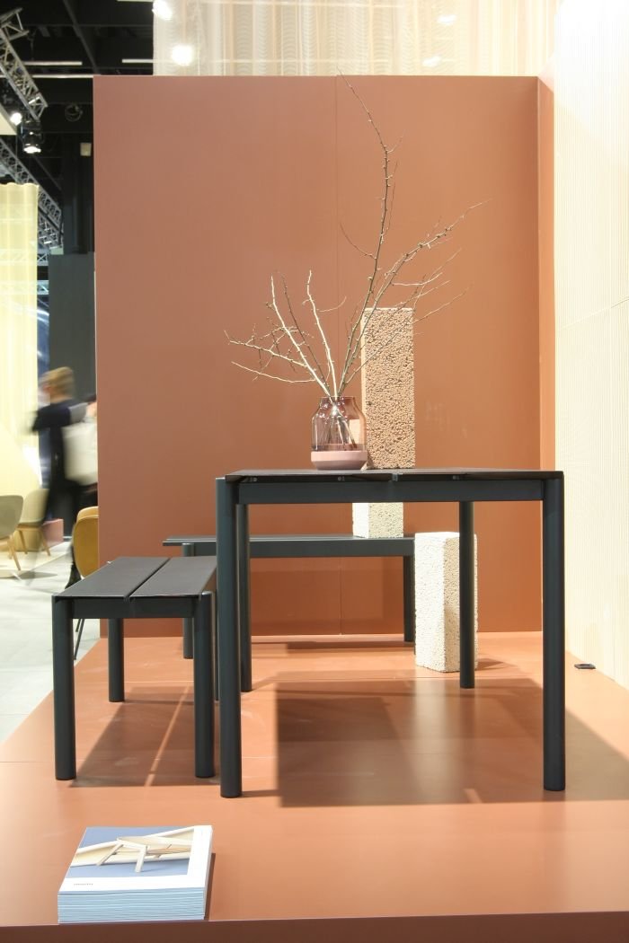
Designed by Thomas Bentzen the Linear Steel collection does pretty what it say on the tin: they are linear, are steel and are in addition pleasingly and instantly accessible objects, objects which possess an easy familiarity but not an over familiarity, objects whose form is as functionally well considered as it is optically, and objects which possess a visual lightness that belies their physical mass. As in seriously belies it. You do not want to bash your flip-flop-exposed toe against them.
Don't get us wrong, there not so heavy that you can't move the bench easily back and forward from the table depending on requirements and mood. You can. Just a little too heavy for one person to comfortably reposition over a longer distance.
But then, should you need to move them, it becomes social act. And thereby the start of social outdoor afternoon, evening, night.....
Once upon a time in Berlin an Adirondack chair and a wheelbarrow fell in love, married and started a family.......
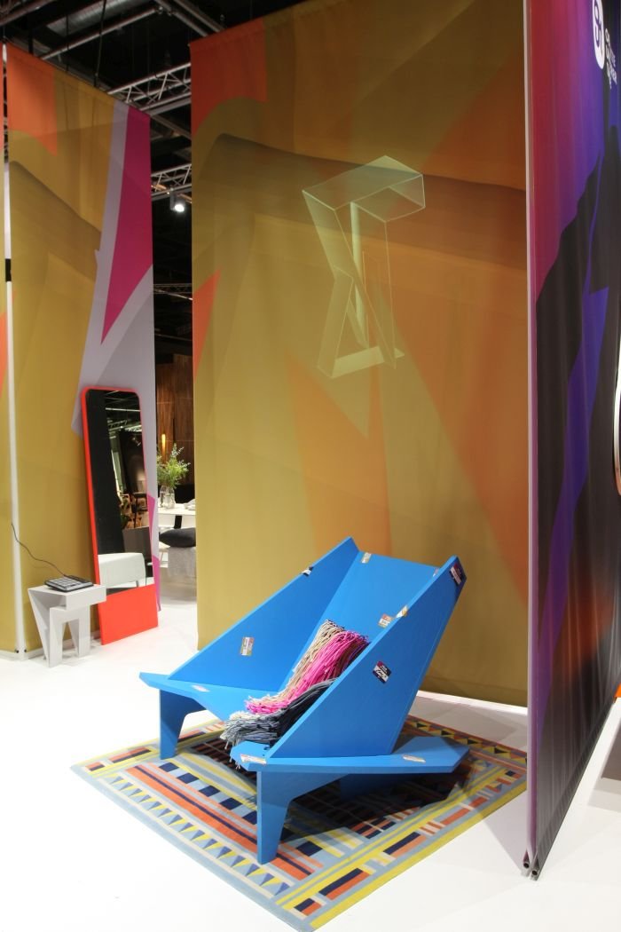
That's how we we like to think the story of Objekte Unserer Tage's Takahashi Lounge Chair begins. Accept it probably isn't, but since when has that stopped us. We're unashamed dreamers.
In the Objekte Unserer Tage's portfolio since 2016, we saw it for the first time at IMM Cologne 2019, thus once again underscoring that we can and do miss things. And that we will always see that which we are supposed too.
Despite is very real physical presence there is something charmingly humble about Takahashi, it has an ease, self-confidence and innocence about, in addition to having a satisfyingly unnecessarily over-dimensional volume and a very pleasing, reclined, seating position. All which means we can well imagine it passing into neigh on any space, office or domestic: in the former as a semi-hideaway in a relax, freestyle, area, in the latter either packed with cushions and blankets as a cosy retreat or, more spartan, without such comforts as fitting addition to a domestic library.
In the interests of transparency, had we not see the High-Density chair at the 2019 Generation Köln showcase, it probably wouldn't have featured in this list. But we did, and because we liked what we saw there, we went to look at the other couple of examples on show at IMM Cologne.
Examples we otherwise probably wouldn't have become acquainted with.
In many regards more a process than an object, the story begins, and as with so many good things in life, with wine. Although here primarily, we assume, the barrels. But you never know.
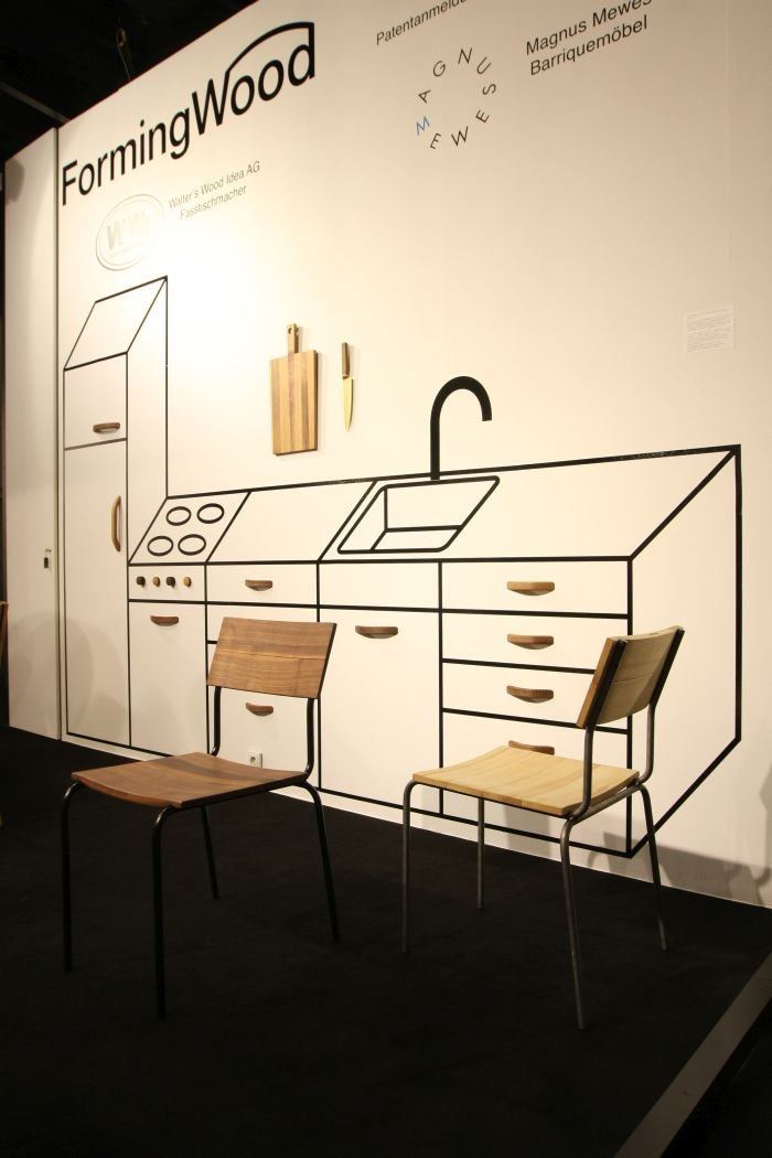
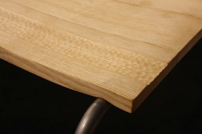
In context of a project for a high-end kitchen goods manufacturer Magnus Mewes, a designer whose main line is furniture made from used wine barrels, began cooperating with fellow wine barrel furniture maker Walter Amrhyn, who, at the time, was working on the development of a process for embossing solid wood. And from this research came a process to deform solid wood to a controlled degree in a specific place.
Whereby its important to underscore, that it's solid wood. Not veneer, nor plywood. But solid wood.
And thus, and as with Michael Thonet's solid wood bending process, is a lot more complicated than it sounds; and therefore, and as with Michael Thonet's process, produces a result whose stupid simplicity belies the complications, a work so obvious it is almost impossible to achieve. Which is always a joy, be it in art, music, literature or design.
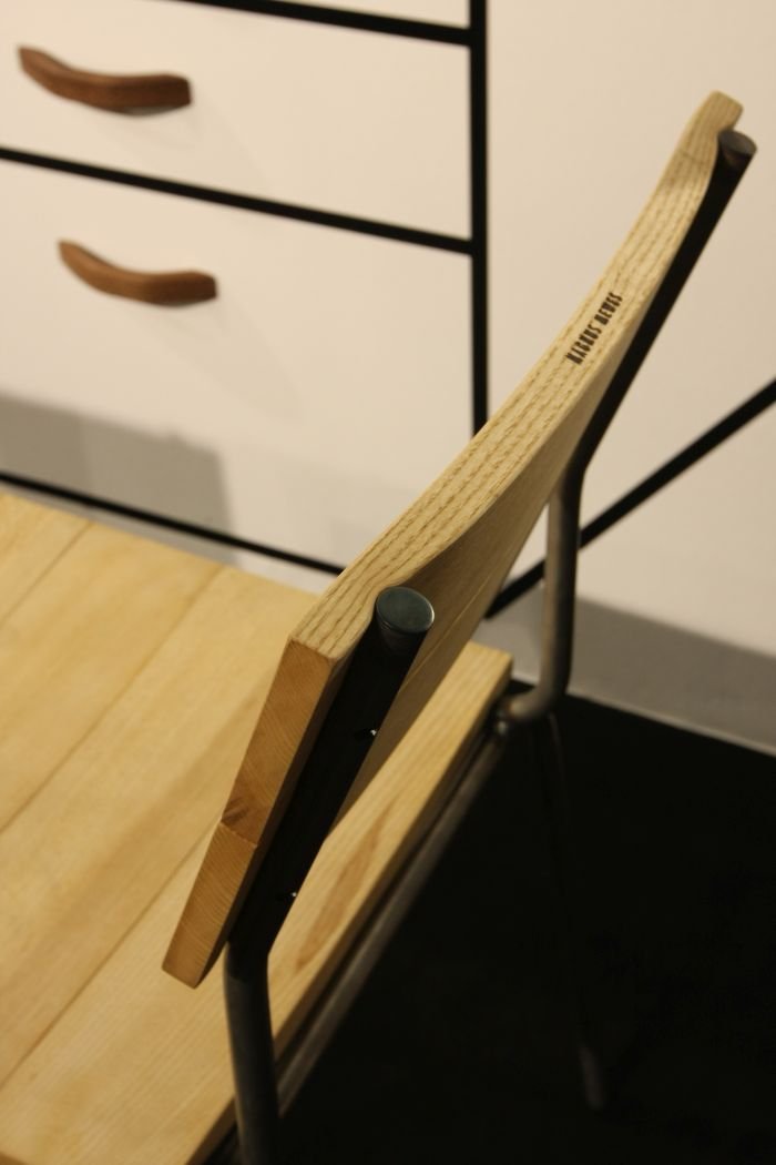
Still very much in development, the High-Density chair represents, essentially, experimentation with what is possible. And with the High-Density chair Thomas Schnur demonstrates, quite a lot is not only possible but, arguably, desirable: the deforming of the wood at the point where it joins the backrest/seat allowing for a clean, efficient join which, combined with the other (necessary, and complicated) twists and turns, gives the work a lot more character than could be achieved by machining out a grove into which to place the steel. Or indeed wood, plastic, whatever. In addition, the ability to emboss solid wood opens up a vista of near endless decorative possibilities. Neither point being restricted to chairs, but, we'd imagine, applicable across furniture genres.
Beyond the process, the nature of Thomas's design, and as so often with Thomas Schnur's designs, reduces the number of process steps to a minimum, reducing not only work but also resource input and waste output: specifically the seat and backrest panels are one and the same, thus allowing for a very efficient, pared down, if from a mechanical engineering perspective highly complex, production process.
In which context, while we assume that for most producers mass machining of wood to shape will remain the preferred option, as an alternative method solid wood forming/denting/embossing offers the adventurous and imaginative whole new worlds of possibilities. And for our part we're very much looking forward to how, and where, the project develops.
