Designer | Exhibitions and Shows | Office Furniture | orgatec | Producer | Product | Vitra
As previously, and repeatedly, noted, one of the defining aspects about an office furniture fair such as Orgatec Cologne is that wherever one looks one sees a similar vista. Whereas in terms of domestic furnishings there are enough genres of furniture and interpretations of those genres to allow for a, at least relatively when not necessarily satisfyingly, varied landscape, office furniture is much more limited, not only doesn't have the variety of genres, but has a few that are essentials; consequently every manufacturer has very similar product lines, every manufacturer has, for example, a height-adjustable desk, a sofa with high sides, a desk height rocking stool, a modular bench system, and an office chair with flat, slightly organic quadratic armrests that resemble cutlery Georg Jensen may have produced in the 1960s. The differences are, generally, to be found in terms of mechanisms, connection systems, interfaces, materials or textiles, so very technical aspects. Very important aspects, very fundamental aspects, but things that aren't necessarily instantly visible. Hence the visual monotony. And aspects which when explored in detail aren't always that interesting/innovative/engaging/sensible/relevant/practical/functional/etc. It's a tiring, thankless, business working your way through such a landscape.
Particularly a landscape such as Orgatec 2018 which was, at least as we experienced it, largely about consolidation, about manufacturers extending existing product families or presenting existing products in new materials, new textiles, new colours, new fragrances, etc, etc.....
Which isn't to say it wasn't a thankless and fruitless task, just thankless, and thus, and with the standard disclaimer that we have invariably missed numerous genuine highlights, a smow blog Orgatec Cologne 2018 High 5!!
In the interests of full disclosure, at Orgatec 2014 Vitra launched the low-tech Allstar office chair by Konstantin Grcic, which kind of passed us by. Until Spring 2017, when we spent an awful lot of time becoming (re)acquainted with it in the VitraHaus, really liked what we discovered, had a great time with it, and since when we've been feeling a little guilty about the somewhat off-hand way we dealt with it in 2014. We trust such isn't influencing our judgement here, trust we aren't over-compensating, trust we're cynical enough to ignore guilt. In every other facet of our lives' it is so, we're assuming it is here. Just wanted to ensure all facts were on the table.
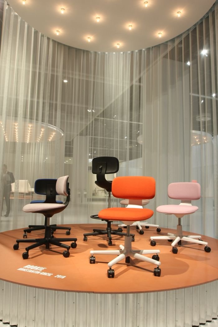
It's fair to say that chairs with round(ish) seats are an established staple in the Konstantin Grcic canon, a typology he always returns to and where he always finds new ways to connect seat with base and backrest, and to create objects which although always in some way reminiscent of an earlier work, are always unmistakably new. And a phrase which can, arguably, be used to summarise his work generally. In the case of Rookie, the seat cushion is held in an injection-moulded plastic base which then tapers upwards to the backrest, the whole gliding on a five star base, and thereby creating an object which although formally very different is, in some way, reminiscent of Allstar, but also has unmistakable elements of Tuffy for Magis or Remo for Plank, but yet which is very much its own work.
A visually and functionally very pleasing object, for us the defining feature of Rookie - a name we have a few problems with, not least that it sounds far too programmatic, and why does a Rookie come after an Allstar? Or is there a bit of The Byrds My Back Pages going on there? And is the name the reason we keep thinking of baseball helmets every time we look at it? But we digress, 'tis but a side issue..... - for us the defining feature of Rookie is the fairly rigid base/backrest connection element which although rigid is sufficiently pliant to provide for a very satisfying level of movement, support and comfort, to diligently respond to your movements, but never to do more than that which is asked of it; and which, yes also means means you can't lean that far back, means Rookie isn't an office chair for those of you who like to slouch at 45° with your stomach under your desk. Or perhaps put another way, is an office chair for those irritated by a colleague who slouches at 45° with their stomach under the desk, and want to put an end to such.
Much as a feature of Kontantin Grcic's work is re-imaging the existing so to, or perhaps better put, inherent therewithin, is refining the existing, and as an office chair Rookie is even lower-tech than Allstar: height adjustable via a gas piston and featuring a manually height adjustable back rest. That's it. Apart from a concealed mechanism whereby the front of the seat cushion bends downwards with your bodyweight, and in doing so provides directed support to the thigh. And apart from the all-important, genre defining, and inherently satisfying, swivel action. But that is it. A satisfyingly self-contained, self-explanatory, low maintenance object.
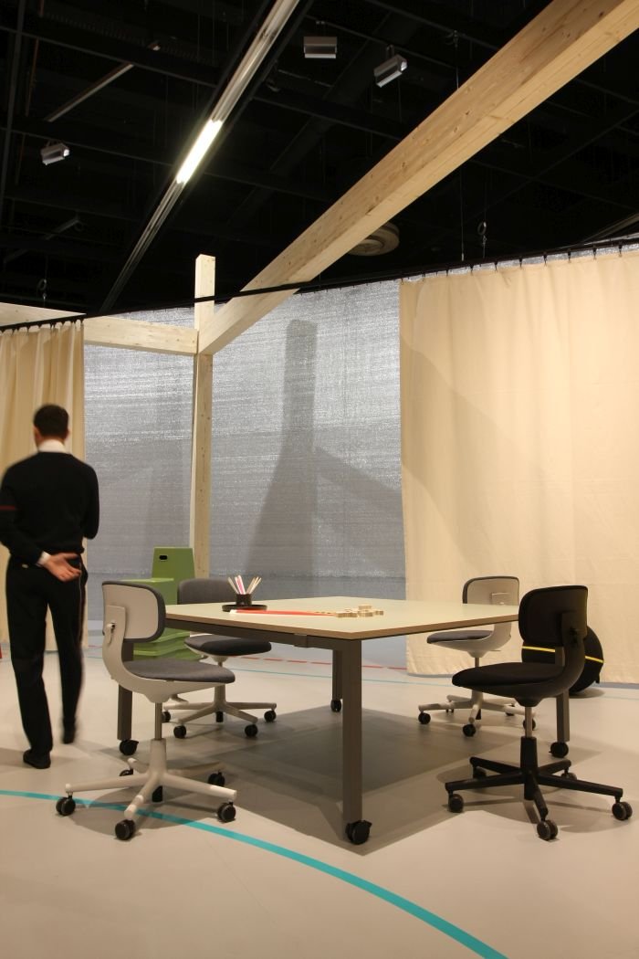
As Konstantin notes, the thinking behind the low-tech approach is that Rookie should be chair that can be effortlessly shared in a company office space, or, wherever chairs pass through a number of users on a regular basis, for example, a library, public office, airport lounge, baseball stadium pressroom, college seminar rooms, and that without every new user having to adjust the settings to meet there own requirements. Should be a universal office chair in which you can sit-and-go.
Or put another way ☑
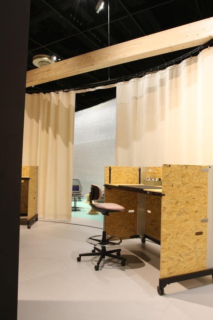
As more loyal readers will be aware, we're huge fans of perching, nothing against sitting, we're regular and keen sitters, indeed are sitting right now, but perching is a much more natural position, and, and importantly in terms of furniture design claiming to be responsive to not only the human condition but also the realities of contemporary office environments, a much more satisfying position in terms of those regular short term taking-the-weight-from-the-legs moments one experiences in the course of the office day.
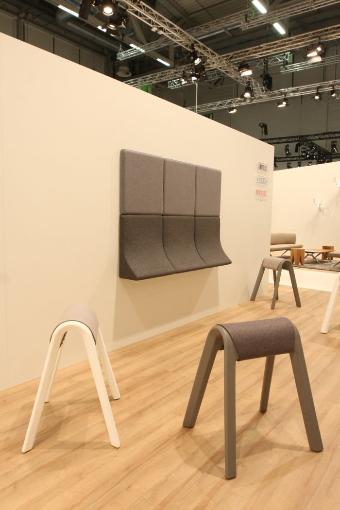
With Sitzbock Hannover based studio Rudolph Schelling Webermann have, essentially, taken the classic gymnastics pommel horse and abstracted it to a perch. Back at the CASS London 2018 Summer Show we discussed the project Perch by Adam Watts, a gymnastic balance beam re-imagined as, well, a perch, noting that we didn't "really feel the need to explain the logic and inherent beauty of the idea". Neither do we here. Sitzbock employs the same logic and inherent beauty, with the difference that through taking the pommel horse as inspiration Rudolph Schelling Webermann have created a pleasingly compact object for individual use.
Formed from through-dyed polypropylene and thereby lightweight, durable and mobile, Sitzbock is approachable/useable from any angle, can be used as seat as well as perch, and provides for a particularly pleasant, stable, secure perching/sitting experience, and thanks to its equine derivation has the added advantage that should you choose to come to work by horse, you've somewhere to store your saddle.
In addition to Sitzbock Wilkhahn also presented Landing by Rudolph Schelling Webermann, Essentially an acoustic panel system Landing features in addition to "standard" panels/tiles, panels/tiles with a foam upholstered curving ridge: a ridge which can be positioned vertically to create a border to a panel system; with the curve flowing upwards, the flat underside thereby existing as a shelf/ledge to lean on; or, and our preferred variant, with the curve flowing downwards and on which you can perch. And thereby perfect for those short meetings/chats to clarify a point, agree a position, compare notes, discuss the latest episode of some Netflix series, or indeed used alone as a convenient perch while reading documents, sending a mail from a tablet or watching the latest episode of that Netflix series everyone is talking about on your phone while pretending to watch an instructional youtube video. And that effortlessly doubled up in those acoustic panels you in any case need, its basically free perching.
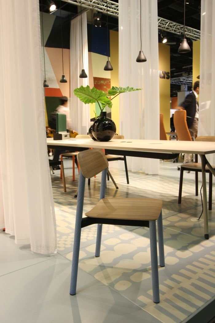
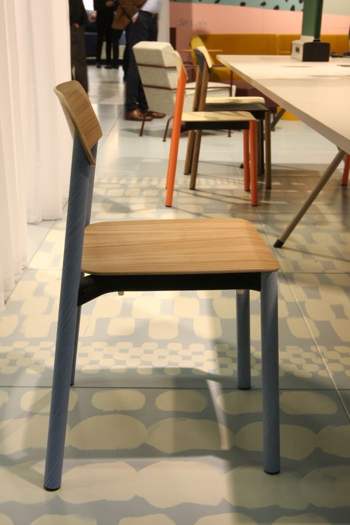
Another nice example of a product we've missed over the years, Penne by Berlin based studio Läufer+Keichel was first presented at Orgatec 2016 and formally released in 2017. Since when it's won awards. We saw it for the first time at Orgatec 2018.
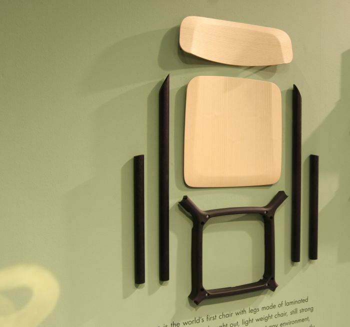
In addition Penne is also a nice example of novel material applications, featuring as it does legs made from laminated wooden tubes. It's one of those basics of materials science, one of those things you learn in materials kindergarten, that among the many ways to make paper stable is rolling it. And apparently it is the same with wood veneer. The result is a supremely stable and pleasingly comfortable chair that weighs next to nothing, and which thanks to its glue-less screw and bolt construction system can be separated into its in component parts for any eventual recycling/repair.
The version we spent most time with in Cologne featured in addition to the wooden legs a moulded wood seat and backrest, all held together by a polyamide framing element, is however also available with aluminium legs and/or plastic seat/backrest: all versions are in terms of mass almost identical and all posses the same engaging, accessible and deceptively reduced form, whereby we'd query why work with aluminium and plastic when you can achieve such a satisfying result in wood.......?
And a work which beyond its obvious uses in offices is also eminently well suited to catering, hospitality, commercial or indeed domestic scenarios.
As noted above, Orgatec 2018 was largely about consolidation, including lots of extending of existing product lines, a perfectly natural part of the furniture business, and for all the office furniture business, and one which is normally supremely dull, being as it is something done primarily for the service of those who sell office furniture rather than those who use it. But not always. Sometimes we can all benefit.
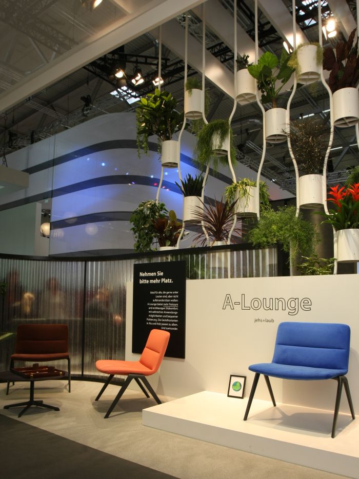
Stuttgart based studio Jehs+Laub launched the A collection for Brunner at Orgatec 2012 as a family of multi-functional chairs featuring a variety of interchangeable shells based around a universal A shaped frame. At Orgatec 2018 Brunner extended the collection through the addition of not only a new modular bench version, but a wider, upholstered lounge version.
As with so much of Jehs+Laub's canon, the A-Lounge is an apparently underwhelming piece of work bordering on the anonymous, and as with so much of their canon is anything but.
Featuring an upholstered steel frame construction the A-Lounge chair is not only a decadently wide chair, but features a seat that is longer than the backrest is high, sounds innocuous, but on the one hand the long, upward inclined seat allows for that "support [of] the upper leg along its full length without the pressure that arises with a flat seating surface"1 as recommended by Marcel Breuer, and which is arguably the most comfortable solution for a lounge chair, while the short back not only brings in a formal informality but also means you can hang your arms over the backrest...... you all do it, don't pretend you don't, and you all do it to allow you to stretch your back in a nice arch.
Visually refined, and very nicely proportioned, since Orgatec we've tried really hard not to imagine the A-Lounge as a work Edward J Wormley would have created, but can't, even though we're not 100% convinced he would have, but it does have something of that re-imagined Georgian about it: and while at Orgatec we went for a tour through the halls looking for something similar, assuming we'd find such. And while we did find millions of upholstered lounge chairs with either high armrests or slightly curved, implied, armrests, both forms clearly intended to cocoon, the much more open, uncomplicated A-Lounge was, when not necessarily unique, we do know of similar objects, know of objects with a similar silhouette, then certainly in context of Orgatec 2018, was an object very much of its own. Which may also have been why it so attracted us, amongst the otherwise monotony. However we do miss things, and are happy to be proved wrong if anyone knows otherwise.
1Marcel Breuer, "Die Möbelabteilung des Staatlichen Bauhauses zu Weimar", Fachblatt für Holzarbeiter, Berlin, Januar 1925
As a chair we can well imagine the A-Lounge finding use not only in a lobby/waiting room or in an office as part of an informal meeting corner, but also airport lounges, trade fair press rooms, hotel bedrooms, or indeed domestic bedrooms for those with the space and inclination for such. Which is arguably the real joy of the A-Lounge, for although being unmistakably an extension of the A collection it is very much an object in its own right. Is more than a portfolio filler.
In the interests of full disclosure,.....
Again!!!
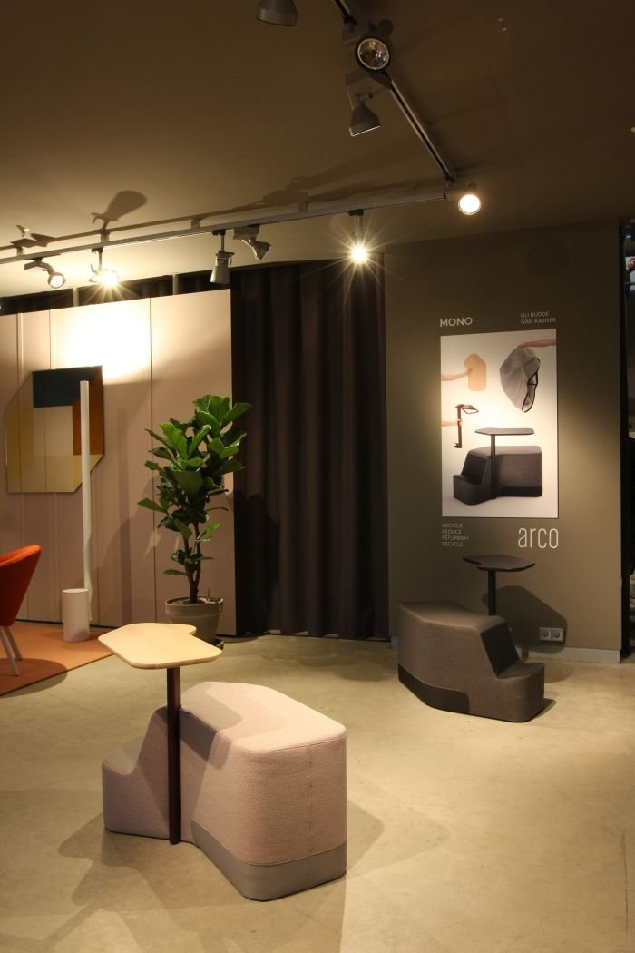
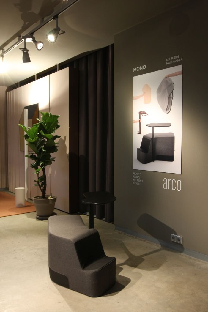
...yeah, sorry, but got to, can't be too carefully these days, the risks are many and hidden, as are those seeking to exploit them..... in the interests of full disclosure we only viewed Mono after talking to Uli Budde, an unplanned conversation and one without which we wouldn't have known Mono was there: Dutch manufacturer Arco weren't presenting at Orgatec Orgatec but across the road in Design Post, a permanent showroom exhibition arena, similar in many regards to the Merchandise Mart in Chicago, just without its own postcode. And normally we don't visit Design Post. Nothing against Design Post, had many a happy moment there, but after a long day at a fair, be that Orgatec or IMM, we really don't have the energy or humour to visit Design Post. It may be across the road, but for our shattered bodies and souls it might as well be in Tbilisi. However, and as regular readers will very be aware, we've long admired Uli's work, and so when he tells us he's showing a new product, we go and look. And so had we not bumped into Uli, we would have missed Mono.
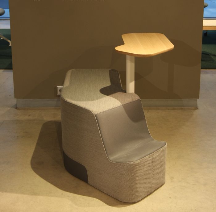
Created in cooperation with Ivan Kasner, and thus reuniting studio Officeoriginair in which guise Uli and Ivan both started their careers and realised numerous projects for numerous clients, Mono is an upholstered individual workstation, in itself nothing particularly new, arguably as an idea it goes back to the Victorian era, was taken up by the first plastic protagonists in the 1960s and since the 1980s has been revived/re-imagined in various formats, however Uli and Ivan's interpretation is most pleasing.
Quite aside from its very well considered scale, nicely judged proportions and very easy visual presence, we were particularly taken by the objects usability. Without knowing for certain, we didn't discuss details with Uli, everything about Mono tells us that it is an object conceived from observation, from observing how people work on upholstered furniture and then considering how to optimise that experience.
Approachable from, more or less, any angle, allowing thereby for a variety of modes of interactions, or simply sitting, Mono is in many regards more a tool than a piece of furniture, an object that in its carefully considered mannerisms is responsive to the user without being suggestive; whereby among the more pleasing functional aspects are the small ledge for placing you bag, a ledge which not only makes it readily accessible, but keeps it out of others way, while the material rim at the bottom, not only provides a little more protection for when your heels bash against it, and means keeping it clean is a lot easier, but also naturally disrupts the upholstery and creates a less monotonous visual.
And while we're not 100% convinced the closeness of the table element to the seat makes it 100% suitable for long term working on a laptop, and certainly not a large laptop, for using a tablet, reading, taking notes, participating in a discussion/telephone conversation, philosophising, having your lunch, eminently suitable
If we did have one suggestion it would be some form of wheels, and thus mobility. Whereas on the smooth concrete floors of Design Post one could push it about, turn it etc, on any sort of carpeted, resistant, flooring it's going mean a team lift exercise. Whereby while we can't imagine such migrating around offices a lot, we can imagine that it is an object that people will want to turn, to face in a specific direction, etc. But otherwise, most satisfying, and well worth crossing the road for.
