The top story from Biennale Interieur Kortrijk 2018 is that use of the toilets is free. Jubilation all round!! Much as we like to think our campaign against the previous 50 cent charge was responsible, we suspect the answer lies elsewhere. But we made a stand, and that's what's important.
As is the fact that freed from our rage at the intolerability of the charges, and the thus ensuing intolerable bladder pressure, we could concentrate freely on the objects on show.
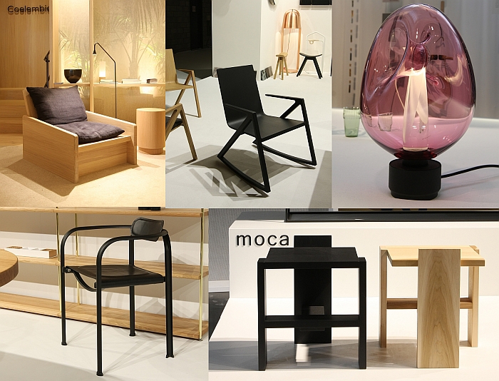
Accepting, as ever, that we missed one or the other genuine delight, a Biennale Interieur Kortrijk 2018 High 5!!
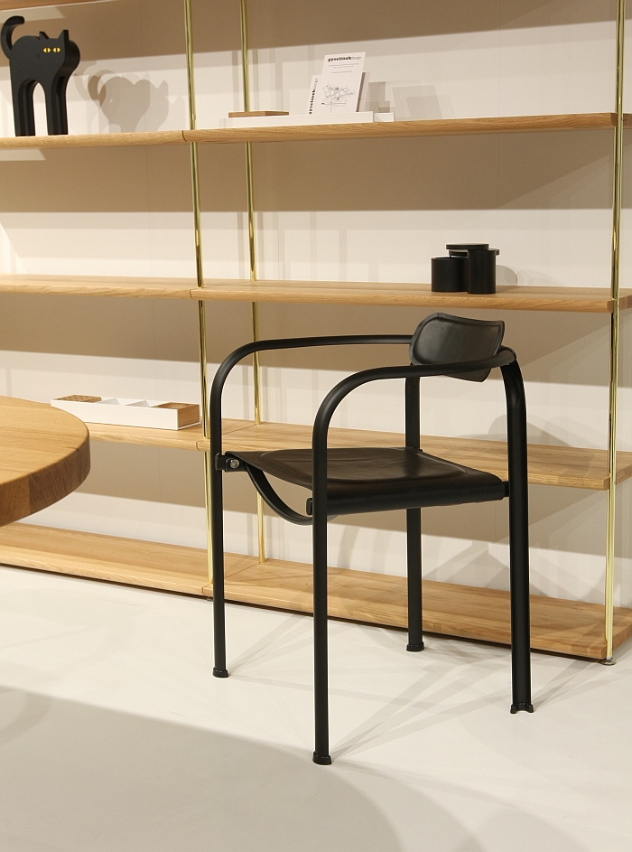
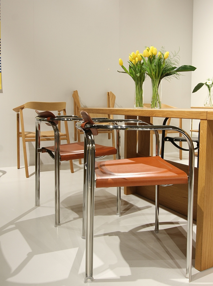
Presented as an advanced prototype at IMM Cologne 2017, where we missed it, Split was launched by Tecta at IMM Cologne 2018, where we missed it. In our defence, at IMM 2018 we were fully concentrated on Tecta's new D7K by Klemens Grund. We also missed Split at Milan 2018. Which on the one hand neatly underscores why we always say that we have invariably missed things at fairs, because we have; but also highlights the advantage of a fair such as Kortrijk, or indeed Stockholm, where one is freed from the distracting background noise one is exposed to at the larger fairs.
Designed by Daniel Lorch, obviously while moonlighting from his day job as art director of Berlin based brand L&Z, Split is one of those objects that makes satisfyingly intelligent use of technical finesse to realise something seductively simple, something effortlessly easy, yet something almost unreachable, something almost unimaginable, something previous generations would have denounced as witchcraft: A steel tube is bent, laser cut longitudinally, a little contemporary techical understanding/design thinking/magic dust is applied, the two halves of the former steel tube are realigned and you get a chair crafted from a split and twisted steel tube. Each leg being a steel tube profile masquerading as a steel tube. And thereby a result that only has very little to do with the steel tube furniture of yore, using as it does the steel tube as a material rather than as a construction element, an important difference and one which allows Split to stand completely independent of anything that may have gone before. And an object which has a delicacy and visual lightness that belies it's stability.
A somewhat squat, quadratic object, Split is a very aesthetic object, a very pleasingly aesthetic object, with a strong visual character, there is almost something regal about it; yet is charmingly reserved, unassuming, an object which presents its construction openly, but leaves you to discover and engage with it in your own time, doesn't force the issue, tends to underplay it. Which we really enjoyed.
Featuring a leather seat stretched between the sidebars, Split offers a very secure, comfortable seating experience, the leather backrest is apparently an optional, for us a compulsory to ensure the completion of the composition.
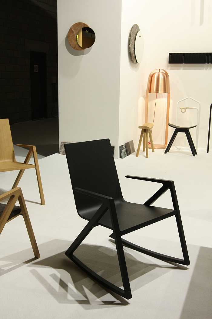
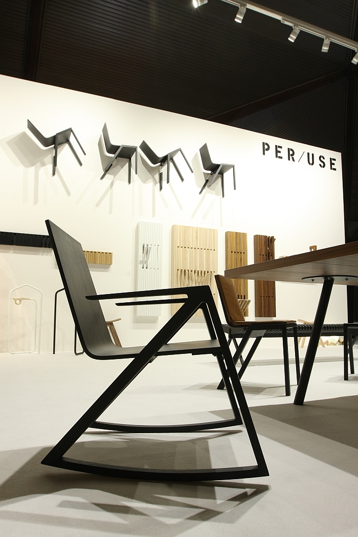
Whereas with Split we can come up with some form of justification for our sloppiness, with the Félix rocking chair by Frédéric Richard for Belgian manufacturer PER/USE it's a lot harder, released as it was in 2014. And since when we've theoretically had a 1,000,000 chances to see it. And have failed to. Chance 1,000,001 we took. Gladly.
What we particularly like is the incongruity between seat shell and frame, it's two chairs cobbled together as one, knows it is, but doesn't see the issue and carries its incongruity with a charming self-confidence.
A self-confidence repeated, nay nay, justified, in the highly comfortable and supportive seating experience. The rocking motion is reserved, compact, short, but also exactly what one wants when sitting in such a chair and working, reading, talking to your mother on the phone and looking for the pleasing distraction of a gentle, regular rocking motion while you hear something about what somebody you may once have known may or may not be doing. Hhhm, hhmmm, aha.
While visually the dialogue between the two elements, the ease with which they relate to the other, the nicely balanced proportions and scales of the two elements, and the object's own sense of its self-obviousness create a very harmonious object.
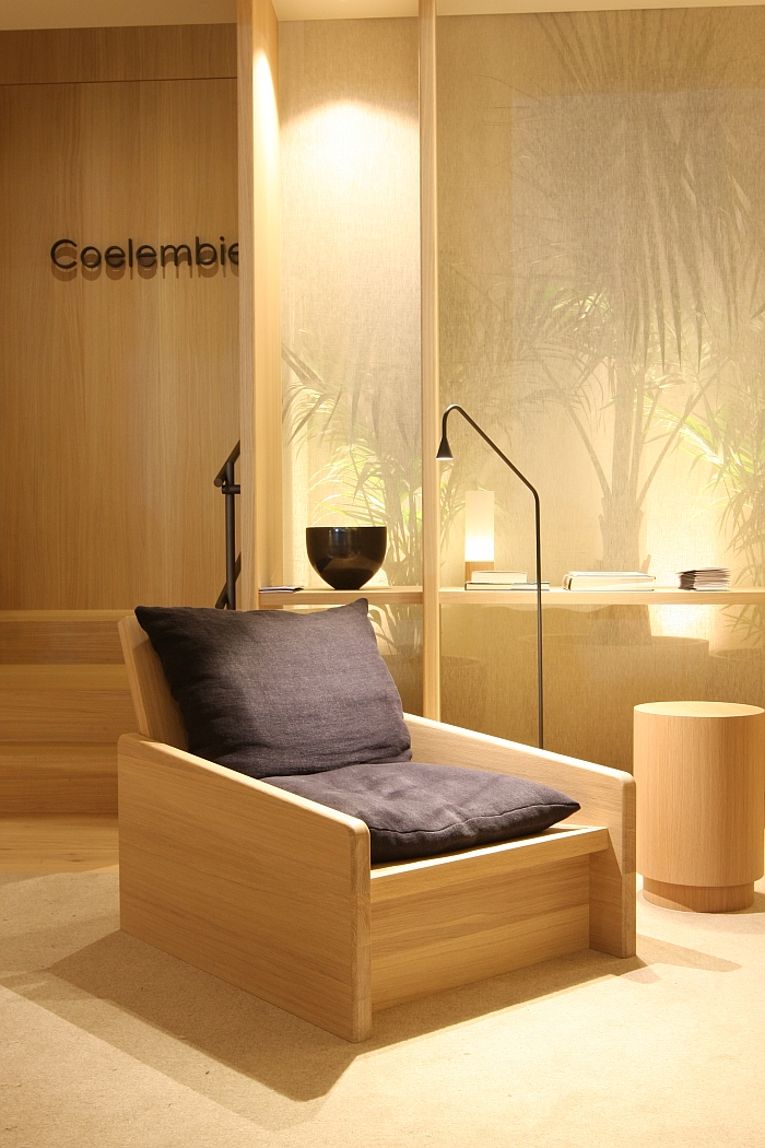
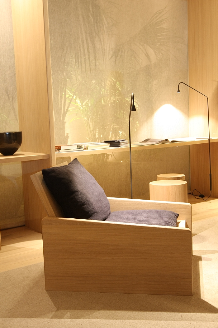
As a work, the object we are arbitrarily calling the Coelembier Chair, makes a mockery of contemporary understandings of chairs, and in doing takes us back to the early history, early understandings of chairs. Go far enough back, back before before chairs became something everybody had, back to a time when chairs were commonplace but before they became a commodity, to when they were still essentially representative and symbolic of church and power, back then a chair was nothing more than a box in which one sat, often highly ornate, often highly decorative, but always, in essence, just a box.
With his design Emiel Vercruysse beautifully evokes such, while at the same time developing an object that is much more functional, more engaging, more responsive than the boxes of yore. Whereby we believe the secret is on the one hand the scale, it's massive, as in massive, on the other hand its openness, and on the rare, decisive third hand, on the low to the ground, slouchy character. A combination which means that, and suitably stocked with cushions, blankets, as we say it makes a mockery of contemporary chairs, necessitating as it does the user to complete the work, which then again allows for the personalisation, allows for the creation of a very individual chair/box, of a low-slung chair/box, in which you can lounge, sit more erect to read/work, curl up and seek comfort in your loneliness,...... that was where we stopped, there is only so much you can try in chair on trade fair stand. But essentially, its adaptable. And highly personable.
Not technically a product per se, the chair was created as a one-off as part of Emiel's commission for the design of the Kortrijk stand for Belgian interior outfitter/carpenter/shopfitter Coelembier, hence our choice of name for it, and thereby a chair which was/is developed from the same oak boards as the stand, developed specifically to exist in dialogue with the stand, is/was, if you will, simply part of the stand furnishings. And so, yes, we travelled all the way to Kortrijk to see the latest objects of international furniture and lighting producers we know, and the current portfolios of those we don't, and became obsessed with part of one stand's scenography.
But then that is exactly why you are reading this, you don't want the blah blah, blah you want the genuinely engaging and interesting. And the Coelembier Chair is.
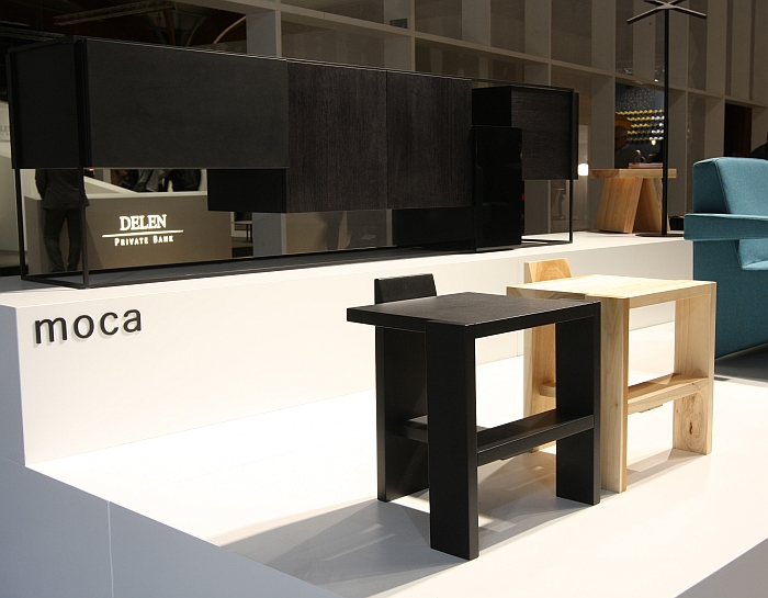
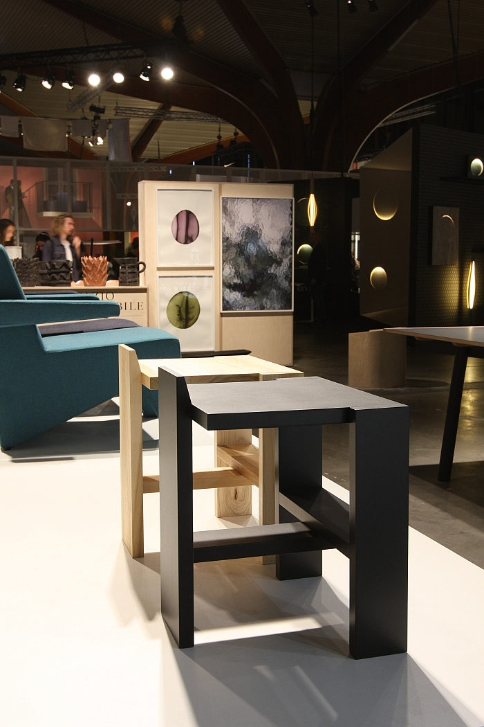
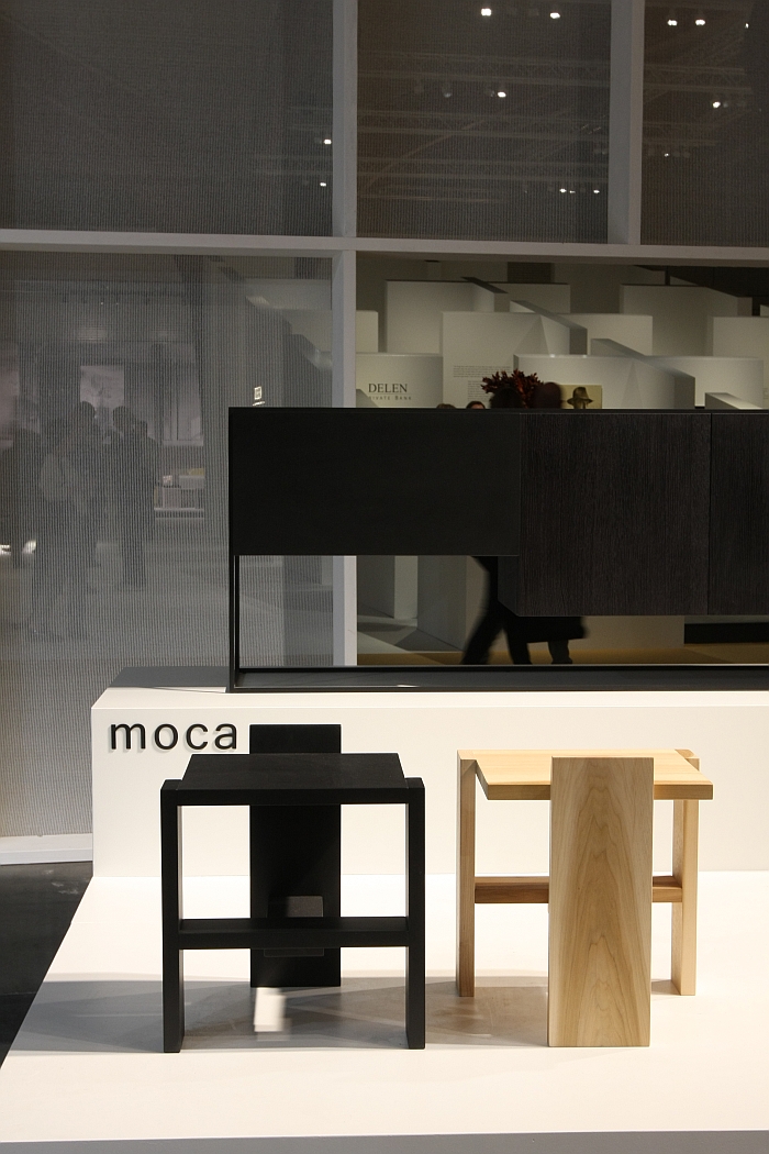
Much as with searching for a soulmate/lover, searching for furniture is often at first about a physical attraction, whereby we, and romantic fools that we are, would argue that part of any persons/furniture objects physical appearance is also a reflection of the inner character. That what you see visually is a good indicator of that which is hidden within, and that later when you discover the inner depth of the person/furniture object, you'll understand the initial, physical, attraction as being something more than that. So too with the Sixplank Chair by Steven Wittouck for Kortrijk based brand Moca
It caught our glace from across the room, we went over became better acquainted with it, became increasingly partial to it, a partiality that led us to take an ever deeper interest in it, and then we learned that Steven Wittouck that he had developed it in context of a cloister interior project, and suddenly we understood what we'd been reading.
Which no doesn't mean it's stereotypical cloister austere.
But does mean it's an object created in a context, and such an object that isn't really that bothered what the market thinks of it, does its own thing, goes its own way, an object conceived within a set of constraints and which therefore has the freedom to be more expansive, and in doing so becomes all the more engaging. And an object whose context gives it a depth and cohesion all of its own. And it's anything but austere, rather is a rich and complexly simple object which emits the most contagious tranquillity.
Constructed from, well six planks, and also available in two higher stool versions, the chair presents itself with well considered proportions, while the suggested backrest is a nice visual touch which rounds off and completes the otherwise formally brutality, brutal but not unwelcoming, while the lower plank functions as optimal footrest and allows a lot more functionality than one could otherwise imagine.
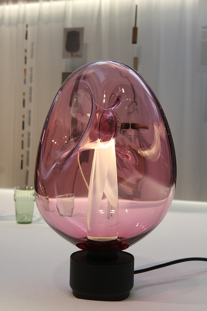
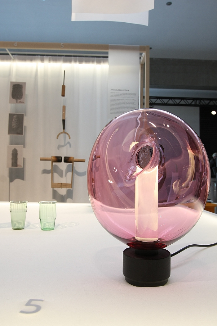
While we know there will be those who assume that us choosing KOR for this list was somehow inevitable, it wasn't, we always approach trade fairs with open minds and on the search for the interesting, engaging, informative. And KOR earned its place in this list.
Presented in Kortrijk in context of the so-called Kassel Collection, a curated selection of objects by Kunsthochschule Kassel students, and which in its current fourth edition presents a wide array of lighting, furniture, product and accessory design, KOR remains for us as articulate, intriguing and thoroughly delightful as when we first saw it and the 2017 Kunsthochschule Kassel Rundgang, something that, as we noted from Light + Building Frankfurt 2018, for us, is because the object arises "from a very nice piece of very pleasingly realised craft manipulation coupled to some very logical design thinking", and a combination which, as we noted in Kassel "deliciously connects the outer to the inner and thus gives what would be an otherwise blah blah two layer glass lamp a sympathy, logic and vitality of its own".
And, so, yes, that means it is now making its third appearance in these page. We could talk about it therefore being a "hat(KOR)trijk" of appearances, but that would be truly awful and we'd have to resign. Instead we'll refer you to our previous posts on KOR.
