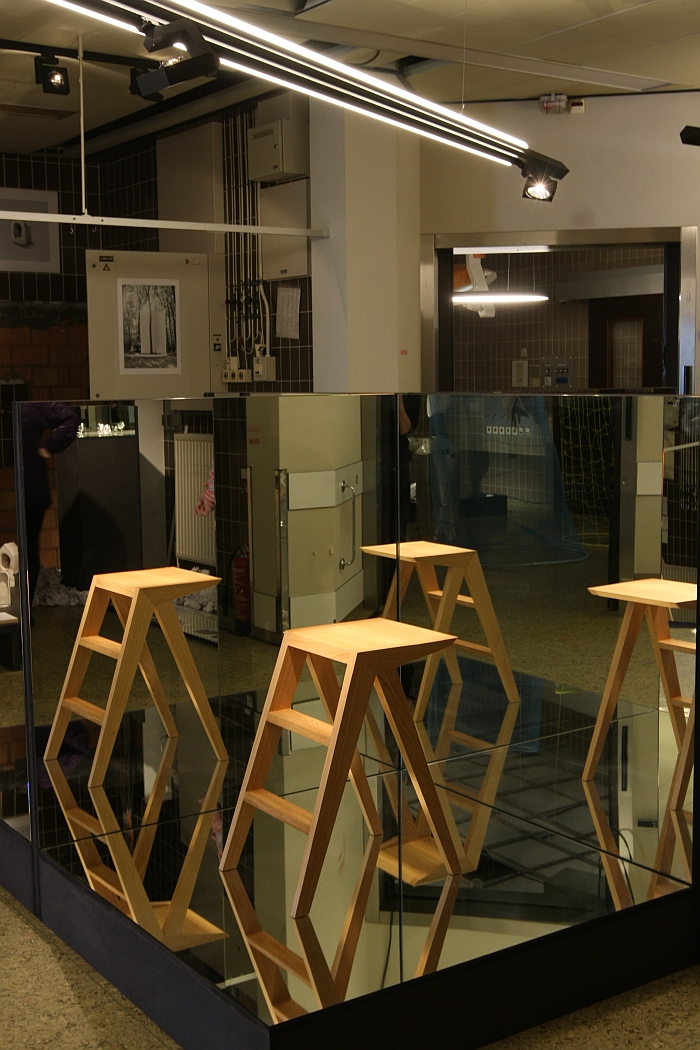
Staged as part of the Biennale Interieur Kortrijk 2018 City Festival the showcase, We are the Next Generation, presents/presented works by graduates from design schools across Belgium and northern France.
But are they.........
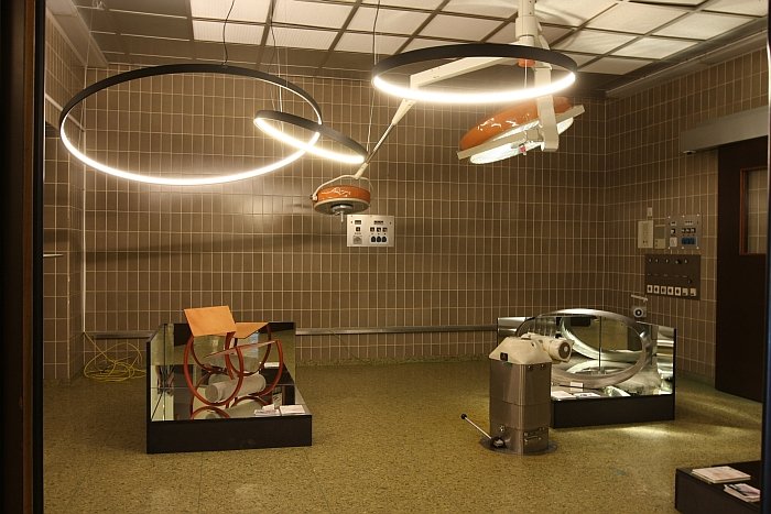
The first thing to say is that the Biennale Interieur Kortrijk 2018 City Festival is/was staged in the town's former Sint Martin hospital, we're not sure how quickly the hospital had to vacate the premises, but apparently very quickly, potentially overnight, as they left vast swathes of furniture, fittings and technical equipment behind, meaning visiting the 2018 City Festival is/was as much an exploration of the former wards, theatres and kitchens as it was of the numerous projects on display. Is/was about enjoying that unmistakable aura, that serene, resigned, yellowing aura of times past. Specifically, the area hosting the We are the Next Generation showcase had obviously, in a Previous Generation, been operating theatres and therefore in addition to the new graduation projects was populated by once important, cutting edge, diligently designed, highly functional, expensive, industrial objects that have now become obselete artefacts. We'll leave you dear reader to consider for yourselves the numerous analogies contained therein.
The second thing to say is, or are we already on the third?, no, second, the second thing to say is that the complicated logistics of the 2018 #campustour meant that we didn't make it to Belgium, and northern France didn't even come into consideration, simply didn't fit in with any other lines of deployment..... Consequently, and while in no way compensating for the insights that could/would have been won from visiting the respective institutions, the We are the Next Generation showcase did provide us with a nice overview of some of the themes being tackled at design schools in the area, and for all how they are being tackled, why they are being tackled, if those tackling them should be and in how far those themes/those tackling those themes are appropriate for/as any future generation.
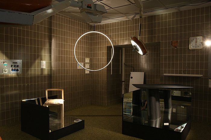
According to the organisers, some 190 projects were submitted for the 2018 edition of We Are the Next Generation, from which the international jury selected 44 projects, the vast majority being in the category Product Design, however Multi-media and Architecture are also represented. And 44 projects from which our highlights are all Product Design. No particular reason, it is certainly no reflection on any negative opinion of the other categories, much more we'd argue that it was very busy when we were there and so there wasn't really the necessary calm to properly engage with every project, something that tends to disadvantage the more inherently complicated architecture/multi-media projects; and our activities these past few weeks have been pretty much exclusively product focused, which tends to condition your thinking. But we've got our notes and are certain we'll return to one or the other project in due course. Viewing such a showcase never being solely about the moment, but the paths of consideration and reflection it opens. And in any case, design, or at least good design, evolves slowly, and while we do urgently need to start thinking about coming generations now, those on display in Kortrijk are arguably the next, next, next generation. Which is still important/interesting..
Particularly pleasing for us was the revoir/weer ontmoeten with Insecurity Couch by LUCA School of Arts Genk graduate Lieke Lenaerts, a work which gives a physical form to the sense of guilt felt by the child of a depressed mother, a work also on show, and discussed in greater length as part of, LuForm 6 at the Ludwig Forum Aachen, albeit presented in Kortrijk under the title Awareness for Depression in a much fuller scale, and which in addition to being accompanied by further objects dealing with different aspects of depression also featured/features an audio installation, the combination seeking to highlight the reality of depression and also provide some initial help in coping/dealing with depression. And which thereby helped place Insecurity Couch in a slightly different context than that which it exists in Aachen. Not necessarily a better context just a different, broader, one and one still very relevant in terms of future society.
Elsewhere.......
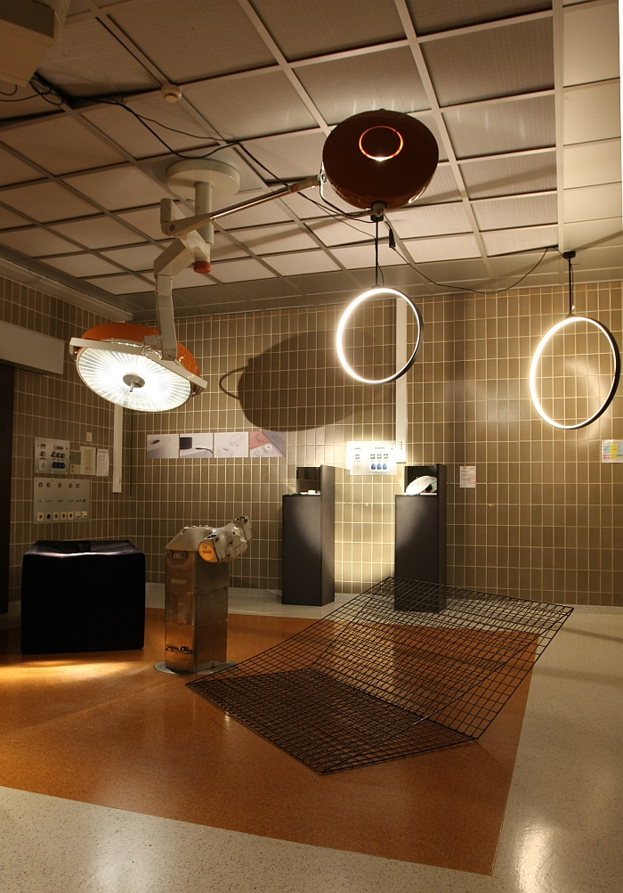
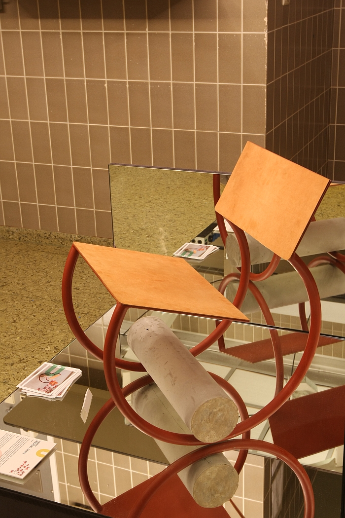
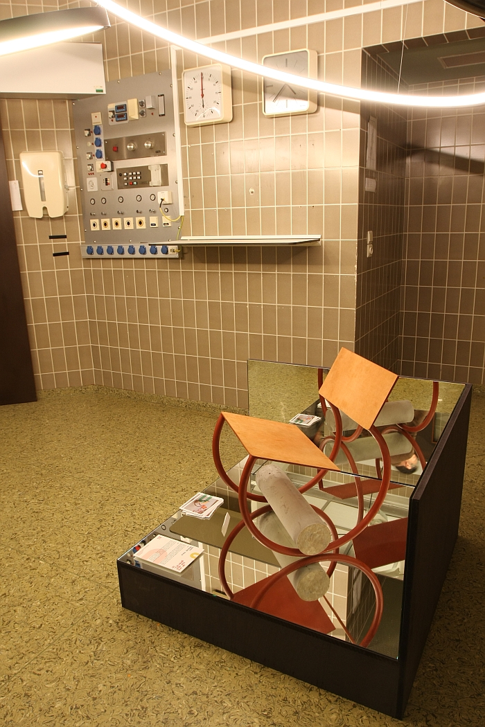
Although it would appear the elegant solution, there are a number of reasons why rocking chairs generally don't have circular frames, principal amongst them being the danger of rocking completely backwards and spilling your gin. That we didn't get to sit on Ernest by Thomas Moore Mechelen VOMO graduate Thomas Dreezen we can't comment in how far that is a risk, can't comment on the rocking motion, on the control the user has over the rocking motion, on the quality of the rocking motion, far less the seating comfort; can only comment based on the visuals, and the first comment is that the circular frame appears to the elegant solution
As an object there's a lot going on in Ernest, which presumably/hopefully is how it acquired its name, and although we, as a general rule, are not naturally at ease with bricolage in furniture design, Ernest carries its mixed medial soul very personably, largely, we feel, because of the complete independence of the three materials, they all exist harmoniously in one object, in a spirit of egalitarianism, even if within that object there is no dialogue, no inter-relationships.
Despite its very obvious post-industrial brutality Ernest is also a very homely object, one suspects on account of a visual deception achieved by the flow of the lines, the proportions and its compact, somewhat squat scale, which combine to bequeath the work an endearing, articulate, if not particularly Ernest, character.
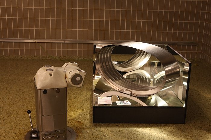
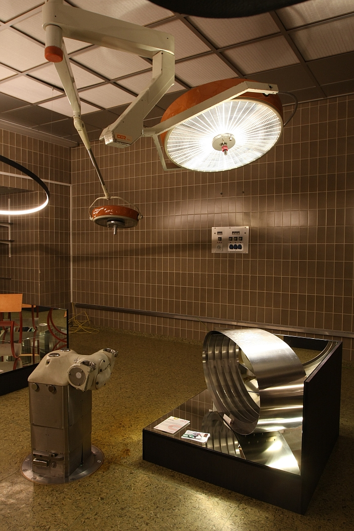
Cutting straight to the chase, and as previously discussed from the exhibition Yes to the Uncommon! at The Vitra Design Museum Schaudepot, in context of a workshop with Vitra in 1990 Ron Arad developed his so-called Bucking Bronco, a tempered steel ring on which one sits, bounces, and, and if required, travels across a space. Not that we are accusing VOMO graduate Maurann Lootens of anything underhand, far from it, much more we want to on the one hand set up a discussion that is on its way, and on the other underscore that in product/furniture design there are only very few truly new ideas, for all in terms of furniture most "new" tends to be a "new-imagining" of the existing. Which is important to understand when assessing an object, important to always ask in how far is it a new-imagining, and in how far a tired generic blah blah. The majority off "new" products released are the latter.
That we're including Woo here should, hopefully, make any explanation as to on which side of the divide we consider it completely unnecessary.
Starting from the fact that seating furniture has to be able to bear the mass of the seated, something that involves, statics, mechanics, and something that is normally, when not deliberately hidden, then certainly invisible, Maurann considered her response. Her answer is Woo. Unused it is a steel ellipsoid, when you sit on it, it deforms to that degree necessary to support your weight, to that degree where the forces in the system exactly counterbalance that applied by you. Meaning, one presumes, we sadly couldn't try it, that if you displace your mass vertically Woo adapts with you to create an active seating experience.
And whereas Bucking Bronco is/was about using the inherent properties of the material to create an object which achieves that which the inherent properties allow, with Woo the steel is a construction element, different pieces having been deliberately and consideredly arranged to create an object which performs an intended function. It's a small difference, but a fundamental one. Another being that, as far as we can tell, you can't use Woo to bounce your way to the photocopier/kitchen/front door.
The chair/stool combined with stepladder is no new idea, (see above for a few more thoughts on the re-imagining of the existing) there is/was however something elegantly endearing about the way Technical University of Graz stude.....
Graz!
Yes Graz, Austria.
???
The Technical University Graz were invited as a guest institution to submit works by students from their Studio for Furniture Design and Prototypes, not that Leon Chanteux appears to be a student at Graz, but rather to be/have been there for a semester as an exchange student. Which is all we know, we sadly don't know from where, just "Germany".... Ok?
OK.
...where were we. ..... standing in a long tradition of objects combining seating with stepping functionalities arguably the key to Susa is that you don't automatically recognise it as a two in one, that the naturalness with which the two are combined tends to see them merge into one, as with that vase/face optical illusion, you see both at once, but always only one at a time. Although a relatively substantial object the intelligent and well realised construction lends Susu a very pleasing reduction and universality. Or put another way, as an object Susa doesn't do anything spectacular or revolutionary, but does so in a very satisfyingly uncomplicated, accessible and charming manner.
Full details on We are the Next Generation can be found at https://weekvanhetontwerpen.be
And full details on Biennale Interieur Kortrijk 2018 City Festival can be found at www.interieur.be
