The biggest disappointment at Maison et Objet Autumn 2018 was that Announcement Lady wasn't broadcasting across the halls, and so this year there was no continual "Mesdames, Messieurs", and so we had no continual Sash soundtrack to carry us though our visit.
We just hope Announcement Lady's absence wasn't on account of us, we hope she didn't quit because she felt we were mocking her, being cheeky, or otherwise making fun of her. We weren't. It was genuinely one of our highlights at Maison et Objet Autumn 2017. One of the reasons we went back.
Fortunately, and as much as we missed her, there were a few other highlights to distract us in Paris this September.
And so with a hearty Encore une fois for auld lang syne, a Maison et Objet Autumn 2018 High Four!
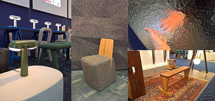
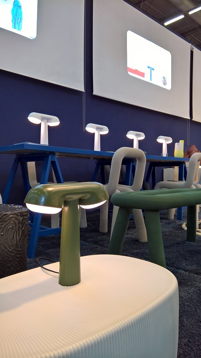
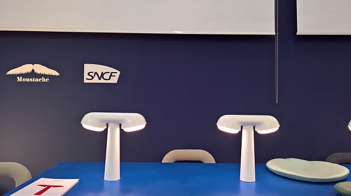
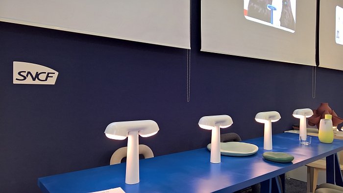
In context of the development of a new generation of TGV high speed trains, French designer Ionna Vautrin was commissioned to design a new table lamp, the result was launched on-board, by the French national railway operator SNCF in 2017: and was launched off-board, by the French manufacturer Moustache at Maison et Objet 2018
According to Ionna the form and design of the lamp is based upon a range of impulses and influences from across the centuries of rail travel including, 19th century Art Nouveau train design and also the work of that Grand Doyen of French train design Roger Tallon; if you will the various "golden ages" of train travel when new technology seemed to make the impossible possible.
For our part we were/are enjoying the very nicely considered proportions, the calmness of the silhouette, the elegant, self-confidence and the natural relationship between the different components, if you will the internal dialogue it is having with itself, while the open accessibility of the work has something of a street lamp feel about it, arguably a late 19th century street lamp feeling. Featuring LEDs and cast from aluminium using the same tools developed for SNCF, the only difference in the Moustache version is the addition of a base plate so that it can be stood independently, and the inclusion of internal ballast for stability: in the TGV the lamps are fixed in place, if travelling at 300 kmh through the French countryside, the home version is more mobile, if at more sedate speeds.
Whereby, when initially faced with the lamp we automatically imagined it in domestic settings, on sideboards, in conservatories or on the home office desk, only later did possible contract uses occur to us: cafes, bars, hospitality in general, but also retail, offices or civic and public spaces, and for such spaces the TGV lamp can also be fixed to desks/tables if required. And thereby presents a universality which stands as another nice example of an object created for a specific location, yet which on account of the fact the designer was diligently focusing on the context of the work, the specific local requirements, rather than on achieving some random/abstract form/function for an anonymous location, coupled to the designers understanding of design, results in an object which transcends its genus loci.
And if you want to experience the TGV lamp in a TGV, you'll have to travel between Paris and Bordeaux, as they are currently only installed in the new TGVs serving that route. The plan is however to roll it out across the fleet as and when new trains are brought into service.
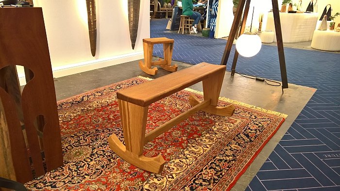
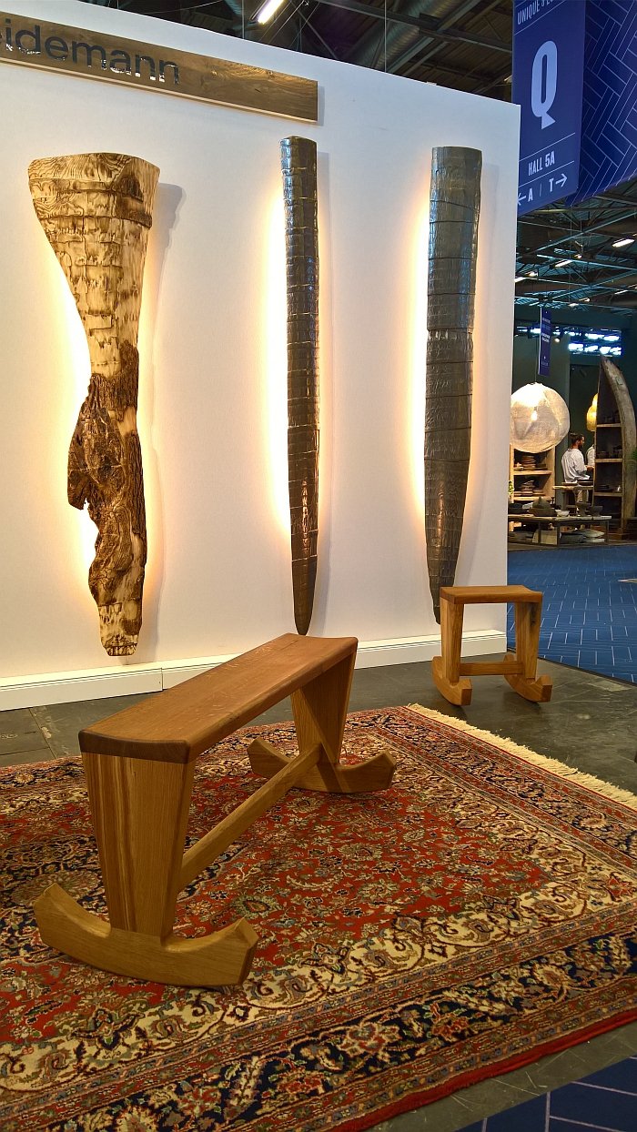
Our first glance of Rüdiger Weidemann's rocking bench and stool came when, and as so often at a trade fairs, we were scurrying off to to view something that proved to be a lot less interesting than the promise therein.
Our initial reaction as we rushed by was they must be based on a historical model, or perhaps better put the bench must be, the stool we took to be a contemporary development, but everything about the way the bench carried itself said it was a new interpretation of an historic idea; but nothing sprang automatically to mind. Then realising that Rüdiger was based in Hamburg we decided it must be Hanseatic, nothing sprang to mind, but we managed to convince ourselves that in the trading houses of 16th century Hamburg such benches were common, or maybe in the Kontors in London, Bruges et al... That was it, a Hanseatic bench. Obvious really.
What's it called? we asked...Anchor Bench came the reply.... It's an anchor! Its an anchor!! There's not an historic model, look at it!, Open your eyes!, Pay attention! It's an anchor!!
Which just makes the most delicious sense. And which is arguably why we assumed there must a historic model. Because it is so inherently logical. As older readers will be aware, we don't really do upcycling, but theoretically you could take two anchors, round of the crown, put a plank between them, and you've got a rocking bench. A pretty ugly rocking bench, but a rocking bench.
Alternatively do what Rüdiger Weidemann did. Abstract the idealised form of an anchor, round of the crown, flatten the arms until you reach a level of curvature which allows for a pleasant, secure rocking motion, repeat, and then add a comfortably formed bench between the two. Thereby resulting in objects where the inherent logic of the design and ease of realisation translate into a very pleasing accessible familiarity. And it's important to point out that the objects did begin with considerations on anchors, the form is deliberate.
While not comfortable in the classical slouching sense, they have no backrest, and relatively compact sitting surfaces, both the Anchor Rocking Bench and Stool are comfortable in the sense that they force you to sit upright, conscious of what you are doing, while still, or at least based on our small test in Paris, allowing you the freedom to do your thing: the stool being ideal not only for general sitting but also, we can well imagine, for working, while the bench is well suited to sharing with a friend, for example, while setting the world to rights and enjoying a well deserved gin.
Neither the Anchor Rocking Bench nor Anchor Rocking Stool do anything particularly revolutionary, but do it very satisfyingly. The bench arguably more so than the stool, but that's one of these personal preference questions. As presented at Maison et Objet Autumn 2018 the two were crafted from a trunk of moor oak, a trunk that is no more, versions in other woods are however available.
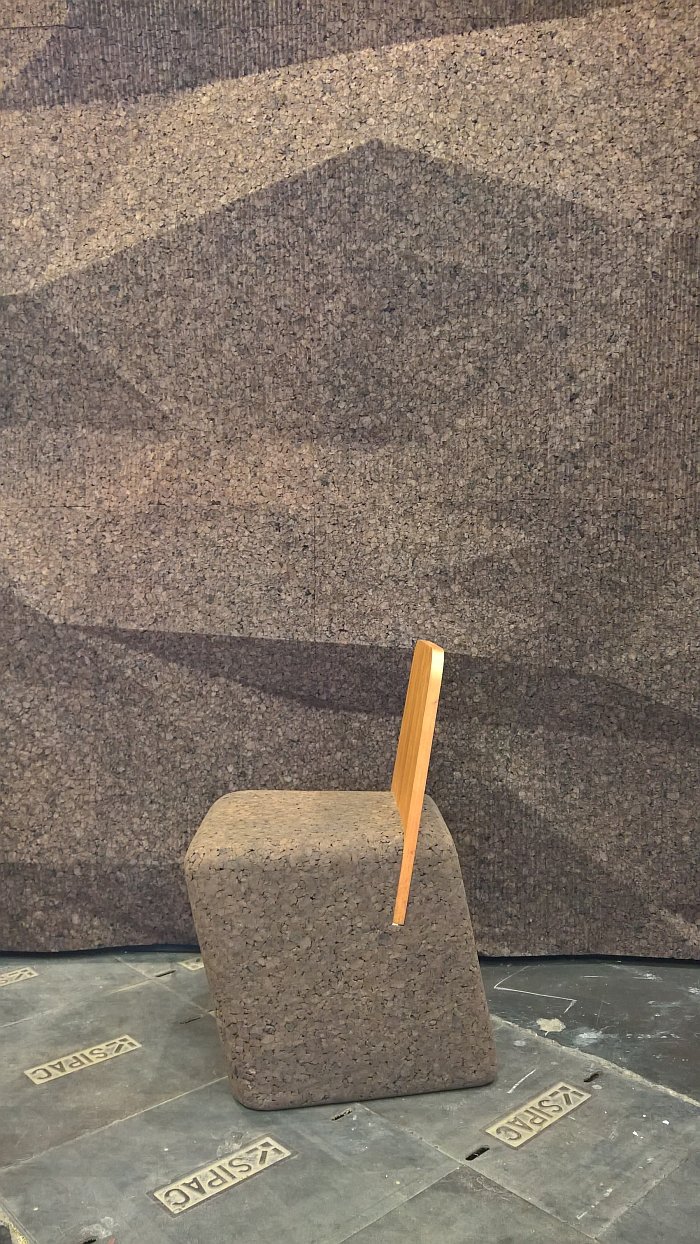
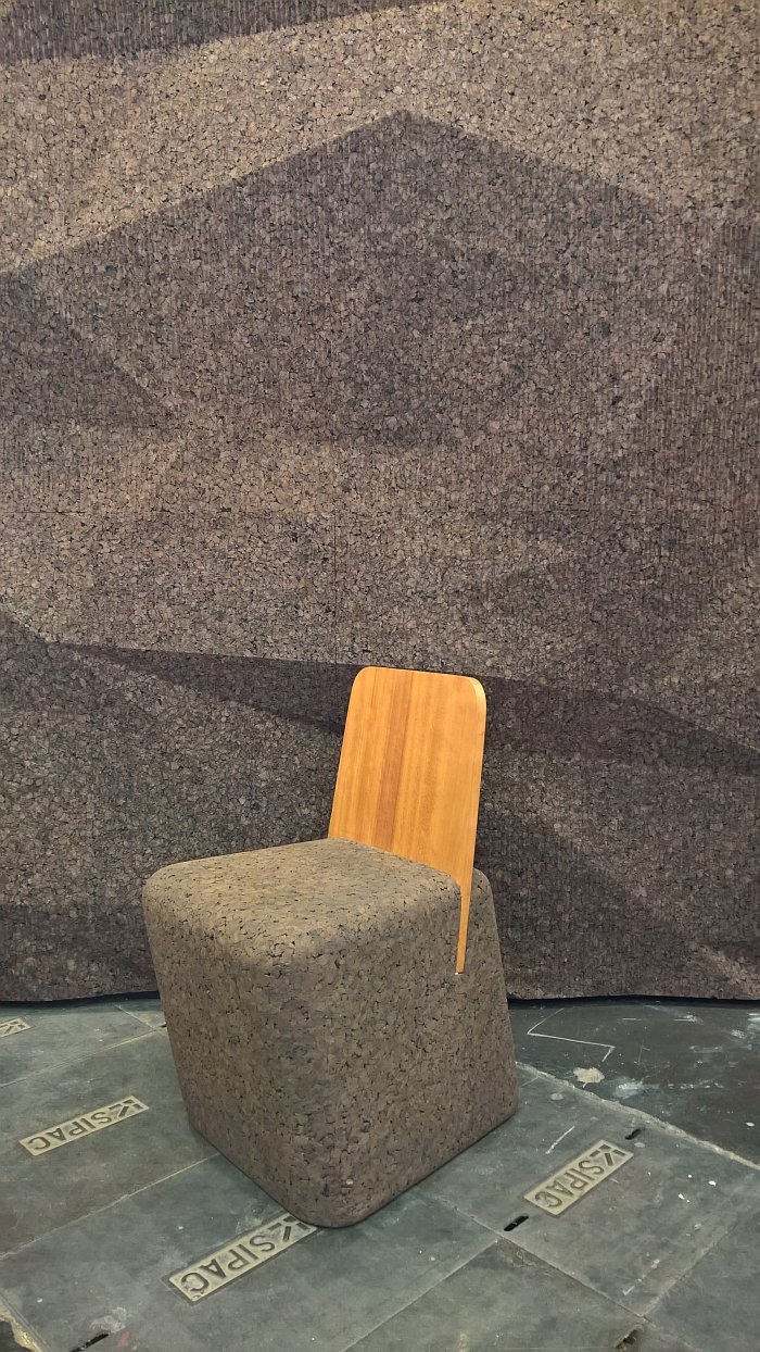
The Cut Chair is an almost textbook example of what we mean when we say that we haven't necessarily seen everything at a trade fair, nor necessarily understood everything that we have seen; we must have, theoretically, seen Cut Chair at last a couple of times, it ain't a new project and we've almost certainly been at trade fairs since it launch where Blackcork have exhibited, yet it has never caught our imagination as much as it did in Paris.
Maybe we just weren't ready for it. At Maison et Objet Autumn 2018 we were.
A stupidly simple piece of work, Cut Chair sees a wooden backrest inserted at an angle into an essentially trapezoid cork stool to create a low chair. And thus a work reminiscent of the very origins of the chair when backrests were added to the, until then, ubiquitous stools.
A sturdy piece of work one of the joys of Cut is that you can't rock back in it, which sounds like a weakness in the design, but .....on the one hand realising you can't rock back installs a respect for the object, while trying despite knowing that you can't allows for a very pleasing bit of leg muscle stretching. It's sturdy. Which shouldn't be misconstrued as meaning it is heavy, it ain't, can be easily and simply lifted and moved; does however mean it is massy, its voluminous, the stability in the sitting experience coming from the combination of the size and shape of the base and the volume of the inherent cork. A volume, we assume is at least in part due to the processing method which involves injecting water vapour through cork pellets under pressure and temperature. This process is also what gives the cork its black colour.
Providing for a pleasingly comfortable sitting experience, coupled to a very easy yet compelling visual, crafted as it is from cork, Cut, should, in addition, not only develop a nice patina over time but has all the atmospheric, acoustic and antibacterial properties of the material, meaning we can well imagine it just as happily in a domestic situation, for example in a bedroom, hall or as an ad-hoc seating option in living room, as well as in a contract, commercial and/or retail situations.
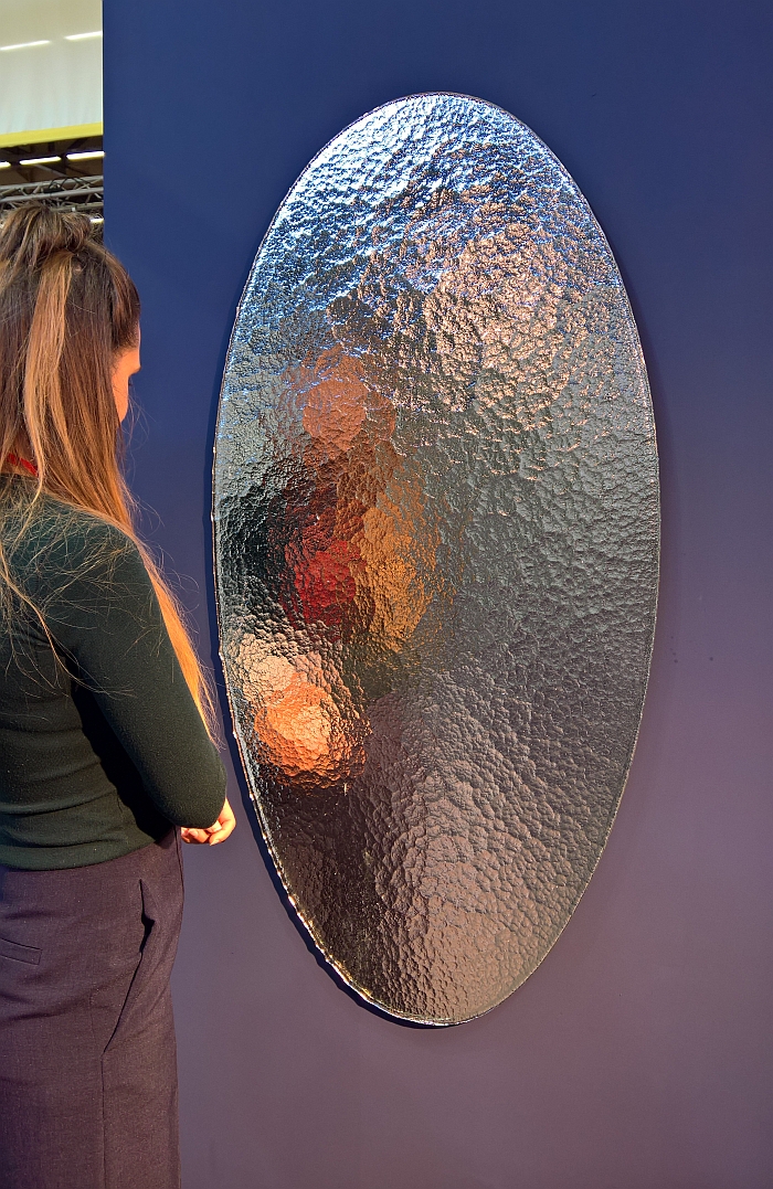
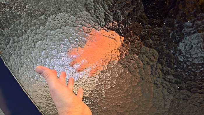
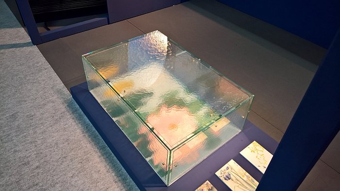
The basis of the Design Impressionism project by Berlin based studio b severin a.k.a Birgit Severin and Guillaume Neu-Rinaudo is the so-called rolled cathedral glass process, a process which although centuries old, achieved a great popularity in the late 19th century, a process which sees molten glass spread via a roller across a metal table to create sheets, and a process which on account of the physics at work results in glass with an uneven interior and surface, resemblant in many ways of melted-refrozen-melted-refrozen-melted-refrozen-etc ice. And a glass which although translucent results in a hazy, blurry, unfocused light. A hazy, blurry, unfocused light which on account of its use in 19th century Paris inspired the impressionist artists, and whose response to that inspiration subsequently inspired Birgit and Guillaume.
Exploring the properties and uses of cathedral glass Birgit and Guillaume have developed, thus far, a small side/coffee table which contains on its base a graphic print, a print which when viewed through the cathedral glass takes on the the blurry dynamism of impressionist paintings, and a mirror whose surface reflects less an image of that which is before it but large patches of distinct colour drawn from that which is before it. For all digital natives out there, it's a mirror which reflects you at about 3 dpi.
And a mirror which was the highlight of the collection for us. If you will, that which made the best impression of on us.
While obviously a mirror in which you can't see yourself brings us back to the recently discussed chocolate fireguard, the joy and beauty of the object lies elsewhere.
On the one hand there is the metaphor, much as impressionism was a reaction to the detailed, realistic artistic styles of the preceding periods, and in contrast realised works which, as it were, represent the spirit, the atmosphere of a scene rather than getting lost in detail and attempting to achieve a documentary reproduction, so too can Birgit and Guillaume's mirror be considered a reaction to the continual self-reflection of our social media age, a self-reflection not only visual in our selfies and instagram "at airport check-in", "at gate", "boarding", "being told to turn off phone" updates, but also the need to post such, the need to ensure your life is the focus of your interaction with others, to ensure you're visible. How about a mirror that ignores you and presents you as something abstract, general, a few vague colours, something indistinguishable from anything or anyone else? We are all after all just splodges co-existing in the great mass of humanity. Or at least should be.
And on the other is the decorative function, as a mirror it reflects, and that essentially passively; yet while it can only reflect that which faces it, the conditions under which it reflects are in continual flux, as with the weather the impressionists experienced when they took their easels out of doors. Thus depending on the light, time of day, season and perspective of the viewer, it allows for an ever changing landscape, continually reordering itself according to the new realities, or at least should, in the sterility of a trade fair exhibition hall such can be very hard to judge. But ultimately the question is why hang one impressionist painting on the wall, when you can hang an ever changing impressionist painting?
