Having made his way to America as a stowaway on an British freighter the Dutch abstract expressionist artist, and eponym of Rotterdam's art school, Willem de Kooning, initially made his living as a painter and decorator.
Which, considered in context of his later work, is just the most delicious thought......
"No Willem, that wall ONLY green, that wall ONLY yellow, the doors ONLY white. And straight edges!!!"
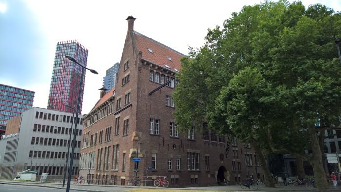
Tracing its history back to 1773 and the establishment of the Drawing Society "Hierdoor tot Hooger", a phrase which, if our 18th century Dutch is up to scratch, is a motivational call for improvement/advancement, the contemporary Willem de Kooning Academy, WdKA, began to take form in 1781 when the private academy became a public one, the Rotterdam Academy, and added courses in subjects such as anatomy, art appreciation and architecture to its existing drawing and sketching syllabus.
In 1851 the Rotterdam Academy merged with the local Architecture and Technical colleges to form the Academy of Fine Arts and Technical Sciences, an institution which allowed females to enrol, and an institution which in 1883 was, informally, internally, separated into an Art College and Technical College, under one roof. A state of affairs which continued until 1988 when the Academy of Fine Arts and Technical Sciences was integrated into the Hogeschool Rotterdam & Omstreken and the art academy became the semi-autonomous Academie voor Beeldende Kunsten Rotterdam, which in 1998 was renamed in honour of its famed former alumnus who had died the previous year.
In 2001 the Willem de Kooning Academy inaugurated the Piet Zwart Institute, PZI, similarly named after a famed alumnus, as a home for the school's international Master programmes, and today both are formally components of Rotterdam University of Applied Sciences.
Offering courses across a range of disciplines including Bachelor studies in, for example, Animation, Fine Art, Spatial Design, Product Design or Advertising and Masters in, and amongst others, Experimental Publishing, Lens-based Media Design or Education in Arts, a particularity of the WdKA is that in context of its Bachelor degrees students don't just study a subject but produce their gradation projects in one of three contexts: Autonomous Practices, Social Practices and Commercial Practices, or put another way with a focus on a project for the project's sake, in a social context or as a commercial proposition.
And thereby a structure which made the scenography of the Graduation Show fairly straightforward, neatly subdivided as it is.
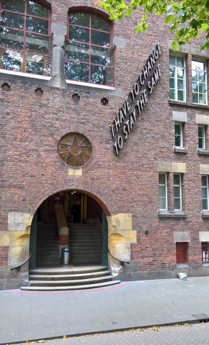
Despite the obvious logic of dividing the Graduation Show into four identifiably groups, the 3 Willem de Kooning Academy graduation practices and the Piet Zwart Institute Masters projects, the fact that the school is spread across two buildings linked by an internal bridge did mean that the whole took a little getting used to, but eventually we got there and once we did discovered more than a little scepticism and criticism of developing digital technologies.
With Codemandments, for example, Jerry Estié seeks to establish a code of ethics for artificial intelligence, starting with the stimulation of a debate on the subject through posing questions such as "AI should always be identified as such when interacting with a human being?", "All code for AI should be open source and checked before release?" or "The creator, owner and operator are all responsible for an AI's actions?"; similarly with Imprecisely Human Caio Vita Silveira questioned contemporary and future computer vision systems such as facial recognition, emotion detection or predictive vision, including the all important question of for whom they are being developed. We've not read her thesis but suspect the answer isn't you and I; with Nobody Nina Michailidou poses questions about the future relationship between humans and chatbots, which, to judge by reports one reads, appear to be less future questions as more very, very pressing now questions; while in her project A New Sense of Self Naomi van Maasakkers challenged Google's perceived role as a 21st century Oracle of Delphi, or perhaps better put, underscored that Google ain't a Oracle, but a search engine. And in terms of your life, the truth is definitely out there, but Google can't find it.
Interestingly all the above are Graphic Design projects, thereby, and after similarly pleasing experiences in Den Haag and Edinburgh, neatly demonstrating that Graphic Design needn't be all about beard oil, tattoos, craft gin or whatever the latest tribal fad is, can be about challenging conventions, waking society from its dangerous slumber.
Elsewhere, and in no particular order.....
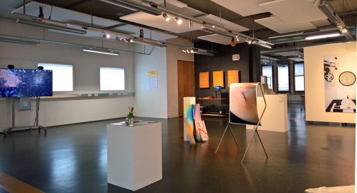
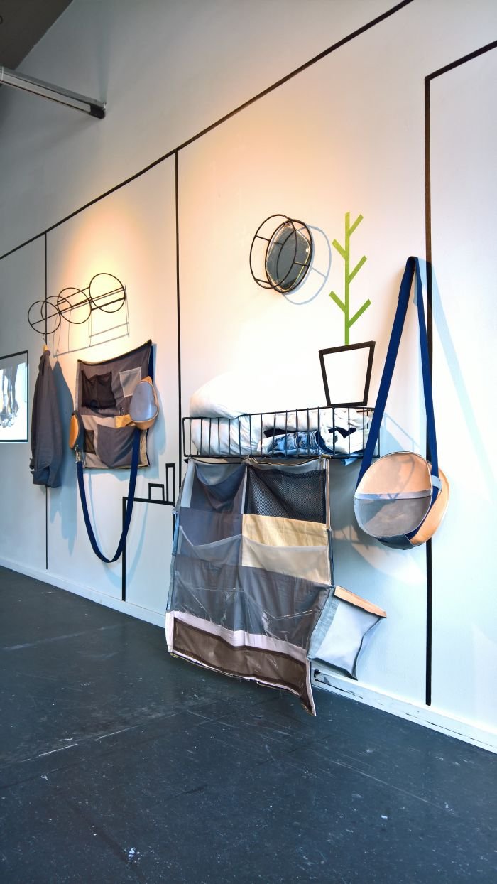
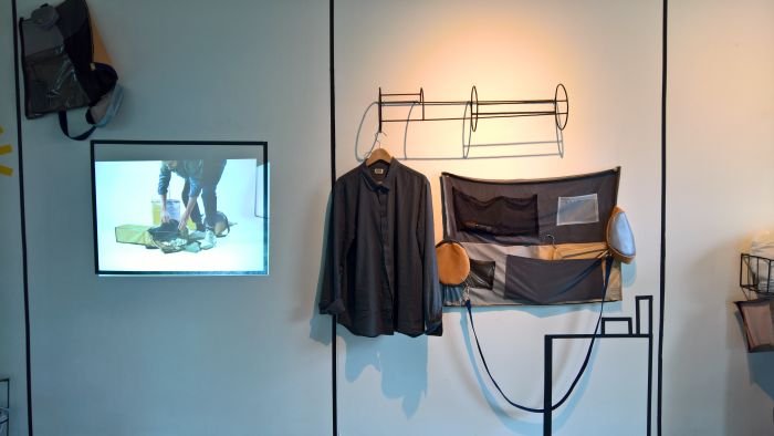
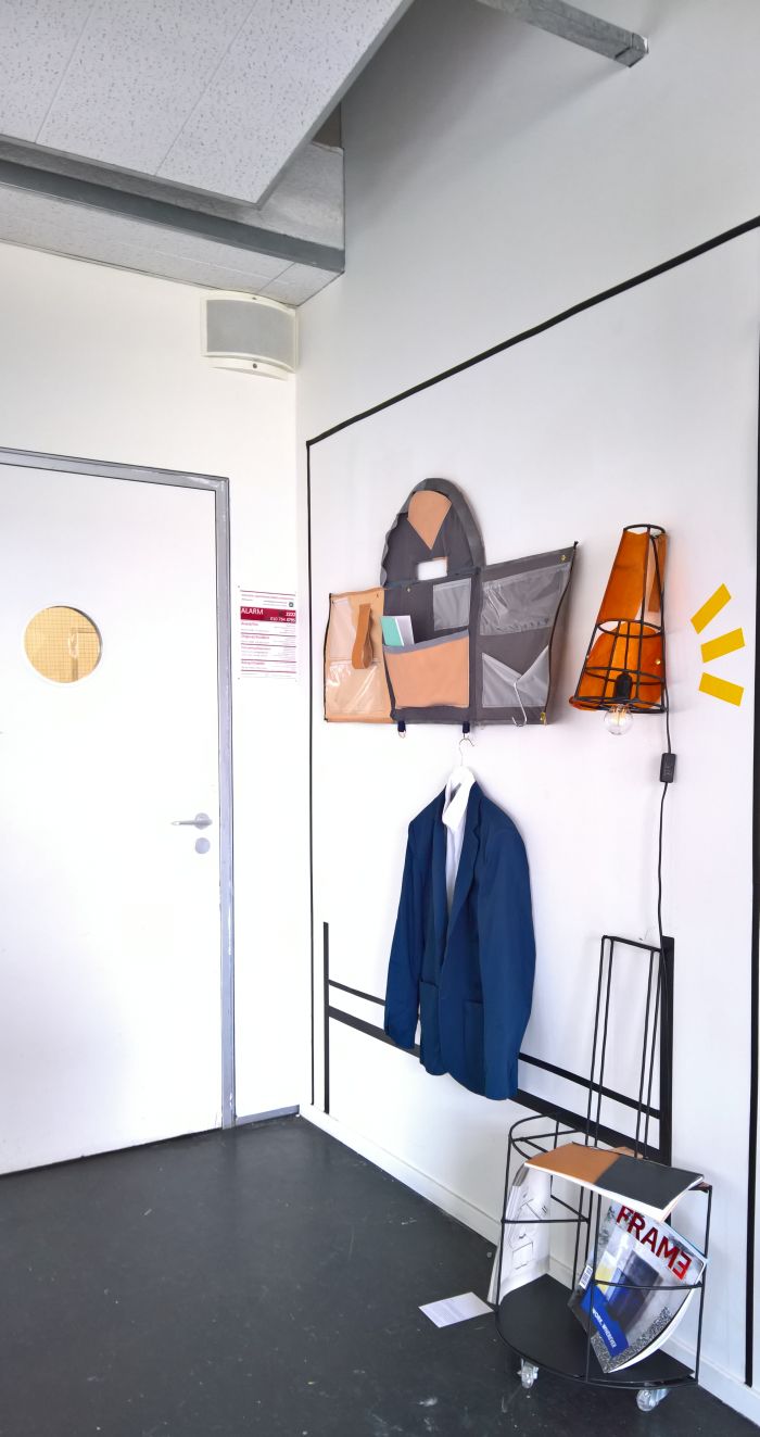
In the past we've seen, and been impressed by, a couple of projects based on the classic knotted-handkerchief-tied-to-a-stick luggage concept, De Mobile Itinerate by Francesco Mottola is a very interesting further development of that idea, tackling as it does that question of what you do once you get to your destination? A question that in context of the couple of possessions you can keep in a knotted handkerchief is quickly resolved, but in context of contemporary professional itinerants who may find themselves spending a day or two here, couple of days there, on a bit further and then home, and require numerous objects and articles, is a lot more complicated.
And, yes, we can identify with such a scenario. And, yes, know only too well that wherever you are there is never enough space to appropriately store, hang and generally organise your things.
Realised in context of Francesco's Master in Interior Architecture: Research + Design, De Mobile Itinerate approaches a more meaningful answer through making your luggage your storage. Logically. Offering three (four) proposals, a trolley, a tubular backpack, rectangular backpack (and a small bag containing a mirror), all of which can be taken apart at your destination to reveal a range of storage space, hanging space and pockets of various forms and sizes. And because you only have the things that were inside the luggage, the available space is small but optimal for your current needs. Is only intended as a transitory solution for a transitory moment.
As presented in Rotterdam the objects were hung on the wall with picture hooks, which (a) isn't stable and (b) isn't going to make you popular with hotel/hostel/apartment proprietors, and so the most pressing problem would appear to be, how to hang them without hammers and drills? Viewing them in Rotterdam a couple of possible solutions did arise, but they would need to be intelligently and carefully realised to be practical.
But as an idea, very interesting.
Much as the streams of data which flow from us all to California, and which will ultimately make life on earth unbearable, are invisible and so easy to ignore, so too is the carbon dioxide generated on our behalf every day. And which will ultimately make life on earth unbearable.
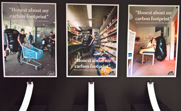
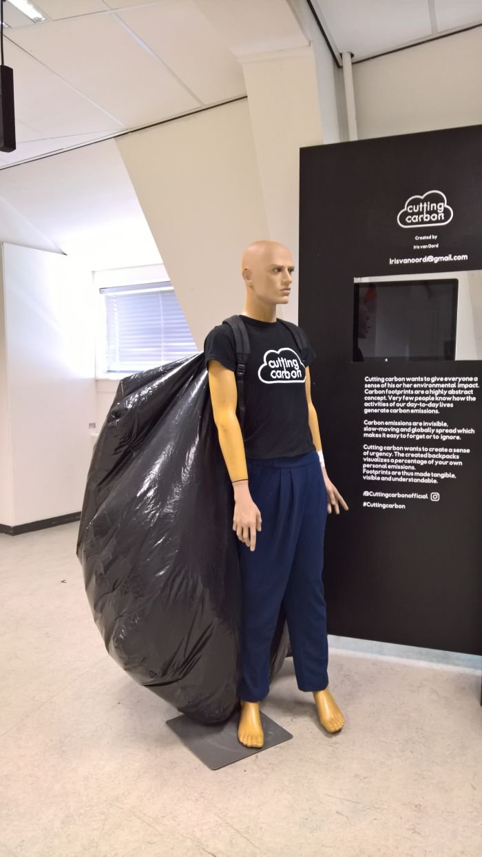
In context of her Illustration Bachelor project Iris van Oord sought to make our carbon footprints visible, by making them carbon rucksacks. Yes large inflatable shoes would have been funnier, but somehow the large inflatable on your back is more laconic and unequivocal, the metaphorical monkey on your back that you/we need to free yourself/ourselves from.
Unavoidable, in your face and satisfyingly abstract, seeing a group of individuals wearing such backpacks probably won't directly motivate anyone to actually actively reduce their carbon footprint, but could, should?, lead to an increased sensibilisation of the problem, awareness of the need for change and thereby a long term change in behaviours.
Or alternatively, such should be compulsory, for example, for those working on a trade fair stand, olympic athletes, tourists, etc, to underscore the carbon footprints associated with large events and global travel.
Admittedly unlikely to ever happen, but would mean that no one can claim they didn't know. Didn't see it coming.
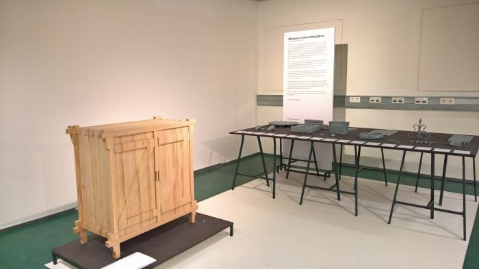
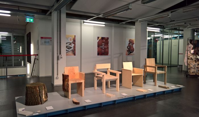
Taking as its impetus John Berger's TV series/book Ways of Seeing, a project which challenged accepted conventional understandings of viewing, for all art, but by extrapolation everything, and argued for a more differentiated understanding, Ways of Sawing both explained that a wooden chair is from a tree, and also that the more processed and refined an object becomes the further removed it becomes from its origins. Which is a fascinating thought in all manner of contexts, reminding us as it does about the absurdity of frozen ready meals, any mass produced object that claims to be authentic or indeed character traits of anyone climbing a career ladder. Or on a more basic level, the more you refine an idea the less it has to do with the original motivation, intention and hope.
Physically Tim presented 5 seats, starting from a tree trunk stump, free from any human intervention, save the act of chopping it down, moving over a chair crafted from parts of a stump cut and formed into a something resembling a conventional chair; a chair formed from standardised lengths of processed wood; a chair made from veneer covered construction board; and finally a chair featuring a cardboard core with an MDF exterior printed to resemble wood. And while for us the last chair was perhaps a little too gratuitous, we do understand the what, why and wherefore and do see its place in the extrapolation away from both a tree and the earliest wooden chairs.
No. We didn't know what skeuomorphism was either. Turns out is not only an actual thing, but one that is becoming, and arguably will become, ever more relevant and important.
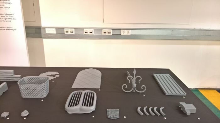
A skeuomorph is, essentially, a feature of an object that used to have function, a function which has become obsolete, but the feature is retained. Or as Hugo phrases it, "Items that are faking a function." Skeuomorphism is when designers incorporate such fake, obsolete elements into objects.
Among the objects presented by Hugo in Rotterdam were the small fifth pocket and rivets from a pair of jeans, a turnable knob for a kitchen hob and wall anchors, metal objects that used to hold a building's facade to its frame but are now strictly decorative.
While one could argue that any architect/designer claiming to be following a rational, functional, economic design position would automatically do away with such, as Hugo highlights there are arguments in favour of the skeuomorph, not least the cultural considerations.
Cultural considerations which, yes, can make good marketing. One of Levi's most famous adverts is for a skeuomorphic rivet, while they miss no opportunity to make a great fuss about the fifth pocket, the presence of both rivets and the fifth pocket, we're told, guaranteeing tradition, authenticity, quality.
However there are also a great many skeuomorphs whose cultural role help make the object/functionality clear and understandable.
Sometimes, such as with the turnable knob on the kitchen hob it comes down to gestures, turning a knob is an obvious and natural way to increase/decrease the temperature, and as we learned in the exhibition Gestures – Past, Present and Future at the Sächsische Industriemuseum Chemnitz, the most obvious gesture is the best for a functional application; and sometimes, and remaining in the kitchen, it comes down to pure familiarity, Peter Behrens first electric kettles for AEG mimicked stove top kettles, because that was what people knew and understood, and even today you can buy a kettle that maintains that same form of yore.
Considerations which are of course interesting/relevant in context of the design of our future objects.
Why a smart watch? Only a very, very small minority use them to check the time. Yet they resemble watches. Why? As does your fitness band. Why? Then there are our brave new autonomous cars. Much as everyone is in love with the sci-fi imagery, how much of the familiar will we want, both in terms of actual tangible features but also gestures, movements and feeling. The same questions apply in context of our future smart homes, service robots, wearables, etc, etc, etc
And not just in terms of products and services, amongst the objects presented were, theoretical, artificial pork ribs which pose the question if in a meat substitute future our "meat" must look like the meat we know? The exhibition Food Revolution 5.0. Design for Tomorrow’s Society presents numerous examples which suggest yes. And even today vegetarians can enjoy the meat-free sausage, burger, nugget or schnitzel. Why? Arguably because it's a form your aged aunt can understand and so can confidently buy you for your tea.
Or put another way. Evolution in terms of design tends to be slow, as we've noted before the steel tube desks designed by the inter-war functionalists maintained the same formal identifiers as the solid wooden ones they were meant to replace, and evolution in terms of design will remain slow, that while form may or may not follow function, it will continue to follow cultural acceptance. Thoughts which of course underscore that design is primarily a cultural practice. Skeuomorphism neatly confirming that.
Full details on the Willem de Kooning Academy can be found at www.wdka.nl and on the Piet Zwart Institute at www.pzwart.nl
