As Katie Melua informs us "There are nine million bicycles in Beijing. That's a fact. It's a thing we can't deny"
But why chose to highlight Beijing's nine million bicycles? Why not focus instead on a city such as Münster where there are a great many more bicycles than the paltry nine million Beijing has to offer? Maybe Katie wasn't convinced people would believe her, wouldn't be so willing to accept that that's a fact. It's a thing we can't deny.
Which all has nothing in the slightest to do with the Akademie für Gestaltung Münster Finale 2018 graduation exhibition.
It just occurred to us as we crossed the city on our way to the Akademie.
On they way back to the train station we were too preoccupied with newer thoughts generated by the students' graduation projects to worry about the streams of bicycles flowing through the streets or the post-industrial sculpture park into which Münster has been transformed by the ubiquitous bicycle parks/storage units.
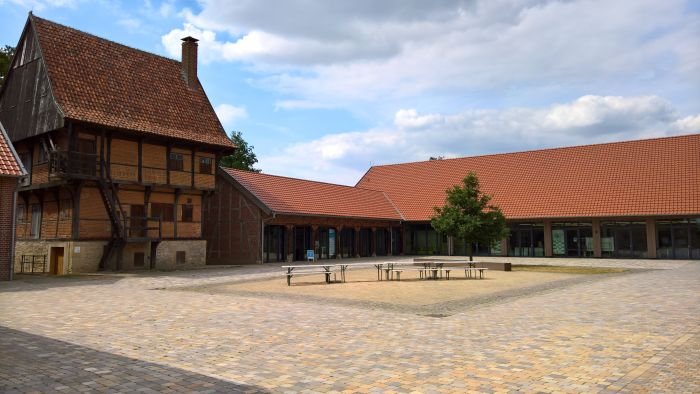
As noted in context of our 2017 #campustour, the Akademie für Gestaltung Münster was established in 1991 by the local Handwerkskammer – Chamber of Trades - essentially as a school where trades and crafts practitioners could be taught in a manner that reflected a higher degree of design thinking, design methodology, than is normally the case in a craft/trade education. For all further details we refer you dear reader to that 2017 post.
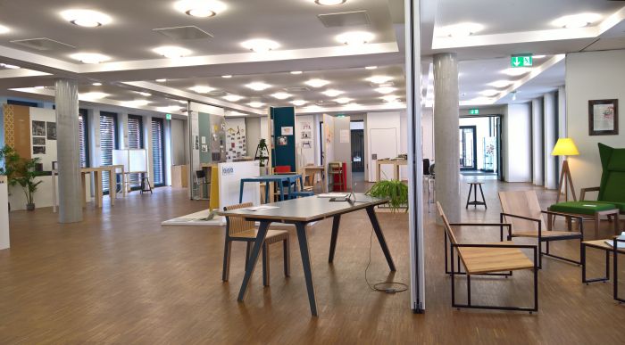
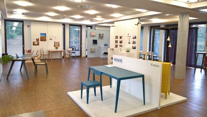
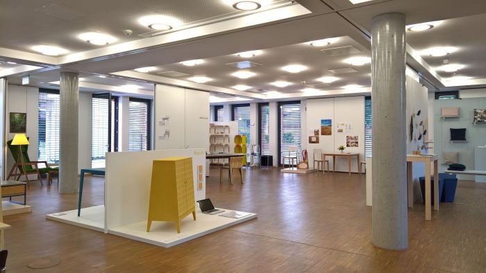
The 2018 Akademie für Gestaltung Münster Finale exhibition presented graduation projects from the past year and from across the school's various options for the form of the final project, including product design, interior design, exhibition design or establishing a company, an option which sees the students develop elements such as product portfolio, corporate identity and business plan. As a supervised graduation project. Which is an interesting take on business development support. And one of which we thoroughly approve.
As ever with graduation projects, and regardless of chosen format, important isn't the end result, but how the student got there: how the initial question was posed, the research undertaken and how the student subsequently moved from idea and fact to a solution, responded to challenges and brought the whole into a coherent package. And that, in all honesty, is all but impossible to assess from viewing the end result itself. Doesn't however stop a project catching your imagination and attaching itself to your stone heart like a limpet.
In no particular order.......
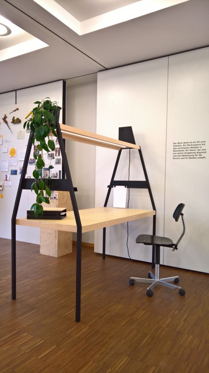
The search for methods by which to separate work areas, to create defined spaces within a larger, borderless space, has produced many delightful solutions over the years, largely based on physical boundaries. A logical solution. Yet as we've oft noted in theses pages, particularly in context of room dividers, division needn't be physical and definite, often an implication of division suffices. As with Work Desk by Julius Cober
Resembling a house, or perhaps more technically, a barn, Work Desk says, I'm closed, I'm distant, I'm not for you: while remaining stubbornly open, communicative and accessible. The tension between its (un)approachability is also reflected in the construction, you assume it is a solid, belts and braces construction; however, on closer inspection it reveals itself to be a filigree object, carefully, thoughtfully, reduced in terms of its construction to a minimum. Stable and durable. But with a minimum of fuss. And all the more delightful for it.
Aside from its visual charms Work Desk is also pleasingly functional: the metal side walls doubling as magnetic notice holders, the top and inner shelves providing for a variety of long and short term storage/display options, and the light strip in the overhead bar providing..... light. Whereby the addition of plugs and/or USB chargers in the overhead bar would appear to be almost too obvious an addition to suggest.
A robust and imposing object, we can well imagine Work Desk functioning as a long row of desks, doubling as an ad-hoc room divider, in an open plan office, or as an unambiguous work/life break in large home office environment, and regardless of actual use, is a most interesting proposition.
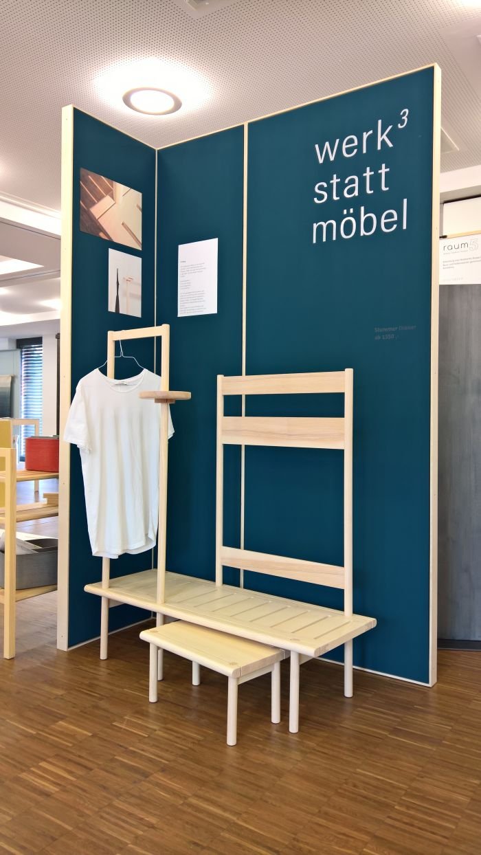
As one of several companies established by way of a graduation project, Christian Manuel Semrau, Thomas Fischer & Anton Frei united as furniture brand Werkstattmöbel.
The inaugural collection of wooden furniture as presented at Finale 2018 was, for us, occasionally, a little too obvious, presented itself, occasionally, with a, for us, language that spoke to a perceived market segment, one that numerous manufacturers have attempted to reach in recent years, and which is represented by that expression through solid, conspicuously, wide and ohhhh so natural, wood, as opposed to the filigree metal constructs so beloved of "scandinavian" labels. Which, yes, increases the chances of getting instagramed. And which, yes, in our mouths is a criticism.
However.
In aspects of the Stummer Diener Valet-Bench and also in the intelligently formed and well proportioned table trestle, one senses a studio capable of more, but who need the time and space to develop their language skills, to become a little braver in their designs, more self-confident in their considerations on typologies, but who certainly appear to be moving in interesting and promising directions. And lest we forget, they've only just graduated, only just begun to refine their design understanding. Cut them some slack, man!
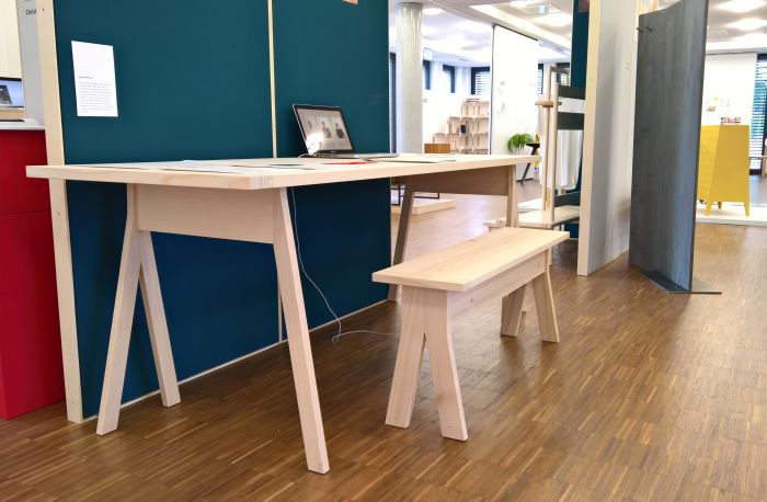
Although the visually light, robust, multi-layer plywood table is a well established genre, there is/was something very pleasing about Table 9 by Morten Hemsteg, not least the construction system which makes it essentially a trestle system with higher ambitions. And we all respect those who honestly and diligently strive to improve themselves.
And there isn't a great deal more to say. Presenting a neatly proportioned, well-considered form crafted from multi-layer poplar plywood, Table 9 doesn't do anything spectacular, but does it with such a flair, personality and self-confidence it is impossible not to be drawn to it.
And according to Morten it can be assembled by one person working alone, and we see no reason to doubt him, for, as we said, a large part of the joy of Table 9 is the construction system.
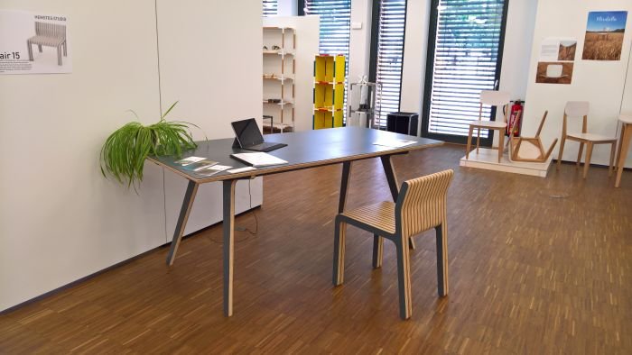
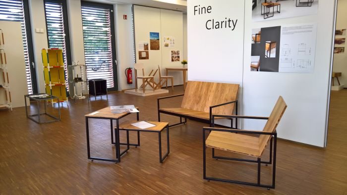
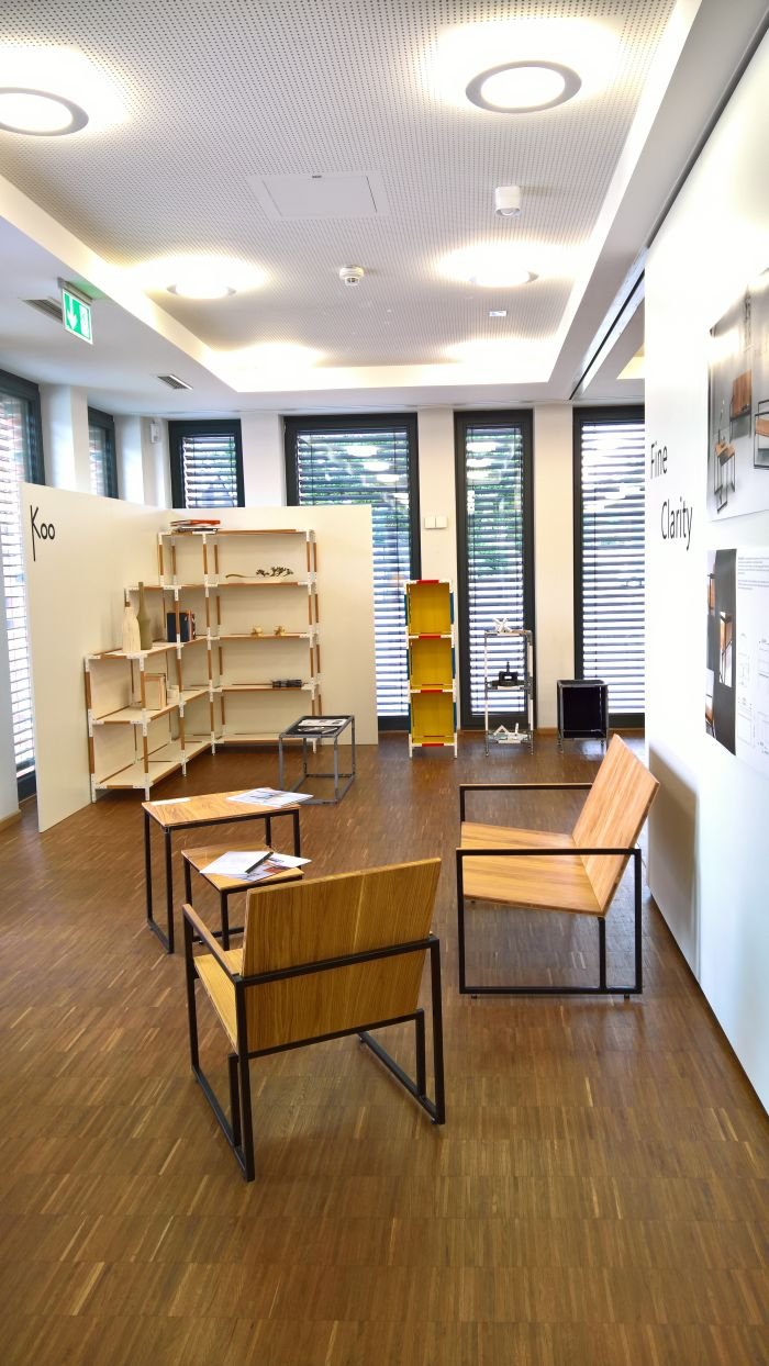
Fine Clarity is/was one of those objects which, although in principle fascinated us, we're going to need a little more time to fully digest.
For all on account of the lower metal bar at the back, a feature which irritated, not least because it looked like a necessary rather than an intended solution.
The lightly sprung backrest appeals a lot, an awful lot, requires however the stability of the lower bar, and that irritates. We understand the quadratic division achieved with the lower back bar, but it still says "I have to be here", rather than "I want to be here". Or is that just us? Is it a perhaps a logical and coherent component, and we simply can't see it? Possible. Wouldn't rule it out.
But on the whole the two seating objects as presented at Finale 2018 struck as being very interesting propositions, works which demonstrated a good understanding of material properties and also of scale and proportions, we couldn't sit in them and so can't comment on the comfort, but all things being equal that should be OK, and for all nicely functionally considered in terms of their intended use for short term sitting in lobbies, waiting rooms etc.
As we say, in principle fascinated, but we're going to need more time.
Further details on the Akademie für Gestaltung Münstercan be found at www.akademie-gestaltung.de
And all 2018 Akademie für Gestaltung Münster graduation projects can be found as a pdf (6 MB) at www.akademie-gestaltung.de/Finale_2018_pdf
