Tracing its history back to 1899 the Sir John Cass School of Art, Architecture and Design a.k.a The Cass has an established place in the (hi)story of English design, for all in woodcraft based design including toys, music instruments and furniture.
But as we all know a long history and illustrious alumni are poor hooks on which to hang the future of an institution, much more robust are the current staff, students and their work.
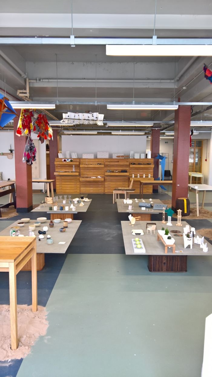
The 2018 Cass Summer Show allowed some insights into the contemporary Cass......
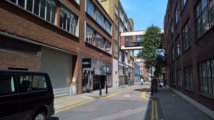
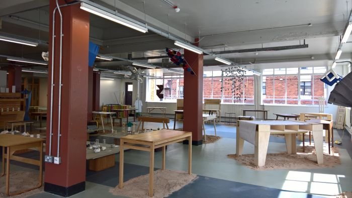
That we visited The Cass Summer Show 2017, we refer you to that post for the background to the institution and its studio based education system; important in context of the 2018 Summer Show is that it was staged in the school's new home, Calcutta House in Aldgate, and thus, still, in its native East London. Even if the move to North London appears inevitable. With all the possible consequences that will/could have for the workshop space which is so central to the institute's practical, studio, approach.
And that this year there was only one furniture and product design studio: Amalgam, under the guidance of Peter Marigold, Cathy Stack & Will Smith, and which challenged the students to experiment with a wide range of materials, processes and approaches, and thereby aim to produce not only works, but also a personal understanding of design, designing, design industry and designers, that is an amalgam. In the sense of mix, and not something with which to fill teeth and hasten the onset of Alzheimer.
Elsewhere, with the project Factories+ the Interior Architecture/Design Studio 3 explored how factories could be, beneficially, reintroduced to central London; with Action Stations, Interiors Studio 2 considered what makes a temporary home, home, for all in context of displaced individuals; while the Postgraduate Architecture Studio 10 undertook a cooperation with the Moscow School of Architecture (MARCH) involving considerations on the town of Tarusa, on Moscow's southern edge.
That our principle focus at the 2018 Cass Summer Show was the 3D showcases wasn't of our making; rather, when we visited the Summer Show the 2D presentation spaces were still firmly locked. A regular risk when visiting a student showcase, yet one which no matter how often it occurs annoys and infuriates as if it had happened for the first time.
However ultimately we don't care, we don't have to visit summer exhibitions, don't have to view student projects, choose to, and from what we did see the following projects in particular made us glad we do.
And yes they are all furniture. Wasn't planned. And we hope that elsewhere in these pages we have proved that furniture isn't our sole focus, just an ever recurring central theme. And one that over the past year Cass students have, apparently, approached not only with a high degree of technical finesse and understanding but also with the requisite free, untroubled, unrestrained thought processes....
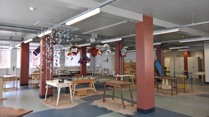
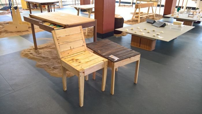
Jake Hawkins presented his Pallet Chair with two objects, which we initially thought were one and the same just in different states.
Fortunately we realised our error and that it was in fact two approaches to the same functionality, of which we have to say the one in the left of our photo, the lighter of the two, impressed us the most.
Without giving away the magic, that's hidden on the backrest, Pallet Chair can be transformed from a chair to a side table, and that via the most deliciously simple, logical and self-contained process.
In addition to the functionality, and the ease of that functionality, we were very taken with the scale of the object, the dimensions make sense and indicate its true character, let you know that something is afoot and closer inspection is needed.
But, no we're not particularity keen on the pallet optic, even if that is a key component of Jake's design; however smarten it up, refine the moveable joints and you have, we'd argue, a very nice universal, everyday object.
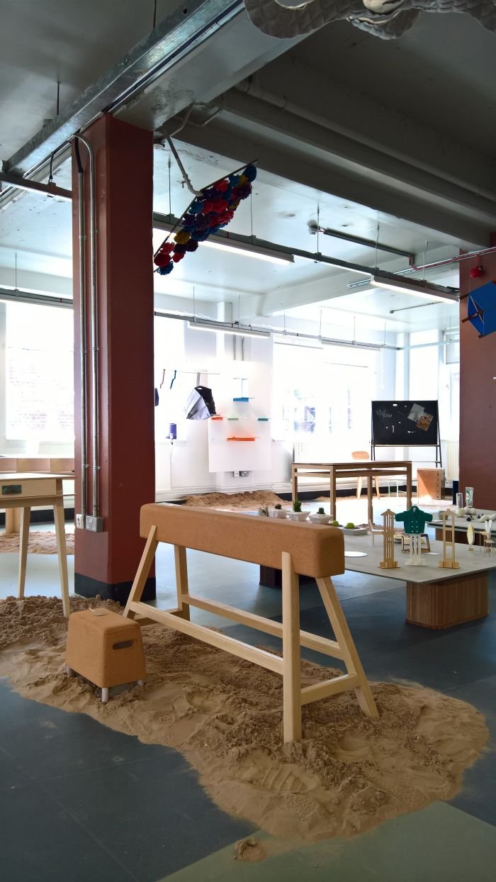
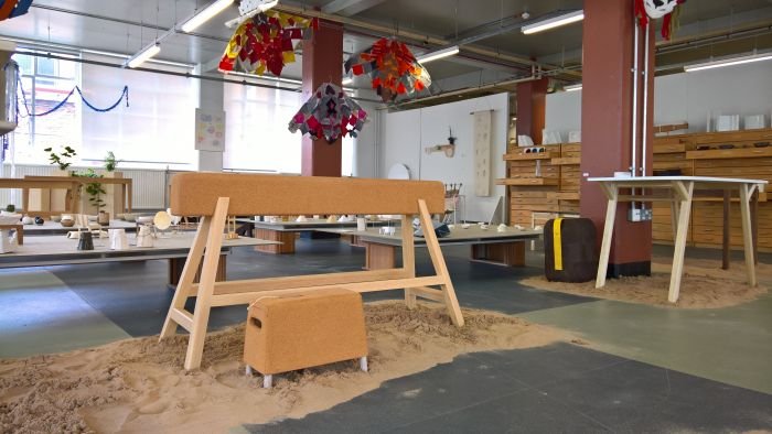
You won't believe how long we've spent since our visit to the Cass Summer Show looking for something similar to Perch by Adam Watts. Nor our relief at having found nothing.
As regular readers will be very aware there is little that brings us more joy than perching, and so there was a certain inevitability that we would be taken by Adam's cheeky misappropriation of a balance beam as a perch.
Wait........"misappropriation of a balance beam as a perch"?
Yes, and that's why we spent so long looking for another example. There must be one we assumed.
Assumptions however can be dangerous, certainly misleading. And time consuming.
We don't really feel the need to explain the logic and inherent beauty of the idea, a balance beam as a perch; should however comment on the very nicely proportioned and technically realised object that Adam presented. And the intelligent use of cork for the beam bar, with all its inherent tactile, acoustic and antibacterial properties.
As an object it is naturally suited to all manner of locations domestic, commercial, public or private; and when not in use for perching, four year olds can walk along it, spin round it, fall from it etc, etc, etc
The one criticism we would have is Adam's comparison of it to a pommel horse, we'd argue they're fatter and shorter. Perch is definitely modelled on a balance beam.
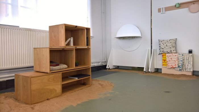
Officially we gave up on stackable wooden box storage systems some time ago; there were so many, every design week/fair bringing ever more, the ceaselessness with which we were faced with new systems making differentiating between them an impossibility. Thus, and as so often in situations of over supply, we just stopped caring.
Maybe because of the length of time that has passed since we walked away from the stackable wooden box storage system, or maybe on account of the restrained, reserved yet self-confident manner which it carries itself, Lift by Moe Redish re-focussed our attention on such systems.
In essence the stackable wooden box is the perfect basis for a storage system, important is the method by which the boxes stack and the manner in which the boxes are made functional.
With Lift Moe not only proposes a tool-free construction system with an inherent logical ease, but through the simple, efficient, unobtrusive trick of the drop down door allows for a nice degree of variety and versatility, which brings a certain dynamic to an otherwise static system.
As older readers will be aware we are keen advocates of the desk drawer, ideally drawers; with his Lazy Desk Barnaby Lewis has taken the concept a step further with the rotating, in-leg, A4 folder shelf.
It ridiculous. And exhilarating.
Although thoroughly, stubbornly, analogue there is something steampunk about it, we could well imagine that Barnaby was inspired by an archetype he found in a some anonymous Victorian professor's study.
And he may have been. Alternatively it may just be an exaggerated re-imaging of the Rolodex business card filing system. We don't know.
According to Barnaby the design is intended to "maximise storage space under the modern desk", at which point we feel inclined to argue that with the march of the paperless office, the A4 folder is likely to become an anachronism before all too long.
But until that day comes Lazy Desk is a delightful proposal. Even if it will annoy all those ergonomics experts who advise keeping files and folders out of reach to ensure more movement in the working day.
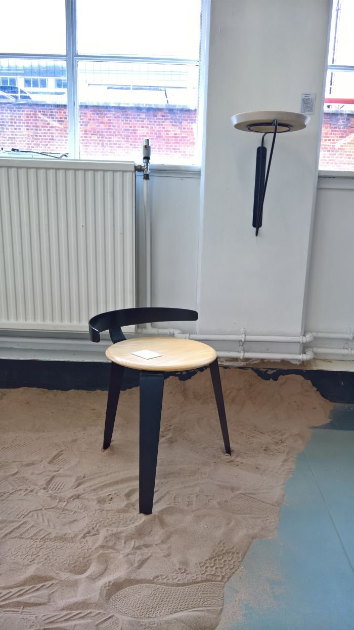
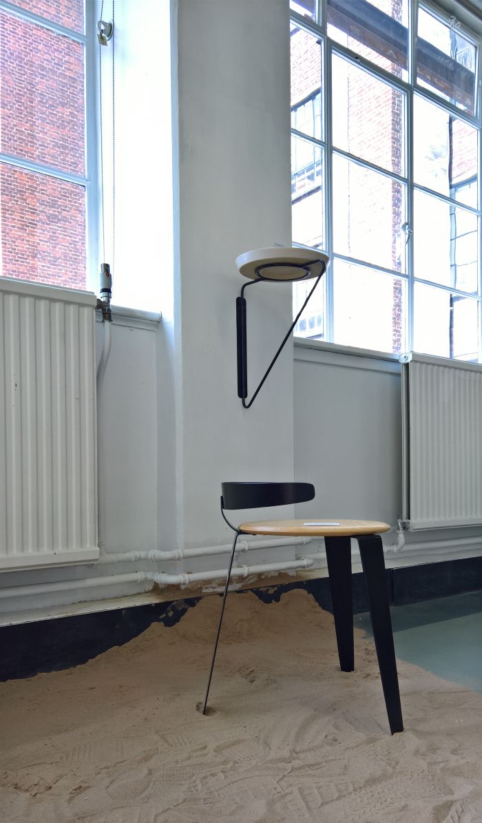
According to Fioralba the improbably titled s-T-ool is "a stool characterised by it's nonessential T-shaped backrest", now, and aside from the errant apostrophe, what we like about that description is the way she has made "nonessential" a synonym of "defining"
Even though we would argue that the presence of a backrest, regardless how nonessential/low/reduced, does make it a chair; ever since the backstools of the 16th century that's been the definition.
That aside, as an object there is something very satisfying about not only the proportions but the implication of a backrest and the assurance with which the metal arch encloses the seat, proportions, implication and assurance which both bequeath the work its character and also create a complete, natural composition: no backrest would make no sense, a higher backrest would spoil the harmony.
And so while the backrest is perhaps nonessential, it is certainly not dispensable, trivial or cosmetic.
Full details on The Cass London, and its numerous studios, can be found at www.londonmet.ac.uk/the-cass
