"Monsieur, with these Rocher you are really spoiling us!"
Ever since Ferrero brought a touch of self-congratulatory kitsch to the savoir-faire of international diplomacy, we've felt a great empathy for the concept of the Embassy.
And while the years since we first heard those words may not have seen us follow an illustrious, freely debonair, diplomatic career, we do have as a substitute the embassy design exhibition.
3daysofdesign Copenhagen 2018 offered such a wealth and variety of embassy exhibitions we simply couldn't resist donning a metaphorical morning coat and taking a flânerie through the diplomatic quarter.
But would that which awaited us also be an ultimate "sign of good taste"........?*
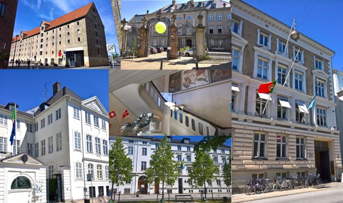
A mainstay of any design event the embassy design exhibition is traditionally a chance for the trade and export division of a national government to promote the domestic creative industries; can however be used as a platform to present emerging talents, thinking, materials or processes or, as for example in the case of the Danish Embassy Berlin's exhibition Much More Than One Good Chair. Design & Society in Denmark, be used as platform for deeper exploration and/or discussion and discourse.
At 3daysofdesign Copenhagen 2018 the embassies of Iceland, Sweden, Italy, Switzerland, Portugal, Spain and France hosted exhibitions. Which we visited. With the exception of France. Not for want of trying. But on account of a bottle of water. Here is not the time nor place to get bogged down in the trivialities, it suffices to say it was 27° in the shade, a cloudless azure sky hung over those enjoying the hospitality of Nyhavn, we had a long afternoon pounding the streets of the Danish capital ahead of us, when an unnecessarily curt security guard at the French Embassy gave us the choice of our water or French furniture.
And so off we went. Apologies to those French manufactures who presented at the embassy, but we're not prepared to risk our health to view your products. Nor do we feel it fair that we should be asked to.
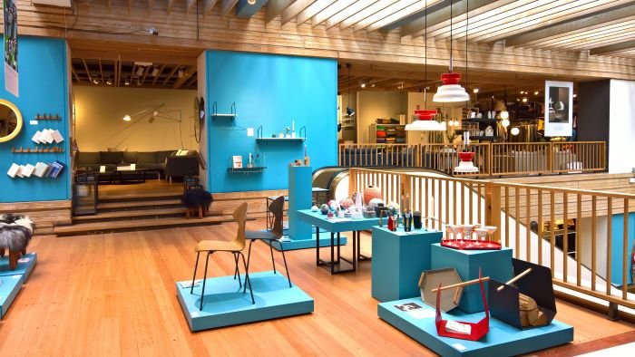
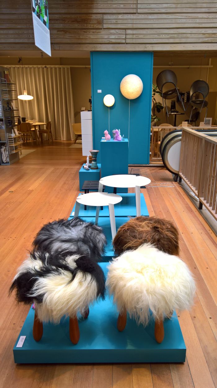
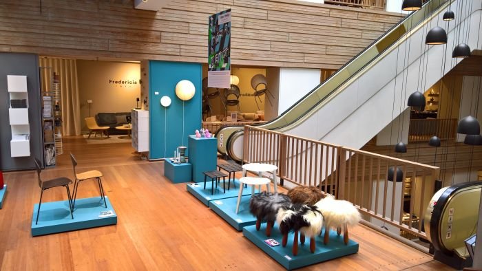
Presumably in the exuberance of the nation's centenary celebrations the Icelandic Embassy presented two exhibitions in context of 3daysofdesign 2018, one in the embassy foyer and the other in the reserved and understated luxuriance of Illums Bolighus furniture, lighting and accessory store in downtown Copenhagen. Presenting a selection of contemporary products from Icelandic designers and craftsfolk, the presentation did sail a little too close to being a purely commercial one, we however are happy to include it here because it did have that randomness, transience, non-coherence, of an embassy exhibition, and which meant there was an obvious distance between it and the sales presentations of Scandinavian manufacturers which surrounded it.
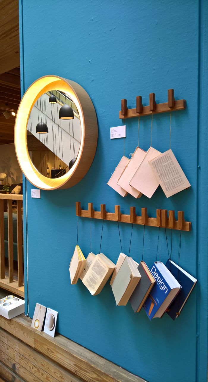
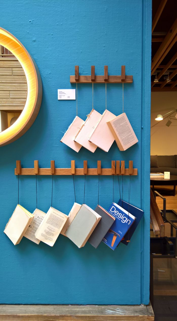
And because of Book Rack by Ágústa Magnúsdóttir and Gústav Jóhannsson a.k.a Reykjavik based studio/manufacturer Agustav. Because if we don't get to tell anyone about it soon we will explode from excitement.
The first thing that struck us about Book Rack, and that from the escalator as we approached the second floor, was its inherent logic. Systems for hanging newspapers and magazines have been around decades, if not centuries, and are, for example, as synonymous with 19th century Viennese cafes as bentwood chairs and penurious authors. But by convention books go on shelves. Or on the floor. But why not hang them? On the one hand, should you have several books in use at once, hanging helps keep them out of the way yet immediately available, be that next to a favourite reading chair, the bed, (home) office desk, or in the kitchen: your top 4 goto cookbooks hanging conveniently in a corner. Lovely. And on the other, it adds a very pleasing visual addition to a space, creates an atmosphere alternative to that generated by a photo, painting, shelf, while on a practical level helping maintain order.
Equally satisfying is the stupidly simple system on which it is based, effortlessness of use, understated aesthetic charm and quality of the craftsmanship. Even without books it has a certain harmony and symmetry, it is very well balanced object. And very logical. So much so it wouldn't surprise us if something similar weren't mentioned in a Saga somewhere.
That Agustav were new to us we subsequently did a bit of research on the studio, and found in their Nightstand an object that is, arguably, even more satisfying, including as it does a small vertical element for hanging things on/over and a little shelf for placing things on. We've not seen it in the flesh, but judging from the photos we really need to.
We're not pretending we've discovered Book Rack nor Agustav, we haven't, both have featured in major newspapers and magazines, and parallel to 3daysofdesign they were exhibiting at ICFF New York, one of America's leading domestic furnishing trade fairs. But until 3daysofdesign, they weren't on our radar. Are now.
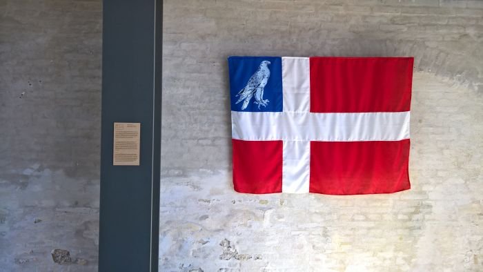
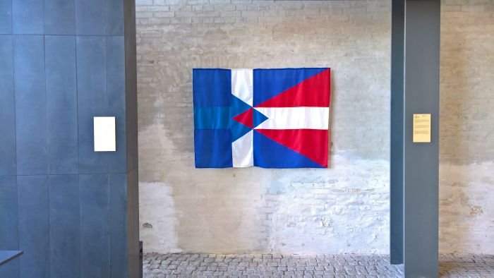
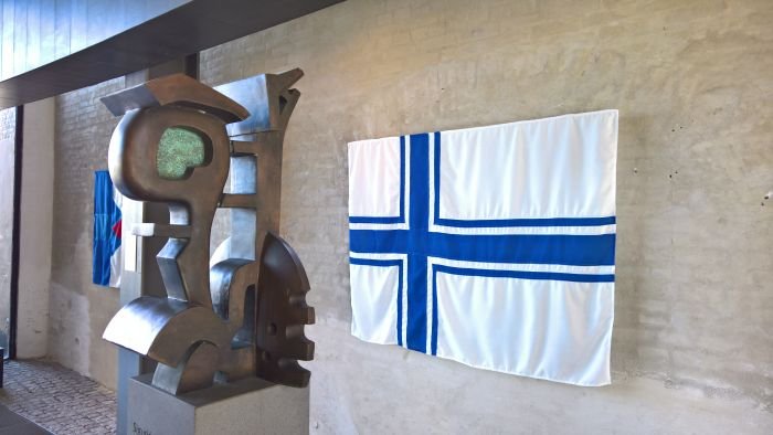
While contemporary Icelandic designers were showcased at Illums Bolighus the Icelandic Embassy itself used 3daysofdesign to host a presentation devoted to the nation's flag, or perhaps more accurately put, devoted to the public competition that was organised in 1914 seeking "a flag for a new nation". Presenting three unsuccessful designs from the 46 submitted - one from the then Danish, and future Danish & Icelandic, monarch King Christian X; one from the then art student and future leading Icelandic artist Johannes Kjarval; and the "Plan B" developed in case Christian X rejected the preferred choice - the highlight for us was however the small booklet produced by Hörður Lárusson featuring 28 of the submitted designs. And a work that indicates that those Icelanders heading off to Russia for the 2018 football world cup could have brought whole new colour combinations to the stadia of Moscow, Volgograd and Rostov am Don rather than the blue, white and red they will bring. And in which context, standing there in the Icelandic Embassy, we couldn't help thinking that what Europe really, but really, needs this summer is surely, but surely, a long collective Húh!
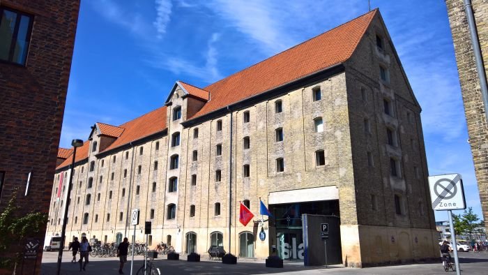
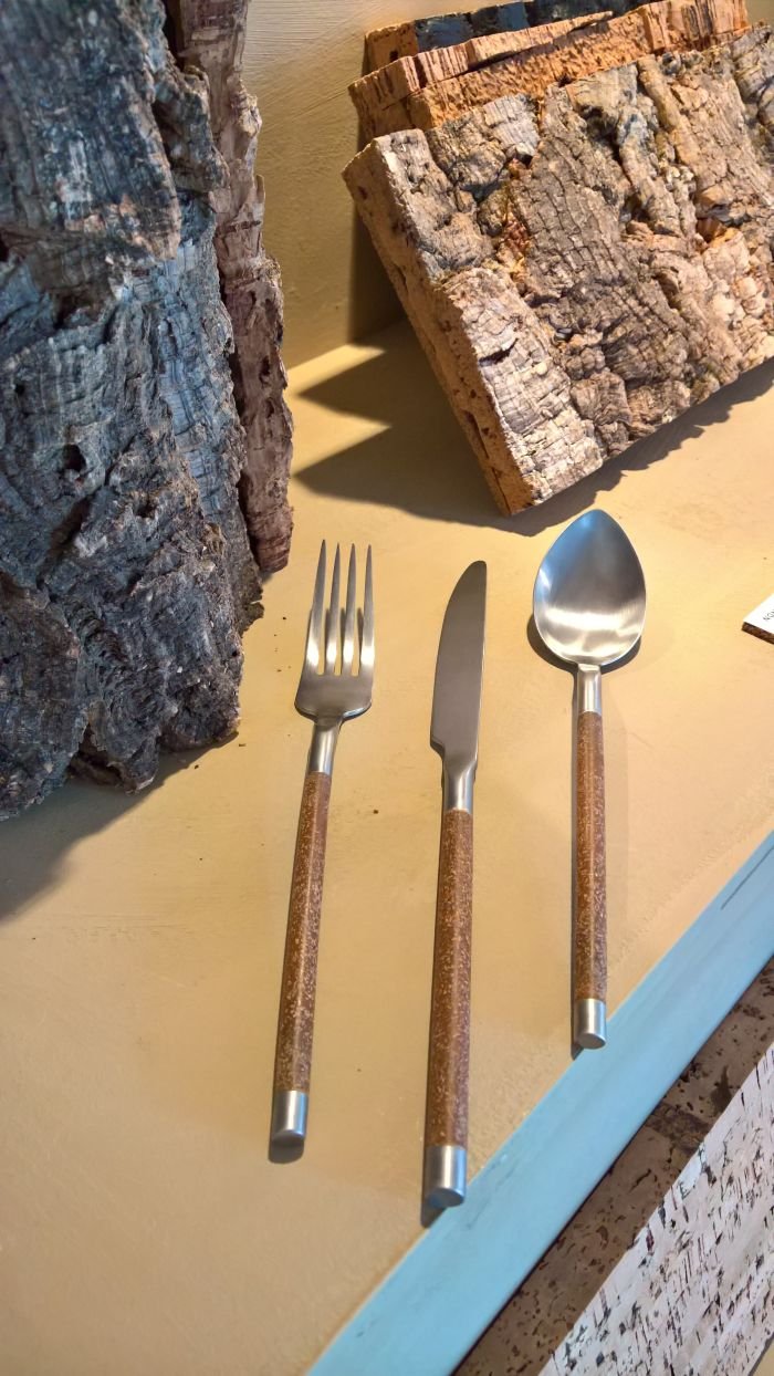
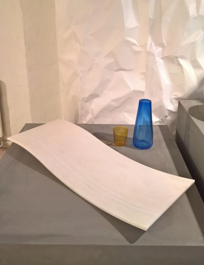
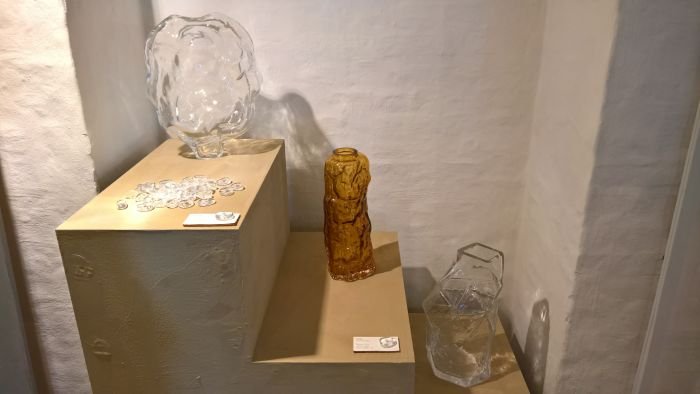
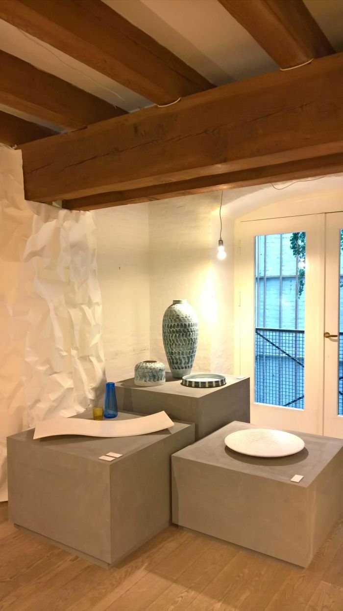
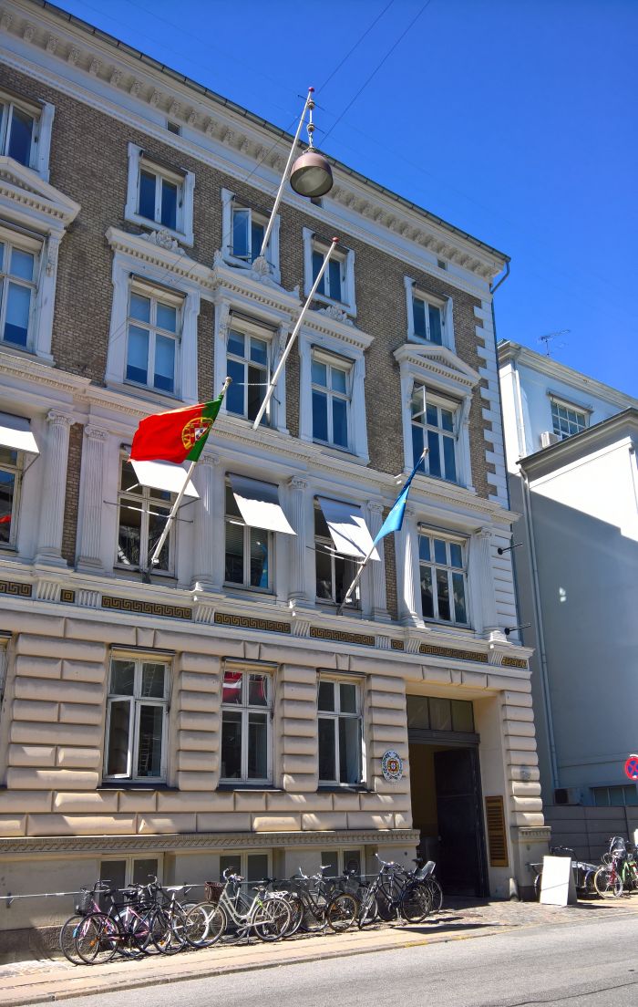
Under the title Changing Matters the Portuguese Embassy used their 3daysofdesign showcase to present a focus on the nation's wealth of natural materials and the possibilities therein for designers and manufacturers. Domestic and international. Amongst numerous examples of contemporary Portuguese glass, marble, cork, wood and textile processing and design, the highlight for us was the cutlery collection NOHC by Mário Marques for Portuguese manufacturer Herdmar.
And not just because it employed cork, but that did add to our enjoyment.
In these pages we've long argued that finding new uses for cork could/should be a fruitful vein for Portuguese designers and manufacturers, being as it is a renewable resource which is plentiful, has served the nation well until now, and which could/should continue to do so. NOHC is a nice example of that, combining as it does stainless steel with "injected cork" - a composite of cork granules mixed with binder, and a material often used as a form of grout on cork flooring. And a material which not only offers new fields of use for cork, but which, one presumes, can also be created from waste cork, thus allowing it to help existing cork based industries to operate more sustainably.
Not only featuring an interesting use of a material in new context, the objects of the NOHC collection also present themselves with an accessible form, are thin but nicely balanced, and also possess a welcomingly informal aura and haptic. Or put another way, they feel good in the hand.
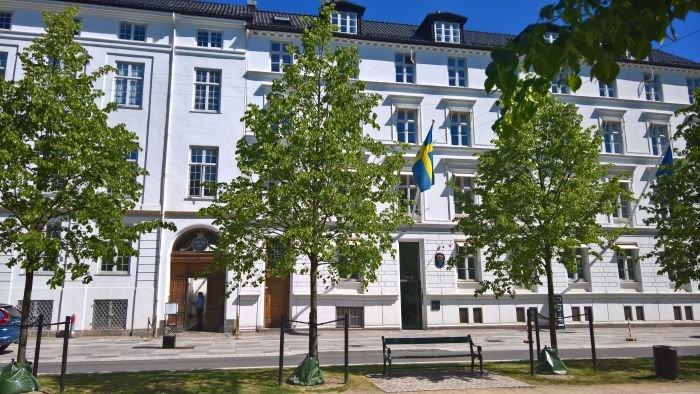
Reflecting the three crowns of its national emblem the Swedish Embassy presented three showcases in the rooms of the Ambassador's residence, three showcases with a southern Swedish focus: upstairs the new sustainable souvenir collection realised by the platform SPOK in conjunction with manufacturers based in the province of Skåne, alongside furniture and beds from Malmö based manufacturer DUX; downstairs "What's Your DNA?", a showcase of designers from southern Sweden: not southern Swedish designers, but a mix of Swedish and non-Swedish designers based in southern Sweden and working across a range of creative genres including fashion, jewellery, product and bell design.
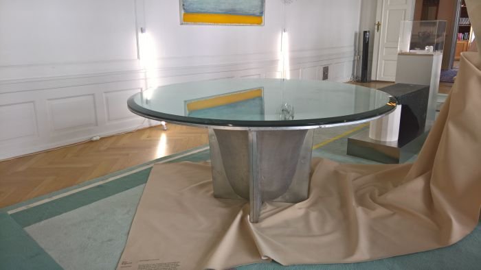
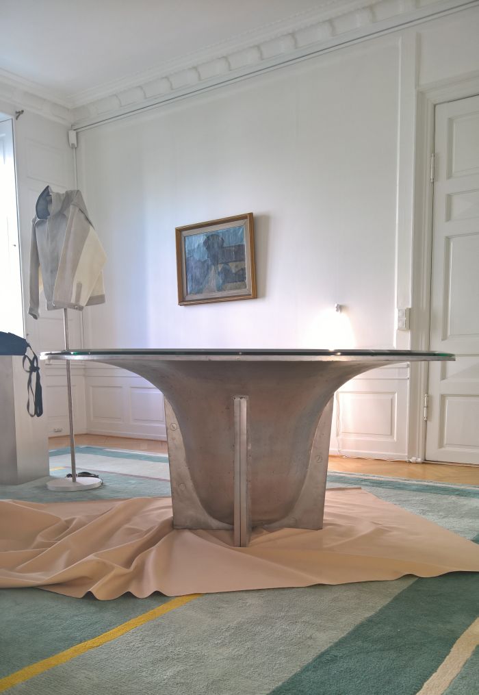
OK the last one is not technically correct; however, for his Orotundo table Sydney born, Malmö based designer Glen Baghurst cooperated with Ystad based bell foundry M&E Ohlssons Klockgjuteri to create the church bell base. Or perhaps better put the church bell mould base, the flanges providing the necessary stability without in any way distracting from the integrity of the form. Inspired by the large aluminium objects in Otto Wagner's Postsparkasse in Vienna, Orotundo is a monumental yet essentially non-existent work whose visual lightness neatly contradicts its physical presence. Topped with a glass plate there is, unsurprisingly, a large well in the middle. It's a bell. Although large enough to comfortably house a wombat or enable you plant a decently sized tree, for us keeping it empty is the only solution, anything else would spoil the delicate balance, the tension between the robust and the fragile, on which the work depends.
And quite aside from the object Orotundo is another very nice example of how those industries that aren't as much in need as they once were, can remain relevant, economic and productive, it just takes a little bit of uninhibited design thinking.
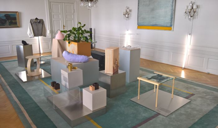
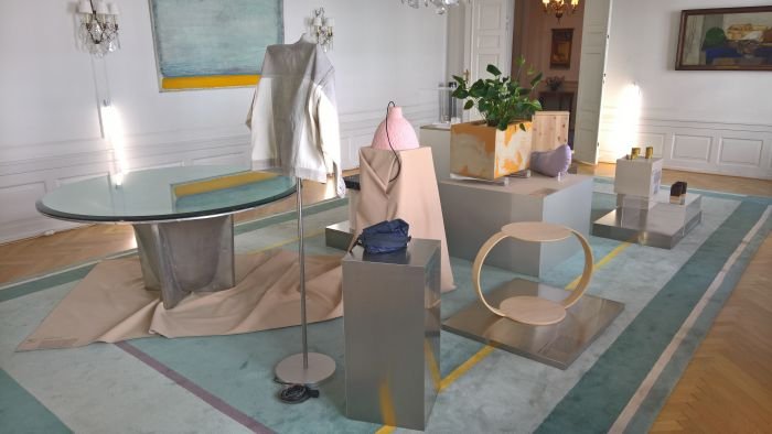
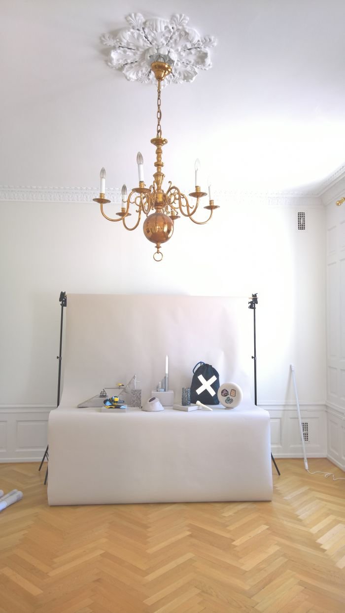
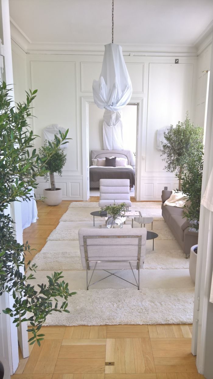
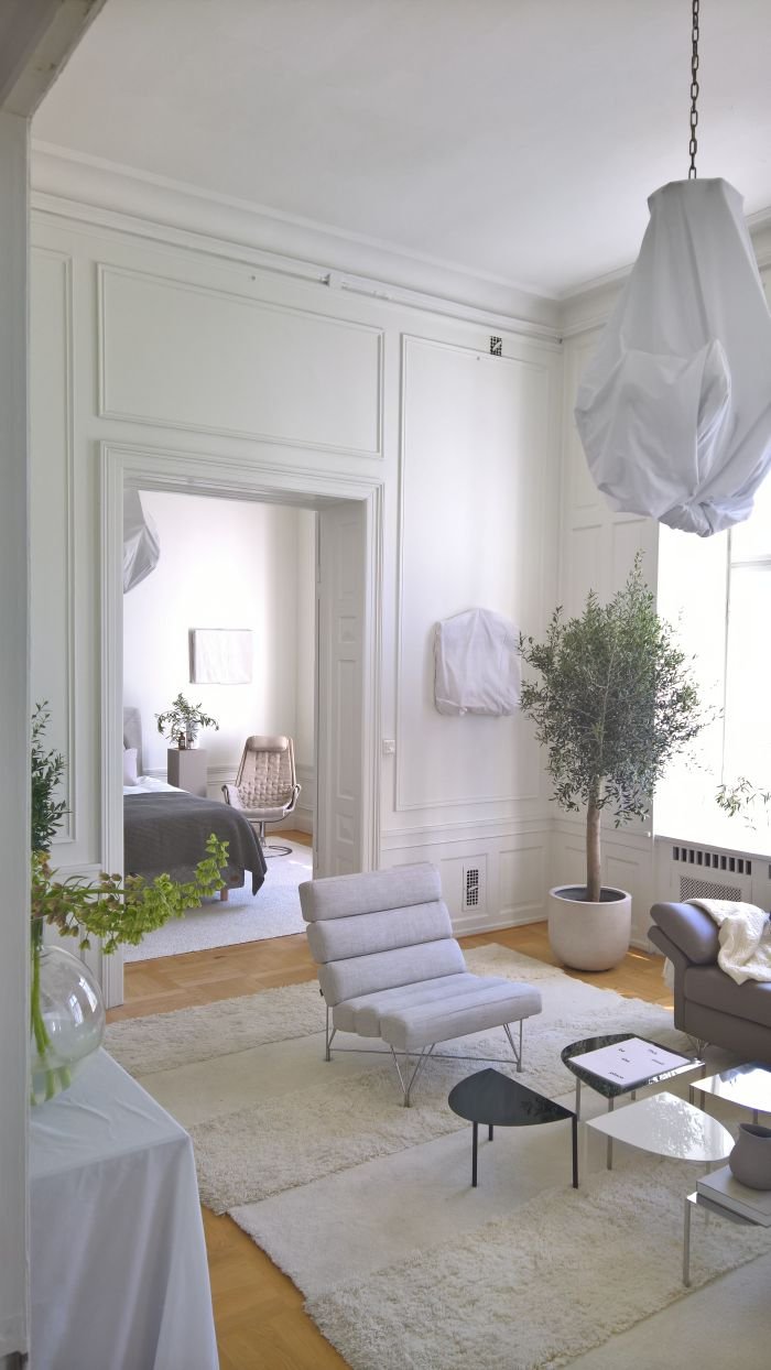
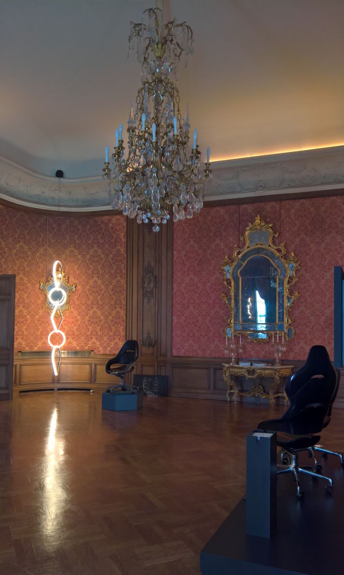
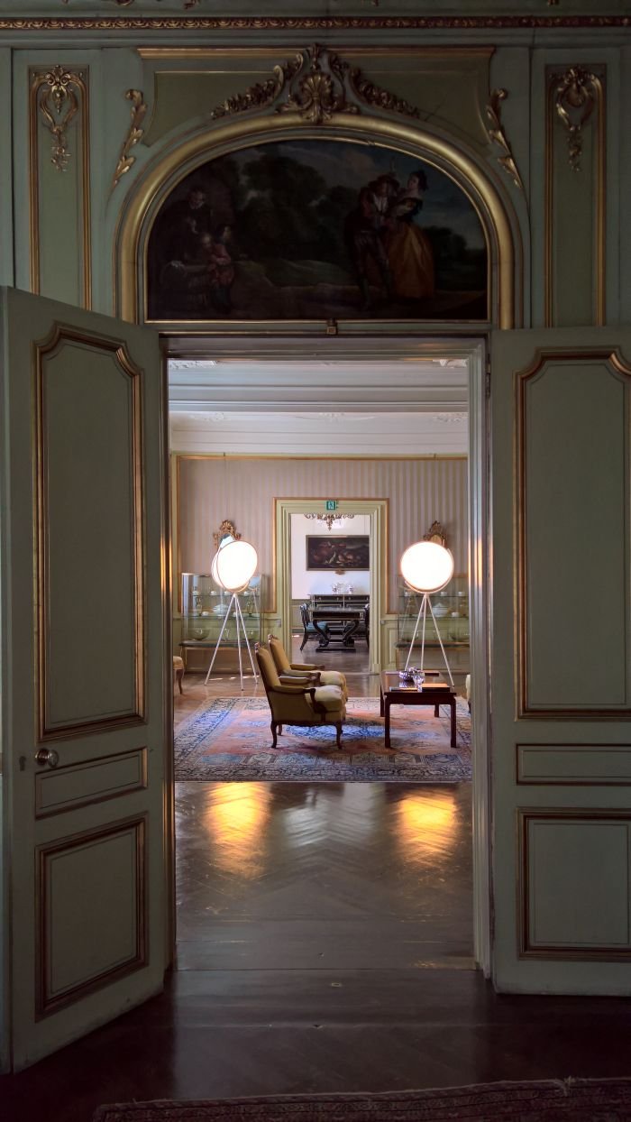
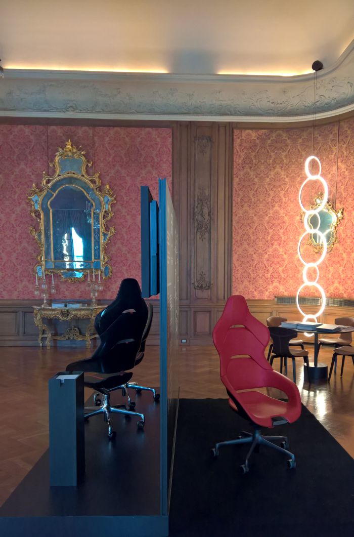
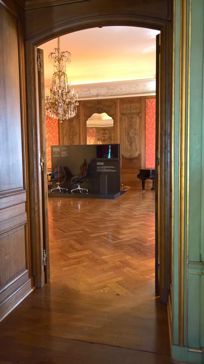
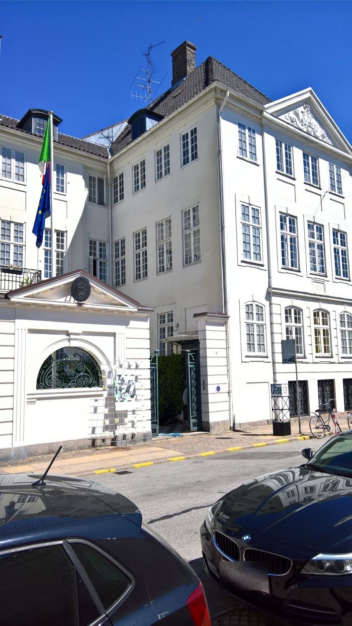
With a presentation concept whose clarity and reduction stood elegantly juxtaposed to the Georgian opulence of the rooms in the Ambassadors residence, the focus of the Italian Embassy's 3daysofdesign showcase was the new Cockpit chair from Poltrona Frau in conjunction with Ferrari, and the Arrangements modular lighting system by Michael Anastassiades for Flos. From the two projects the chair appealing to us the least. For us it is just a touch too obvious, too technical, too quadratic, had too many of those hard edges so beloved of automotive design students and was trying too hard to look as if it had just been removed from an actual Ferrari; but surely if you're cooperating with Ferrari then evoke the spirit of the car, the emotion and tradition, and thereby imbue the object with that spirit, emotion and tradition rather than the faint perfume of testosterone and diesel.
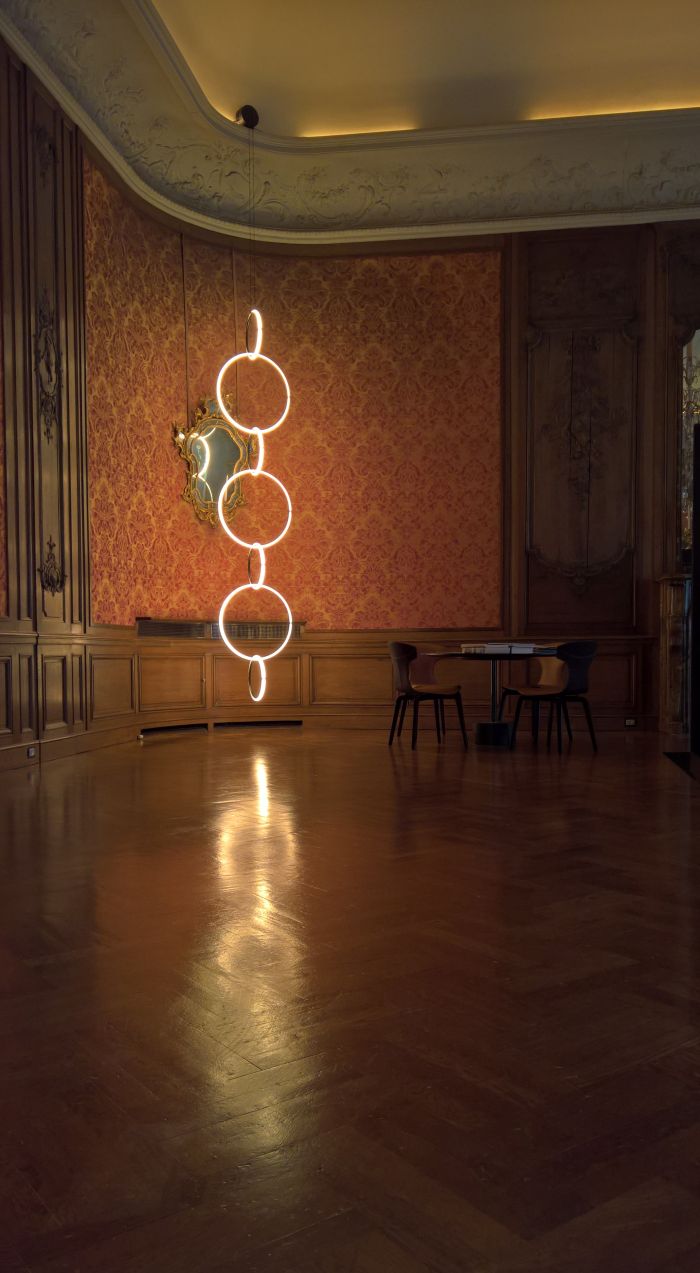
Much more satisfying was Arrangements. First presented at Euroluce 2017 and officially launched at Milan 2018, where we were far too distracted by Flos's parallel launch of the infinitely smaller Ventosa by Achille & Pier Giacomo Castiglioni, and didn't get round to viewing Arrangements. Thankfully Copenhagen afforded a second opportunity. Comprising a range of elementary geometric shapes which can be linked as required the true beauty of Arrangements is its simplicity, a simplicity which underscores the monumentality it can achieve. Arguably must achieve in order reveal its true potential. One gets the feeling one or two components wouldn't work, its needs to be long chain. And while a space as decorative as the Italian Ambassador's residence isn't necessary, it is very much an object that needs to exist in a space larger than the average home.
Staged not in the Spanish Embassy but in the so-called Odd Fellow Mansion the Spanish showcase was the embassy exhibition at 3daysofdesign that came closest to being a trade fair, when albeit more relaxed. As one would wish from an embassy exhibition.
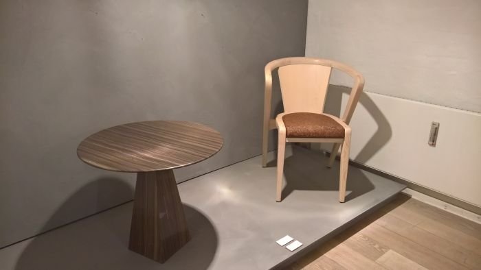
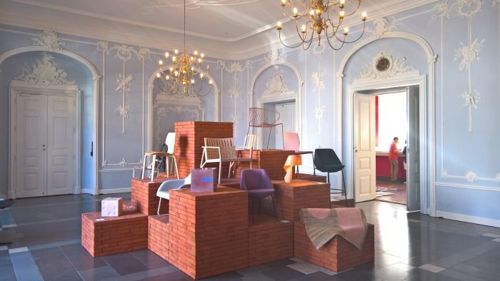
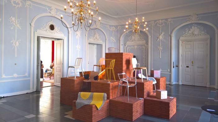
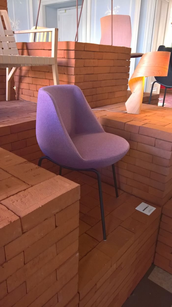
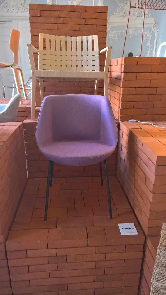
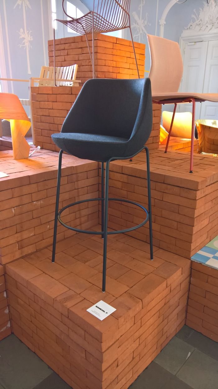
Featuring nine Spanish furniture, lighting, carpet and tile design companies each of whom was given their own space to present their latest projects, in addition, and by way of an introduction to what would come, a large brick podium was erected in the foyer featuring selected products. From which the Magnum chair by Valencia based designer Jose Manuel Ferrero a.k.a Estudihac for Sancal struck as as being anything but just another brick in the wall.
Available with a range of bases, from the three on display in Copenhagen the most pleasing for us was the simple four-legged version, the others lacking somehow in coherence, a coherence and logic the four-legged version effortlessly displayed. However judging from photos we've since seen there are a couple of other bases that look like they may be worth exploring.
Essentially a bucket chair, the joy of Magnum is that it is only half a bucket chair, and thereby reduction not only in terms of real and visual volume but also material. Presenting a very classic line, Magnum is a relatively formal seat, its dimensions and form supporting you very nicely but not allowing for any slouching, and thereby a chair for the dinning table, a visitors chair in an office, a lobby chair or a bedroom.
In the development of the design José Manuel Ferrero was inspired by the cognac glass, if we're honest, we didn't get that, for us there was something much more floral going on, we were getting much more the sense of a tulip, thistle or an allium flower head with a bit shaved off. Although admittedly we have spent quite a lot of time of late in the florid universe of Jugendstil and arguably that has influenced us to a degree that all we see are figurative floral emblems
Magnum was launched in 2017, which means we missed it a couple of trade fairs, and thereby as a product it also neatly underscores what we always say in reference to our High 5's, namely they aren't based on having seen everything at a fair, we do miss things, but we never stop looking.
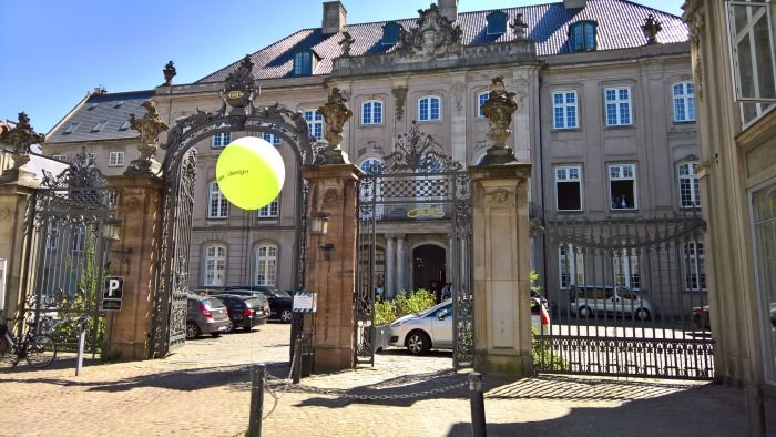
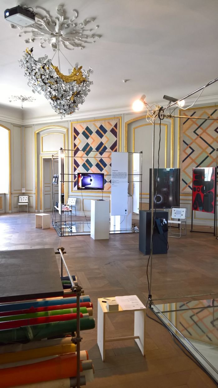
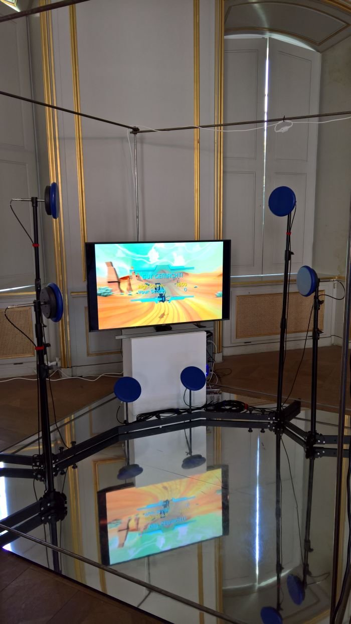
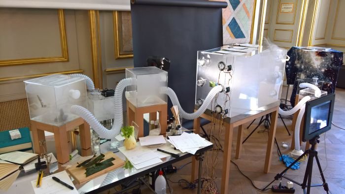
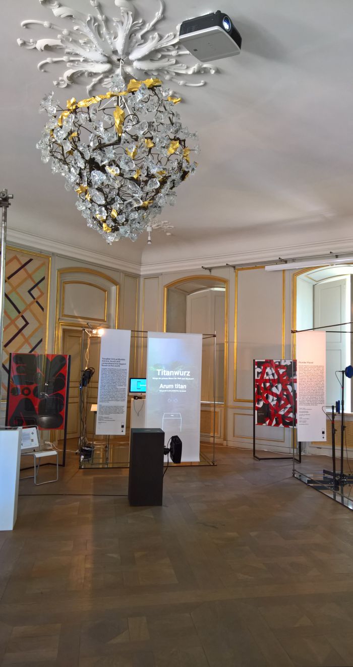
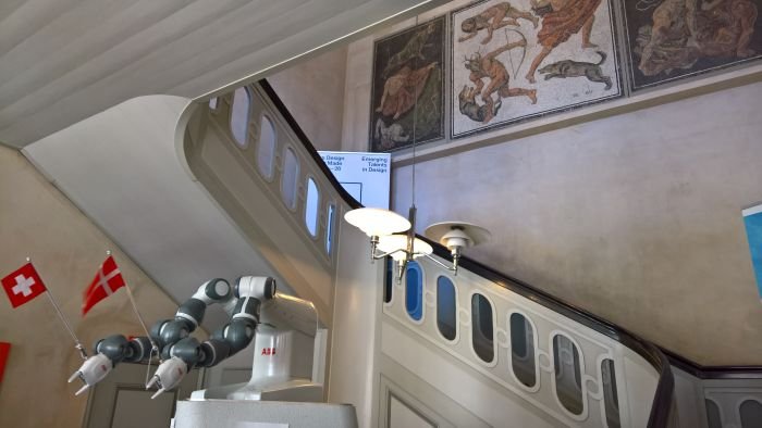
Foregoing the opportunity to present established Swiss brands the Swiss Embassy used their residency at the Designmuseum Danmark to promote student research, specifically projects by students and researchers from the design department at the ZHDK Zurich. Presented under the title Zurich Made by far the most numerous genre on show was computer games, and from which the highlight for us was the exergame Plunder Planet, a game which not only allows for movement during the playing process but also through monitoring the player's heart rate and performance continually adjusts the difficulty and complexity thus, ideally, optimising the benefits of the process. Not least one imagines through keeping the player's interest high in those moments when physical and/or mental energy are waning or frustration at lack of success begins to creep up on you. The project team note that Plunder Planet adapts to meet the player's "physical and emotional states", which got us thinking about the Workout Computer by Studio Bless, essentially a series of punchbags, each one being a letter and which allows you to type while boxing: if that could also track your "physical and emotional states" it could help avoid many a breakdown here in the smow blog office as deadlines approach....
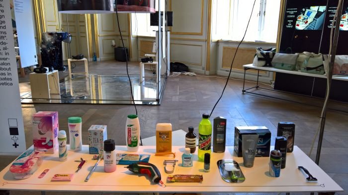
Away from games our attention was particularly caught by the project Gender Salon which explores gender coding in design, so those products which although essentially gender neutral are so created so as to signal a specific gender affinity; and Take Action! which presented the results of a series of symposia exploring how design education can be better structured to better help design students better help future society. And thus a project which promises to enrich our forthcoming 2018 #campustour. Watch this space....
* In the interests of fairness, while also providing a glimpse behind the scenes here at smow blog, the introductory paragraph was drafted on the way to Copenhagen, so before we'd seen anything. As it transpired the Italian Embassy did indeed have a fulsome assortment of Ferrero products, including Rocher, freely and generously available for all visitors. We partook. Freely and generously. They were most welcome. And we did feel very spoiled. Grazie mille!