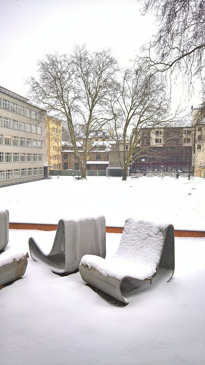
Following three years of renovations and redesign the principle house of the Museum für Gestaltung Zürich is once again open for visitors.
Three years which have not only seen the physical structure renovated and redesigned, but also the presentation concept and foci.
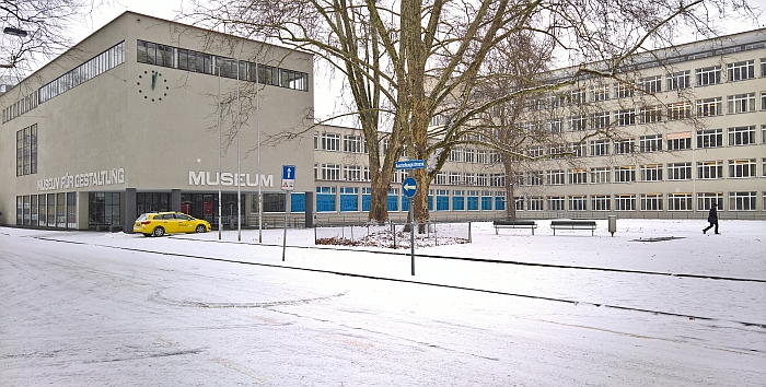
Established in 1875 as an applied arts and crafts museum, the contemporary Museum für Gestaltung initially served, and as with so many of the early applied arts and crafts museums, as a material and product specimen collection for local industries and trades, a place where they could come and experience the new and/or the unfamiliar and thereby gain information, ideas and impetus. Moving on the general flow that brought arts, crafts and industry to Jugendstil and then on, ever forwards, towards modernism, the museum began with the focused collection of works from across creative genres in the early 20th century, and today boasts a collection of over 500,000 objects, thereby making the Museum für Gestaltung Zürich one of the most important design museums in Switzerland.
In 1933 the museum, together with the three years younger School of Applied Arts, the contemporary ZHdk, moved from their then home in the Swiss National Museum into a new complex designed by the Zürich based architects Adolf Steger and Karl Egender; a building very much in the prevailing modernist/structuralist ideas of the period. And a building which like so many of its contemporaries suffered at the hands of later generations who couldn't or wouldn't follow the original architectural vision. Among the changes endured by Steger & Egender's work was the hanging of a interim ceiling over the central exhibition hall, creating two one storey spaces from the original one two storey space, and thereby realising in the words of museum director Christian Brändle, the ugliest exhibition space in Europe.
Yet it was exactly this unloved interim ceiling which necessitated the renovations, and thus enabled a new presentation of the museum's collection: and not because it was unattractive, but because the local fire regulation authorities said it had to go.
Searching for a new, appropriate presentation concept for their re-won and re-imagined interior, the museum decided to tell four stories. We'd argue that technically it is five, but we'll get to that, and regardless of how many the first two stories can be considered those told in the Museum's new permanent collection exhibition.
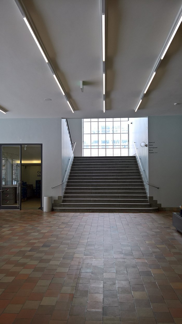
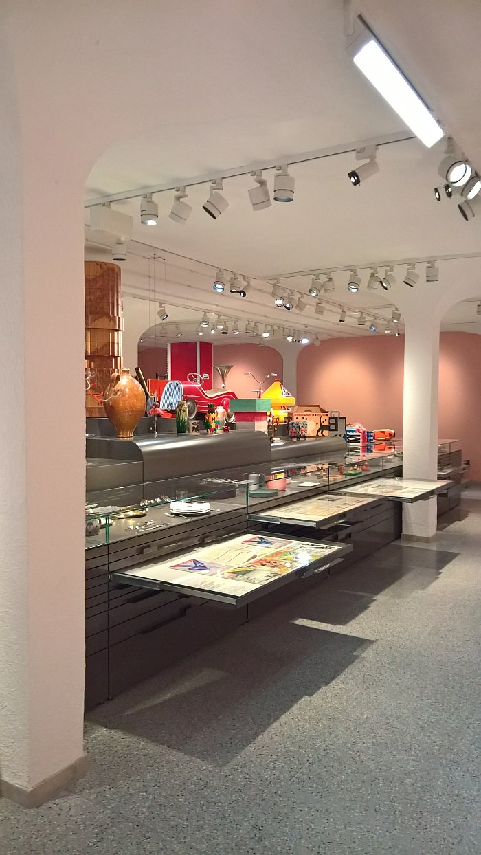
Sited, appropriately, if also most amusingly, in former storerooms, the new permanent collection exhibition is divided into two sections: Collection Highlights, which presents the full scope of the museum's collection(s) across applied arts, crafts, fashion, graphics and design; and Ideales Wohnen - Ideal Living - with its focus very much on furniture.
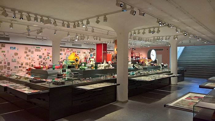
Presenting some two thousand items, Collection Highlights is arguably barely that, does however provide for a very accessible and illustrative overview of the museum's collection: and thus by extrapolation of how the museum understands itself, its function and of course the past century and a half of both Swiss and international creativity.
Two thousand objects sounds like a lot, is a lot, and when spread across such an expansive range of genres in an inversely enclosed space, could quickly become deeply, deeply banal. The exhibition design concept intelligently avoids such: yes, at first sight the central presentation podium does have the flair and charm of an overly ambitiously stocked curiosity shop, but once the eye adjusts and starts to focus it all becomes much clearer, while the use of drawers to house much of the display means that you are free to decide what you want to view. Which, yes, means a bit of work on the visitors part, but we'd like to think you are at the museum to learn, and thus happy to apply yourselves.
But it's not all self-discovery, the curators have also highlighted topics they consider of particular interest, including aluminium which we learned is Swiss. Obviously not aluminium itself, but rather aluminium smelting and processing. Another feather in the already pleasantly plumed Swiss cap.
Interesting and informative as Collection Highlights is, for us the real value in a permanent collection exhibition can be experienced in Ideal Living.
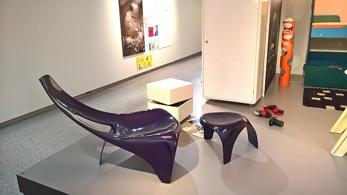
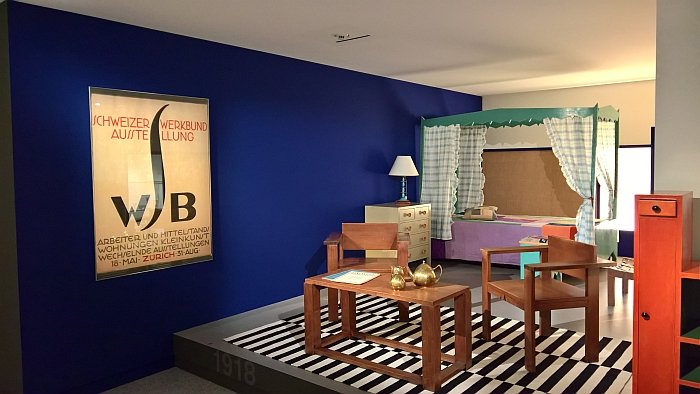
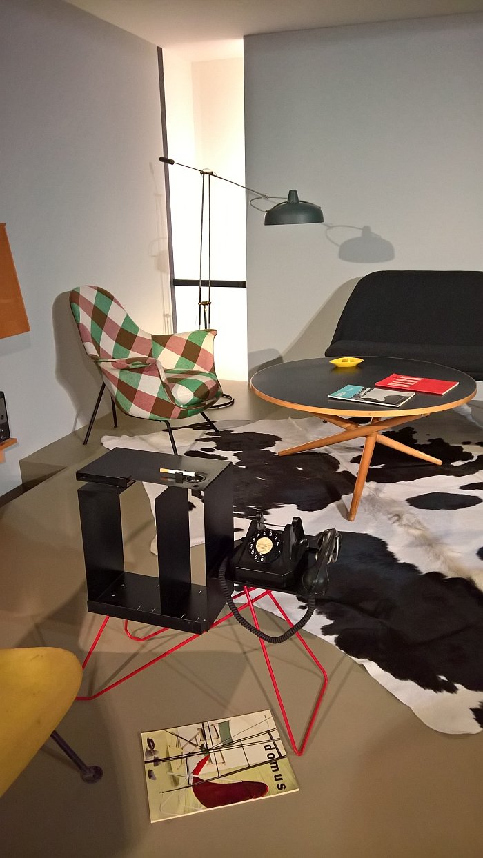
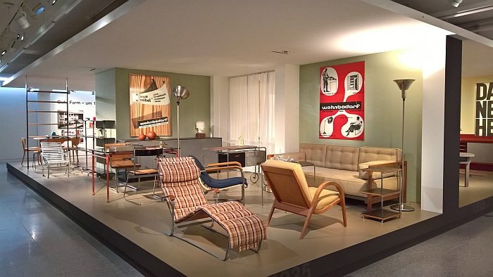
Starting with the Swiss Werkbund exhibition of 1918 and its exploration of the future of furniture, furnishings and accommodation, Ideal Living takes the visitor on tour through the manifold means by which subsequent generations continued those self same explorations, a journey over the functionalism of the 1920s, the gute Form of the 1950s onto the Pop of the 1960s and ending with 1980s Minimalism.
Each stage on the journey is set up as a room installation with representative furnishings, Swiss and otherwise, backed up by original advertising material and which thus allows for seven brief snapshots of both the impulses Swiss designers have sent into the world, and how Swiss designers absorbed and responded to those from outwith.
Particularly pleasing is the way the design concept allows familiar and unfamiliar works by the likes of, and amongst many, many others, Max Ernst Haefeli, Marcel Breuer, Wilhelm Wagenfeld, Werner Max Moser, Trix Haussmann, Alfredo Häberli or Susi Berger, to be understood in context of their time and their contemporaries, rather than, and as so often in museum presentations, as abstract, stand alone objects: and which is important in helping advancing understandings of furniture design as a social, economic and political activity as much as it is a technical and artistic one. The strict arrangement of the presentation does however mean there is regrettably no space for the ever majestic Rocking Chair by Jacob Müller. The 1948 Plio folding stool by Müller for Aremo-Möbel Zürich is however included.
The fact that Ideal Living ends in the mid-80s could lead one to believe that the museum are of the opinion that nothing relevant has happened in context of Swiss furniture design since 1985. Or that they haven't been paying attention.
Both of which are clearly without foundation.
Much more, the story is in many respects continued, if when not via the same principle, in the museum's third story, the Swiss Design Lounge.
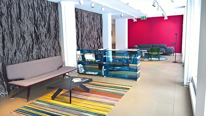
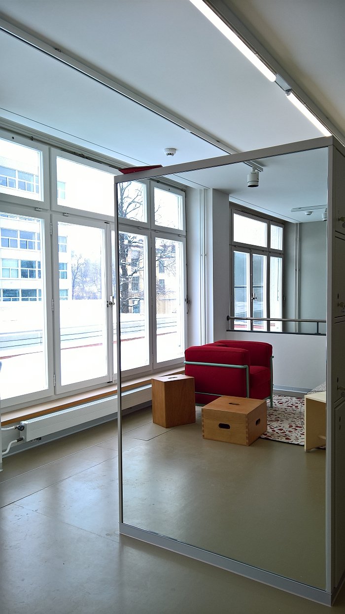
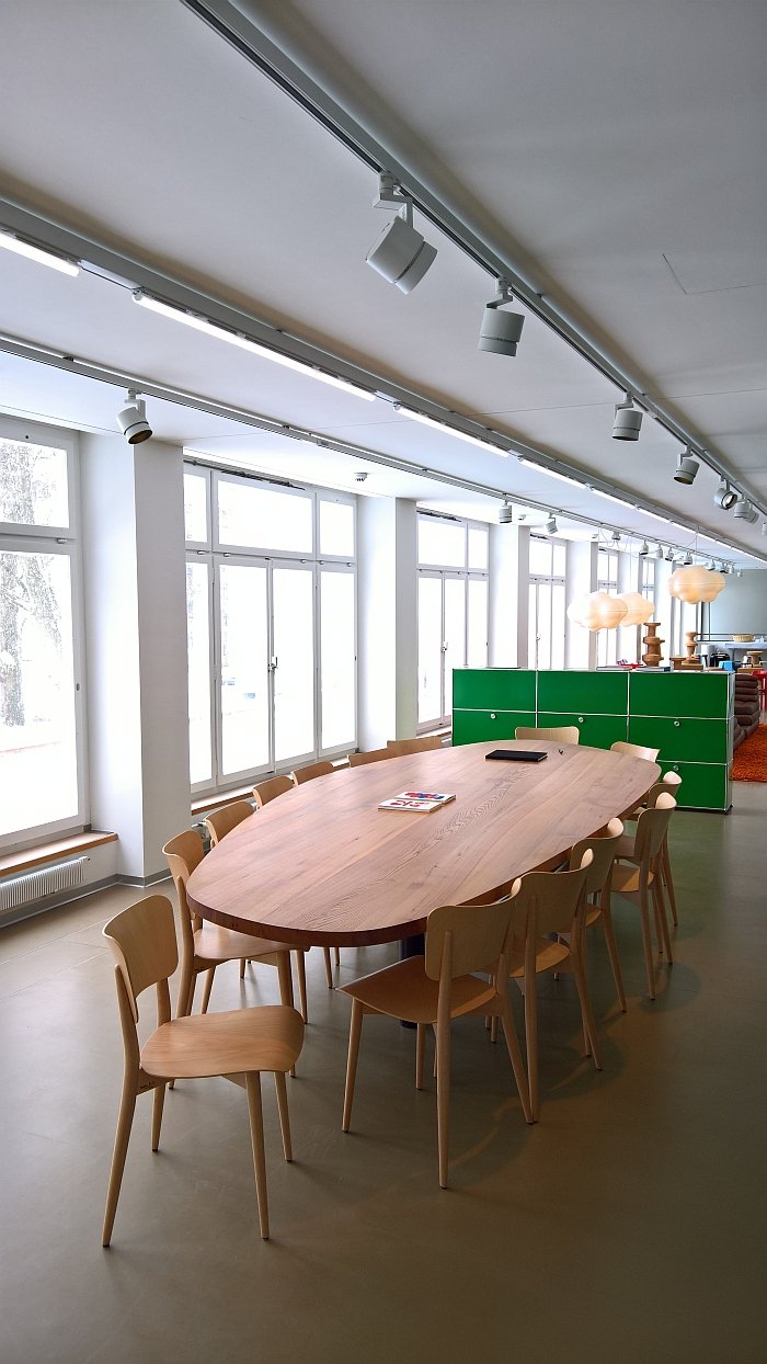
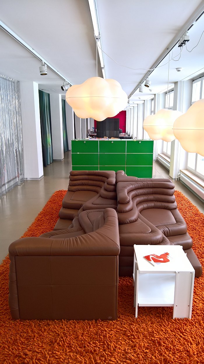
As we noted from the exhibition INSIDE architecture by Åke Axelsson, Jonas Bohlin, Mats Theselius at the Konstakademien, Stockholm, aside from the chair designs of Åke Axelsson the highlight for us of the showcase was that you could sit on the chairs: a chair is, logically, a sitting object and you can't fully understand a chair you can't sit on. It's like trying to understand a cake you can't eat. It's stupid. Whereas downstairs in Ideal Living the chairs aren't for sitting on, upstairs the Swiss Design Lounge presents classic and contemporary Swiss chairs, stools and sofas one can sit on, tables you can sit at, lighting you can illuminate with, shelving systems you can place things on and generally a space to relax, read a few books, browse the museum's virtual collection, enjoy a coffee, reflect etc, etc, etc.
And that on and at objects you may never normally get the chance to experience in such an unhurried fashion, including, and amongst many, many others Le Corbusier, Pierre Jeanneret and Charlotte Perriand's LC2, the Castor armchair by Big-Game for Japanese producer Karimoku, the monstrous Terazza sofa by Ubald Klug, the Moser lounge chair by Max Ernst Moser for Embru-Werke and perhaps, and as most pleasing for us, the 1951 Cross Frame Chair by that unshakable proponent of gute Form, Max Bill and which as a lightweight, intelligently constructed and very satisfyingly formed wooden chair offers all it promises. And a good deal more.
Presenting as it does, largely, objects that are in production, the Swiss Design lounge does sound a little like a furniture store, and invariably one or the other visitor will later purchase an object first experienced in the Museum für Gestaltung. The difference is, or at least should be, that the focus is, or at least should be, not commerce but information.
Back in the day the MoMa New York presented with their Good Design exhibitions commercially available objects in a museum environment; then as now we consider such to be important, valuable and for all an excellent method by which to introduce well designed, well formed, well constructed, meaningful contemporary objects to a wide public, and therefore help that wide public develop better, more considered, understandings of such: assuming that is, then as now, that the objects are honestly, systematically and seriously selected with museal professionalism, and not just supplied by sponsors.
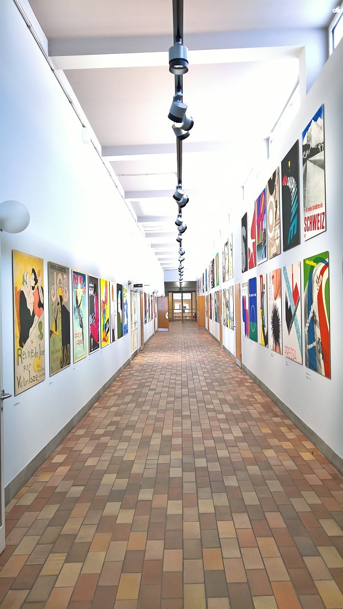
The fourth story is the museum's poster collection, at some 350,000 objects one of the world's largest, and which is represented in the new exhibition concept by themed selections of posters displayed along a corridor, allowing thereby the briefest of brief glimpses of the collection, yet one which demonstrates not only the variety of the graphic designer's art but the depth of the museum's collection. We, famously, don't really do graphics and so for us it felt like walking down an art college corridor. Which is an observation not a criticism, we love art college corridors, but would never visit one just to walk down it; however, if you are into graphics the Museum für Gestaltung Zürich is arguably an interesting location in any case, and the newly presented poster collection alongside the graphics related objects in the Collection Highlights exhibition will, we are sure, cause one or the other endorphin rush.
We noted above that we consider the museum's four stories to be five: whereby for us the fifth is a temporal tale, the museal equivalent if you will of a snapchat story; namely that told by the temporary exhibitions in the newly designed main exhibition space, the inaugural exhibition of which is Oïphorie. atelier oï.
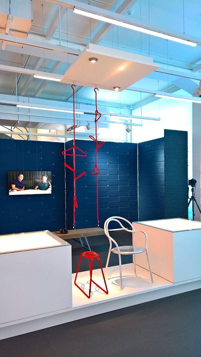
Established in 1991 in La Neuveville, Switzerland, atelier oï a.k.a Aurel Aebi, Armand Louis and Patrick Reymond work across a wide range of creative genres including scenography, installations, exhibition design and interior design in addition to realising product and lighting design projects for clients as varied as, and amongst many others Zanotta, Artemide, B & B Italia and USM Haller for whom they developed the USM Privacy Panels.
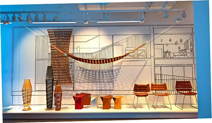
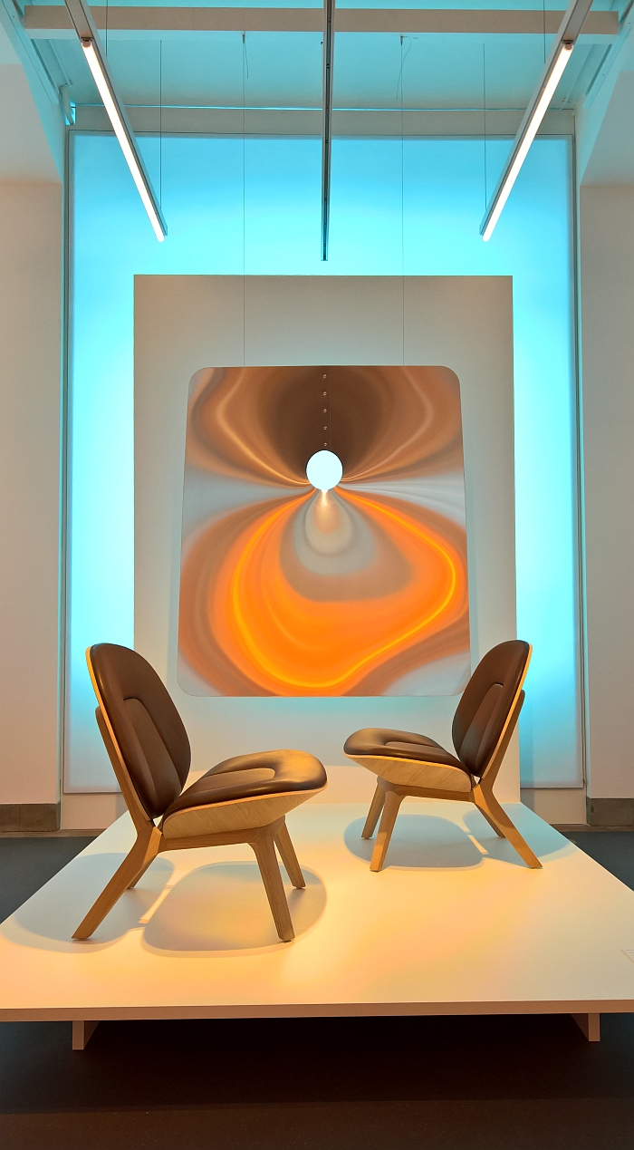
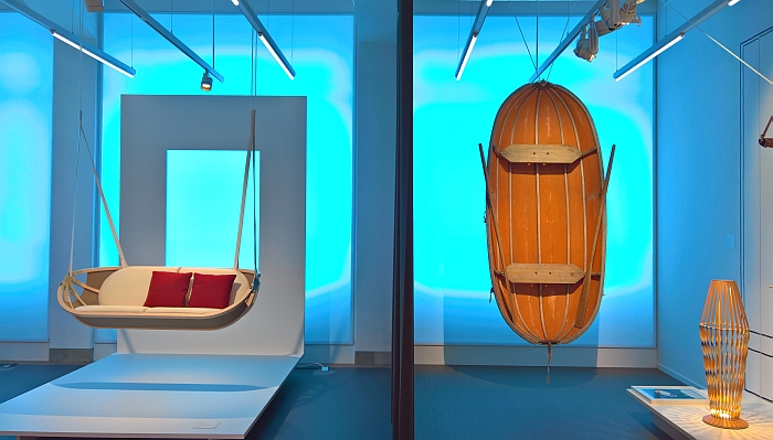
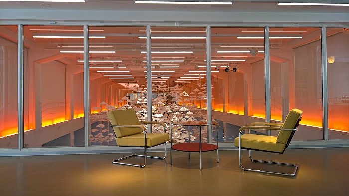
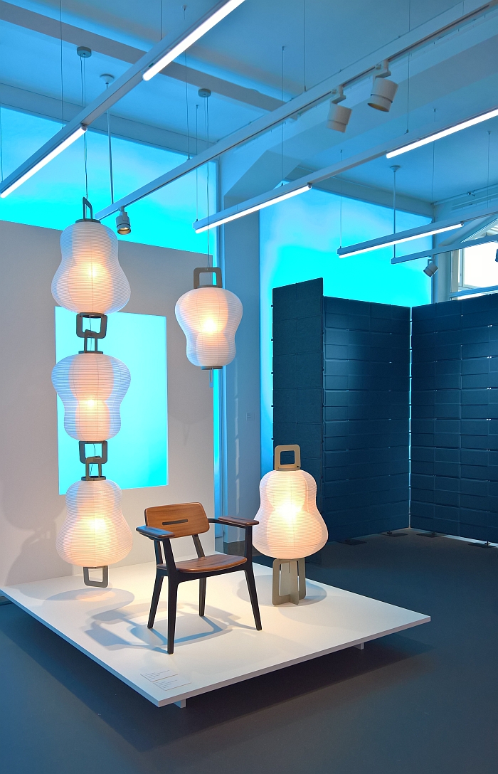
In essence two exhibitions in one, the central space of the exhibition hall is home to three installations, Minoshi, the latest evolution of a hanging paper garden concept, and Brindilles and Helicoïdales, both specifically developed for Oïphorie, and installations which in their lightness, movement and focus on the properties of materials leads neatly into, and also stand in dialogue with, the presentation of atelier oï's work.
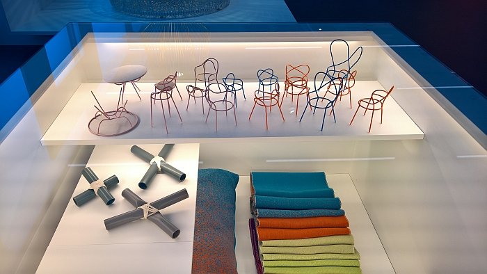
Arranged around central themes such as "weightless", "incised", "linear" or "handmade", Oïphorie combines short explanatory texts with objects from the studio's portfolio, be that objects from their numerous interior and installation projects, such as, for example, the prototype of a panel developed for Rimowa stores in Paris and London or the "dancing" Oïphorique light sculpture; objects of a more classic product design nature, such as the Oasis seating collection for Moroso, the Prêles coat stand and stool for Atelier Pfister or the Objets Nomades collection for Louis Vuitton; or objects of a slightly more idiosyncratic nature, for all those that have evolved from the studio's long-standing cooperations with craftsfolk in the Japanese prefecture of Gifu.
The result is a pleasingly compact, efficient, and very well paced exhibition which helps illuminate atelier oï's understanding of and approach to design, and the thus helps bring the visitor closer to the studio and their work.
If one considers the 2018 re-opening as the museum's third opening, following the initial in 1875 and that in 1933, then one automatically constructs a timeline along which one can follow not only the changing function of museums, but also the changing demands and expectations of visitors, in addition to the increased level of background information and knowledge most visitors bring with them.
Changes which by necessity demand changes in how museums operate and communicate.
Quite aside from letting museum visitors use objects rather than setting them all on plinths to be stared at, the most obvious change to the museum concept in comparison to 1875 and 1933 is the virtual collection, a collection which existed previously but which has been updated in conjunction with the reopening and which now includes, for example, a series of tours through the collection exhibitions.
While available 24/7 on your own computer/mobile device, it can also be accessed via tablets in the Swiss Design Lounge, tablets which allow for a very nice extension of the physical exhibition spaces, allowing if you will a respite from them and the chance to view the collection(s) from an alternative perspective, and tablets which are the only obvious integration of contemporary technology in the exhibition spaces; and that in age when museums generally are turning ever more multi-medial. The decision to remain more analogue does however make sense, for all in the permanent collection exhibition the visitor has more than enough to busy oneself with without increasing the complexity and interactivity with tablets and digital technology.
Housed as it is in a 1930s building the Museum für Gestaltung Zürich is never going to have the space to fulfil all its, or its visitors wishes, however with the new design of both building and concept they have established a good position from which to not only grow and develop as an institution, but to efficiently and entertainingly inform and educate visitors, if you will through their presentation of the new and/or the unfamiliar to provide the information, ideas and impetus once offered to 19th century tradesmen and industrialists.
Full details on the Museum für Gestaltung Zürich, including information on their numerous and varying fringe programmes can be found at https://museum-gestaltung.ch
Oïphorie. atelier oï runs until Sunday September 30th and the virtual collection can be found at http://www.emuseum.ch/
