Ukrainian designers haven't featured often in these pages.
Arguably never.
And may never have, had it not been for the exhibition Transformation staged at the Ukrainian Cultural Centre during Paris Design Week 2017
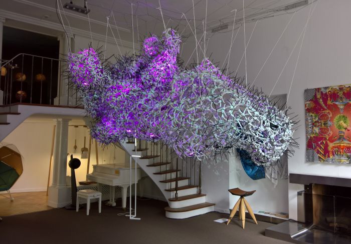
Embassy and Cultural Centre presentations are a regular feature of design weeks, and as a general rule are awful. As in truly awful.
But not all, and Transformation at the Ukrainian Cultural Centre was one of the better sort.
Presenting works by a dozen designers, architects and artists across a range of genres, Transformation felt less like an exhibition and more like a collection: there was very little connection between the pieces, no real interaction, and a general lack of necessity, lack of pressure to "understand" anything; all of which allowed you to focus on the works, to concentrate on their individuality, engage with them, whereby a couple particularly caught our attention....
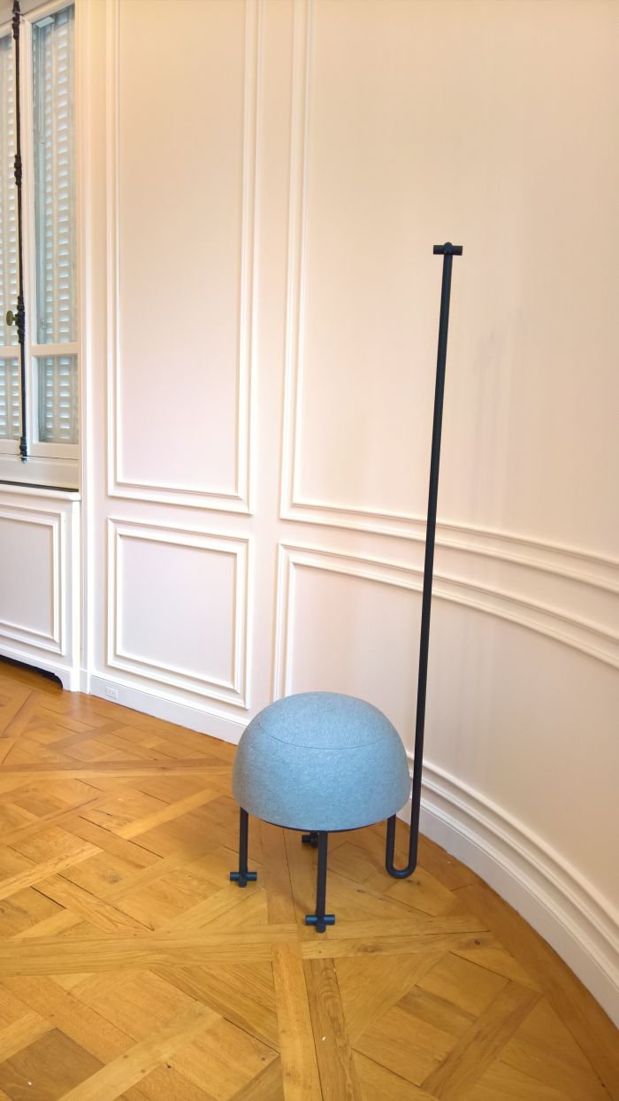
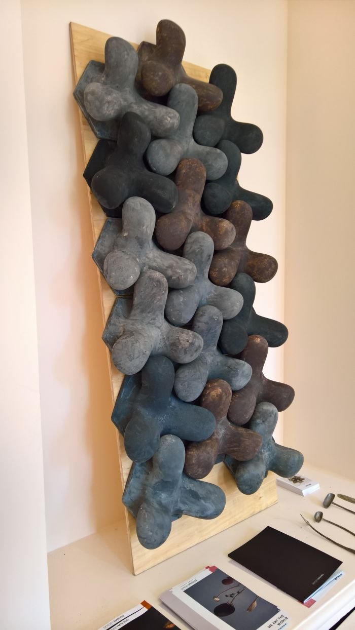
Sergey Makhno is a Kiev based architect and designer and was represented in Transformation by a range of projects, including Pouffe Tree which reduces hall furniture down to the very basics in the most elegant and charming fashion, if for our tastes the Pouffe element was a little too soft, for us such needs to be rock hard; and the Tetrapod 3D wall tiles, which interlock to create a very coherent, animated yet thoroughly unhurried surface, and which we can also well imagine being further developed into a couple of stand alone products.
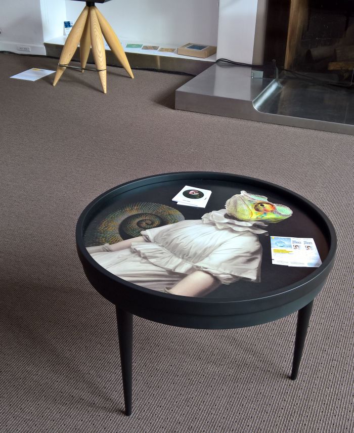
Over the centuries the tilt-top table has been a popular form of furniture, the idea being that when not in use the top can be tilted over, flush with the base, and thereby allowing for flat-ish, unobtrusive, storage. During the 18th and 19th centuries manufacturers took to ornamenting tilt-top tables, for all in context of "Japanned" furniture, the idea being that tilted over, and stood in the corner of a room, the heavily decorated table tops served as works of art when the table wasn't in use. The Dixit coffee table by decorkuznetsov studio very neatly takes that idea one step further being as it is a demountable table which can be hung on the wall when not in use, thus genuinely keeping it well out of the way. And serving as a decorative addition to any home.
If, and as with much of the 18/19th century tilt-top tables, we're not particularly feeling the art. But art is subjective, others will invariably be a different opinion, and it takes nothing away from the principle. Which is most pleasing.
As is the fact that demounted Dixit can also be used as a tray, the raised side rim providing the requisite security
But perhaps most pleasing, and elegant and well-considered is how the detached legs are stored, and then reconnected .... but we're not going to tell you, some secrets need to be kept..... nor do we want to make it too easy for any ne'er-do-wells.

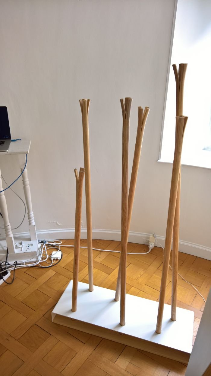
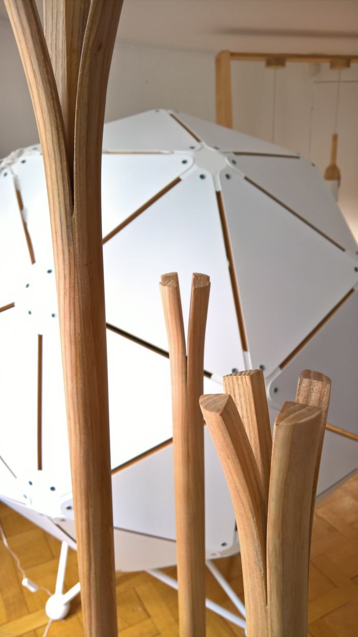
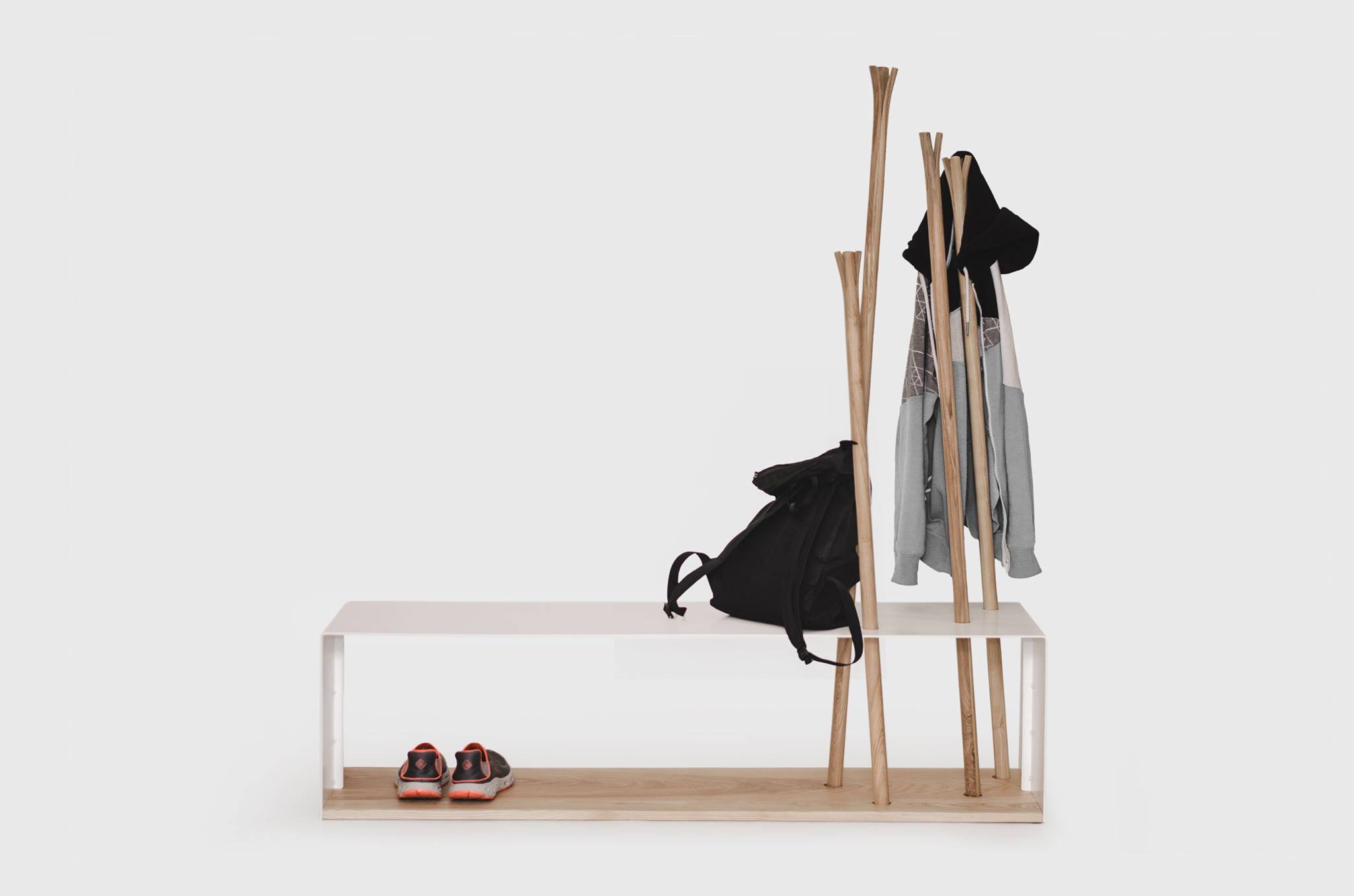
In the Thonet canon the bentwood coat rack is an established classic. With Hilka for MZPA, Ulyana Zachkevych & Stanislav Boichuk have, in spirit, evolved the concept one step further in that they have reduced the object down, in that rather than bending wooden staves they have forced them to open up, blossom-esque and in doing so realised not only a practical, convenient hanging solution, but also the most wonderful aesthetic.
We don't have a romantic bone in our bodies, but the imagery of broken branches collected after a walk through the autumnal countryside is inescapable: particularly in a version we discovered post-Paris on Ulyana's facebook page which combines the staves with a powder coated steel bench: no matter how grim the vicinity of your inner-city flat is, with such an object you're always on the edge of a forest on crisp autumn morn. Or at least to judge by the photos. That we haven't seen it in the flesh, steel and ash we, as ever, can only comment from afar. But we're prepared to stick our necks out. Not least on account of how much we're enjoying the split staves, if admittedly less keen on the base. Arguably we would prefer single a single stave solution. Or a full concentration on the bench........
Yes, the comparisons to Oliver Bahr's Pin Coat for Moormann are inescapable, not that we're sensing an impropriety on the part of Ulyana and Stanisla; for us Hilka is the result of an exploration of the wood splitting technique, and represents a very logical, satisfying and intuitive result. In addition the naturalness of Hilka over the much more industrial Pin Coat results in a work with a completely different character, while through the version with the bench they have taken the concept to a whole new level. At least, as we say, based on the pictures....
