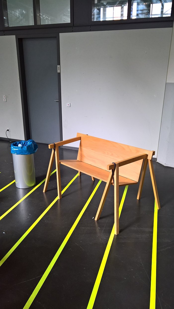
Established in 1992 the Hochschule für Gestaltung Karlsruhe was conceived from the off as a design school for coming realities, for a world we don't yet know.
But is that a world of smart, autonomous apps? A world of intelligent and considered applications of evolving technology? Of the craft of yore? The 2017 Rundgang durch die Lichthöfe summer exhibition was a chance to glean some clues......
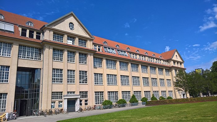
Keen readers of our #campustour musings will be aware that here should stand a brief history of the Hochschule für Gestaltung, HfG, Karlsruhe.
But we wrote that last year.
And never ones for unnecessarily repeating ourselves see little reason to reconfigure an existing text. And so we refer you dear reader to our 2016 Rundgang durch die Lichthöfe post.
For, at least in terms of the school's history, only little has changed.
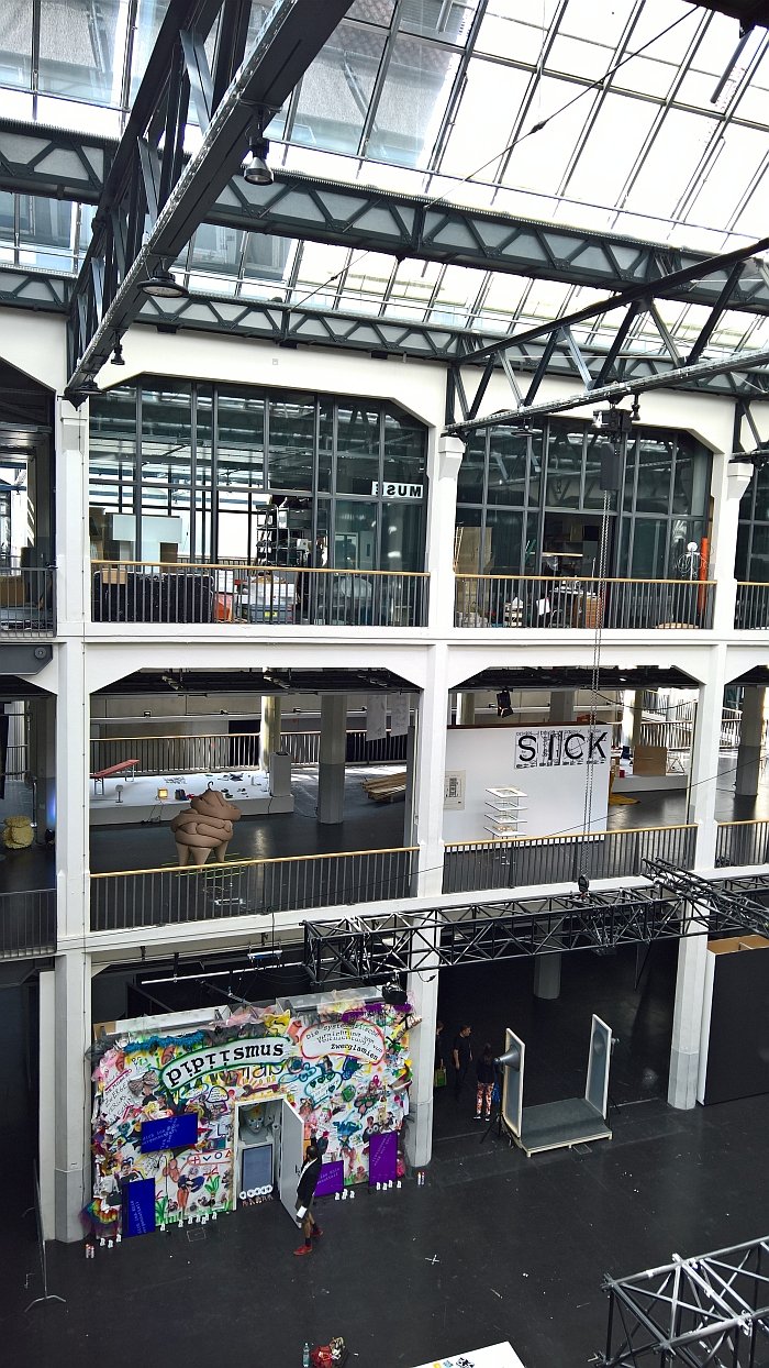
The one thing that has changed since 2016 is that in 2017 the Hochschule für Gestaltung Karlsruhe turned 25.
An event barely marked by the 2017 Rundgang durch die Lichthöfe summer exhibition.
Or at least not visibly, arguably through one or the other podium discussion or presentation, but barely in terms of the exhibition format and content. We're not saying that is a bad thing, nor that it is a good thing, we're just saying.
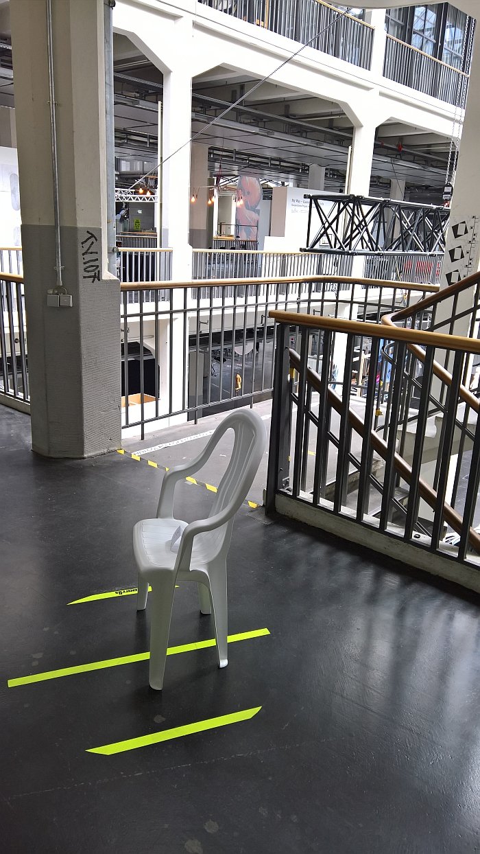
The only, marginal, indication that the HfG Karlsruhe had something to celebrate was the preponderance of projects from the school's ever delightful kkaarrlls collection, including a very welcome, and very long overdue, reunion with Kantbank by Andreas Grindler, a project which for us still stands as representative of the very essence of seating design. And always will.
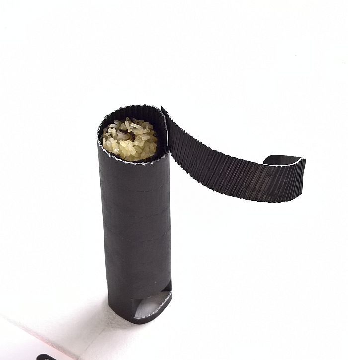
Elsewhere the 2017 Rundgang provided, in addition to a selection of self-initiated, pre-diploma and diploma projects, a nice overview of the semester projects undertaken in the previous year including Eat Wear which challenged students to develop alternatives to the plastic containers and paper cups of contemporary food/drink to go and throw away culture, Power of the Triangle which took, well, the triangle as its starting point and the perpetual HfG Karlsruhe favourite Logo! in which a company logo has to be transformed into a marketing product relevant for that company's core business.
And from all of which the following projects continue to occupy our thoughts......
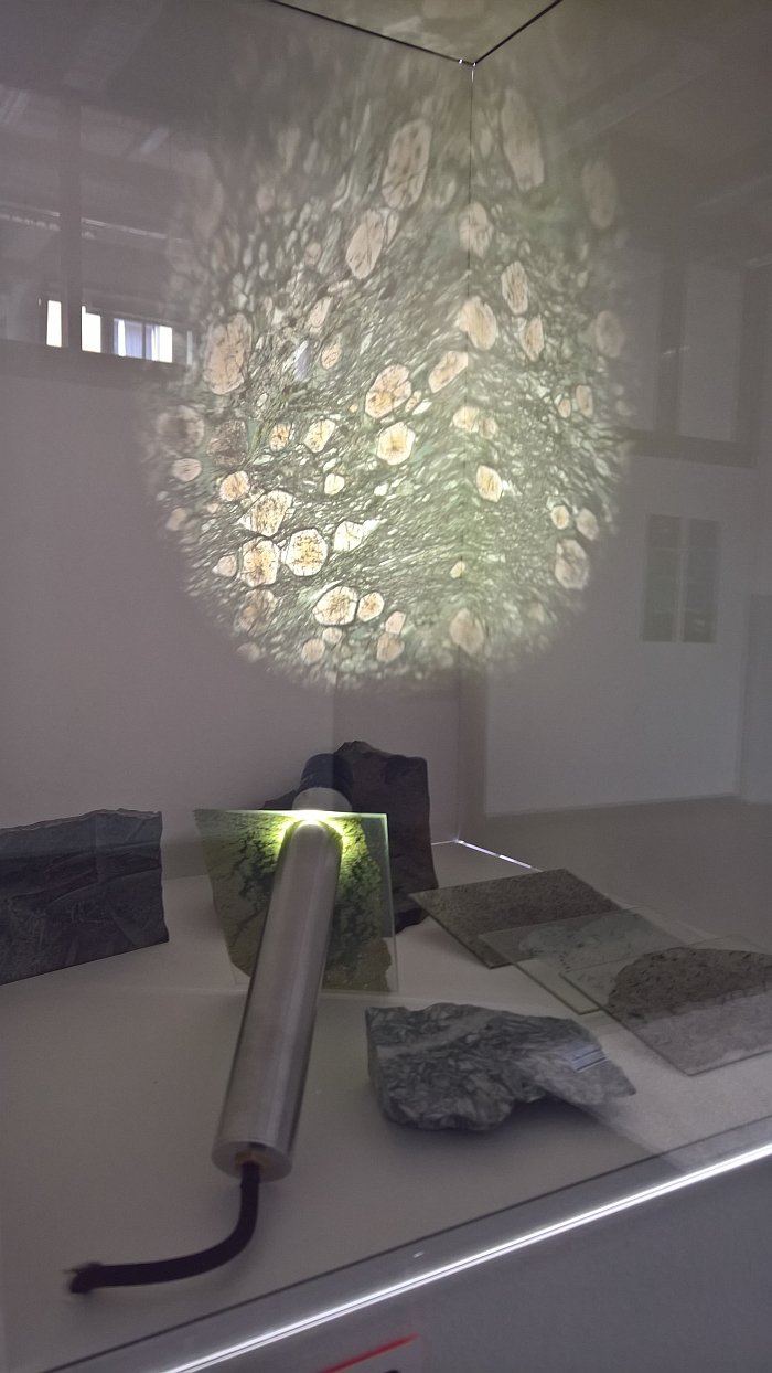
The inner life of objects is invariably more interesting than the exterior. Psychologically and physiologically. Yet presenting this inner life so that it is visible, explainable and understandable is difficult. Psychologically and physiologically. Petroskop by Pia Mareike Matthes allows for a simple, logical, and illuminating presentation.
In essence a light source and a magnifier which sit either side of a thin slice of an object, the magic of the Petroskop is that the light and magnifier are joined by a magnet, thus meaning the whole construction can be effortlessly moved across the presentation slide to allow for exploration of different sections. As the name implies, the concept is primarily concerned with viewing and presenting the interiors of rocks, but we're saying, without actually knowing for certain, that any suitably prepared cross-section should be possible, thus allowing a view into the inner physiology of plants, animals, fungi or indeed, rocks. Now all we need is a psychological Petroskop...... or is that just Instagram?
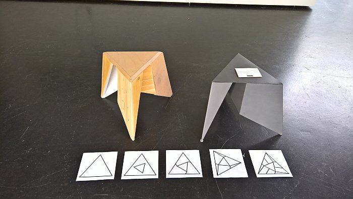
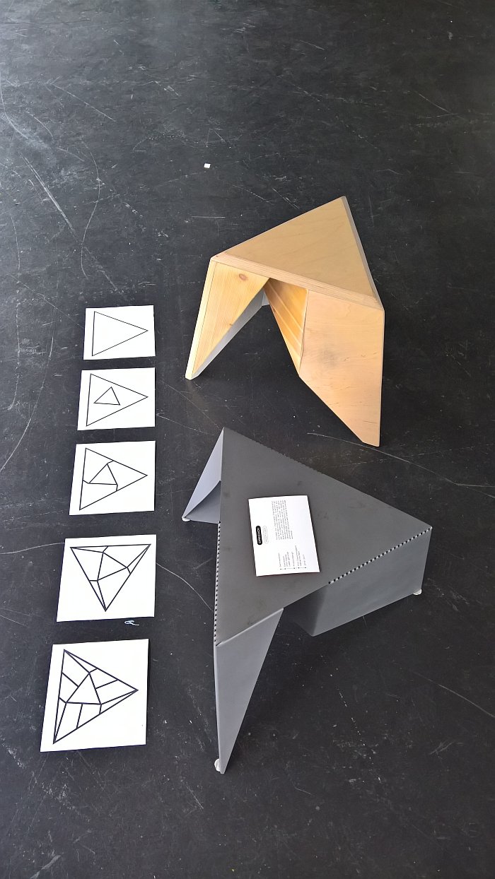
Idiots that we are we thought Gregor Stober had been a bit cheeky with the construction of his Dreizack stool, that there was no way he had produced it from folding a square, that he must have cheated, at least a little. Surely! Fortunately Gregor was on hand to point out our error, not that it should have been necessary: the fact that the project arose in context of the class Power of the Triangle, and the drawings next to the stool showing how he had folded a triangle to create the stool should, arguably, have given us a clue that the starting form wasn't a square. But. You know. Idiots.
Aside from its formal confidence and visual lightness, one of the joys of Dreizack is that it is an essentially wasteless production process: the only slight bit of waste coming from the blunting of the feet, but, theoretically, there should/must be a solution for that. And while in many, if not all, respects, we were most taken with the wooden version, the fact that it involves cutting and then rebuilding the triangle, and thus an awful lot of individual steps, does mean that the metal stool impresses most on account of its more efficient, less resource intensive, production process. And which yes does mean that if Gregor can produce the same from folded/moulded plywood we'll find ourselves moving towards a very happy place.
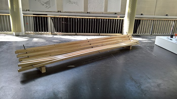
The so-called Tegernseer Gebräuche regulates the domestic German trade in raw and processed wood; including wooden slats of the type Florian Knöbl has woven into his bench. And it is exactly this woven construction which makes Bank der Tegernseer Gebräuche so interesting, meaning as it does the work features no connections, no joints, just weave.
The physical tension holding the bench together is neatly complimented by the visual tension arising from the metal bars over which the wooden slats are woven, metal bars which appear as the most fragile element of the work and bring a very slight, though not accented or otherwise prominent, industrial feeling to the composition.
Sadly we never got to try it and so cannot comment on the sitting comfort, but the inherent logic of the work would appear to imply it'll be fine.
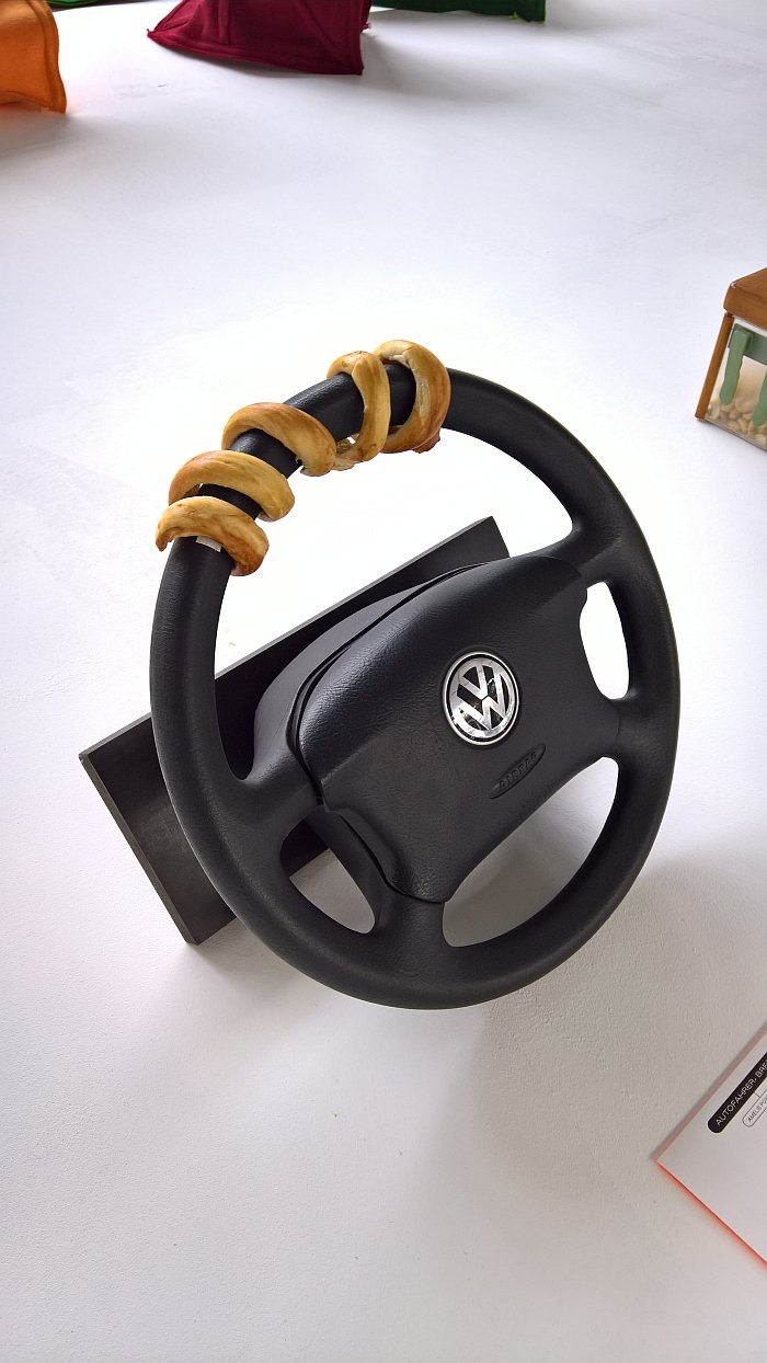
Autofahrer-Brezel is one of those delightful projects which quite aside form its own charm stands as much as a metaphor for design as it does as an object in its own right. Clearly a brezel that you wind around your steering wheel is ridiculous. But also ingenious. Cruising down the open highway, munchin' on your brezel as you go...... But move beyond the simple imagery and all the practical problems immediately become clear. Unless that is you are so blinded by the ingenuity expressed through the simple imagery you cannot see the ridiculousness of the logic..... As we say, there's a message in there somewhere. And not just for designers......
There is something irritatingly obvious about Sushi To Go: why is sushi sold in boxes, when, as with toffees, they are perfectly shaped for stacking? A stack of maki and/or uramaki inside a cover of seaweed which you peel back as you munch before sustainably disposing. Purists will hate it. Never, ever, listen to purists. Inflexible, self-serving the lot of them.
Full details on the Hochschule für Gestaltung Karlsruhe can be found at www.hfg-karlsruhe.de
