Once upon a time there lived in Cassel two brothers by the name of Grimm. Legend has it that one day Jacob and Wilhelm, for that was their names, travelled to Marburg to become wealthy lawyers; however, instead of learning the basics of Roman law, jurisprudence and how to write huge invoices, they spent their days with the witches, kings, queens and elves of northern European folktales.
The people of Cassel were angry when the heard of the brothers' activities, and a large crowd gathered to meet them on your return.
"Why do you waste your days with this romantic nonsense?", they demand, for they were very aware of the cultural context of the period.
"It's not romantic nonsense", the brothers protested, "rather these stories contain the wisdom of previous generations, wisdom our current age has forgotten, yet which could help us not only better understand our current age, but also help us prepare for future ages."
And then a wolf ate them.
Romantic dreamings? Contemporary reinterpretations of tradition? Or just autonomous vehicles and Apps that tell when you've had too much to drink or help you identify wicked stepmothers from their social media activity, what future folklore would the 2017 Kunsthochschule Kassel Rundgang present......
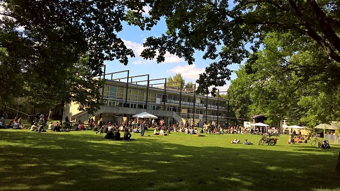
Whereas one can, and could, trace the history of the Kunsthochschule Kassel back to the 18th century and the establishment of the L’Académie de Peinture et de Sculpture de Cassel, it is very much a post-war institution.
In 1946 the pre-war Applied Arts College re-opened as the Schule für Handwerk und Kunst – School for Crafts and Art – and was joined a year later by the Werkakademie, a continuation of the former Kassel Art School. In 1960 the two schools merged to form the Hochschule für bildende Künste – School of Visual Arts – before in 1971 all higher education institutions in Kassel, including the Hochschule für bildende Kunst, were incorporated into the newly established Gesamthochschule Kassel, the various pure and applied art faculties became independent departments. A further reorganisation in 1997 saw art, product design, visual communication, art history and art education reconfigure into the semi-autonomous Kunsthochschule Kassel. Alone architecture remained part of the new Kassel University.
Situated on the edge of Kassel’s Karlsaue park and in buildings, largely, realised in 1961 by architect Paul Friedrich Posenenske, the Kunsthochschule Kassel offers post and undergraduate courses in Art History and Theory, Visual Communication, Art Education, Visual Arts and Product Design, the latter offering final specialisations in Industrial Design, Designing Textile Products and Furniture Design/Exhibition Architecture.
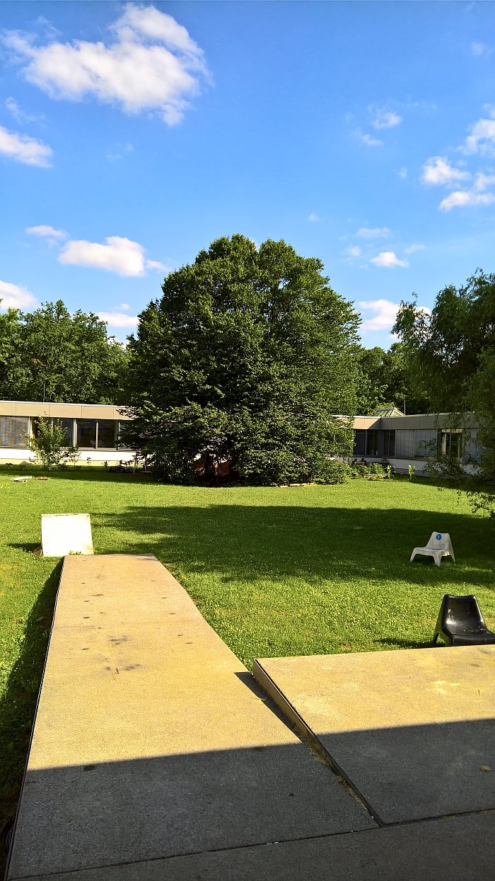
At the risk of fully denigrating the efforts of the staff and students in Kassel, the best thing about the Kunsthochschule Kassel is that the design department is housed in a square building, meaning the Rundgang is just that, you walk round and round and round and round. You can't get lost. Can't miss things. Can only get dizzy. Which is why we change direction after every second tour through the ateliers. Not daft us.
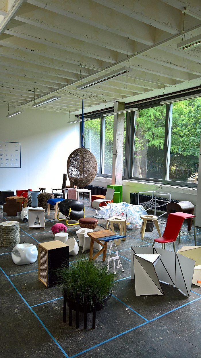
In terms of the design courses the focus of the 2017 Kassel Rundgang was very much the various foundation classes undertaken across specialisations and the specialist semester classes, including My personal Collection - collecting, disposing of, unifying and Optimism through design, both led by guest Professors Katharina Mischer and Thomas Traxler a.k.a Vienna based studio mischer'traxler, and the foundation course documenta Hocker which challenged the first years students to design a stool which could be produced and sold in context of Kassel's quinquennial documenta art exhibition. Most couldn't, the results presenting a collection of works every bit as grotesque, fanciful and wholly improbable as one meets in most of the Brothers Grimm's collected tales: but that's not the point, the point is it got them thinking about form, functionality and materials. Thoughts they will, hopefully, develop over the coming semesters
In which context, and as ever, important is not what the students produced but the thinking behind it, the way they approached the brief and/or problem, the way they got to the end result, they way they justified their decisions, what they learned on the way. Design students aren't supposed to realise market ready products or projects which can be globally implemented, but learn how to develop such so that one day they can.
A position which of course makes comparing student projects futile in the extreme. Yet doesn't stop us doing just that....
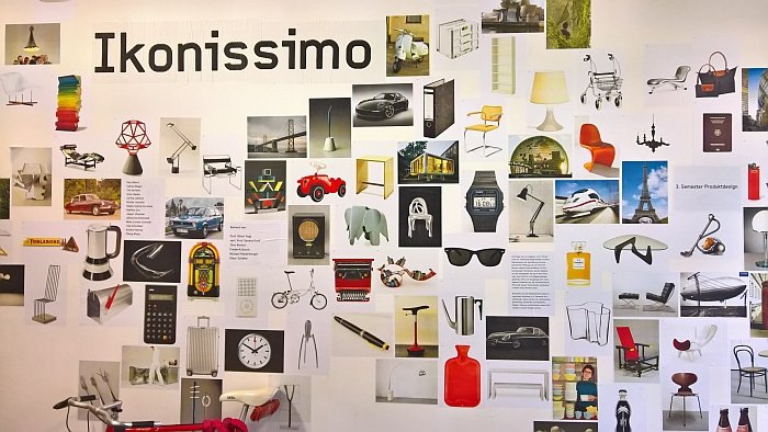
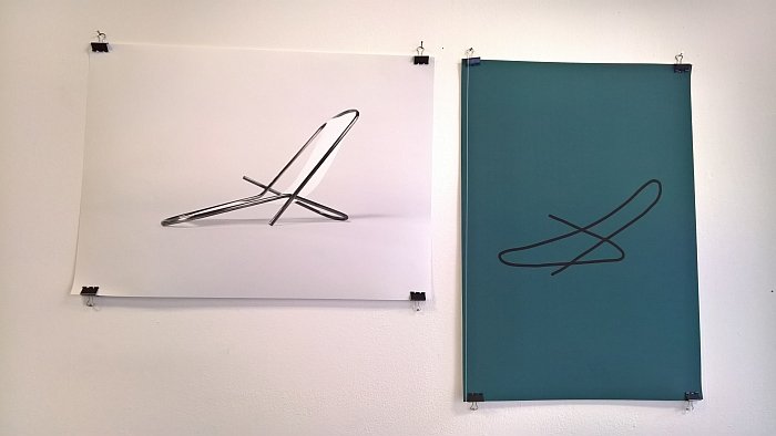
The 3rd semester product design class Ikonissimo asked the students to re-imagine an established "Icon" in a new context: Paper Nap by Lisa Schreiber proposes a paper clip abstracted to create a lounger. Aside from creating an aesthetically very pleasing "object", whereby it only exist in renderings and so without of proportions and scale, Paper Nap is in many respects the most delightful continuation of the bent steel tube furniture tradition. Mart Stam had his gas pipes, Marcel Breuer his handlebars and/or Junkers aircraft factory as inspiration, and Lisa Schreiber the paper clip. In all cases the process is a minimal, observation based, abstraction of a simple object to create something equally simple. If Paper Nap is stable, if it is durable, if the structural weak points are as weak as they would appear to be, if it can be industrially produced, if the proportions work, if a suitable material can be found to allow for a meaningful lounging experience, aren't even questions here. It's a third semester project, but a very nicely thought through one.
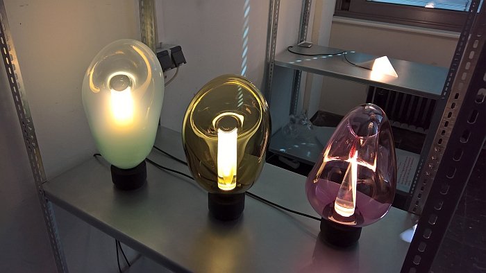
Created in context of the class Glasleuchte - Glass Lamp - from and with Jakob Gebert and Kai Linke, KOR's charm arises from its simplicity. Or at least it apparent simplicity. Presenting an illuminated core is set within a blown glass bubble, the joy of KOR - assuming that's not an episode of some fantasy TV series - is that the top of the glass bubble has been "pinched", a simple, almost nothing, process, one involving nothing more complicated than a set of specially created wooden tongs, yet which not only bequeaths the object its endearingly delicate, yet robust, form, but which deliciously connects the outer to the inner and thus give what would be an otherwise blah blah two layer glass lamp a sympathy, logic and vitality of its own.
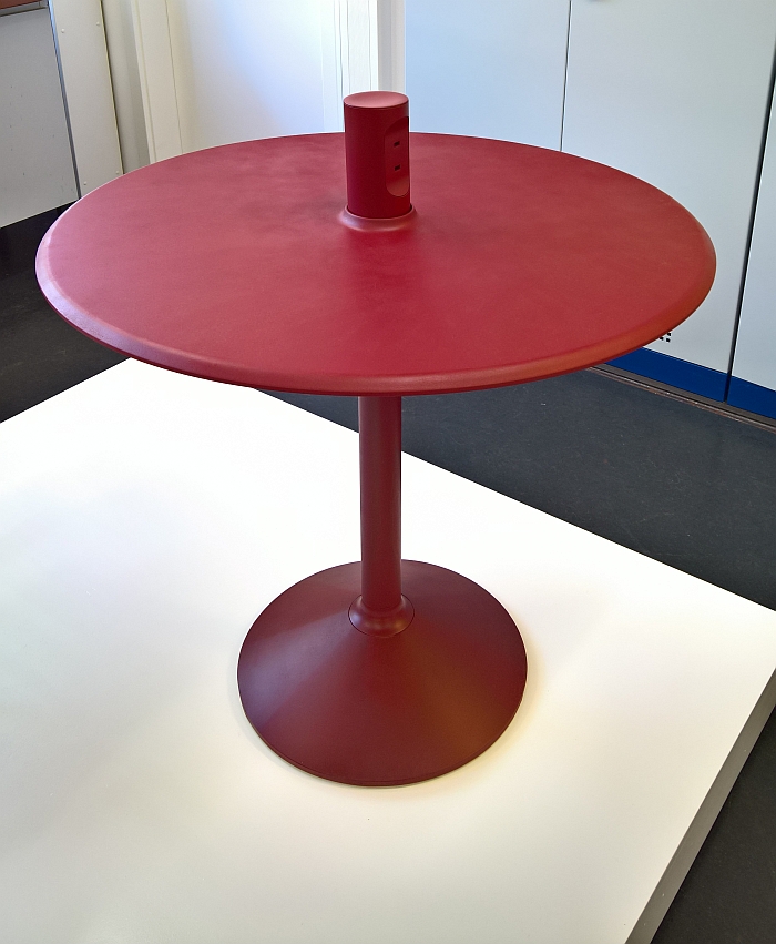
Describing the background to his project Maximilian notes that where plugs are available in public places then invariably in the form of a randomly placed wall plug. At floor level. To which we'd add, one placed more for the benefit of cleaners than the public, and almost always in a dark corner with no obvious sitting or perching possibility. Which poses the question why? In our mobile digital age everyone permanently needs a plug and/or USB charging point. Yet whereas plugs are an established standard in context of contemporary desks, so a location where one has alternatives, tables for public spaces, be that in cafes, train stations, museums, town halls, wherever remain firmly in the pre-digital mobile age.
Charger Table is Maximilian's solution. And a very elegant one at that. The central column not only providing space for plugs and/or USB chargers, but does such in a way that it is obvious: even without seeing the plugs/chargers, you know that is why the column is there. Is in many ways comparable with the location in a hotdog shop where you would find ketchup and/or mustard. Which sounds a little deprecating, isn't meant as such. Rather means a location that draws you in because it is in the right place. Is logical. And knows it is important. Which is something we really like, it doesn't pretend to be a super refined table which hides the chargers somewhere on the underside in an attempt to preserve some perceived formal unity or artistic signature, but rather says, here you can drink your coffee and charge your phone. Which is friendly and inviting, be that at a sitting or standing height. The question Charger Table can't answer is if the reason such solutions don't exist is perhaps because cafes, train stations, museums, town halls wherever, don't want to offer them.......
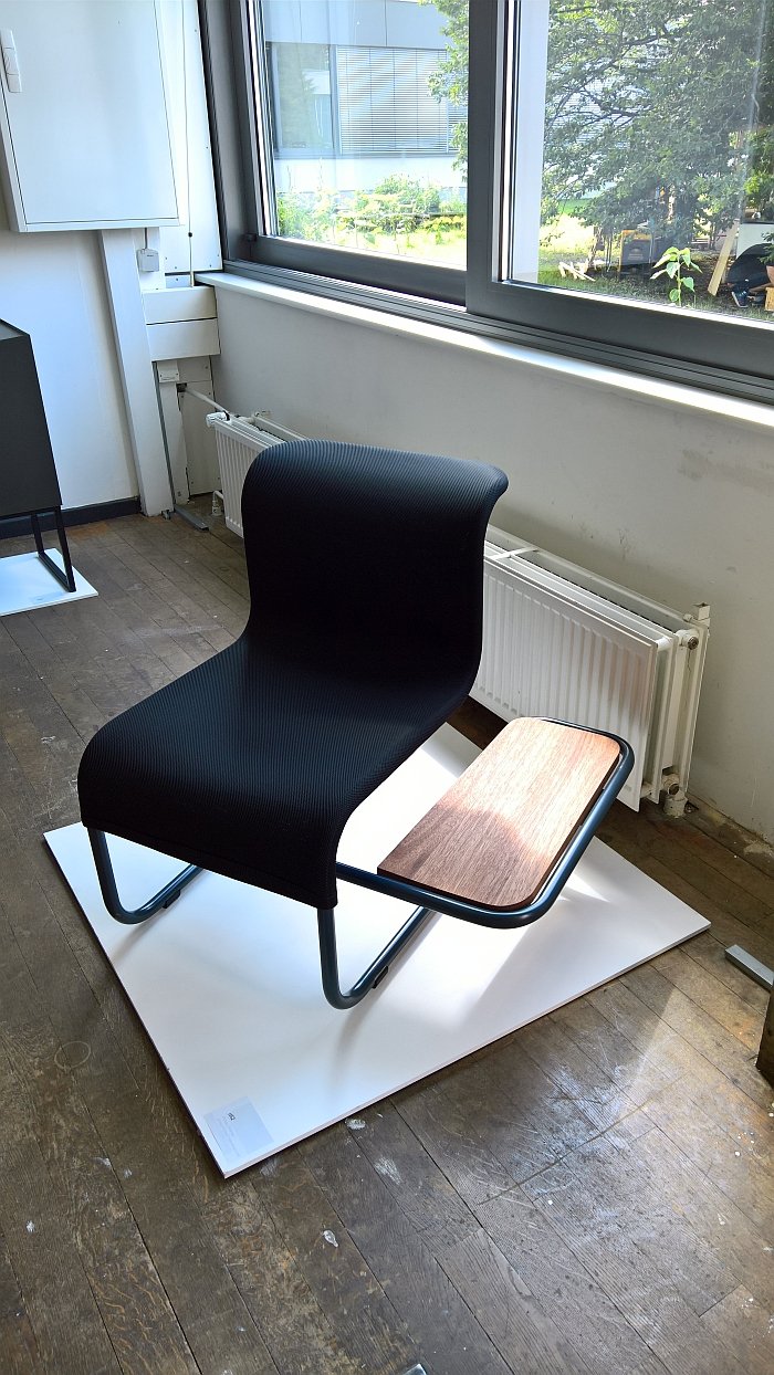
It is a universal truth that where an object performs more than one function a degree of compromise must always be assumed. A sofa bed, for example, is rarely as comfortable as either a sofa or a bed. Similarly much as we're taken with the d52 by Philipp Thomas, much as we liked the clever way the steel tube frame has been extended by a couple of effortless curves, much as we like the easy simplicity of the functionality, much as we like the visual lightness and unobtrusive character of the object, much as we like the nod to Heath Robinson's ever delightful "How to live in a flat"
You can only use it as a chair with side table.
If that fits into your way of living, fits into the space where such is to be used and it will never be used in another space, perfect. If not, then the separate chair and side table option is better.
Whereby one must also remember the d52 was created in context of the class In-between under the guidance of Jakob Gebert und Kai Linke. And as a work is not only in-between a table and chair, but also in-between practical and impractical.
As any fool know, if you want to catch our attention do something with microbes. We can't guarantee it will speak to us, but we will attempt to start up a conversation. mykes by Christian Freudenberger is the sort of project we can get along with. Even if we would stridently argue with him that mycology is a relatively young and little researched subject.
? or put another way ???
In terms of fungi in design processes perhaps, but mycology itself is one of the nobler arts.
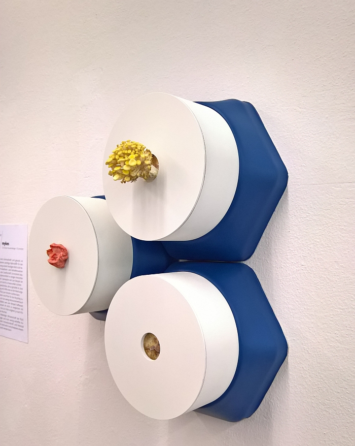
mykes is, in effect, a wall mounted mushroom growing system which employs normal domestic organic waste, for example used coffee granules, as the nutrient basis for cultivating mushrooms, and thus allowing for the meaningful re-use of, at least a part of, your domestic waste. For us the charm of the system, beyond the fresh mushrooms, is the way it uses the mushrooms as a decorative feature, thereby bringing a note into a space that plants, trees and bushes can't.
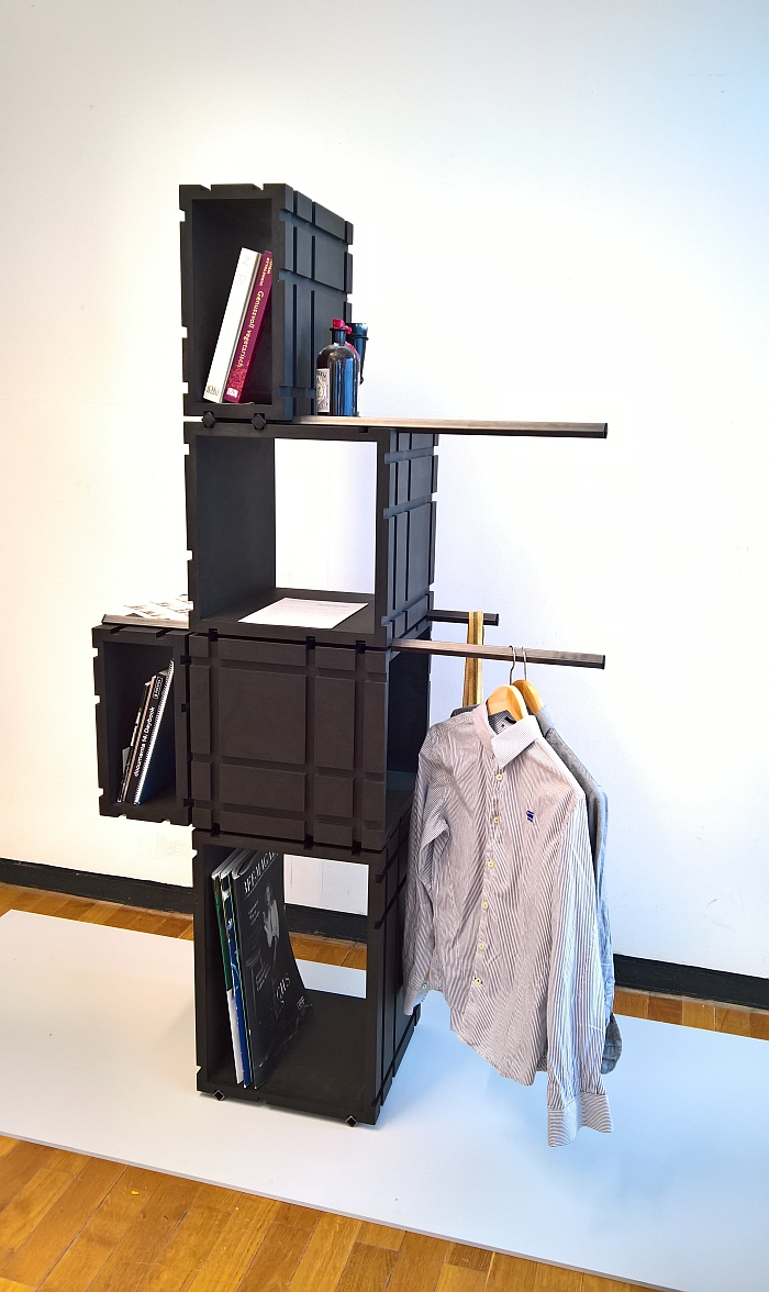
According to Sanchir Kath the project Tercio arose from a process of self-reflection and self-analysis. Honestly you do not want to see what would arise if we were do such. You really don't. If Sanchir forgives us, we're going to ignore the background to the project and focus on what resulted, namely an eminently obvious, elegantly self-assured and stupidly simple modular shelving and storage system.
Square stabs form the structure onto which boxes of differing sizes and forms and placed, weight and counterweight holding the ensemble together, while the nature of the system allows for both storage and hanging space. And that in an endlessly extendible and reconfigurable system.
The grooves in the boxes, necessary for the construction, provide for a degree of ornamentation and also neatly disrupt what would be an otherwise very, very dull quadratic structure, and that in a concept suitable for hallway, conservatory, kitchen, living room, bedroom, office, garden........
Which just leaves one question unanswered..... what's not to like?
Full details on the Kunsthochschule Kassel can be found at www.kunsthochschulekassel.de
