The Hochschule Wismar is an institution we have wanted to visit for a long time; and no, not just because it means a trip to the Baltic Coast and the historic Hanseatic port, but much more for despite being in no respect the largest design school in Germany, it is one of the most present: from Milan to Berlin to Cologne hardly a design week passes without Wismar.
And so we wanted to understand the school a little better. Which is of course one of the stated aims of our 2017 #campustour, developing a better understanding of contemporary design education and those schools responsible.
The thought of a Sunday afternoon on the Baltic Coast admittedly didn't make the decision any harder.....
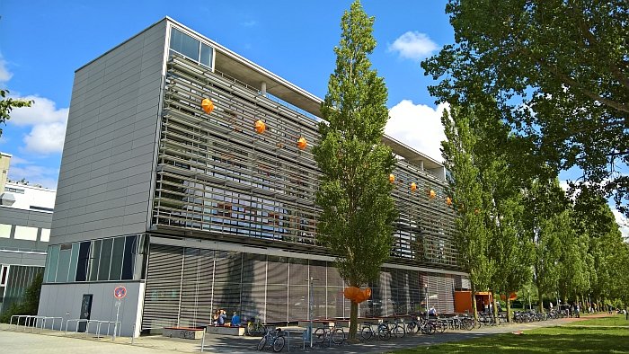
Established in 1908 as the Wismar Academy of Engineering the contemporary Hochschule Wismar remained, largely, an institution for engineers - civil, mechanical and nautical - before post-unification mergers saw the school's programme expand, and that in a very logical fashion: the integration of courses from the former Marine Engineering College Warnemünde/Wustrow expanding the maritime elements, while the 1992 merger with the College for Applied Art Wismar-Heiligendamm and its specialisation in interior architecture, jewellery design, graphic design, product design and furniture design bringing design to the engineering. Which is always a welcome mix.
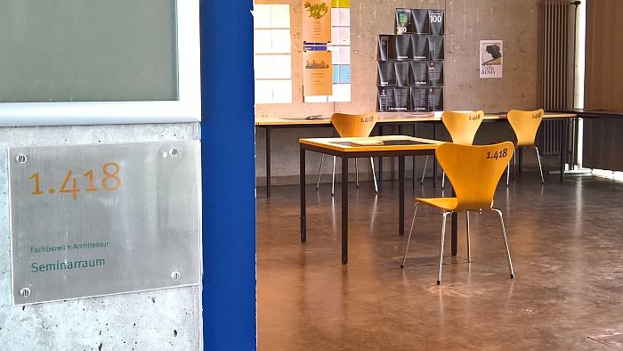
Sited since 2000 in a purpose built facility, the design faculty at the Hochschule Wismar offers undergraduate and postgraduate courses in Architectural Lighting Design, Architecture, Interior Architecture, Jewellery Design, Communication Design and Media, in addition to Product Design.
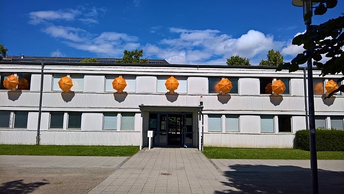
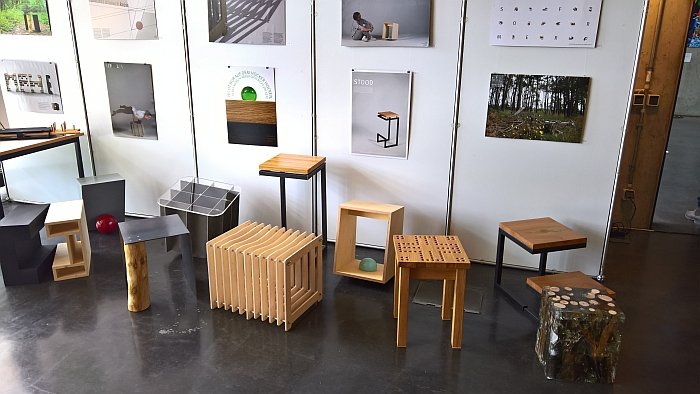
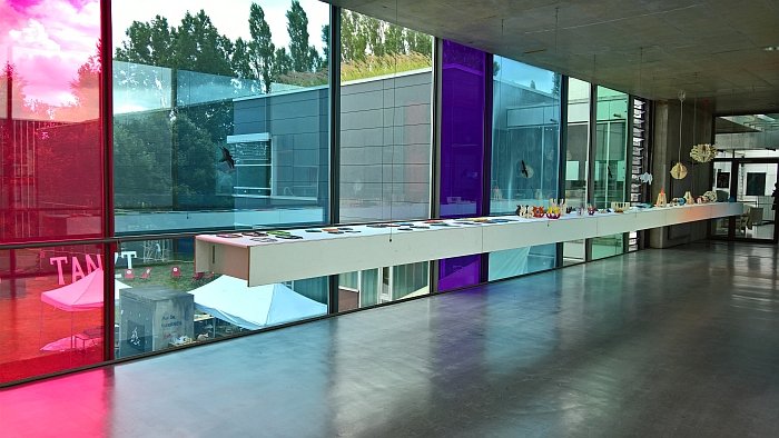
Staged under the title DIA – Design, Interior Architecture, Architecture – the focus of the 2017 Hochschule Wismar summer exhibition was very much the various semester projects, including, and amongst many others, Foundations of Design: Drafting and Forming, Vietnam-Tradition-Architecture and Behütet – Sheltered – the last of which challenged fourth semester Interior Architecture students to create six spatial design concepts that provided sensory comfort as part of a wider ranging project to provide spaces where students could relax, switch off and unwind.
The college’s new graduates were however also very present, and especially pleasing for us was the presentation of the Architectural Lighting Design Masters Theses, being as they were fundamental research, rather than formally reduced spotlights. Which really appealed to us.
Yes, had we been more familiar with the course, such wouldn’t have come as a surprise to us; but, and to repeat, that is why we are doing this, to learn. And now we understand. Among the subjects explored were Mimicking daylighting in office spaces by Poorvi Kamath, Light and lighting design in mental healthcare by Valeria Surrente and Light poverty – Building a strategy for sustainable light development by Carlijn Timmermans, and thus a nice mix of subjects and motivations.
Whilst, and as ever, accepting that a semester exhibition isn't a beauty pageant, and that much more it is about understanding what the students were taught, how they were taught and how they approached the various briefs, amongst the various semester and graduation projects on show one or the other did particularly catch our attention. Two to be precise, quality allows taking precedent over quantity......
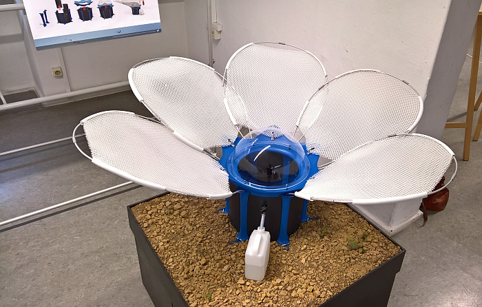
As previously noted, over the years we have experienced various systems which allow for the transformation of brackish water into potable by the principle of evaporation; De Bloom is, as far as we can remember, the first proposal which uses the principle of condensation to "mine" fresh water from the air.
In essence, as air cools it liquefies, requires however a surface on which it can settle in order to complete its transformation and become available. In nature numerous plants and animals have evolved strategies to utilise condensation to secure their daily water budget, and with De Bloom Miriam proposes following nature's lead.
Intended for use in semi-arid regions De Bloom's "petals" capture the inversion mists of morning in a net like structure - so analogous with the famous misty cobweb - while the plastic dome provides a surface on which the condensation of evening can rest. The collected water being guided into a cannister.
Delightfully low-tech, small scale and self-explanitory, De Bloom would appear to do everything right, the question is if it actually does and we hope Miriam gets the chance to carry out some meaningful larger scale tests.
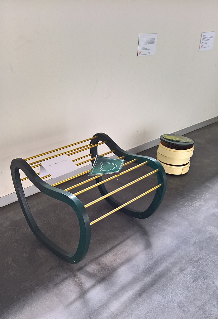
Realised in context of the class Vietnam-Tradition-Architecture we are admittedly unsure in how far Auris actually meets the set brief, but we're not letting that spoil our enjoyment of it.
According to Chiara the idea was to develop a two dimensional form into a 3D organic form and the result is a very neatly formed wood frame elegantly complimented by brass bars in a nicely proportioned and realised object.
We can't comment either on how comfortable it is or if/how satisfying the rocking experience is, but let's assume it is all as good as the formal impression.
Full details on the Hochschule Wismar can be found at www.hs-wismar.de
