She came from Greece, had a thirst for knowledge, studied sculpture at St Martins College and, according to Jarvis Cocker, had no understanding of the brutal realities of late 1980s British society.
Thirsty to know if the 2017 Central St Martins design graduates were more grounded in their contemporary reality, our 2017 #campustour headed to North London....
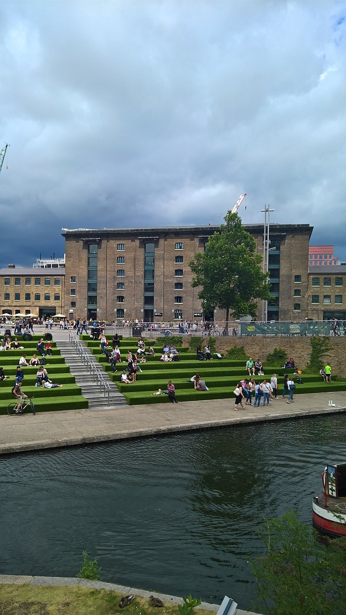
Tracing its origins back to the late 19th century, Central St Martins was formally established in 1989 through the merger of the Saint Martin’s School of Art, established 1854, and the Central School of Art and Design, an institution originally established in 1896 as the Central School of Art and Crafts, the name change indicating its evolving focus. In 1999 Central St Martins was extended through a merger with the Drama Centre London and in 2003 by Byam Shaw School of Art.
Part of the contemporary University of the Arts London, an collegiate institution uniting six London creative colleges, Central St Martins offers graduate and postgraduate courses across a range of creative disciplines including fashion, textiles, jewellery, performance, fine art, product design and industrial design. Of which the last two were our primary focus at the 2017 Degree Exhibition.
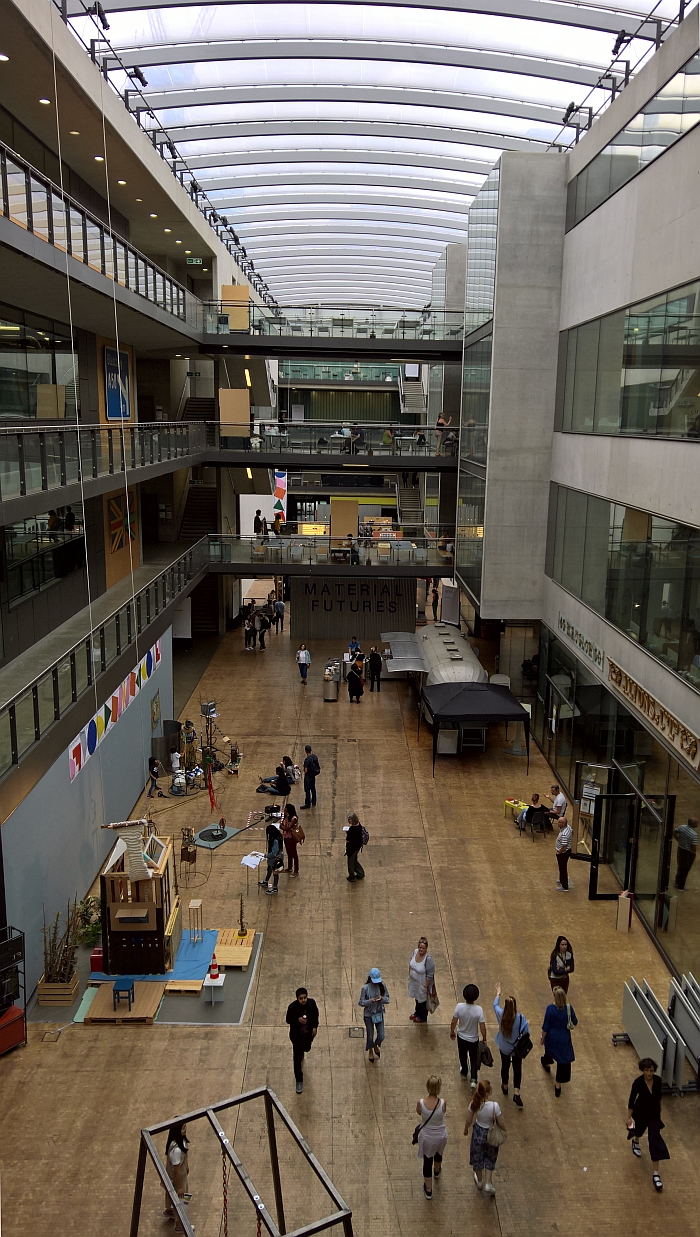
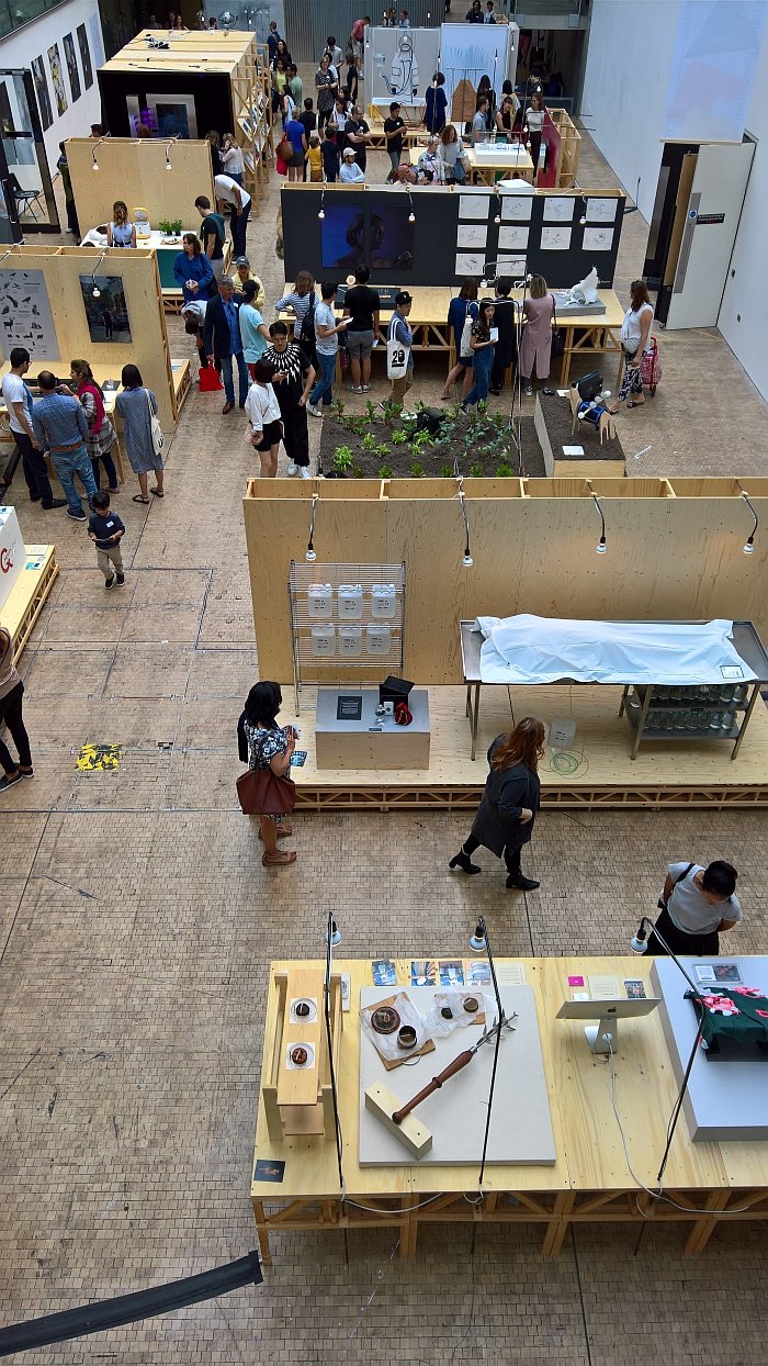
Staged in Central St Martins campus, a converted 19th century granary near Kings Cross Station, the 2017 Graduation exhibition presented the results of the numerous Bachelor and Master programmes, including the MA in Material Futures, a two year, transdisciplinary, Master exploring possible futures, and theoretical responses to such. Presenting an extensive collection of projects including, and amongst many others, The Galactic Everyday by Christine Lew which questioned how human comfort can be achieved in space, Humankind by Hannah Brooks which explored recycling human corpses, with a focus on "harvesting" water from our dead selves, and Future Farming by Agusta Arnardottir which created open source solutions for small scale farms based on technology normally only practically available to industrial farms, Materials Futures presented a future which, when not exactly dystopian, indicated that avoiding it involves not only making some serious social and economic changes now, but for all reaching a global consensus on the direction we want to go and the means we want to employ to get there.
In addition to graduation projects the Central St Martins 2017 exhibition also featured the results of numerous semester projects run in conjunction with commercial partners. While such cooperations are, arguably, important and a sensible part of any designers education, a couple of those presented at Central St Martins did make us feel a little uneasy. No names, no pack drill; but, if a cooperation, potentially, benefits the partner more than the students it isn't a good project. Sure the partners must get something from the cooperation, that is only fair, but that shouldn't be out of proportion to how the project helps the students develop as designers. Or put another way, the immediate focus should be the students, not the partner.
But then again, maybe we should trust the students to see through the smoke and mirrors.
Aside from such considerations, several projects particularly caught our attention and fired our imaginations, including......
Created in context of the MA Design (Furniture) course Harmony seeks, in Shan's words "to offer a point of reflection to release urban dwellers from stressful environments by creating abstracted mountainous environments as seating spaces" The chosen vocabulary for these abstract landscapes having its origins in Oracle bone script, one of the earliest forms of Chinese script. A visually appealing, well proportioned, engaging, object offering a range of sitting options, what appealed to us most is that the base is a mirror reflection of the, intended, seat. And impressed us for two reasons. Firstly there is the, well, harmony it brings to the work. The relationship of seat to base is important in any sitting object, by using the same structures and shapes in the same places you create a very logical and accessible object. One which can have a complexity, because that complexity becomes secondary. In effect Harmony is a slightly more involved take on the egg-timer stool/table. Then there is fact that, theoretically at least, you can invert it. And thus turn an ode to the calm of the Chinese mountains into a reduced, slightly aggravated, industrial wasteland. One resting of course on a rural idyll.
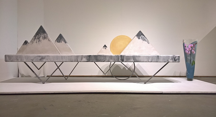
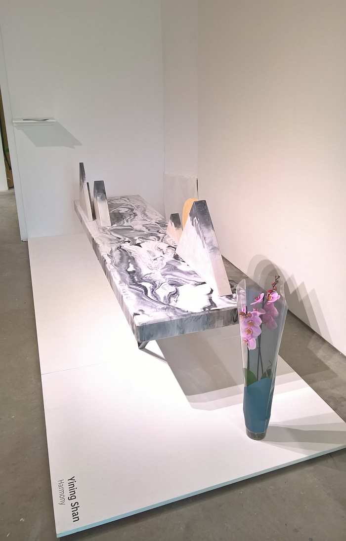
Furniture and other household have accepted forms, designers start with these forms, consider the materials from which they are crafted, the mode(s) of construction, their relationship to other objects. And presented the results in Milan as something new.
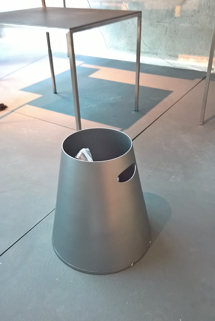
But these forms are not irrevocable laws, rather have become accepted over time and through convention. Zhen Jiang has questioned these forms, and played with them. Most pleasingly in his desk and his litter bin.
Although most of us have a flat, planar desk, we don't use it as such. Mentally we have it divided into areas, areas which serve specific professional and private functions. With his Opposites Desk Zhen Jiang has given this virtual division a physical form, transforming a desk into a series of islands. A most pleasing transformation. And most logical. As is the metal construction system. Although we could well imagine it working in a majority of other materials. In which context, yes we also see serial production problems, but not insurmountable ones.
Equally pleasing is the Opposites litter bin which not only transforms accepted thinking on the shape of litter bins, but also how one empties them. We'll not reveal all the secrets here, but the emptying solution is as delightful as it is painfully obvious. In addition its upwards tapering form means it, theoretically, passes effortlessly into any space, unlike cylindrical litter bins which scream "LITTER BIN!!!", and thus are objects many of us try to hide in domestic settings. Zhen Jiang's litter bin is, well, the opposite.

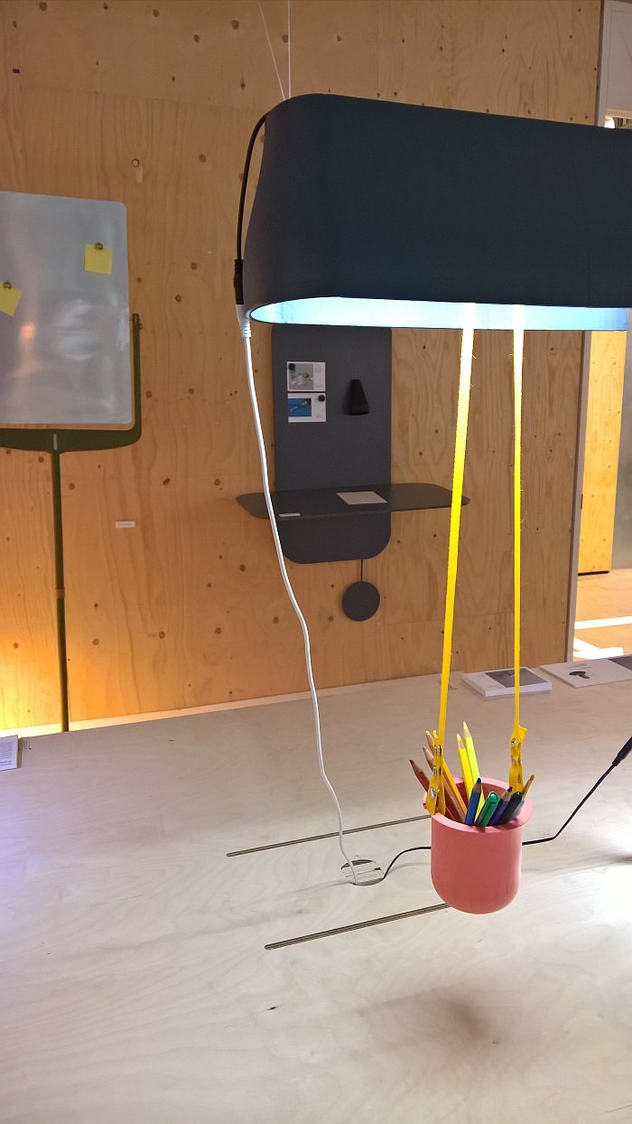
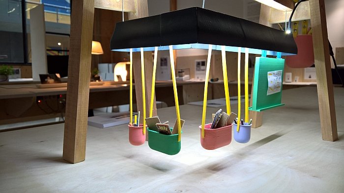
Arising in the context of a project sponsored by Anglepoise, Affix imagines work space lighting as the basis for a collection storage, display and teamwork accessories. Which would appear to make sense, most work place lighting is strip based, and above desks. And so why not integrate the lighting into the workspace set-up. The only question is the effect on the field of illumination. While some shadow is inevitable, it shouldn't distract or or otherwise interfere. The only second question is that of weight, extra suspension is going to be necessary. Then there's the visuals. We are, to be honest, not 100% certain about Rebecca's "cartoon" aesthetic, but then again for start ups, and those multi-national tech conglomerates who use interior design as a form of self-denial, it might be just the thing.
So yes there are open questions. But it is a student project, an idea in development, on the way to being a work in progress.
That we need to change the way we live is fairly clear. How we do that. Less. With [Em]power Sigrid Husson presents an alternative washing machine concept. Physically reminiscent of an early 3D printer, and unmistakably a child of open systems and rapid-processing technology, [Em]power is a flat pack system designed to be built yourself, repaired yourself, and powered yourself - the latter via two pedals. As such [Em]power not only reduces that resource usage directly associated with washing clothes, but also that indirectly involved in constructing, distributing and maintaining domestic washing machines.
And not just our domestic washing machines. A low-cost, low-tech, local solution [Em]power also offers possibilities in extreme situations, for example in emergency accommodation after disasters. Shipped in flat-packed, assembled on location, used until such time as more permanent solutions can be established, disassembled, shipped out flat-packed and stored. If, for us, there is still a lot of work to be done to make it such a truly universal and practicable on a wide scale. But a most intersting approach.
![[Em]power by Sigrid Husson, as seen at Central St Martins, London Degree Show 2017](https://www.smow.com/blog/wp-content/uploads/2017/06/Empower-by-Sigrid-Husson-Central-St-Martins-London-Degree-Show-2017.jpg?w=3840)
[caption id="attachment_49157" align="aligncenter" width="700"] [Em]power by Sigrid Husson, as seen at Central St Martins, London Degree Show 2017[/caption]
The history of contemporary chair design begins, in effect with the development of the so-called "backstool": historically tables were placed adjacent to a wall, diners sat on stools with their backs to the wall. When changing social conventions saw tables moved to the middle of the room, the stools became uncomfortable with prolonged sitting and so a backrest was added. That was the 17th century, and since then all we've tried to do is make chairs more comfortable.
Which is arguably four hundred years wasted effort
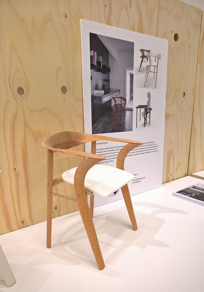
Or at least such considerations arise in context of Chang Liu's project Uncomfort Design.
Deliberately designed to be uncomfortable Chang Liu's chair forces us to adopt a more comfortable seating posture, or put another way Chang Liu's chair forces us to adopt a more beneficial and healthy seating posture. And being creatures of habit, having "learned" such, we will continue to adopt our positive sitting position. Thus the apparently disadvantageous seat becomes something very positive.
While arguably not the first project to approach seating from such a perspective, and accepting that it only exists as a model and thus is untested, we really like the way it is cheekily modelled on popular interpretations of hand crafted Danish chairs.
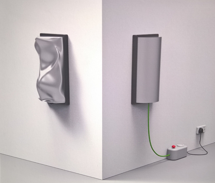
Motivated by an interest in better integrating fitness machines into our homes, Impact is the punch bag which became so, so much more.
A wall mounted unit Impact takes the blows you give it, in that deforms..... With every punch you sculpt, the reminder of every glove that laid him down or cut him adding to and transforming the object's physical appearance. And thus when not in active use Impact serves as a feature in the space, in direct contrast to contemporary sports equipment which simply takes up space when not in use.
Still at a very, very early stage of development Impact is obviously also interesting beyond simple fitness training and as something generally to punch when you have no other outlet for your frustration. Or joy at a small success. Why punch the air when you can punch Impact and thereby add to the styling of your space.
Full information on Central St Martins can be found at www.arts.ac.uk/csm
