Designer | Exhibitions and Shows | Fuorisalone Milan Design Week | Milan Design Week | Producer | USM Haller
As older readers will be well aware, little gets us down quite like Milan Furniture Fair. Every year our only wish as we cross the Alps is that we will find something to make us thankful that we did. Milan Furniture Fair 2017 produced more such moments than the average year, which we suppose means we'll be back next year!!
Our Milan Furniture Fair 2017 High Five!!
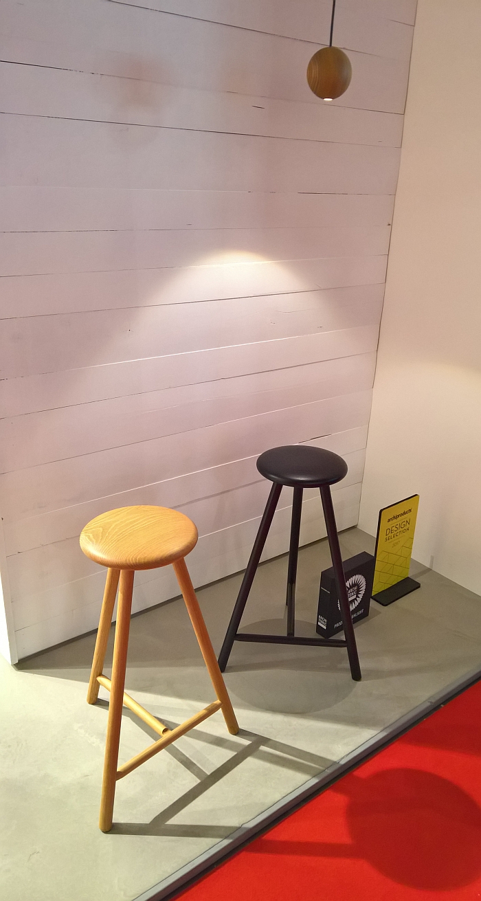
Back at Neocon 2016 we bemoaned the lack of objects in public places on which one can perch. When waiting, or idly passing time, one doesn't always want to sit as an alternative to standing. Sometimes you simply want to perch-a-while. The "perching problem" isn't of course purely one of public spaces, in domestic spaces we also lack objects on which to perch. We all know the situation, you've got your coat on to go to work when someone posts on Instagram just the best picture of a plate of chips, ever, and you have to spend the next five minutes commenting on and sharing it. But you don't want to sit down, you're on your way out the door. Or you're about to do the washing up when the last car rental firm you used call to check the user experience. And you spend the next four minutes saying "very happy", "very happy", "very happy" But you don't want to sit down, you've got things to do. Or you're waiting for your better half to, finally, get ready, you're ready and don't want to sit down, you want to perch. Impatiently. Linea by Wesley Walters & Salla Luhtasela for Finnish manufacturer Nikari is the object for allowing just that.
We're not claiming stools are new. They aren't. Stools are very very old. But Linea is a particularly fine example of the genre. Neatly proportioned, intelligently constructed, lightweight and unobtrusive, Linea is an object which demands little attention and will never receive more than that which it seeks, but most importantly the small button seat is comfortable without inviting you to sit. Rather it invites to perch. A thoroughly engaging project and one which proves that perching stools don't have to wobble.
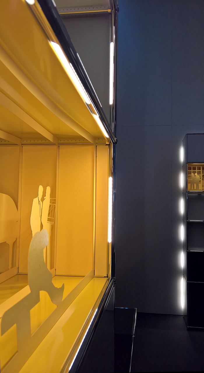
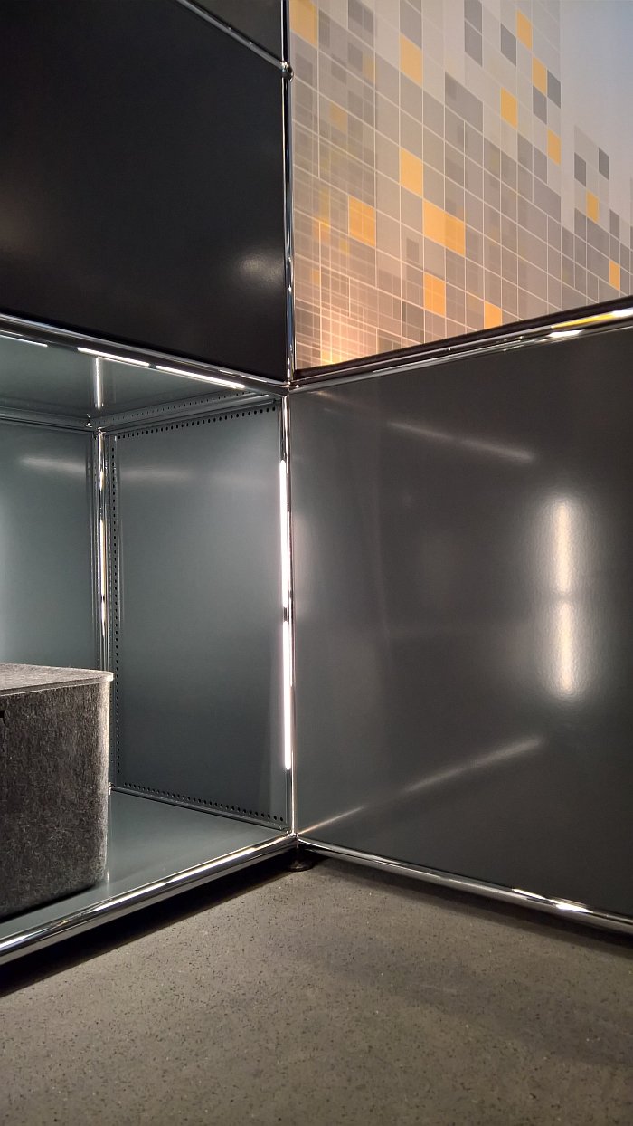
We genuinely never thought we'd feature USM in a High Five! Not because we don't like, system USM Haller, we do, but because one of the delights of the system is its completeness. With its self-obvious simplicity, how can you develop it? What can you add? No honestly, what?
Lights.
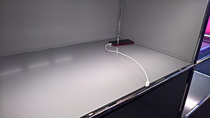
USB chargers.
What amuses us most about the new development is that one can't visit a student showcase, design festival or trade fair these days without seeing someone who has placed LEDs into a bit of wood or metal. Yet despite having seen such concepts untold times, and despite having a USM tube on our desk - long story, involves an aquarium - and despite the fact that with little meaningful to do all day we regularly just stare at said USM tube, it never occurred to us to use it to help transfer electrical current and thus power lights and USB chargers. It occurred to USM, and for the past seven years they have been developing the idea, and have realised a solution as simple, appealing and patently obvious as the system it now illuminates.
Through adapting the connecting balls and connectors, making them, if you will, connectors in an electronic as well as a physical sense, power can be supplied to specially adapted tubes; tubes to which USB chargers - or USM chargers as we're now calling them - or LED light strips of either warm or cool white, can be added. And therefore a solution which means that any existing USM system can be retrofitted, and that without disrupting the aesthetics of the unit. Particularly pleasing is the automatic on/off function for drop down and extension doors, handy for dark nights in the office when you've just got a desk lamp on, don't want to put the main lights on, but really need a gin from the USM Bar Cabinet. Or a document. Elsewhere we can imagine such working very well in display stand situations or simply as background, ambient light, while the USB charger is an unavoidable of contemporary life, and having such fitted so effortlessly and logically into your domestic USM sideboard is more than appealing.
Having developed the USM charger, we're now eagerly awaiting the USM Disco Ball... Watch this space!
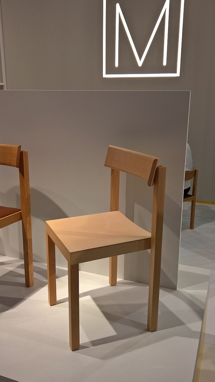
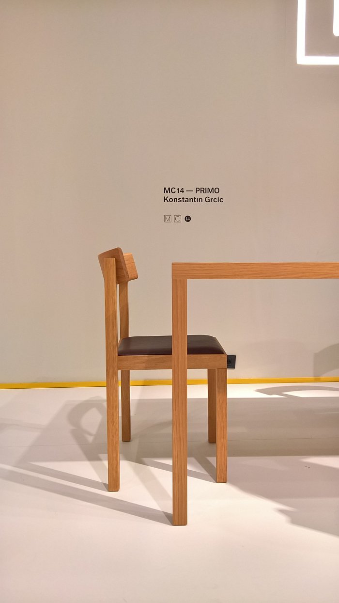
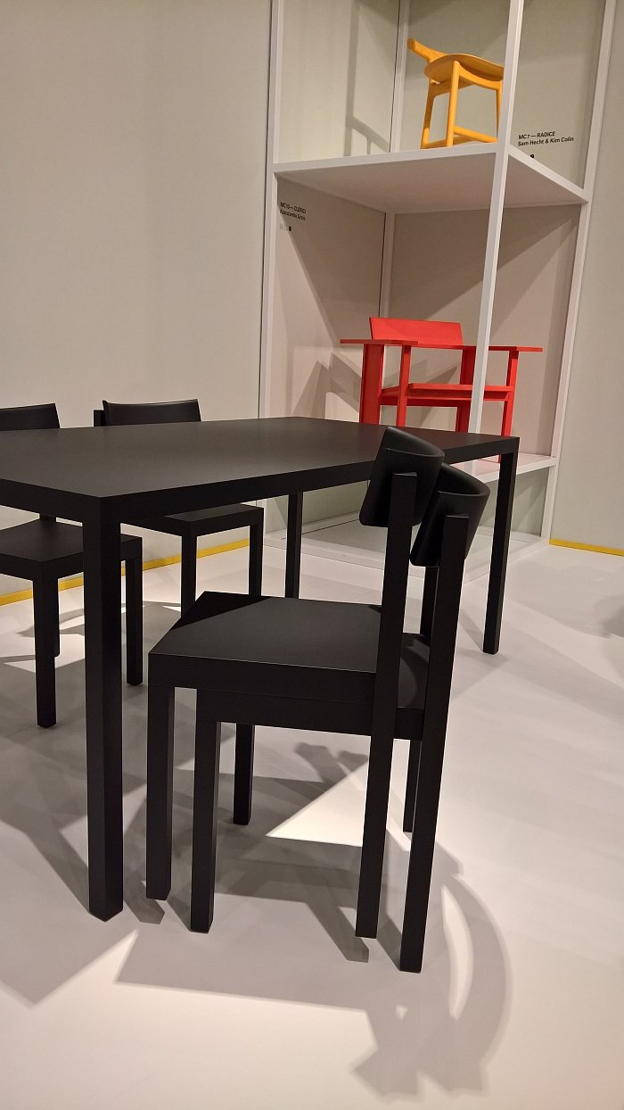
It's fair to say few objects occupied us at Salone Milano 2017 quite as much as the Primo Chair by Konstantin Grcic for Mattiazzi. We must have visited Primo four or five times and every time left just a little more obsessed than when we arrived. As with so many of Konstantin Grcic's projects there is nothing special in genre or concept, but a lot special in the realisation and form achieved. In many respects with the Primo Chair Konstantin Grcic has out-Ungered Oswald Mathias Ungers, who's few chair designs never achieved quite such an unrelenting quadratic poise, an unrelenting quadratic poise deliciously juxtaposed by the curved, offset, and supremely comfortable backrest. Set solidly, resolvedly into the vertical, quadratic supports the backrest doesn't dissolve the principled quadric construction, but reinforces it. In a way helps celebrate it.
And why is it worth celebrating? With its simplicity, sincerity and utter command of its environment, the Primo chair is a very grand object in an unassuming coat; a work in which Konstantin Grcic has reinterpreted a very simple, everyday object according to much more refined and cultured parameters to produce a chair which is more than the sum of its parts. More than square bits of wood. Although they are central, and defining.
Stackable up to three chairs and available with or without a padded seat, what is particularly pleasing with Primo is its compactness: at just 40 centimetres in width, 45 centimetres in depth and 78 centimetres high, Primo is smaller than comparable chairs, while still allowing more than enough room for a secure, stable, and comfortable sitting experience. With the associated lower material requirement. All in all a delightful project.
One of our highlights of Milan 2012 was our introduction to French brand La Chance. It may have been because they were exhibiting in the railway hall of the National Museum of Science and Technology. We like to think it was because of the collection they presented. Since then, and maintaining the language of the railroads, we've lost track a little of La Chance, not least because, for us, they seemed to be heading towards a siding. Pleasingly, before they reached that cul-de-sac the points were changed, and they are now rolling in much more positive directions, and developing a nice portfolio of very self-confident, autonomous, if not always easy, objects.
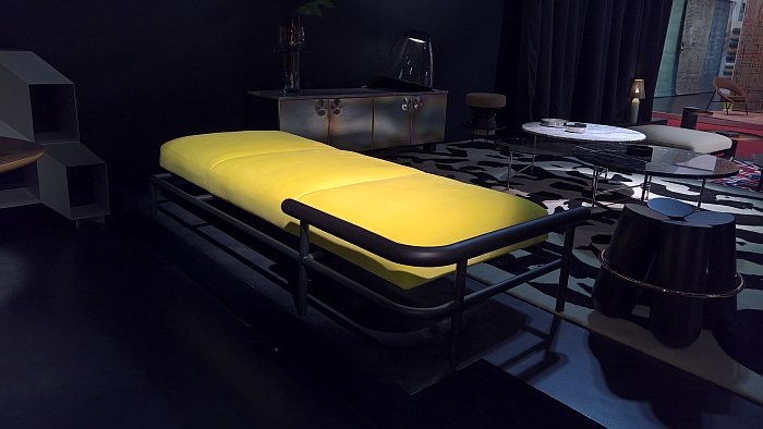
One of the drivers of locomotive La Chance is the X-Ray collection by Brussels based designer Alain Gilles. Self-confident without being brash or overbearing X-Ray began as a sofa collection, and at Milan 2017 Alain and La Chance unveiled a matching daybed, armchair and ottoman-table, of which the daybed particularly caught our attention. Even if the concept of the daybed does generally confuse use. Particularly appealing about the X-Ray daybed is the way the wooden bar not only frames the "mattress" without dominating it, helps keep a sense of scale and stability, but has been set just marginally above "mattress" level allowing it to be used to help prop up a cushion. Less appealing is the yellow covers, but only because it makes photographing it under trade fair lights an absolute nightmare........
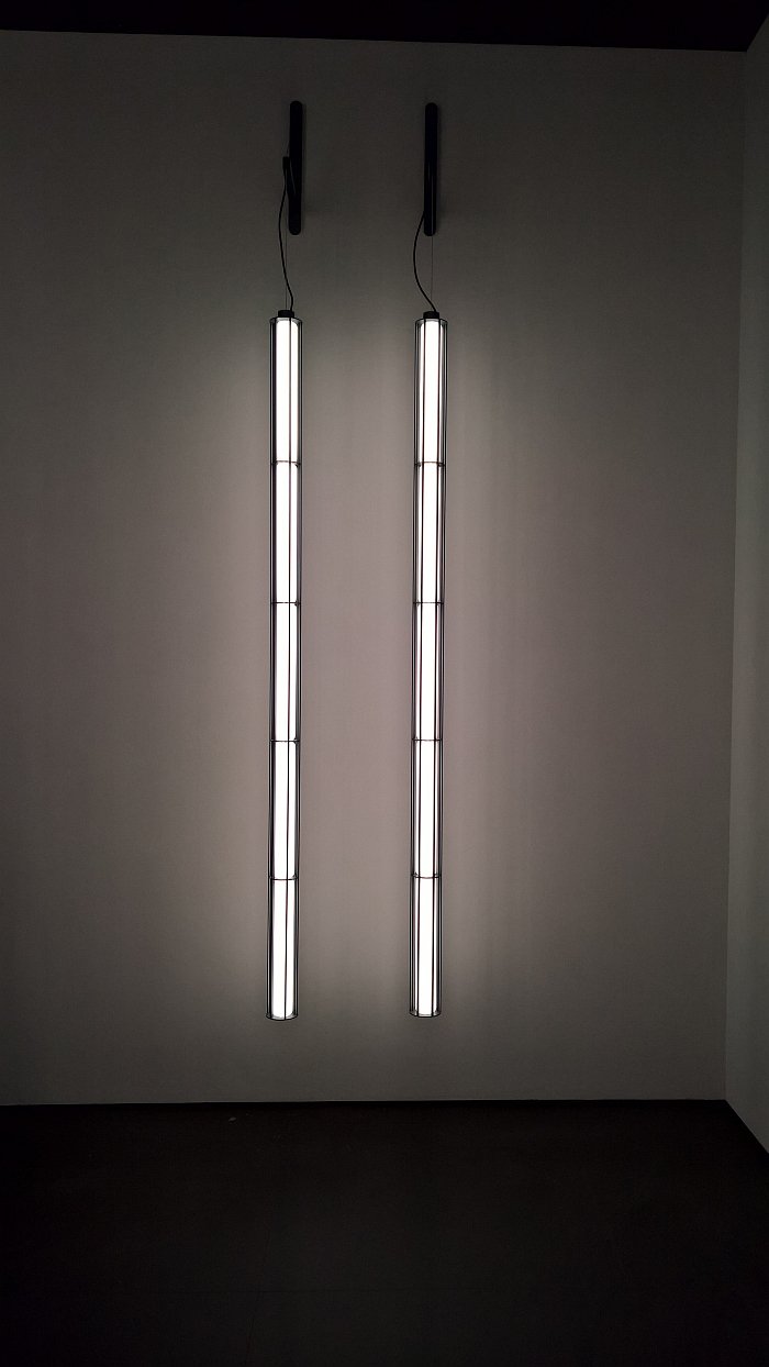
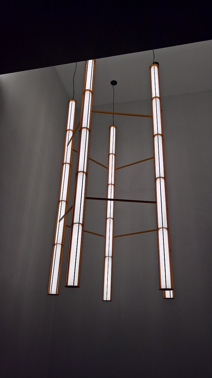
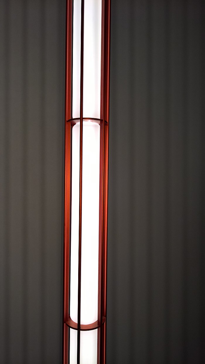
When the exhibition Ronan and Erwan Bouroullec: 17 Screens opened in Tel Aviv we opined that one or the other idea from the research would, at some point, work its way into Bouroullec products. We were thinking more about connecting systems, not the idea of the hanging object as a typology. But why not? A very pleasing, neatly proportioned, calming object, which commands without being dominant or conceited, Verticale essentially traps the light inside an aluminium frame: or at least attempts to, light by its very nature seeks to diffuse and does so from Verticale in a most pleasing manner.
A very elegant object which could just as easily have been developed a century earlier - we can well imagine Verticale gracing the entrance hall of an early Applied Arts museum or the vestibule of a progressive, early 20th century industrialist's townhouse - the Verticale modules can be used individually or in groups and stand a good 3 metres tall; thus Verticale isn’t going to be suitable for every home, or we suspect home budget, and thus is more likely to find itself in public spaces, receptions, hotels, etc, etc, etc
Sadly we didn’t see it turned off, and so cannot comment on whether the unilluminated form maintains the elegance and wonder of the illuminated. But let's just assume it does......
