With the exhibition Stapeln. Ein Prinzip der Moderne the Wilhelm Wagenfeld Haus in Bremen celebrate the complex diversity of one of design's simplest principles .... Stacking.
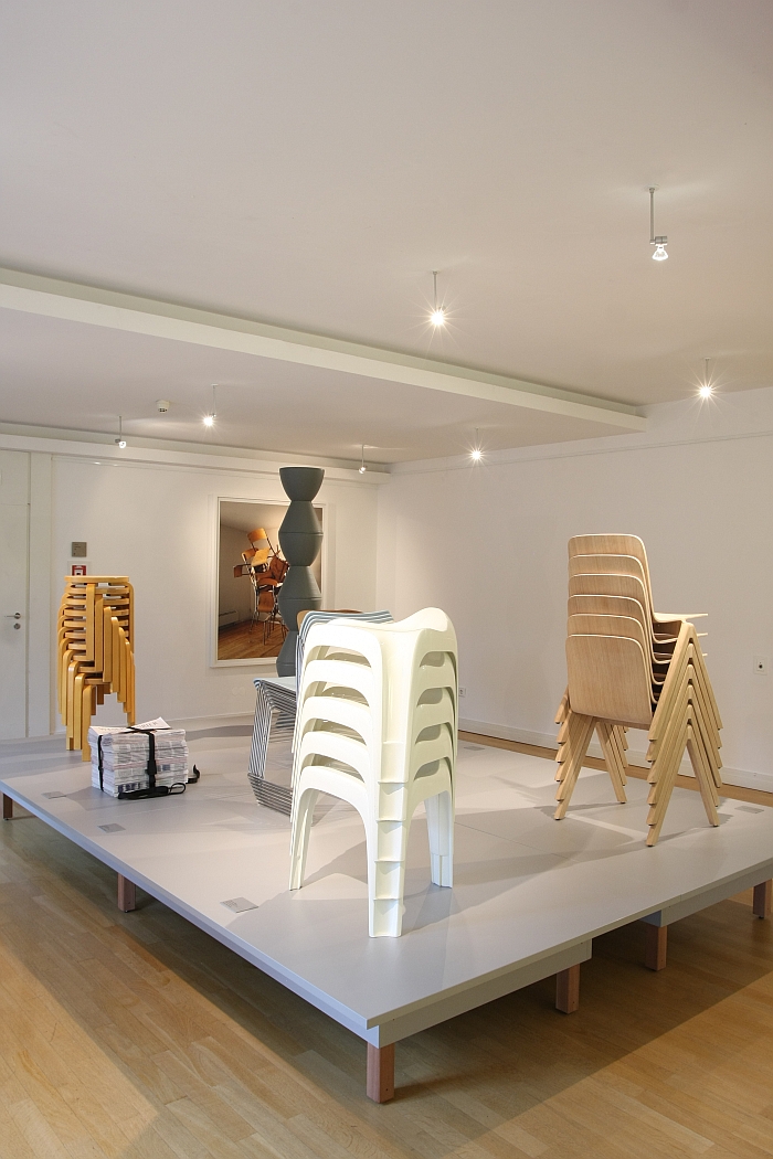
Placing one object on top of another is one of the more innate of human actions. Is something we start to do before we can talk, and an action so simple, so self-explanatory, we generally pay it no heed. Why should we? It is so obvious. Something that we've always done. Without ever needing to question how or why.
As a design principle placing one object on top of another, is relatively new. Why that should be, how stacking in design has evolved over time and how designing stackable objects affects the design process is explored in the exhibition Stapeln. Ein Prinzip der Moderne - Stacking. A Principle of Modernity - at the Wilhelm Wagenfeld Haus in Bremen.
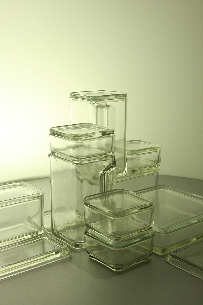
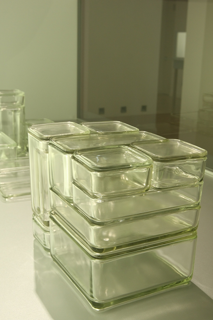
The origin of Stapeln. Ein Prinzip der Moderne is almost as innate as the process itself, and yes, started with Wagenfeld's 1938 Kubus storage containers for the Vereinigte Lausitzer Glaswerke, not only one of Wilhelm Wagenfeld's best known works, but one of the earliest examples of using stacking in design, "We have numerous examples of the Kubus system in our repository" explains Dr Julia Bulk, Director of the Wilhelm Wagenfeld Stiftung, "and one day I was looking at them and found myself questioning how other designers approach stacking." A eureka moment, a question almost too obvious to pose, about a principle so simple it is barely worth heeding, and one which has resulted in an exhibition which explores stacking in design over the past eight decades and in context of eight thematic areas.
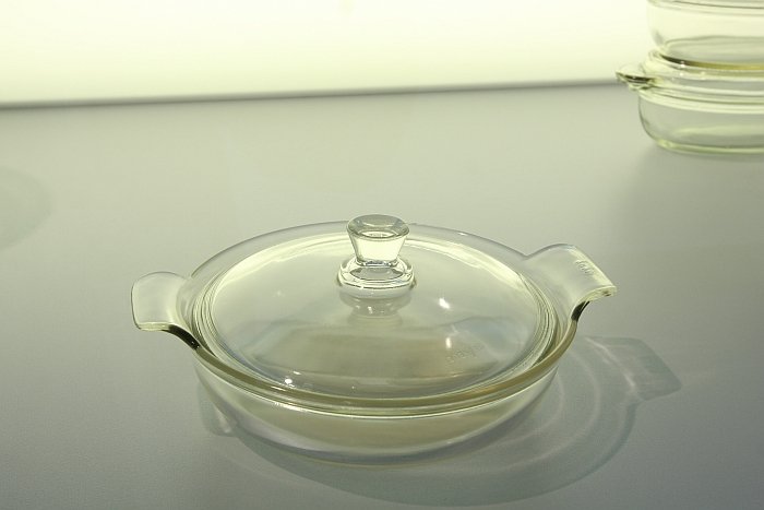
Yet which "begins" with a non-stackable object: a Durax baking dish designed by Wilhelm Wagenfeld in 1935 for Jenaer Glaswerk and which features, in a very classic terrine style, a grip handle centrally placed on the lid.
Next to the 1935 Durax baking dish stands a 1937 Durax baking dish, a stackable object which Wagenfeld developed from the non-stackable baking dish, and thus a direct comparison which deftly guides the visitor towards one of the main themes of the exhibition: how does stackability* affect the way a designer approaches a project? The way a designer designs.
In the case of the 1937 dish it is not only that Wagenfeld replaced the handle on the top of the lid with handles on the side, which corresponded to the handles on the dish, and thus allowing the dishes to become stackable, he also incorporated a so-called Formschluss, a slight ridge in the lid which means that the object stacked above it can't slip and slide out of place, is held tight, thus maintaining the stack's stability.
"It is an exhibition where one must always look very closely" advises Dr Bulk, and indeed the true beauty, genius, magic even, of many the designs is at first invisible. Often remaining hidden on the second or third viewing. But invest the time and you'll get there. And over the course of the exhibition learn to appreciate what Charles Eames meant when he said "The details are not the details. They make the design"
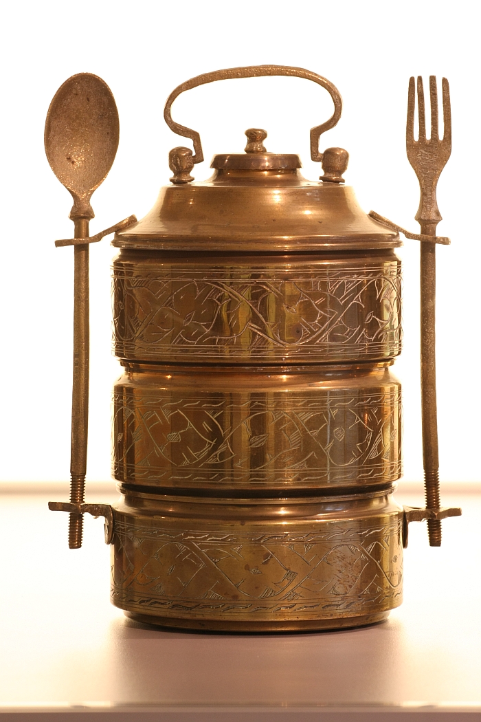
In which context we were particularly taken with an otherwise unnamed and uncredited Tiffin Carrier from south-east Asia and dating from the mid-20th century. An object we're likely to be obsessing about for the foreseeable future.
Look very closely at the exhibition and you will also slowly understand that it is about stacking. Which yes, sounds obvious and simple, it's in the title; but, means the connections between the objects are, in a way, non-existent. The objects fit with/into/on top of one each other, but aren't joined. Save for in a couple of very specific exceptions.
Systems which are joined by physical connectors are generally about the system as a complete entity, because they generally only exist as systems. The individual components having a function, but little real autonomy.
Stacked systems in contrast also exist as individual objects. The stack is intended as a transient state to which the individual elements always return.
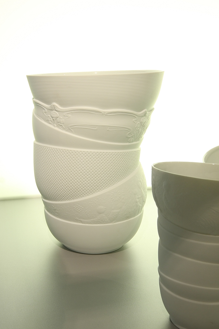
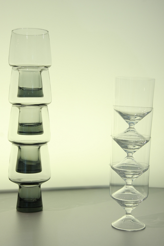
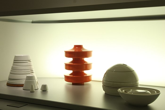
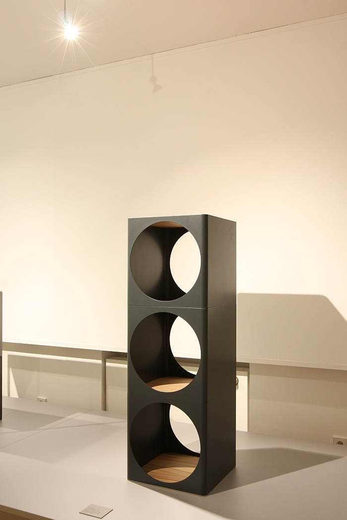
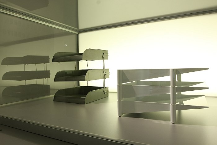
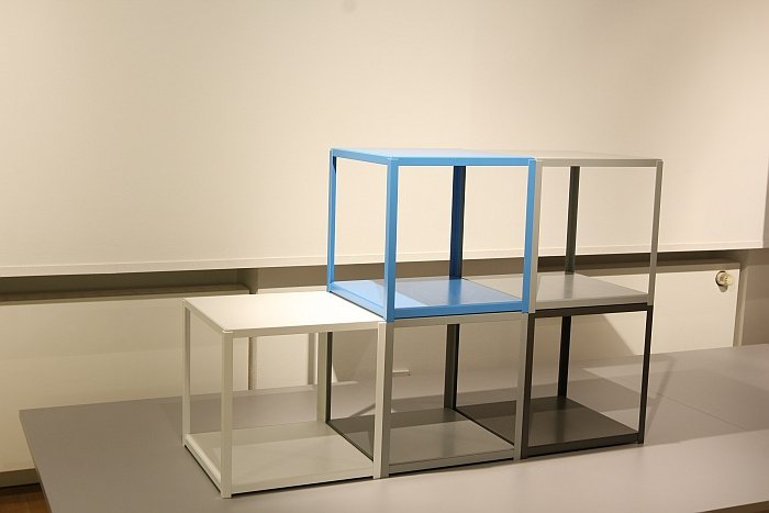
Thus designing for stacking compels designers to consider the complete system in terms of aesthetics, functionality and usability, without losing sight of, or control over, the individual, autonomous, elements. A process which as the exhibition neatly demonstrates results in a range of formal solutions, including strictly regimented, modular, systems such as Kubus, much freer systems which allow the components to have an individual character while maintaining a strictly structured order, such as the TC 100 service by Nick Roericht, or fully abstract systems where the individual elements become consumed by the whole, as perfectly demonstrated by La Boule by Helen von Boch.
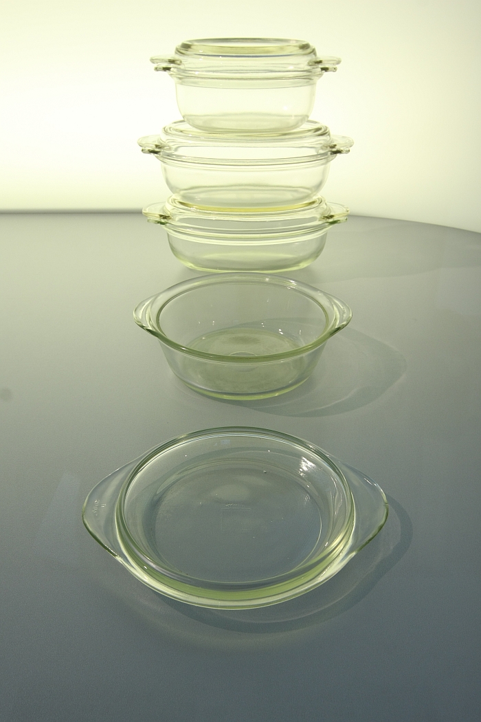
As an exhibition Stapeln. Ein Prinzip der Moderne features an awful lot of glass and porcelain, something which was in many ways unavoidable: some of the clearest and most expressive examples of stacking in design being crafted from glass and porcelain, for all in terms of dinner services and storage systems.
As an exhibition Stapeln. Ein Prinzip der Moderne features an awful lot of Wilhelm Wagenfeld, something which was in many ways unavoidable: not only because of the location of the exhibition, but because it is a theme to which Wagenfeld continually returned throughout his career, and that invariably with success. Or put another way, some of the clearest and most expressive examples of stacking in design being from Wagenfeld. In addition to the Kubus system the exhibition features, and amongst many others, preserve serving jars, various egg cups and his 1955 in-flight meal service for Lufthansa, the first such service commissioned by the airline. Given Wagenfeld's long and close relationship with stacking can one therefore describe Wilhelm Wagenfeld as the father of stacking as a design principle, we ask Dr Julia Bulk, well aware of the fact we are standing in the Wilhelm Wagenfeld Haus, "I think that would be taking things too far", she replies equitably, "he was certainly one of the first, and through his work a lot of people came to understand the potential of stacking, but I think designers such as Nick Roericht are every bit as important."
And this equitableness is reflected in the exhibition, including the decision to use Alvar Aalto's Stool 60 as the main exhibition image, rather than the more obvious Kubus. Yes, there is a lot of Wagenfeld, but it is not celebration of Wagenfeld, rather of a design principle which features regularly in his oeuvre, one in which he was particularly competent and one which can be excellently demonstrated and explained through his work.
Aside from exploring how designers approach and respond to the challenges of designing for stacking, a second important theme of the exhibition is the relationship between stacking as a design principle and industrialisation. A theme which starts with the question as to why, given its innateness, designers took so long to discover stacking?
The most obvious answer is that they probably didn't. They probably discovered it fairly quickly. But before industrialisation there was little need for stackable objects, or as Julia Bulk phrases it, "that for which there is no demand, doesn't exist." And pre-industrialisation, and for all pre the social, cultural and economic changes industrialisation brought, there was very little demand for stackable systems. At least not as consumer goods. The demand came with industrialisation.
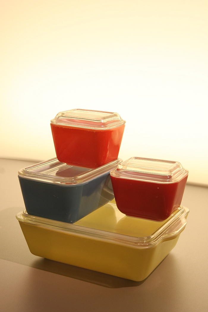
The case of Wagenfeld's Kubus system being an excellent case in point: it was developed in the 1930s for domestic refrigerators, which at that time were a relatively new development, were relatively small, and it was an age when foodstuffs didn't necessarily come packaged. Therefore one needed new solutions to ensure both good order and good hygienic conditions within the constraints of a domestic fridge. Wagenfeld's system allows just that.
And achieved that in a new material, pressed glass. A choice of material which for many was neither simple nor obvious. "Initially pressed glass was considered inferior, everyone wanted crystal glass", notes Julia Bulk, "however Wagenfeld realised that as material it was perfect for forming and for industrial production"
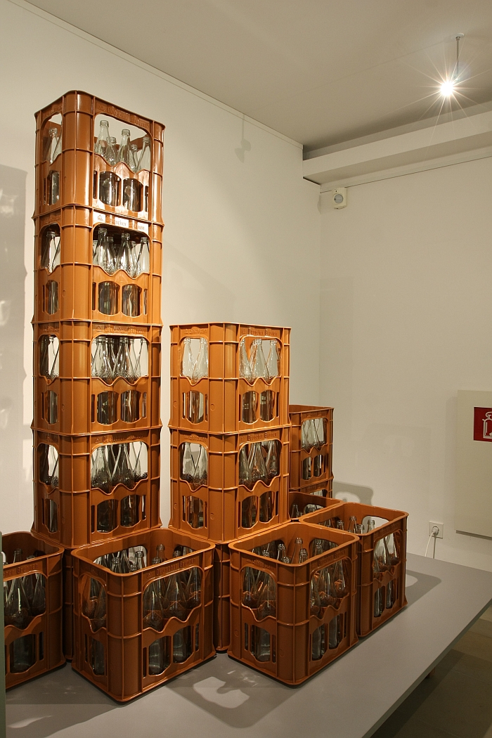
And industrial production being perfect for stacking systems, allowing as it does the creation of very precise, standardised, forms, and that quickly and in large numbers: a combination which was increasingly required from the 1920s onwards as social, economic and demographic changes led to changes in housing standards, transportation, work practices, consumer behaviour and international trade. The new materials, for all the new plastics, and new production processes developed in the course of industrialisation being integral to the new solutions, including the many stackable solutions, developed to meet the new realities.
Thus exploring stacking also helps us understand the connection between social, cultural and economic developments and technological advances, and the role of the designer as the conduit who adapts the later to the former. And that ideally in a functional and visually appealing manner.
And which thus also helps make clear that the exhibition title means less that the modernist stacked out of principle but rather recognised the principle of stacking as a simple, obvious means to help society react to the changing conditions of his/her day.
Not that industrialisation, or modernists, alone have been responsible the proliferation and evolution of stacking in design.
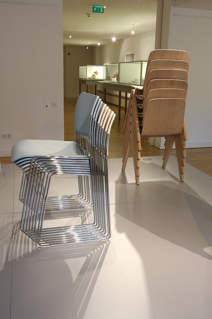
For Julia Bulk an important impulse in terms of the development of stackable furniture, for all stackable chairs, was a post-war rise in the number of communal, multi-functional halls being built: new types of spaces which necessitated new types of chairs, and for all multi-purpose chairs which could be stacked when not in use. The furniture industry being only too happy to oblige, recognising as it did the potential of the new market. And as good fortune would have it the 1950s providing them with designers capable of producing such, including, amongst others, Charles & Ray Eames, Arne Jacobsen or Egon Eieremann
In addition a further impulse for the development of stackable chairs, and an all too easily overlooked advantage of stackable chairs, arguably the advantage of stackable chairs, is that they are easier, and cheaper, to ship than non-stackable chairs. Something which became increasingly important with rising post-war consumerism and the associated mass production of furniture from the 1950s onwards
The variation in methods by which chairs can be stacked, and how the incorporation of such a strictly defined functionality needn't mean any loss in terms of aesthetics or formal variation being demonstrated by a presentation featuring, and amongst many others, the Copenhague Chair by Ronan and Erwan Bouroullec for HAY, the Casalino stool by Alexander Begge for Casala and the 40/4 by David Rowland for Howe.
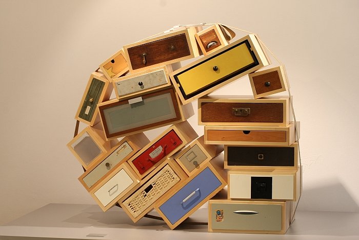
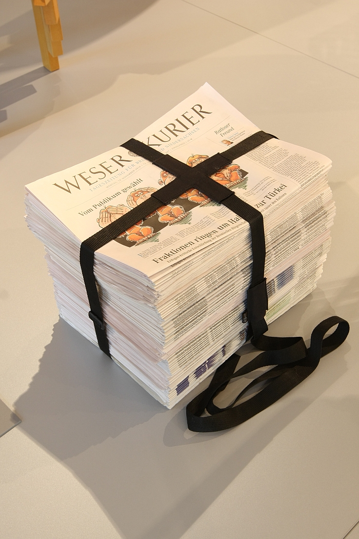
Having opened with an object which can't be stacked the exhibition closes with the Auflösung des Stapelprinzips - The Dissolution of the Stacking Principle - a presentation of, if you will, post-industrial, post-modern, stacking; of objects which are stacked but which rather than being stacked according to systematic and functional considerations demanded of the industrialisation which gave rise to stacking, are stacked according to their own logic. And which thus allows them to present themselves with a greater openness of emotion and to demand a greater personal involvement from the user. And in doing so neatly demonstrates that evolution in design is not just one of forms, materials and functionalities, but also of our relationship to objects and the way objects communicate with us and interact with the space around them.
A development which we think Wilhelm Wagenfeld would approve of, or as he himself once said, "The purpose of an object is of secondary importance, the use however is more relevant .... With use develops culture, the overcoming of a perceived raison d’etre"
The spatial reality of the Wilhelm Wagenfeld Haus being what it is Stapeln. Ein Prinzip der Moderne is a relatively bijou affair, and very pleasingly the curators have avoided the trap many museums succumb to of overfilling their exhibition space in an attempt to explain their position from all conceivable angles. Less can be more and in context of Stapeln. Ein Prinzip der Moderne the decision for a reserved object selection means one isn't confronted by an exhibition in which the exhibits are stacked on top of..each....other.......Oh..... hang on.....hhhhhmmmm.
The reserved object selection is in addition ably supported by the reserved exhibition design concept from Jakob Gebert, Hanna Krüger and Christian Poppel. Although if, and thoroughly unavoidably given the nature of many of the exhibits, there are an awful lot of objects in glass display cases, which as we always note, is never, ever, a good thing; however, the space created in the exhibition gives visitors the peace to follow Dr Bulk's advice and observe the objects closely, and thus get the maximum benefit from a very well conceived and realised exhibition.
If we did have one criticism it would be the the German only presentation, stacking is a universal language and Stapeln. Ein Prinzip der Moderne an exhibition with universal appeal.
As far as the Wilhelm Wagenfeld Stiftung are aware Stapeln. Ein Prinzip der Moderne is the very first exhibition to explore the subject. That wouldn't surprise us. As a subject stacking is so simple, so self-explanatory, so innate, where is the how and why to be questioned? What is there to be explored?
Stapeln. Ein Prinzip der Moderne neatly provides the answers.





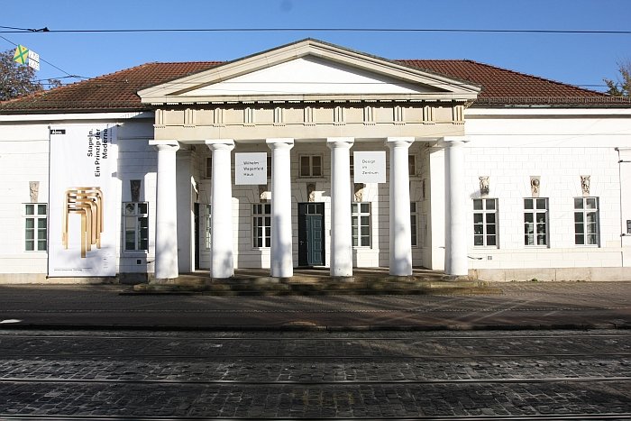
Stapeln. Ein Prinzip der Moderne runs at the Wilhelm Wagenfeld Haus, Am Wall 209, 28195 Bremen until Monday April 17th Full details, including information on guided tours and the accompanying fringe programme can be found at www.wilhelm-wagenfeld-stiftung.de