It goes without saying that picking a "best of" from an event such as Dutch Design Week is impossible.
Too varied are the projects, too wide the scope, too incomparable the works be that classic product design, classic architecture, classic craft, or more conceptual and/or research projects in and across genres. Rarely does urban planning sit so comfortably and naturally alongside pottery, high-tech and politics. While everywhere in Eindhoven one finds people 3D printing with all manner of materials, recycling all manner of materials and invariably 3d printing in all manner of recycled materials.
And it is this variety that makes Dutch Design week so interesting, and such a genuine highlight in the global design festival calendar.
It goes without saying that picking a "best of" from an event such as Dutch Design Week is impossible.
We thought we'd try.
The short list came down to six. None of which we particularly wanted to sacrifice. And so here our High Six!! from Dutch Design Week 2016.
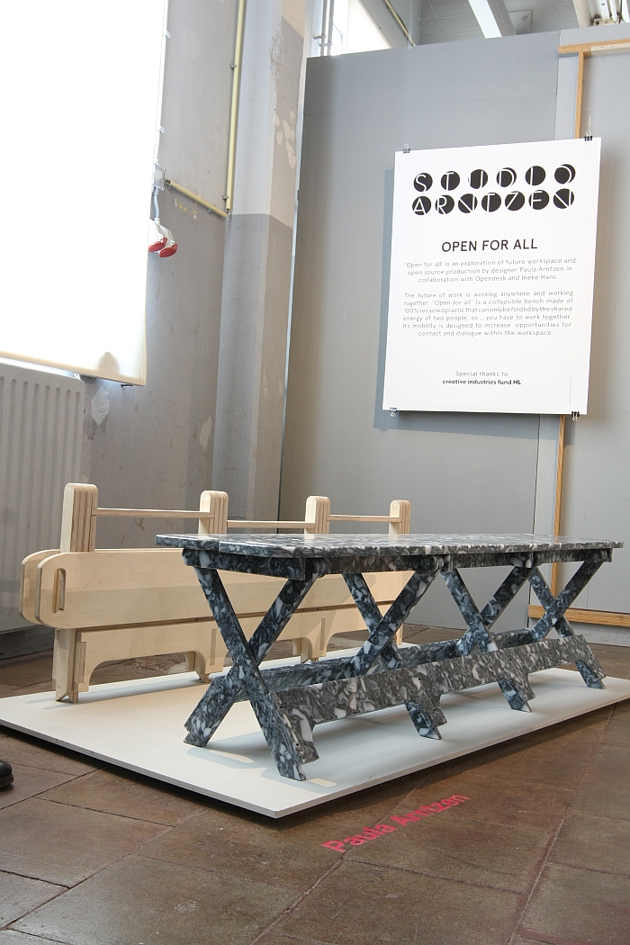
Much like there are animals which are considered worth protecting, saving, caring about, and those which aren't, so to does furniture/product design tend to concentrate on a relatively small number of "pin up" products. While leaving the rest to fight their own corner. Such as the foldable bench: an object which despite its universality and popularity has remained largely unchanged ever since Adam & Eve set up the first one for a picnic back in Eden. While there have been a few notable, and successful, attempts to show the foldable bench that we do care about, appreciate it even, they have tended to concentrate on aesthetic questions, quality questions or combinations of the two. With Open for All the focus is much more the functionality, and the result is an object which for us sets new standards in the genre. Crafted from 100% recycled plastic Open for All was created in context of a project run by the platform Opendesk and the designer Ineke Hans and which asked four young designers to come up with new Open Design concepts for the workplace.
Open for All goes much, much further.
A central feature of the object is the fact that it takes two people to open and close it, a feature that encourages and promotes cooperation. While we understand the where and why of such, we're much more taken with the practical: when folded flat the benches are stable and can be neatly and effortlessly stored, the convenient handles allowing for easy transport. Compact in its design, well considered in its proportions, charming in its appearance and highly durable in its construction Open for All is perfect for all manner of commercial, contract and domestic uses. Indoors or out.
Design is Wolf are one of those new-ish, young-ish Belgian brands we had hoped to meet in Kortrijk. But who weren't there. Were however to be found at Kaserne in Eindhoven during Dutch Design Week.
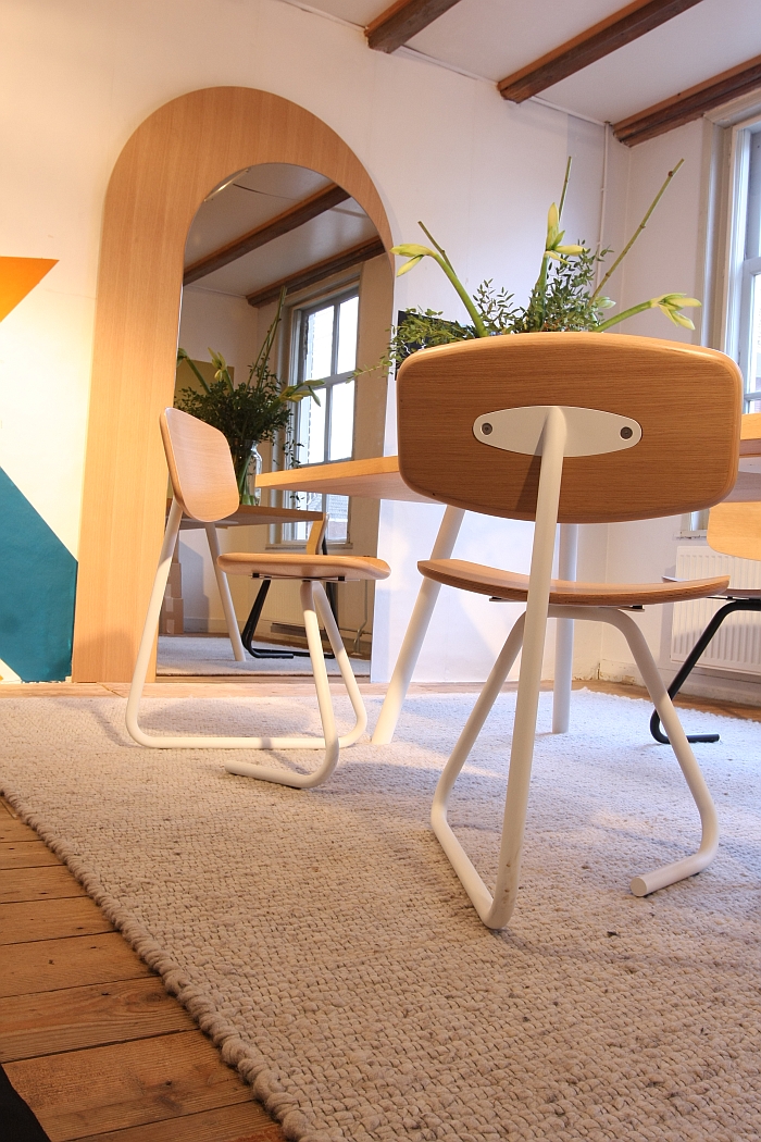
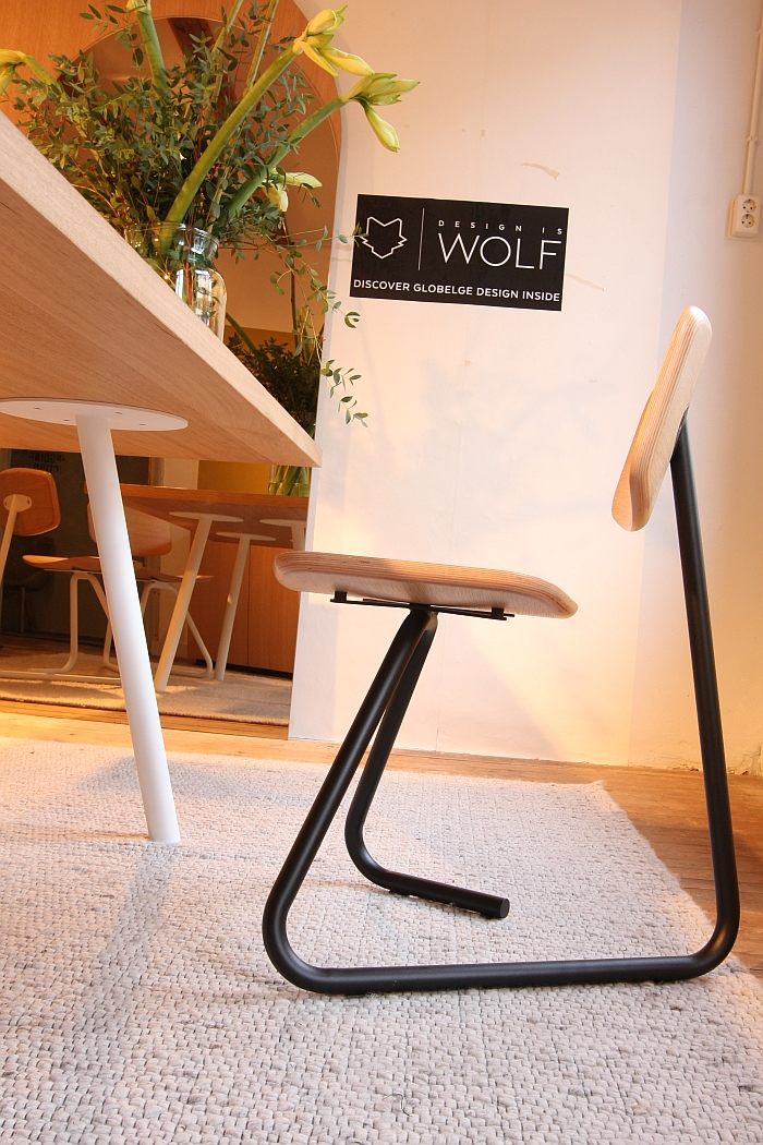
Although we've often encountered Design is Wolf virtually, we've never encountered them physically, yet have long been keen to get to know the collection. And obviously learn exactly why Design is Wolf. That we were up and about very, very early at Kaserne meant we sadly didn't meet any human Wolves, just their collection. Thus we still don't know why, or indeed if, Design is Wolf, do however know that Elephant Stoel by Ghent based designer Charly Cnops is truly a delightful piece of furniture design.
The triangular base is crafted from a singe piece of tubular steel, has a natural elasticity which aids the sitting comfort, and also rocks very slightly, and very naturally, forward, thus not only easing standing up, but also meaning that as a work chair you can lean forward in comfort and safety. In addition we also like the simple, yet refined way in which the base is attached to the backrest. The open, triangular base is obviously a decorative highlight, and with its easy, inviting, accessibility would appear to contradict Heinz Rasch's view that Mart Stam's cantilever chair was able to establish itself so quickly because its quadratic design reflected the quadratic nature of rooms and thus did not contradict the spatial harmony. Non-quadratic chairs being in contrast more difficult to use and thus rarer. Unless of course there is something essentially quadratic about such a triangular construction.......
But regardless, a delightful piece of work it was a real joy to become acquainted with
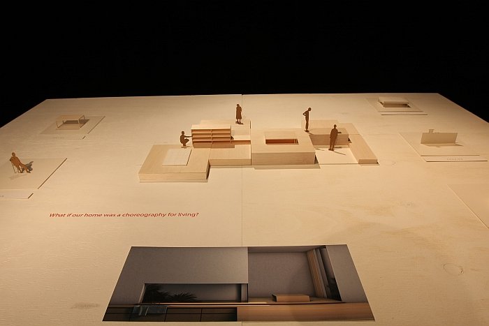
With the project Living Landscapes Design Academy Eindhoven graduate Julia Bocanet hypothesis what would happen if our homes had no furniture but rather placed a greater importance on functional architecture and when, in essence, every room had one function and one function only.
Or rather she poses the question. The hypothesising is left to us. And we must say we find the idea fascinating. A room for eating. A room for sleeping. A room for internet. A room for cooking. A room for staring out the window. A room for listing to music. A room for making music. Etc. Etc. Etc.
And prompt comes a loud cry from the back of the class, "It's OK for the likes of yous with your sprawling Villa in the Tuscan countryside, but what about those of us with a one room flat in Zossen!!!!"
Aside from the brutally honest "Non ci interessa. La tua vita, i tuoi problemi."
Yup, you have a point.
But let's change the perspective.
The project began with consideration on the Japanese tea ceremony, a ceremony which takes place in a room devoid of pretty much everything except tea and tea drinkers. And while in traditional Japanese architecture rooms are multi-functional, the functions of each are strictly defined, each room designed specifically for that/those functions and containing a minimum of furniture or furnishings. And so what if contemporary architects designed houses where each room was to have one function and one function only. How would that affect how they approached the task? If the focus was a space to be subdivided into a fixed number of inter-linked fully functional spaces, rather than in a way which corresponded with the architects aesthetic and artistic sensibilities, how does that affect the final outcome? For all if no, or at least only very limited, furniture is to be added. Does your small flat in Zossen become a more practical, humane space, or does the overt functionality of the space and dependent relationships suck all joy and life from it?
Certainly well worth thinking about.
As part of our 2016 summer campus tour we intended to visit the Hochschule Pforzheim end of term exhibition. But then, and as so often, reality tripped up theory, and we remained seated as our train pulled into Pforzheim station. And as it pulled out again. Something we now regret because had we alighted we would have had an extra three months with Chronüp.
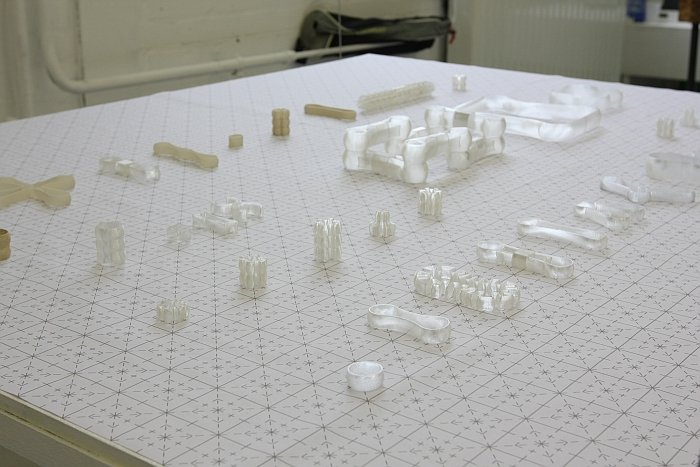
Starting from a theoretical investigation of the creative process Marc Limper established a grid on the basis of which he created a first basic form. A ring. Which he then abstracted, adapted, adulterated and reworked into a collection of forms all of which conform to the dimensions defined by the grid. And thus a project very similar to Thomas Lommée´s OpenStructures, except that whereas Thomas is looking to create a system Marc Limper has created a series of inter-linkable, inter-changeable forms. Connectors.
Marc Limper is a goldsmith and uses the forms as the basis for his jewellery.
Our interest is elsewhere.
A future with 3D printing always sounds very enticing: each of us being able to print off whatever we want whenever we want. Does however involve being able to create what you want in 3D software. And just as the majority cannot use Photoshop, so to will the majority of us never, ever, master 3D programmes. Therefore for a future with 3D printing we need libraries of not only products but also basic forms, building blocks, and for all connectors. And with his very elementary research that is exactly what Marc Limper has given us. Or at least his interpretation of. And we very much like the direction he has taken.
Next July we're getting off the train in Pforzheim. Karlsruhe can wait!
We've long had a soft spot for Dutch design brand Vij5, primarily because they are an Eindhoven based label who manufacture and distribute products from Eindhoven based designers, including, and amongst many others, Jeroen Wand, Ontwerpduo and Daphna Laurens. And thus provide a very welcome island of reality in the fanciful ocean of daydreams that is Eindhoven. Such is the way of things our paths have however rarely crossed; and when then invariably in context of another project which dare not breath its name in these pages. However, at Dutch Design Week 2016 all worked out; not least because Vij5 were hosting a special exhibition to celebrate their tenth birthday - an event which surely means they should change their name to Vij5Vij5. Just our little joke for all you Dutch speakers out there.
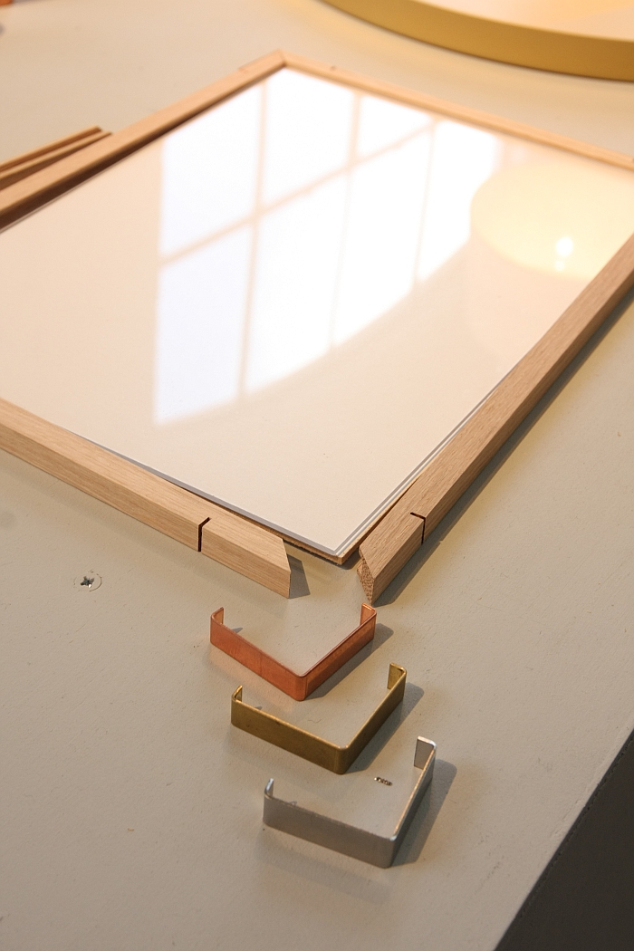
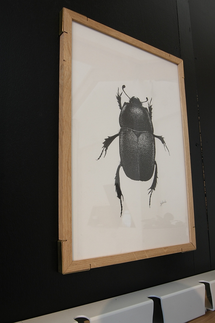
The exhibition featured on the one hand selected products from the past decade either broken down into their component parts or presented as prototypes, a very nice, very simple concept which very much appealed to us, and also saw Vij5 present a series of new products, from which the picture frame Epaulette by Caroline Olsson and Ida Noemi particularly caught our attention.
Somewhat ironically given what we've just written, Epaulette is an object from two Oslo based designers who, as far as we can ascertain, have no link to Eindhoven.
Essentially nothing more complicated than a picture frame the truly delightful thing about Epaulette is that the clips which hold it all together form the corners and thus as well as being functional elements are also decorative elements. Rather than the hideously irritating elements we all know in those hideously annoying back clips.
We ourselves were very surprised that we liked Epaulette, we don't generally get involved with picture frames, but we are unaware of anything similar, and it is such a simple, obvious and well realised solution it just made us smile.
And by way of an added bonus, while typing up this text we realised that Caroline Olsson has already featured twice in these pages: with her Pencil Light at Salone Satellite and her Curious light at Designer's Open Leipzig. And there is little we enjoy more than re-discovering a designer who has slipped from our radar. In a way its better than finding someone new, because it reminds us what joy the past years have brought us. And it is incredibly satisfying to find designers we liked as students moving along their career paths
Tom Frencken's work obviously burns itself slowly into our psyche. Which is no bad thing. It needn't always be love at first sight.
At Dutch Design Week 2016 we were very taken with a chair design we saw out at Sectie C. As we were photographing it we, thought, "Hang on, we know this", but geographically it was wrong. It wasn't a Sectie C chair. Didn't belong in the rabbit warren. A couple of hours later in downtown Eindhoven all became clear in Tom Frencken's atelier on the so-called NRE Area.
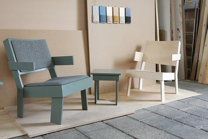
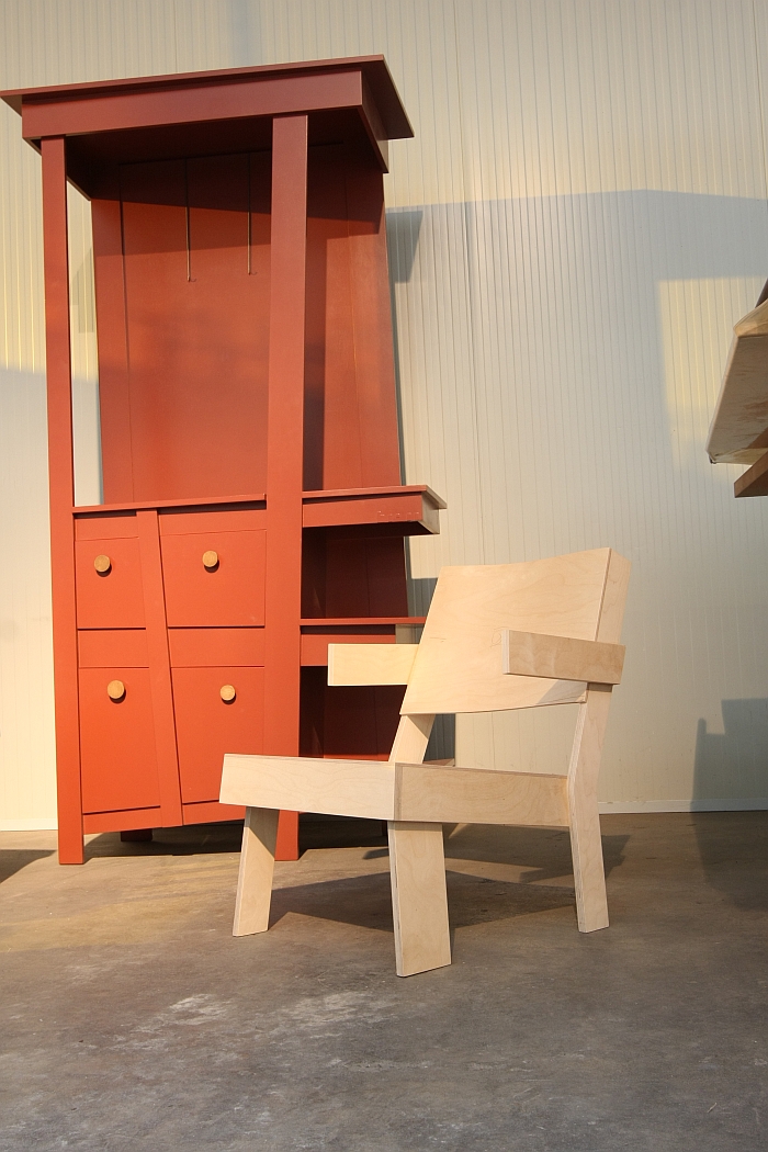
We first saw low chair in 2012 or 2013, photographed it, but, and as so often with these things, didn't take things further. Yet something obviously touched us quite deeply, and the reunion was particularly sweet. On the one hand we like the fact it is, as the name implies, a low chair, it just speaks to us in seductive, dulcet tones, while the dimensions and the very direct form language are neatly supported by the almost apologetically plain wood. Then there are the delightfully abstract front legs which by all normal standards and conventions make absolutely no sense. We've tried really, really hard to find something not to like about it. Can't.
In Tom's atelier there were another couple of items, items which caught our attention and which we discussed a little with Tom. We'll not mention them here, we'll ruminate a little longer, with Tom's work that seems to be the way we go. But if you can't wait, there's always google.........
