When we spoke with Vitra's Chief Sales Officer Josef Kaiser at NeoCon Chicago he told us that at "Orgatec 2016 we will be trying to be more interesting for architects, without losing the focus on the dealers, which will be challenge, but one we’re looking forward to, not least because this year we have our own hall"
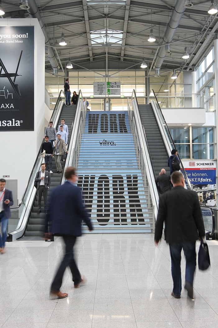
What that meant in practice could be experienced in Hall 5.2 at Cologne Messe. Or in the Vitra Messe - Vitra Trade Fair - as we've taking to calling it, seeing how it was, effectively, a fair within a fair.
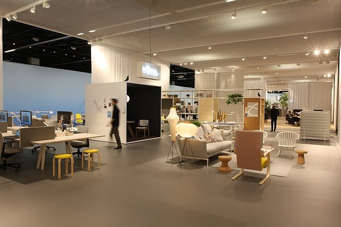
Set in a scenography created by Pernilla Ohrstedt and Jonathan Olivares and presented under the title "Work" the Vitra Messe 2016 featured in addition to new and established Vitra products, selected Vitra partners including, and amongst others, Ruckstuhl, Wästberg and bulthaup.
If we're honest ahead of the event we imagined something akin to a "Citizen Office 4.0", that the whole exhibition hall would be transformed into a large office space presenting a range of scenarios for the (potential) office of the future.
The result was somewhat different, if not unenjoyable. In effect one half of the hall was Vitra, the other half their partners.Vitra furniture and accessories populating the partners stands, while the familiar Vitra Collage was extended by objects from the partners' collections.
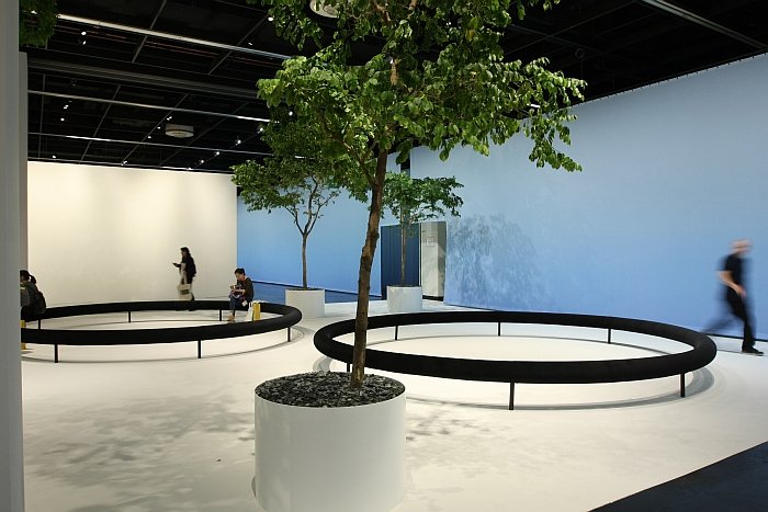
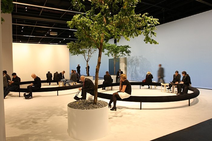
The formal presentation was complimented by a large cafe and what was known as The Garden, an installation by Ronan and Erwan Bouroullec taken from their Rêveries Urbaines exhibition and featuring three large rings by way of public seating.
The overall experience of the Vitra Messe as a complete composition was perhaps best summed up by a German furniture producer popular in this parish as "Excellent but terrifying!"
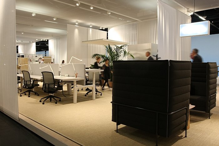
Having acquainted yourself with the surroundings, and for all the scale, the first thing one noticed was how relaxed and easy everything was. Almost quiet. Sure it was busy, it was Vitra at Orgatec, but one wasn't forced to play the involuntary game of Sardines that one knows from Vitra at Orgatec. One had space. Consequently the Vitra products were much more in the foreground, everything was less hurried, cocooned as one was in Hall 5.2, one could focus more easily. More happily.
And in terms of being of interest to architects, we haven't spoken to any and so we can't say how they found it; but in the partners one had a lot of companies who wouldn't normally exhibit at Orgatec, yet who offer products, solutions, services and materials which are important components of any office/construction project and thus of (theoretical) interest to architects, planners and interior designers. As such one had a sort of planning supermarket. How well stocked it was is for others to judge.
If there was one thing missing then for us it was free experimentation. From the late 1980s until the early 2000s Vitra ran the so-called Vitra Editions, a project which invited selected designers, architects and artists to develop experimental/conceptual projects and which in addition to various abstract artistic statements also led to one or the other product. We wouldn't suggest going back to such per se, but there are a myriad of studios undertaking interesting, and genuinely realistic, use orientated, experimental research into materials, production processes, textiles, future scenarios, work flow processes and who could be brought together with a minimum of fuss to create a small showcase to complete the market ready solutions. Aside from cheering us up, such a presentation would also mean that while the retailers concentrated on the price points, delivery times and order conditions of the new products, architects, planners and designers could investigate the research and so start developing new realities. Potentially Vitra could commission an external designer/architect/agency to curate a presentation around a set theme. We're sure the Vitra Design Museum have a couple of ideas as to who one could call.
Everyone we spoke to about the Vitra Messe was positively inclined to what was realised, sure everyone had some point to make or a criticism of some aspect, but they were all different and in general all found it a brave, well realised and for all logical step.
Which raises the obvious question, where to next?
In many respects the only answer is for Vitra to organise their own fair.
Certainly in terms of office furniture.
Do Vitra need Orgatec? Do Orgatec need Vitra?
The answer to both is potentially yes; but as 2016 beautifully indicates, both could also survive without the other.
In terms of the office and contract market Vitra need architects, designers, planners and in context of the contemporary European furniture industry it is questionable if a conventional trade fair is the best place to meet them. We know it has overtones of pretense to write such, but Vitra sell office systems, office environments, the individual elements are less important than the way the interact, contrast, support and communicate with one another to create a logical, unified composition. And that needs to be explained in situ. Not as individual objects on a trade stand.
And so their own event?
The most obvious weakness for us is that if organised along the lines of the Vitra Messe 2016 then all the partner companies would be fully dependent on Vitra's patronage for their presence; one would be moving as it were inside a hermetically sealed Vitra Bubble, with all the problems and lack of creative tension that entails.
Once is OK. Regular repetition becomes dull.
But if a way could be found to ensure a challenging and dynamic mix of partners........
Which only leaves the question of where to stage it?
We'd argue for Weil am Rhein, not least because it presents Rolf Fehlbaum with the perfect excuse to expand the Vitra Campus: The Vitra Expo by ???????
That, roughly, is our vision of Vitra's future.
Much more concrete was Vitra's vision of our futures.
Three project in particular caught our attention.
The office chair has been central to the development of Vitra: it was with the office chair that they started their move away from home furnishings, was with the office chair that they seriously began to develop their own products rather than relying on licensing Herman Miller products, and thus it was with the office chair that Vitra established themselves as a brand. And one must add that selling office chairs allows you to sell desks, cupboards, and all those other furniture items any office needs, and which help raise the bottom line.
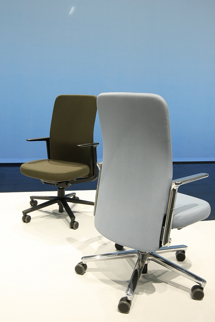
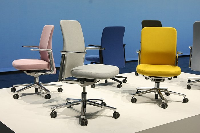
In addition to further developments of the ID Chair collection by Antonio Citterio and the launch of the new AM Chair by Alberto Meda, the highlight for us of the new Vitra office chairs presented at Orgatec 2016 was without question the Pacific Chair by London based designers Edward Barber and Jay Osgerby a.k.a Barber Osgerby.
The commission from Vitra came shortly after the launch of Barber Osgerby's Tip-Ton chair, and represents the pair's first office chair project, and was as Jay Osgerby says "quite a scary thing. You take these things on and then as you start to understand the complexities of a project like this it is quite daunting."
"But", we venture, "presumably working with a company such as Vitra takes a lot of the technical stress from you as the company have the experience"
"Such a chair is less about the physics, we're comfortable with that, but is more about the constraints the market demands", answer Jay, "health and safety, how big are people, how much do they weigh, how much support is needed where, there is an encyclopaedic knowledge about what such a product needs to conform to, needs to do and Vitra have that and that helped us immensely"
"For us the biggest problem with an office chair is that it has to have so many options", continues Edward Barber, "it has to do so many different things so that people can specify it and also so that it meets all these regulations, and this creates a contraption, a monster, because you've got all these things going on in one object. And so our concept was to keep the functions, because we had to, but to visually reduce the object so that you ended up with an object which was pleasing to both sit in and look at."
"And so we approached the project with an ambitious naivety and tried to reduce what is normally a machine into something much calmer, something which looks more furniture like.", concludes Jay Osgerby.
The phrase "ambitious naivety" is now firmly ensconced in our all-time top five phrases. Expect to find it repeated regularly in these pages in the coming months.
The result of this ambitious naivety is a chair which while unmistakably an office chair has more than a hint of domesticity, and certainly no hint of either contraption nor monster......
Through moving the armrests from their normal central location to the back of the seat Barber Osgerby have not only combined the functional elements in one location,and thus created a construction advantage and reduced the number of elements required, but have also opened up the seat, making it a very clear defined and thoroughly welcoming object. Almost lounge. But with just enough tension between comfort and functionality to keep it in the office.
A central feature of the Pacific Chair is the height adjustable backrest, as in the whole backrest can be moved up or down. A mechanism which takes a little bit of getting used to, but once you have understood the very simple principle, it makes almost as much sense as the design thinking that led to it, "you need to have some form of lumbar support and so rather than add an extra piece that moves up and down why not just move the whole back up and down?" explains/asks Edward.
It would certainly appear to be the elegant solution.
And further proof that design isn't a profession but a way of thinking.
With the backrest in its lowest position one has an underhang, as if the chair is wearing a tailed dinner jacket, and is thus visually very reminiscent of the pair's Pilot Chair for Knoll. A favoured new signature style for Barber Osgerby? The chair tailcoat?
"The Pacific Chair has got a long back because we wanted to hide the mechanism, keep everything visually clean", answer Jay, "with the Pilot Chair it was the case that we had to clamp the backrest onto the Y-shaped bracket which is below the seat. However both are chairs that are mainly seen from the back and with the long backrest one brings in a certain visual calmness."
For us the Pacific Chair is not only a very well realised and executed office chair design but also a valuable addition to the Vitra Office chair programme, offering as it does a pleasingly graphic, easily accessible and universally applicable chair which brings a new dimension and atmosphere into office spaces.
And for Barber Osgerby, having completed their first office chair have they tasted blood, are they keen to do more?
"Definitely, answers Jay Osgerby, "it was really tough but we really enjoyed it"
"And the work isn't finished yet", adds Edward Barber, "we are still working on for example a netweave backrest and various other features, and so although it is being launched here the chair programme and the work will continue"
"I was bored by office development, or the direction office is going", says Ronan Bouroullec, "for me office is going in directions I don't like, it is becoming ever more complicated, and so while there are obviously different needs in the office I thought it would be quite interesting to develop something that goes back to a certain primitivism."
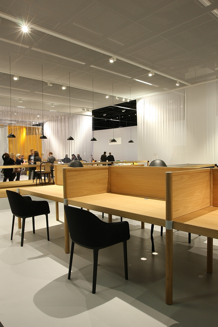
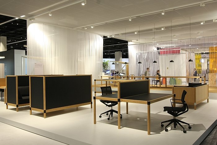
The result is Cyl a project which Ronan initially considered as a potential Artek project but which ultimately developed into a Vitra project. Presented at Orgatec 2016 as an advanced prototype of a potential office system Cyl presents itself in a very paired down, rustic optic: wooden cylinders linked to wooden verticals, horizontals and diagonals supporting wooden panels. The sofa elements are upholstered, the unseen connectors metal, otherwise Cyl is a wooden system.
Ronan Bouroullec speaks of Cyl as being akin to a workshop, a description that is valid both in terms of the visuals as well as in that as a platform based system it presents a series of areas in which you can work as you wish, rather than the system defining what is to be done where. In a similar vein, what we particularly like about Cyl is that it is uncompromisingly, almost hardcore, analogue. Office furniture is by its nature very technical, and by our nature becoming ever more. Cyl ain't. Cyl resists. And we like that. You want a sit-to-stand desk? Build it! No electric motors here.
"Modern technology means we need less objects in order to be connected, to be able to work, and so we can come back to and concentrate more on the simpler aspects of things", adds Ronan, "we don't need a solution for everything and I think it is a question of reducing the number of things which surround us, to consider what is important and in a way to tidy up a bit"
In addition a further aspect is important for Ronan Bouroullec, "personally I need calm"
And with Cyl one has that calm, one isn't distracted by high-tech. Yes some will no doubt argue that Cyl is step backwards, that the toned wooden optics of the system hark back to the early 80s while the rigidity of the desk surrounds is dangerously reminiscent of the much maligned "Dilbert" cubicles
That however would be to confuse the visuals for the essentials of the concept.
Being as it is a Bouroullec project Cyl is essentially about the connector, Ronan refers to its a "knot", and one which is hidden in the construction but which allows the construction to grow and develop in various directions and thus realise all manner of furniture typologies. Some of which are very obvious Bouroullec, the wooden Alcove Sofa for example is unmissable, others more general. And others not yet developed, including more domestic solutions. The formal language of the system allowing as it does an easy transfer from office to home. Or indeed to shop to hotel to hospitality to education to wherever.
And being a system Cyl can obviously be extended, reduced, reconfigured as and when required. And that in perpetuity
As already noted Cyl was presented at the Vitra Messe 2016 as an advanced prototype, if it enters production will ultimately depend to a degree on the feedback received. However as a study, a proposition, a position on contemporary office furniture systems Cyl is a nicely conceived and valuable contribution.
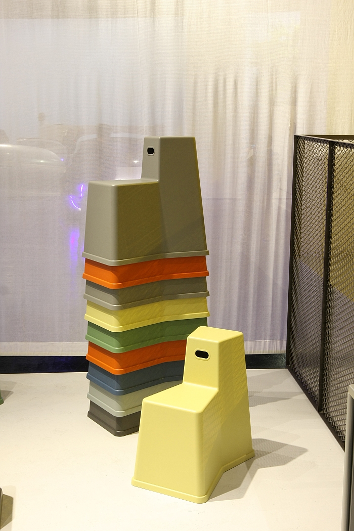
Among a series of office scenarios created by Konstantin Grcic two objects particularly caught our attention Stool-Tool and Chair Table, both playful, almost impudent, objects which play with ideas of furniture office genres and which for us are primarily about bringing a degree of spontaneity and flexibility to the working day and process. And thus when viewed in context of the 2014 Hack table, raises for us the question as to if Konstantin Grcic sees the future office as involving a move away from the large, rigid, office system?
"For me the office of the future is very heterogeneous", answers Konstantin Grcic, "featuring fixed structures, but then also freer, changeable areas and there is increasingly a dynamic in that the layout, the arrangement of offices constantly changes and so while one still needs the large systems, one also needs small, flexible individual objects which form specific areas and meet specific requirements"
And so can we understand Stool-Tool and Chair Table as arising from the research that led to the Hack system?
"Hack arose as a result of a journey to the American west coast where we spent time in Silicon Valley and with tech start-ups" replies Konstantin, "as an idea Hack was very simple, and as a project it became quite complicated, heavy and time-consuming. And in a way the new objects are a reaction to that and the result of a review and revaluation of how we work as an office and how I work Vitra. Vitra is a fantastic company with very high demands and expectations on projects, and who utilise the highest quality engineering, but that means projects can become slow, complicated, cumbersome. And among the things I took from my trip and the people I met there was that they work quicker and in a less complicated manner. Risk doesn't exist. You try something and it works or it doesn't. With a large project we can't work like that, because the risk is real and large, but with smaller projects one can try it, do it and see what happens, as it were "put ideas into discussion""
Both of Konstantin Grcic's new discussion pieces have, at least for us, historical models. And at least in context of Chair Table our assumption is correct. Doing pretty much what the name implies Chair Table is both a chair that can be transformed into a table and a table that can be transformed into a chair. In one object. And an object which as with much of Konstantin Grcic's oeuvre arose from a reinterpretation and repositioning of an historic furniture typology.
"It is a furniture type I've known for a long time, mainly in an American context, and which has always fascinated me, but which I could never classify, could never place where one would use such", explains Konstantin, "and here to transport it to the new office world, to raise the table to standing height as a meeting island, and then the chair as a high sided box where one is a little ensconced that was then for me so somehow an very logical, coherent solution."
Logical and coherent as the work and concept unquestionably are, we remain unconvinced that people actually use such objects. Even in the new office. Just as we don't believe people use QR codes, so to we don't believe that people will regularly switch from one form to the other. Believe much more that such an object will stay as a chair or a table. Except at the office Christmas party. We could be wrong, we've done no research. It is a gut feeling. But one we trust. We're sure Vitra will do more grounded research before deciding how to progress with the project.
And decide they must. The object presented at Orgatec 2016 is to be understood as a prototype, not only in terms that materials and technical solutions aren't fixed, but as Konstantin Grcic explains neither is the final concept, "maybe presenting the project here will help us to discuss more generally about what we want to achieve and that may then lead us somewhere else."
Much more definite is that Stool-Tool will soon be released as a product. Featuring sections at two different heights and thus numerous surfaces for sitting, leaning, writing, placing, Stool-Tool has for us its origins in the so-called "reading chairs" of the 18th century, essentially a lounge chair with a foldable shelf on the backrest and which could be used either sitting or standing. And one of our favourite 18th century chair typologies. We know, we know. Other people have friends, families, hobbies, lives. We have favourite 18th century chair typologies.
The background to Stool-Tool is however very different, and from outwith the furniture world per se, "the basic idea was very simple we wanted an object that had two heights, a small footprint, and was stackable, and the form more or less arose from such considerations. In effect it is comparable with a step, a wall or wherever one sits where one has two heights available and uses them spontaneously, freely and as the situation demands, for me and the object is essentially architectural", explains Konstantin Grcic, "and is more pragmatic than designed."
And statement which could just as easily be applied to the Pacific Chair, the Cyl system .... and indeed the Vitra Messe 2016.
If we're honest we're already looking forward to the next Vitra Messe.
Wherever and whenever that might be......

