Designer | Exhibitions and Shows | Office Furniture | orgatec | Producer | Product | Richard Lampert | Vitra | Wilde + Spieth
We must start with a confession .
This High Five! is a High Four!
Not because there weren't good products on show at Orgatec Cologne 2016, there were. But much more Orgatec is an office furniture fair, and therefore:
a) most manufacturers offer, in essence, the same range, it is all very homogeneous. Generally of very good quality, but otherwise uninspiring, all very generic, safe and overtly commercial. One reason is that in the contract, so wholesale, business, decisions as to which product is used in which project are as much questions of budget and connections as about the product. And so all producers have to have all bases covered. And the market is consequently homogeneous and safe. The "good" producers work with designers to help them optimise the production, sustainability, durability and cost of their products, and important as that is, for all in driving materials science and production engineering, it only rarely results in products which are interesting beyond the fact they can be produced 30% cheaper than the competitors, weigh 10% less, absorb 20% more sound between frequencies X and Y, or can be stacked more efficiently. Important for the trade, but rarely moves the products outwith the manufacturers' comfort zones.
b) The truly interesting products, those that genuinely do new things, go new ways and move office/contract furniture forward tend to be concentrated amongst a limited number of manufacturers/exhibitors. And there were a couple of manufacturers at Orgatec 2016 from whom we could easily have taken a couple of products to reach our five without compromising it, but that's not really the sort of thing we're interested in. The five isn't sacred, just convenient.
b(1)) A couple of the most interesting products at Orgatec 2016 featured in our NeoCon Chicago 2016 High Five!!. And repetition is frightfully dull.
b(2)) A lot of the manufacturers who could have fitted into paragraph b, weren't there. No names, no pack drill, but, for us, and in context of the way we understand contemporary furniture, there were an awful lot of absentees. Almost too many if were being honest. Which has the effect of further concentrating the stands on which one could find true innovation and truly interesting products. And somewhat logically, reducing their number.
But they were there. And so here our Orgatec Cologne 2016 High "Five"!
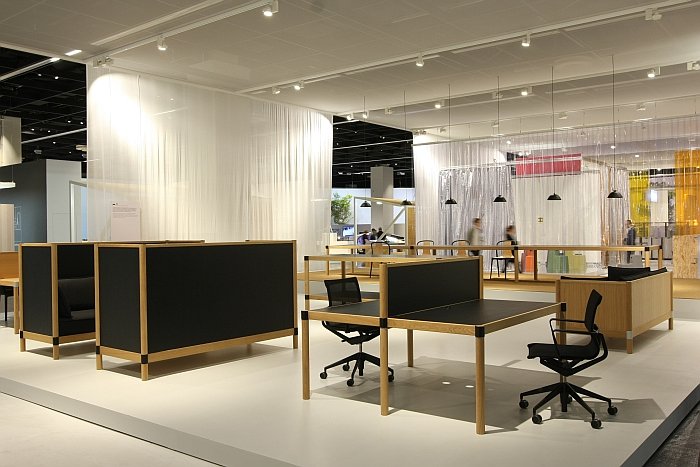
Not a product rather a prototype and so technically shouldn't be here; but we're fairly certain it will become a product. And so we're hedging our bets a little. In our post on the Vitra Messe 2016 we wrote in praise of Cyl "You want a sit-to-stand desk? Build it!" Which we think perfectly sums Ronan and Erwan Bouroullec's new system: and the official entry of office furniture into the post-digital age. You've got all the tech you need in your pocket, let your desk breath.....
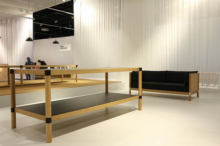
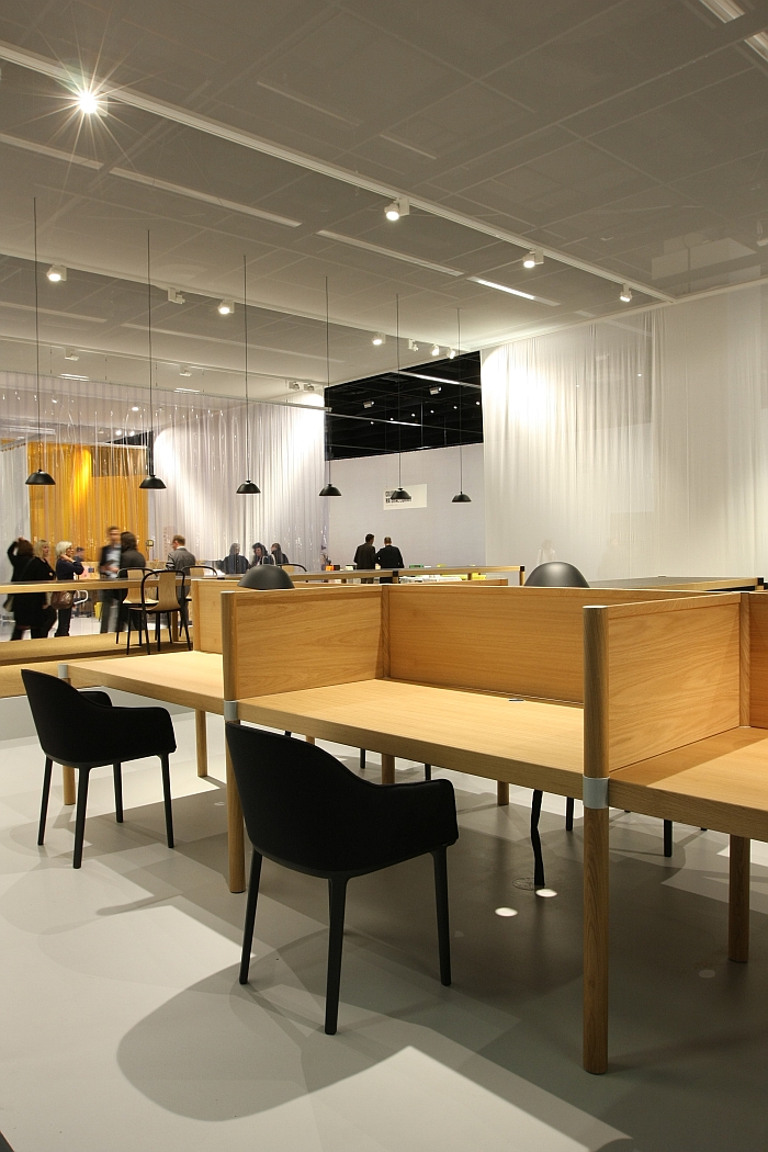
Established in 2011 by Daniel Lorch & Aidin Zimmermann Berlin based manufacturer L&Z quickly established a strong reputation for their self confident approach to design, and for ploughing their own furrow through the detritus of lifestyle tat which others peddle as design. Yet without ever really springing over into a wider public.
Our theory is that their portfolio was always a little too limited. L&Z essentially began with Daniel Lorch's Sinus table trestle, and followed that up in 2013 with his outrageously versatile Ed roll container. Then things seemed to stall a little until the release of the ever wonderful Roll-Up waste paper bin/storage container by Michel Charlot in 2014.
All excellent products which have their rightful place in and enrich the contemporary furniture market, but just too few to be considered a brand in a global market place.
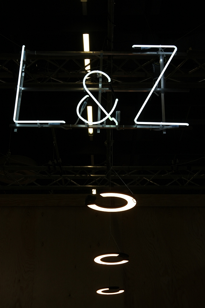
At Orgatec 2016 L&Z rectified that and, in effect, presented all those things that were so obviously missing from their portfolio: a chair system - Glyph by Geckeler Michels; a side table - Beam by Daniel Lorch; shelving - Shadow Play by RelvãoKellermann; desk top accessories - Unit by Mark Braun; a lamp - Help by Rupert Kopp
And all that in the uncomplicated, untroubled manner, and with a focus on design, that defines the brand. And which clearly separates L&Z from the vast majority of producers at Orgatec.
"Are things going well or did a rush of blood to the head cause you to release so many new products at once" we ask Daniel and Aidin.
Both laugh in that half-embarrassed way that suggests a bit of both.
Which we hope is true because that is what the furniture industry needs, a young company interested in design over style, who don't take things too seriously, who are prepared to take risks and who can make a living from doing such.
And more important is that with the new products L&Z have taken a decisive step towards moving on from being a niche brand to a serious mainstream manufacturer.
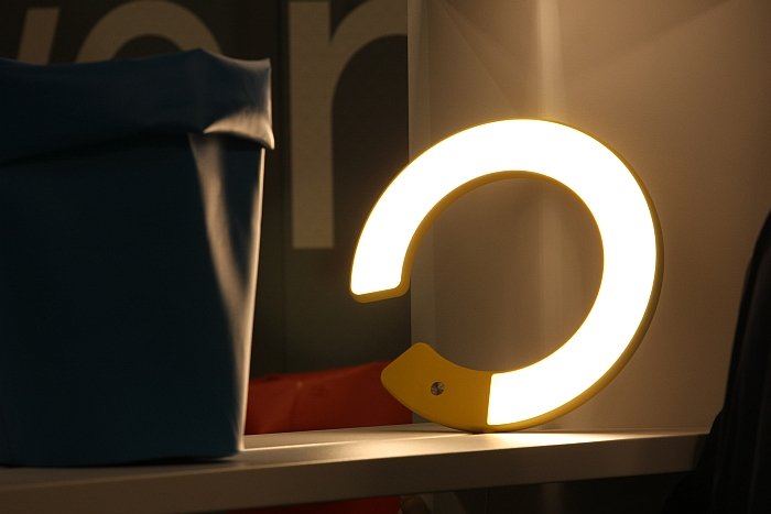
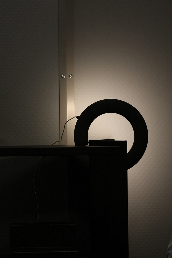
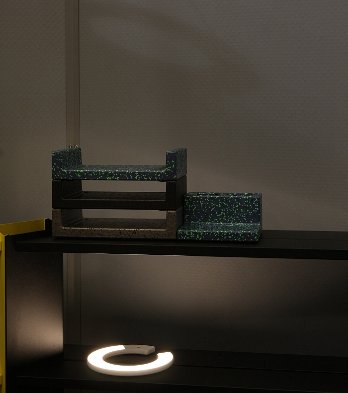
The highlight of the new collection for us was the Help lamp by Rupert Kopp
If were honest, and we always try to be, we first saw Help as a very, very early prototype/model in L&Z's HQ, and liked what we saw, liked the patent obviousness of the idea and the formal solution Rupert was attempting to realise.
And thus it is particularly pleasing that together Rupert and L&Z have achieved such a coherent and integral solution which realises the potential contained in the original idea.
Help is stupidly simple. Help can be hung anywhere, over, on, wedged into, lent against anything, can provide direct or indirect light, from above or below, close or far away, in offices, homes, sheds, caravans, etc and the four metre long cable supports this flexibility, even allowing you to hang it from the ceiling - admittedly a bit of last-minute improvisation for Orgatec, but watch this space at it were. Yes one could query if a cableless lamp wouldn't be the better solution. We did. The decision for the cable was to keep everything as simple as possible, reduce the complexity and also for us has the added advantage that you can't forget to charge it up and so always have light where and when you want it. As we say stupidly simple. Dimmable. Aesthetically charming. And all in all just a lovely piece of work.
As we've noted before, Orgatec is a very technical fair that in many respects concerns itself, or at least should concern itself, with questions surrounding connectors, materials, textiles and systems as much as with questions of aesthetics.
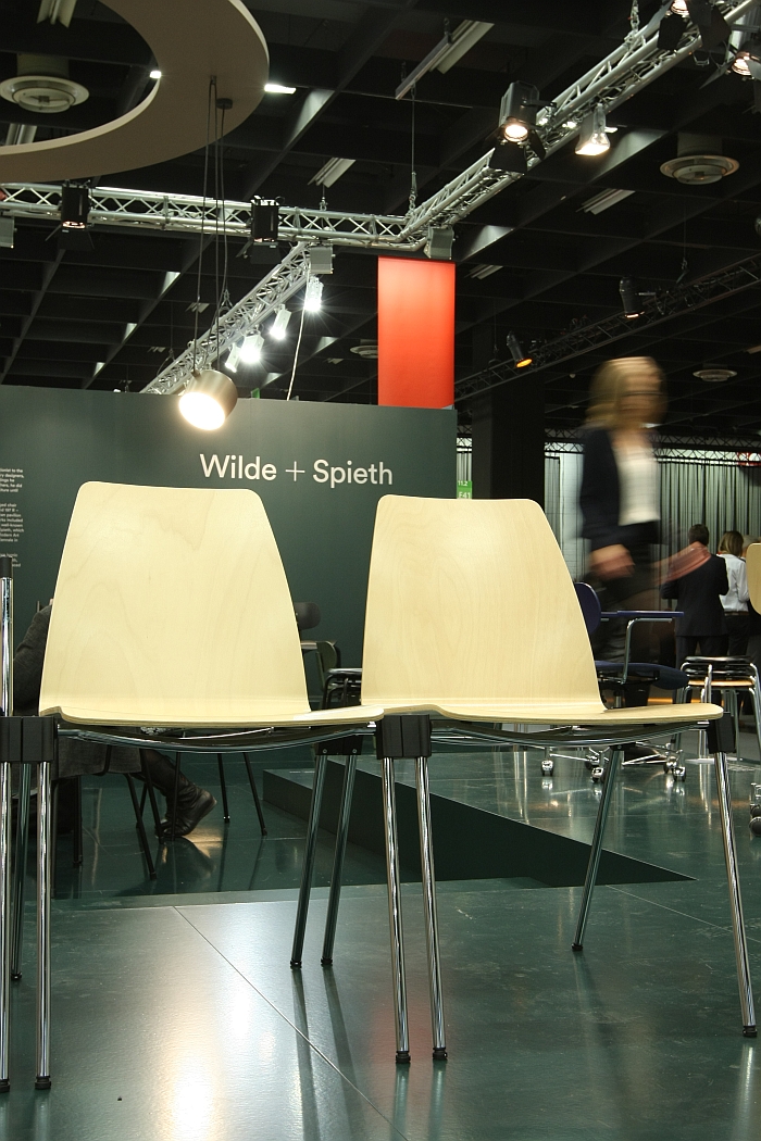
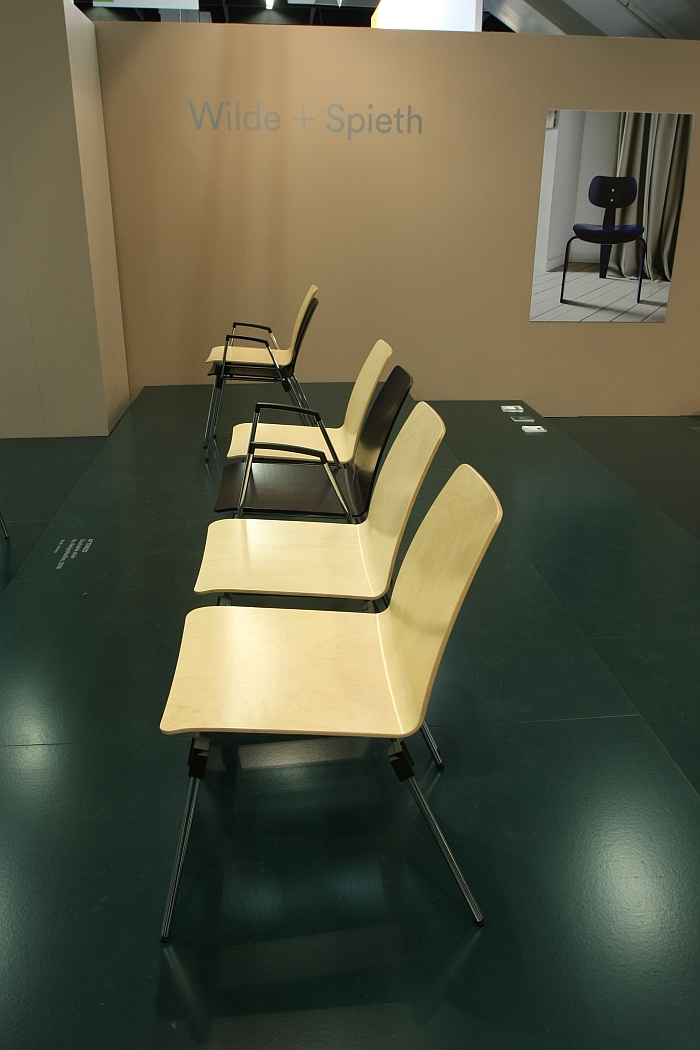
An excellent example of that, and of the oft quoted challenges associated with the norms, standards and certification processes that dominate questions concerning the design of furniture for office, hospitality and contract purposes is the chair Attenzo by Anglo-German design studio designstudios for Wilde+Spieth
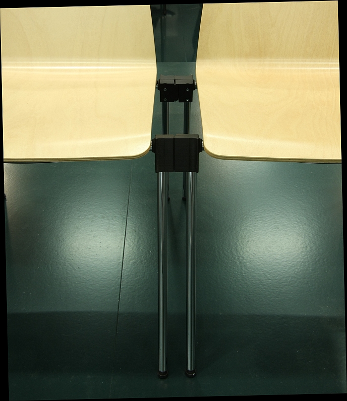
Since 2007 European Standard EN 14703:2007 "Furniture. Links for non-domestic seating linked together in a row. Strength requirements and test methods" has meant that wherever one has more than 200 chairs which are bound together in rows, the connectors must be so designed that the rows maintain their stability and integrity when pushed both from front and rear. The idea is to provide security in panic situations, so that rows of chairs, don't topple over, break-up or otherwise become a hazard
Or blah, blah, blah, blah, blah, blah to most.
Not however to architects and others responsible for putting large numbers of chairs in conference, event, hospitality, etc, locations
However, and according to Wilde+Spieth, who we see absolutely no reason to doubt, there were no connectors which allow conformity with EN 14703:2007
Thus, when Wilde+Spieth began talking with designstudios about the possibility of a possible cooperation they quickly agreed that rather than simply creating yet another conference/event chair they should instead concentrate on designing such an EN conform connector. Which designstudios did. And then followed the conference/event chair. Attenzo. To which the connector is attached, thus allowing for EN conform rows of chairs. The connector also doubling as a docking port for armrests, tables, etc, aiding stacking, and thus allowing for full flexibility.
We know, and fully understand, that 99.9% of you are thinking..... banana
But such things are of central importance in the office/contract furniture industry. This responding to a regulatory compliance in a clear, durable, adaptable yet aesthetically pleasing and user-friendly, functional, fashion is what drives innovation in the office furniture market, what forces designers to explore new approaches, new ways of thinking, develop new concepts, and which also advances understandings of technology, production and materials. And thus is one of those areas where office furniture design is genuinely interesting.
Conference/event chairs need connectors. Attenzo is the first in a new generation of such connectors. Is a lovely piece of design innovation.
Even if it's never, ever going to go viral on instagram.
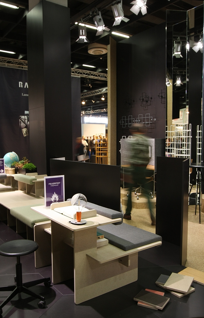
One of the most common phrases you will hear at fair such as Orgatec is that products are fireproof.
A1, A2, B1, etc, certification determining where and in which context objects can be used; and is of particular importance for objects intended to be placed in corridors or other designated fire escape routes.
Fire regulations meaning that most corridors/escape routes tend to have either no furniture or where they do metal furniture.
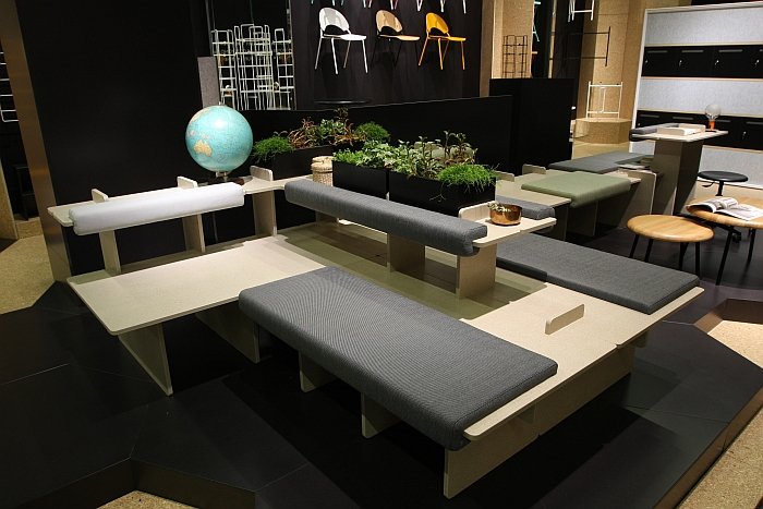
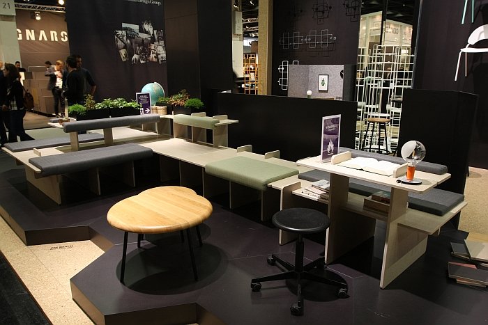
With Pip by Daniel Kern Richard Lampert offer a new alternative. A new alternative which offers new, and eminently pleasing, visual and formal solutions.
Essentially a "plug'n'play" system Pip features vertical and horizontal elements which can be simply slotted together to create any number of combinations; and unslotted and reslotted as and when required. Upholstered cushions and backrests provide for the necessary comfort.
Practical and functional as the Pip system unquestionably is, for us the material is the crowning factor. We can well imagine meeting such a construction principle in a student flat or at a student exhibition. And if so invariably in the cheapest plyboard possible, and would look like a student project. In metal it would look equally awful. Pip is crafted from gypsum fibreboard, a material which has the density to provide it with the necessary optical and physical weight. It visually feels like stone. And thus allows for the creation of a whole new atmosphere in any given space, brings a whole new range of sensory experiences into play. As presented at Orgatec 2016 for example Pip had an unmistakable terrazzo aura: we weren't in a fair hall in Cologne, but a vestibule in Milan. In addition the gypsum fibreboard can be painted, coated, veneered or printed; and thus adapted to fit to any space and/or corporate identity colour scheme.
Aside from the material, the simplicity of the flexible, adaptable construction principle and the open, welcoming, character which the elements create, we really liked the variety of different surfaces that Daniel's intelligently conceived system makes available, and the wide variety of uses they allow. And not just in the obvious vertical context, but also on the horizontal. Thanks to the generous depth of the system Pip not only allows for untroubled sitting but also space for bags, young children and their toys, laptops, suitcases, wombats, whatever.
And being A2-s1 it can do that wherever you want. Even in corridors/designated escape routes.
