On the train down to Kortrijk and the 2016 Biennale Interieur we started drafting this introduction. The talk was of the 25th anniversary edition, the relevance of the event in context of the European furniture and design market - then and now - and the strength(s) of contemporary Belgian furniture design
Then we saw that organisers were charging 50 cents to use the toilet.
In a fair.
Ctrl A. Ctrl X.
It may "only" be 50 cents, but.... having charged visitors €22,00 to enter a fair. You can't charge them to use the toilet.
That is just wrong. On so many levels.
And as if charging wasn't enough, the only possible alternative was also cruelly snatched from us. Before you entered the fair, near about the cloakroom and ticket counters, was a free toilet, there you had the chance to prepare for your visit. Get yourself settled. Until just before 12 noon. Then that too was closed. Which is bordering on the cynical.
It may well be that all in Belgium are reading this and thinking "What's the problem? You always have to pay for toilets at fairs"
Not outside Belgium you don't!
Internet access was free. Everywhere in the exhibition halls one had free Wi-Fi. Obviously.
Have we really reached a stage where it is considered more important to offer people the opportunity to update their Facebook profile than use a toilet? When providing free internet is concerned a better standard of service than free toilets? Is that really the order of priorities in contemporary Europe? We do hope not. That would be a truly awful state of affairs.
If the organisers are genuinely forced, out of economic necessity, to charge fair visitors for the toilet, than why not approach one of the many bathroom or bathroom fittings manufacturers present, we're sure one would happily sponsor such. Or make entry €23,00 and calculate one Euro per head as a secret "toilet tax", then no one is the wiser
And for all who think we may be going on a bit here, maybe making a bit of a drama out of nothing, yes it's just 50 cents for the toilet. It is however about the principle, is about friendliness, service, understanding the visitor as a guest to be treated well not as a source of revenue to be squeezed. The Biennale Interieur is about interiors and any successful interior is, if we're not mistaken, about creating a welcoming, harmonious atmosphere where all feel at ease and familiar. And that be it an office, waiting room, museum, private house or exhibition hall. And lest we forget, a central feature of Biennale Interieur is the restaurants and bars, and for all the five designed by international agencies in context of a competition and prominently promoted in the event's marketing. One is encouraged to eat, drink, socialise. And then pay fifty cents for the all too natural consequences.
And in addition, if you think we're over reacting, you obviously missed what happened in 2009 when there were no tables in the ICFF New York press room!
Clearly we didn't travel half way across Europe to complain about a fee to use a toilet. Our plan was the fair, the brands, the designers, Belgian design, we'd done our research, were prepared, all who reads these pages know the high regard in which we hold contemporary Belgian design. But wrong is wrong. And highlighting wrong is right.
Eventually the point came however when need trumped principle, and you can imagine our disappointment when we weren't met by Renton's "brilliant gold taps, virginal white marble, a seat carved from ebony" etc, etc, etc..... On the plus side the Kortrijk Expo toilets are the only ones in Belgium not to fitted with the deplorable Dyson Airblade. Small mercies and that.
In the rare moments when we weren't concentrating on our bladders, or just getting plain cross, we did discover one or the other genuine highlight, including a couple of new projects from old established favourites. And a project new to us, but which is so old it could be our grandfather.
Here our Biennale Interieur Kortrijk 2016 High Five!
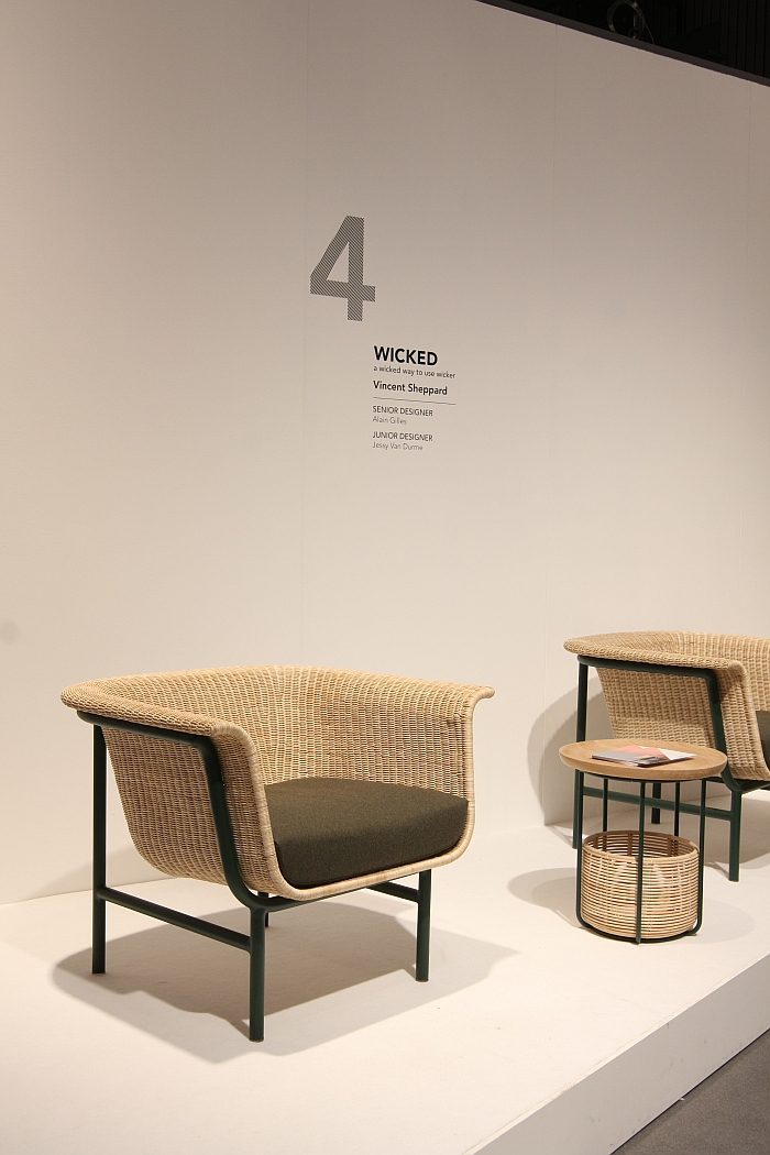
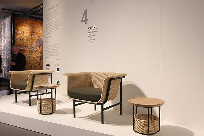
We've never bought into the whole "bringing natural materials into the home" pitch so beloved of interior decorators. But then we are largely soulless creatures. That said we do appreciate a well worked piece of rattan furniture, such as the Wicked collection by Alain Gilles and Jessy Van Durme for Belgian producer Vincent Sheppard. Realised in context of the 5x5 project from Designregio Kortrijk which matches local producers (Vincent Sheppard) to a senior (Alain Gilles) and junior (Jessy Van Durme) designer, the Wicked collection features a sofa, side tables and an armchair. Examples of the latter two were on show in Kortrijk. Featuring a wonderfully voluminous yet unimposing rattan seat shell atop a steel frame, the stubby legs of the Wicked chair neatly compliment the wide, deep seat to form a composition of dignified harmony. And an object which is bold without being brash. The side tables were presented in two heights, and as much as we appreciated the well-considered proportions and clear, logical form we were bought over by the basket, a deliciously informal solution for storing all that household tat that otherwise lies around.
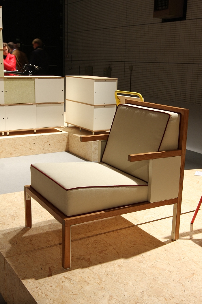
Anyone who reads these pages with even a fleetingly irregular regularity will be well aware of just how much we enjoy the work of Brussels based Ateliers J&J a.k.a. Jean Angelats. What began as an almost dangerous obsession with his simple, narrative, steel tube furniture has evolved into a genuine appreciation of how Jean has developed his formal vocabulary and taken up the challenge of new materials to expand his portfolio without ever losing the honesty, simplicity, wit and naivety which defines his work. And which makes it so appealing
At Biennale Interieur Kortrijk 2016 Ateliers J&J presented a new product. We like it. And your supposed to be surprised?
Yes.
Because it's a wooden lounge chair.
OK, not fully wood, there is still a little bit of steel in the mix, and a lush upholstery, we presume from Jean's colleagues at Atelier Biermann. But essentially a wooden lounge chair.
Classical, almost regal in its form, the piece features the unashamedly open construction principle so typical of Jean's work, while the half-length armrests bequeath it a slight belligerence. And we like that. Lounge chairs normally have full length armrests, but no-one really uses the full length. Only Bond villains sit with their arms resting along the full length of lounge chair armrests. The rest of us only use the first third. But most designers and producers don't have the honesty to tell you the armrests are longer than needed. Ateliers J&J's new chair does. Directly and clearly. As we say, we like that.
We'd love to be able to tell you more, love to tell you about the background, if it is part of a more general move away from steel tube, and for all what its is called. However Jean wasn't in Kortrijk when we were there and has now vanished. At least from our radar. Should, when, we manage to track him down and get the information we'll be sure to pass it on.
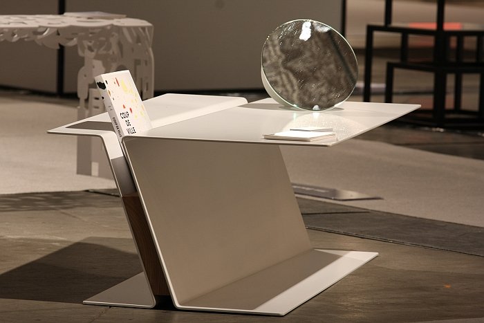
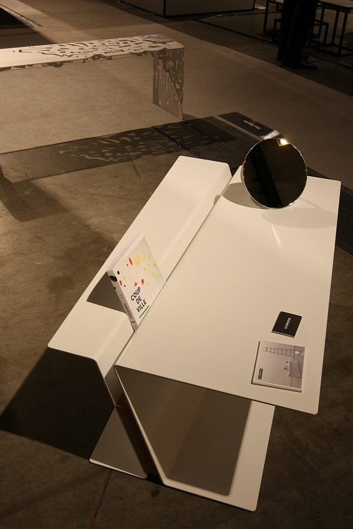
Tim Baute a.k.a interror.be was one of the first Belgian designers we really took an interest in, if not one of the first Belgians. Tim's father was a blacksmith, Tim trained as a metal worker, and worked as a welder before studying design; and Tim's understanding of metal, of its properties, character and potential is just as important for his work as his understanding of form. As a designer Tim rarely produces anything revolutionary but invariably something which adds a new perspective to familiar genres. As demonstrated in his new coffee table Hea. Taking its inspiration from a standard H girder Tim has abstracted the form to create an coffee table in which the formal tension between metal and wood coupled with the lines which run more counter than intuitively create a familiar object you've rarely seen. And being a Tim Baute piece the wood-metal connection is not just invisible, but natural and obvious. Indeed it takes a few minutes to realise that there even is a connection. And that it is invisible. Aside from the formal elegance the central groove provides practical, decorative storage space for books, magazines, tablets, etc, and thus a nice functional extension. As ever with such grooves, our thoughts turn automatically to dust. And spilt beer. Lost crisps. But with regular dusting - to be honest we'd probably hoover on account of the crisps - and careful alcohol consumption, such shouldn't be a problem. All in all a very pleasing extension of the interror.be portfolio.
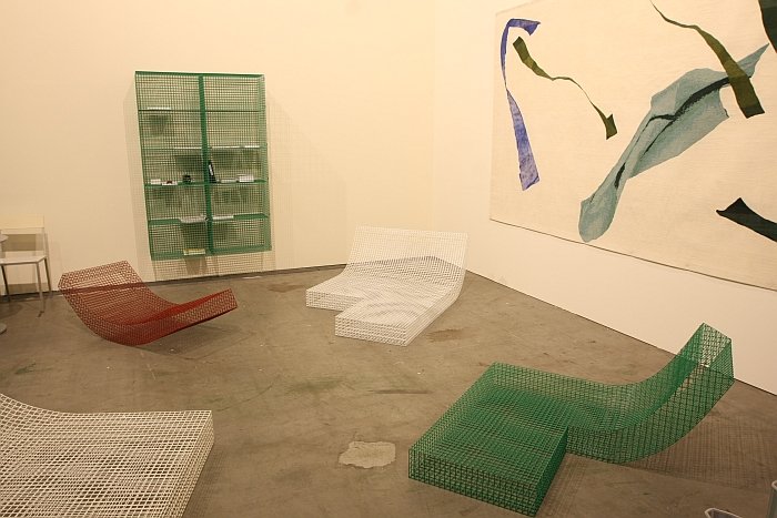
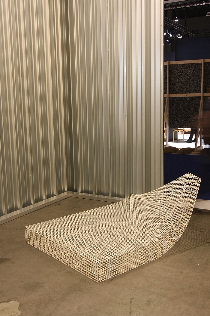
Wire Collection by Muller Van Severen
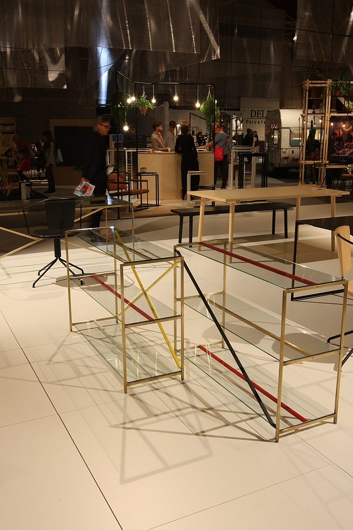
Commissioned in context an architectural project the objects of the Wire collection from Fien Muller and Hannes Van Severen a.k.a Muller Van Severen play very obviously with ideas of permeability, reduction and physicality. While at the same time, and in a much more abstract manner, educate us about the central importance of material choice in future design. All of the objects are essentially very basic furniture genres, certainly easily recognisable, yet in what material would you manufacture them?
As largely material-less forms they are easy and instantly accessible. But how would you translate the material-less into the material? How would you maintain the natural ease all emit? OK with the object that looks a bit like a mattress which has been propped up against the wall a little too long, the answer is fairly simple. But all the others could be easily ruined by the wrong choice of material.
Form may follow function, but is only part of the design equation.
And aside from such philosophising they are in addition simply excellently realised objects which are not only accessible but universally applicable
Crafted from stainless steel the objects are suitable for indoor or outdoor use; and preferably with cushions or some other form of rug if your planning spending any serious time lounging. Unless your an Indian fakir.
R.I.G. System by MA/U Studio
A couple of years ago we officially gave up on the faux-industrial look. We can still remember the precise moment. It was in a coffee shop in Eindhoven. We'd just started drinking a stupidly hipster coffee and were causally perusing the faux-industrial interior as we supped.... and then had a sudden moment of clarity. The faux in faux means faux! What are we doing here!
Similarly we've moaned a lot of late about Danish brands and their ooohhhhh so filigree metal objects. IMM Cologne in January was a very, very difficult fair for us. And we're not looking forward to January 2017.
Consequently the odds weren't good for the R.I.G. System by Copenhagen based MA/U Studio.
Yet it won us over.
And that despite the fact R.I.G stands for the thoroughly pseudo-nonsense "Rudimentary Interior Geometry"
Honestly, we should not be liking this.
But we are.
Very, very much.
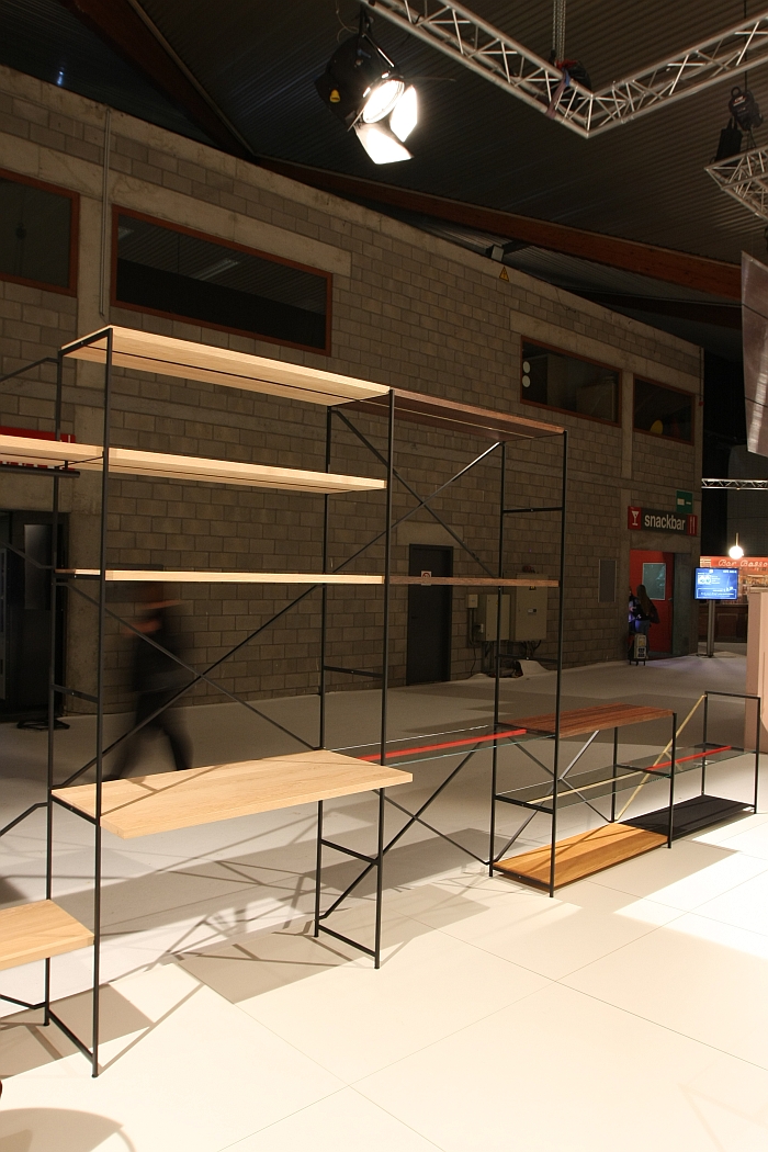
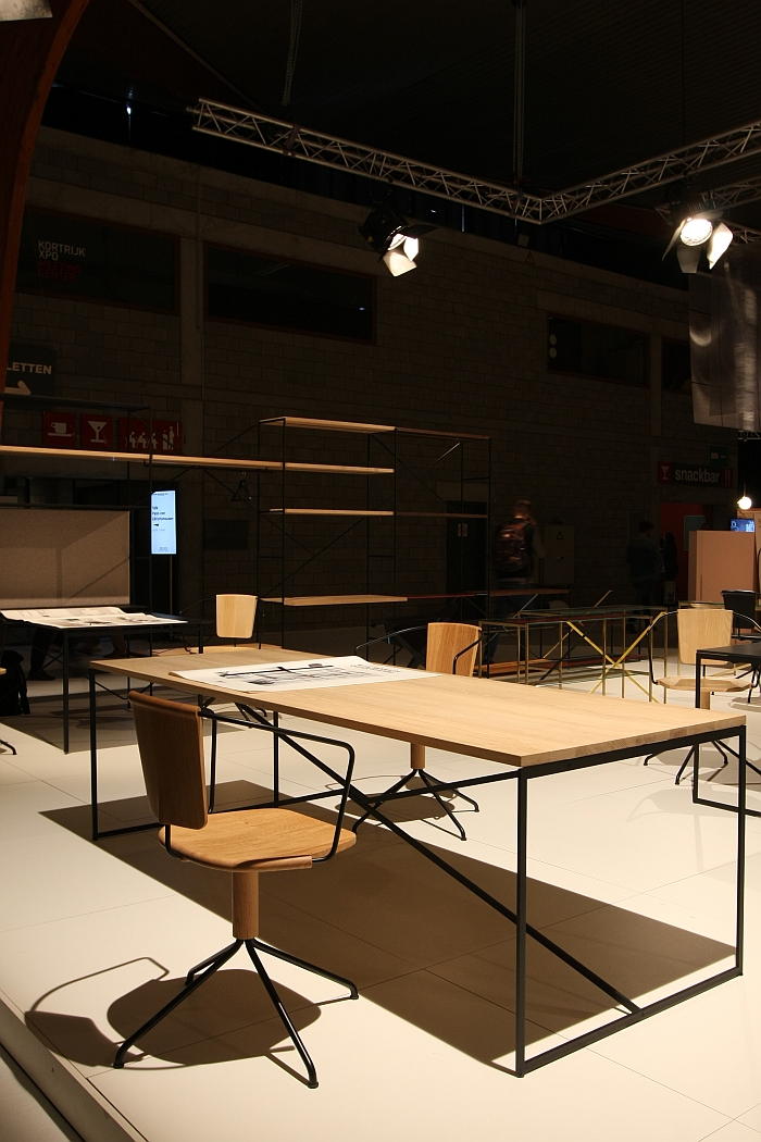
A more or less modular system that allows for the construction, deconstruction and reconstruction of shelving units, including such with inbuilt desks or hanging rails, there is something endearingly elementary about the system: it's a craft object and how it looks or how it functions was obviously less important in its development that how it is constructed, how the connections are realised, how the internal relationships are defined. And because Mikal Harrsen & Adam Hall, the system's designers, got those elements right, the form and function fall automatically into place. The proportions are correct, the optical weight is negligible, and the character emitted is unassuming yet self-confident. Complimenting the shelving is a series of tables which can be used as desks or dining tables and which as with the shelves although approaching industrial, are craft, are unquestionably about the way the materials have been used and are connected, rather than being about realising a table.
The R.I.G. System dates from 2012. Why in all that time it hasn't crossed our path, we don't know. Are however very glad it now has.
