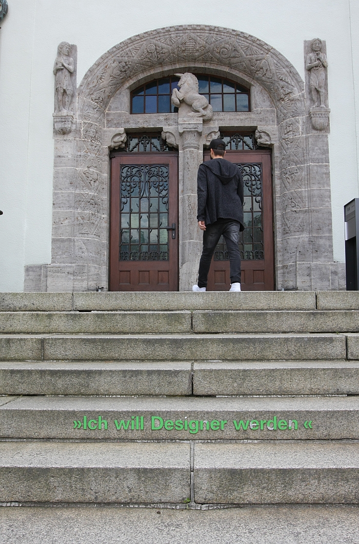
On the steps leading to the entrance of the Hochschule für Gestaltung Schwäbisch Gmünd is embossed "Ich will Designer werden" - "I want to be a designer." With the criticism from Schwäbisch Gmünd alumni Markus Jehs concerning the quality of the discourse in global design education still ringing in our ears, we felt a very real need to grab a marker pen and add ", because..."
We didn't. That would have be vandalism.
Although if we're correctly informed graffiting on design schools is allowed, as long as you invent a new typeface specifically for the job and adequately document the development process. Otherwise it is vandalism. And plagiarism.
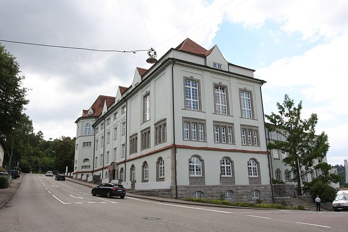
Established in 1907 as the Königliche Fachschule für Edelmetallindustrie - Royal College for the Precious Metals Industry - the modern Hochschule für Gestaltung, HfG, Schwäbisch Gmünd started to develop as a design institute during the 1920s when, and in the shadow of institutes such as Bauhaus or the Kunsthochschule Frankfurt, the first class in industrial styling and form giving was established. Post-war the largely craft based pre-war eduction was augmented by an increasing focus on formal elements before in 1983 the product design department was formally constituted and in 2005 the "Fachhochschule für Gestaltung" became the Hochschule für Gestaltung - the name is not irrelevant, the first Hochschule für Gestaltung was Bauhaus, the second the Hochschule für Gestaltung Ulm, a post-war attempt to revive the Bauhaus tradition, and that just 60 kilometres from Schwäbisch Gmünd. In their approach to design education and the understanding of the design profession Schwäbisch Gmünd has clearly positioned itself
The product design degrees at the HfG Schwäbisch Gmünd begin with three joint semesters before the students move on to specialise in either product design or process design, specialisations supported by classes in more general design subjects such as, for example, aesthetics, ergonomics or material science, in addition to a compulsory practical semester with an external company, agency or institution through which the theory and practice of the studies should, ideally, be connected to the reality of the outside, non-academic, world.
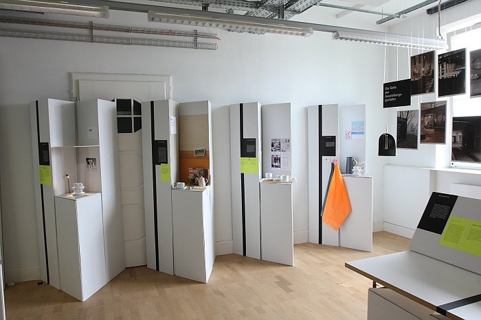
How that theory and practice is taught at the HfG Schwäbisch Gmünd could be experienced at the 2016 summer semester exhibition in a broad range of showcases from across the years and workshops and specialisations.
As ever, design student projects are about the way not the result and comparisons are always subjective, emotional and highly unfair.... that said the following three projects particularly caught our attention...
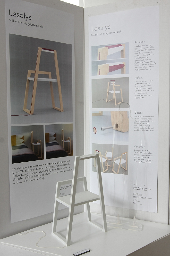
To the traditional bedroom inventory belongs the bedside table and the bedside lamp. Tradition in addition dictating that the bedside lamp take up a third or more of the space on the bedside table and thus reduce the usability of the table to a level where it is just practical, but no more. Wouldn't it, we have never asked ourselves, make more sense to integrate the two and thus create an object in which both function at 100%? We have never asked ourselves that question; Julia Konrad and Eleonora Massarelli did and in the context of the class "Intelligentes Licht/Wasser im öffentlichen Raum" - "Intelligent Light/Water in Public Spaces" - under the guidance of Matthias Wieser developed Lesalys
Now apart from the very obvious, and frankly worrying, question of since when the bedroom has been a "public" space, the idea is as charming as it is eloquent; a reading lamp is built into the frame of the bedside table. LED technology means that lamps constructed from pieces of wood with embedded LEDs have become a common occurrence, in effect Julia and Eleonora have taken what is normally free-standing or free-hanging and integrated it into an object; made it give up its freedom for the common good. Or at least they have done theoretically, which in no way guarantees that a final product is feasible and for all achievable in a sensible and pleasing form that allows for economic mass production .... but it is a first step. And one we hope they get the opportunity to develop further.
Designing a design exhibitions is a tricky business. Art exhibitions are in many ways much easier, art objects being largely self-explanatory, or not, but always open to free interpretation. Design objects are however on display for a reason, are meant to impart some specific piece of information or transmit a particular purpose, and thus must be legibly and coherently displayed. Consequently it was especially pleasing to see the results of the project Design ausstellen - Ausstellen durch Design - Exhibiting design - Designing Exhibitions - by and with Prof. Dr. Dagmar Rinker and looking at how best design can be presented in an exhibition context. We suspect we may have been the only people who were of that opinion, everyone else invariably looking for new, innovative products; but design needs to be explained, and for all design needs to be explained in our modern world where everything is design, even that which patently isn't.
Analysing design exhibitions from the perspective of both the exhibition designer as well as that of the visitor the project sought to explore, amongst other aims, in how far scientific tools can or could be used to optimise the design of design exhibitions, while in the project presentation a nice comparison of four different ways of presenting the mundane coffee cup neatly explained how layout can affect perception. Much like we don't believe an algorithm can tell you how to write a good and interesting blog post, we equally don't believe that there is a universal approach to exhibition design, not least because the design concept is often largely defined by the space and the nature of the objects; that said a lot of design exhibitions could benefit from a lot more thought and so the more people who concern themselves with the specific problems of design exhibitions, and the more an exchange occurs, the better.
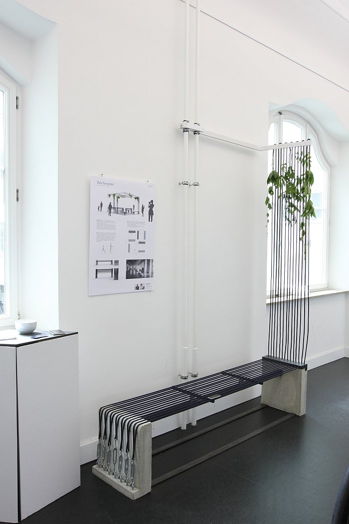
Such is the nature of our lives we spend an inordinately large amount of time at railway stations. Invariably at ridiculous hours of the day and night, equally invariably with troublesome baggage, both physical and emotional, while hunger and weariness burden every step: and naturally we wouldn't have it any other way. Train stations are however, as a general rule, and regardless of in which country one happens to find oneself, dirty, unwelcoming and not particularly well suited for the needs of those travelling. Which we suspect is why Professor Susanne Schade asked students to look for solutions to improve the railway station experience. Amongst a raft of very interesting suggestions the most interesting for us was without question Warteraster by Stefanie Schneider and Moritz Gäckle.
Now normally, and thoroughly justifiably, we'd roll our eyes at the sight of a bench made from taught cord, and carrying on walking. That on this occasion we didn't has several reasons. More an integrated spatial design concept than items of furniture per se Warteraster is a very intelligent and thoughtful response to the brief and one in which through the way the utilised metal, concrete and cord contradict creates a very pleasing formal tension. But mostly we like the way the formal language is used over dimensions and directions And of course the idea of a few plants in train stations, even if we fear no one will properly care for them. Which is of course the real reason train stations are as they are: they are not operated to be welcoming places for travellers, the economic model on which train stations run simply doesn't include customer experience. Thus changing the train station experience requires a change in focus on the part of station operators, not new furniture solutions. Sadly.
