For reasons which we believe are in some form or other closely related to Ley Lines, or similar, all long distance trains in Germany pass through the station Kassel-Wilhelmshöhe. It's not a situation over which Deutsche Bahn have any control, is rather a natural phenomenon, or as Louis H. Sullivan would no doubt phrase it, "This is the law"
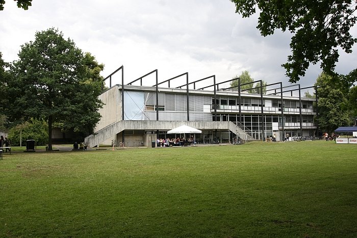
Thus we have passed through Kassel a lot. Without ever having visited the city. A situation we rectified this year with a visit to the Rundgang end of term exhibition at the town's Kunsthochschule.

Although the Kunsthochschule Kassel as an institution can trace its history back to 1777, the Product Design department is but a child; having, effectively, been created in 1869 as an Arts & Crafts School with the aim of training applied artists to create products appropriate for the new age and new forms of industrial mass production, before being officially designated a department in its own right in 1971.
Perhaps on account of this history the course of studies at Kassel has a strong practical, workshop, focus and offers an ultimate specialisation in industrial, textile, systems or furniture design. But first of all students must complete the Introductory Class. As documented by the 2016 Rundgang the Introductory Class from the semester past included courses such as Einmischen - Interfere/Tamper - by and with Kassel alumni Aust & Amelung Design Studio which asked students to investigate processes, spaces and objects found in the college's vicinity and to use them as the starting point for a new project; Brandrunner from Prof. Oliver Vogt, Prof. Lutz Pankow and Ines Göbel which placed the students in the role of both brand art directors & freelance designers and asked them on the one hand to set a brief for other students to design a product for their given brand, and on the other to design a product as defined by their colleagues brief(s); and, and we must add, rather disappointingly, a Readymades class under the guidance of Raw Edges Design Studio. In our experience most design students will of their own volition experiment with Readymades at some stage during their studies, and so there really is no excuse for colleges encouraging such.*
In addition to the Introductory Class the 2016 Rundgang also presented the results of various semester projects and classes including Yellow Pages, which, under the supervision of Raw Edges, saw students learn locally practised trades before applying their new knowledge in the development of an object; Wohnaccessoires which looked at how objects can affect the physical, psychological and social atmosphere in and of a space; and dua meets Kunsthochschule Kassel which, as the name neatly indicates, saw a cooperation between students and the Cologne based label/design agency dua.
As ever, and in a statement we are going to by typing a lot this week and which we will never tire of repeating, student projects aren't about the end result: they are about how the students responded to the brief, how they framed their answer, moved towards it and what they learned on the way. Not the product that arises at the end. That can be as guff as you want.
Similarly visiting end of year student exhibitions isn't about "discovering" "new" "innovative" projects, but about getting a feel for what the students have been up to, what they have been learning, how they have been learning, what tools, materials and approaches are being taught and used, how good is the cafeteria.
That said there were a couple of projects on display at the Kunsthochschule Kassel Rundgang 2016 which did cause our frail hearts to skip one or the other beat.....
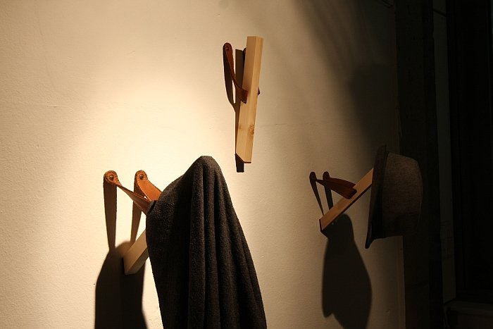
Developed in context of the project Schnalser Säge which saw students cooperate with the eponymous Tirolean firm, a company who process Swiss Pine (Zirbeholz) to a variety of objects using traditional methods, Rautenhag is, very simply, a bar of wood fixed to a piece of leather which one attaches to the wall. When not in use it just hangs there. When in use it is a very practical hook. A piece of leather on the base of the wooden stab adding a little friction, and protecting the wall. For us Rautenhag works on a couple of levels; on the one hand it is just a lovely, simple solution which turns a genuinely practical, mundane, coat/hat hook into something that is not only interesting but involving. Secondly it has a wonderful temporariness. There are numerous coat racks on the market which fold in and out via various methods; however, they are all attached to a backboard and thus have a defined volume and a permanency. Rautenhag just hangs there when not in use, and that not in a particularly flattering or attractive manner, and certainly not in a way that says it is making any claim for long-term residency on your wall. And on the fabled third hand, combine this temporal simplicity with an object made of Swiss Pine and leather and you have a decadently luxurious couldn't give a damn. Which can only be adorable.

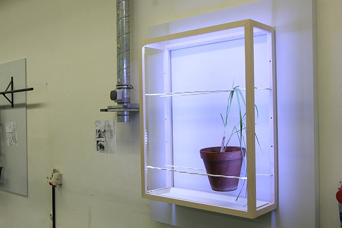
The first product George Nelson ever designed, arguably the only product George Nelson ever designed, and the one that lead to his appointment at Herman Miller was the Storagewall. Essentially a hollow wall which could be used as storage, Nelson's logic was that the wall was there, it was hollow.... might as well use it. We were instantly reminded of Nelson's Storagewall when we saw Garten by Monja Hirscher. With its frame, water bowl and lighting Monja pitches it as a garden for the living room which you can hang on to your wall. We say, wrong. It is a garden for your living room which you can place inside your wall. And not just for your living room. Walls may not be as thick as they were in 1940s America, and certainly not contemporary internal, non-structural, walls, but where walls of a suitable depth are either in-situ or are planned a modular system based on Garten would allow for the creation of recesses which can be used for plants, and storage, but which are also part of the room architecture and lighting plan. Yes, that makes it sound more like an architectural feature than a product, but then so was Storagewall.

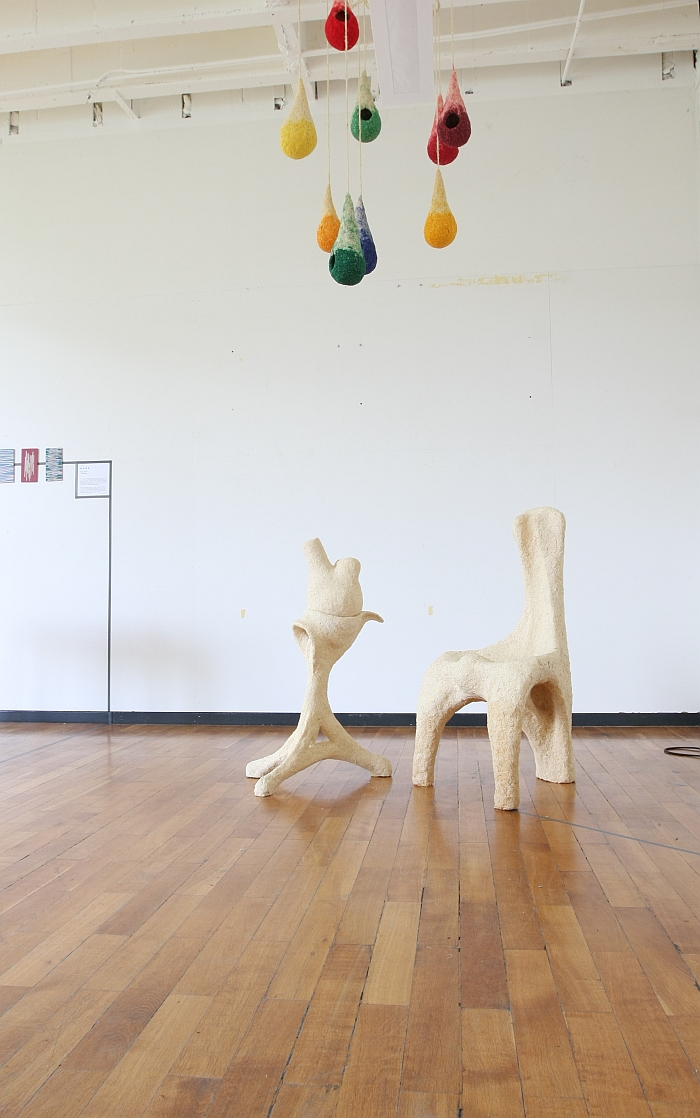
Mixing wood shavings with a binding material and using that as the basis for making furniture isn't a new idea: however, in almost all other cases the designers use the various mixes to create, more or less, furniture of standard forms. Instead of saying "New Material. New Forms." Which is surely the correct and logical way to go. And is the way Jan Emde went. Not that we're saying we like what Jan created, because we don't particularly. For us the objects are a little to Antoni Gaudí, pushing hard at the unacceptable borders of Rudolf Steiner and generally invoke visions of naked 19th century reformists dancing their floral way towards Art Nouveau. But they are new forms. Are an attempt to use a new material to break down accepted standards and to explore new realms. Non-conventional materials and processes allow for non-conventional forms and thus new conventions in product and furniture design, a truth nicely embodied in Jan's project.
