The 18th century Prussian Monarch Friedrich der Große, or Alte Fritz - Old Fritz - as he is popularly known, has many claims to fame, not least of which is his promotion and advancing of the cultivation of the potato in the lands under his command, thus making him responsible for the tuber's contemporary popularity in northern Germany. And hence his other title: The Potato King. Friedrich was also a patron of the applied arts and handicrafts and in 1763 took over Johann Ernst Gotzkowsky's financially struggling porcelain company and thus established the contemporary Königliche Porzellan-Manufaktur, KMP, Berlin: an early example of the state intervening to assist local craftsmen, and a decision taking by Friedrich largely on account of his appreciation for the quality of the company's craftsmanship and also the aesthetics of the porcelain objects being produced.
Friedrich der Große's most famous estate is arguably Sanssouci in Potsdam, and we like to think Alte Fritz, interested as he was in the world around him and the developments of the age, would take the short horse ride from Sanssouci to the Fachhochschule Potsdam to peruse their annual Werkschau end of term exhibition. If he'd find anything that tickled his fancy quite like the potato or Berlin porcelain, is of course another question.....
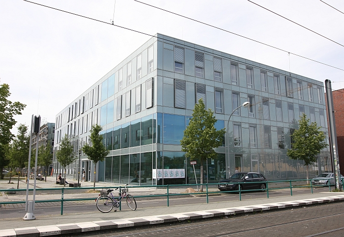
Established in 1991 the Fachhochschule Potsdam is one of the youngest colleges in Germany; and the only one we know to have a smiley in its logo. We've never asked why.
The Fachhochschule Potsdam design department was established in 1992, parallel to the architecture and civil engineering departments, and offers degrees in Interface Design, Communications Design and Product Design, in addition to a BA and MA in European Media Studies organised in cooperation with Potsdam University.
Following three joint introductory semesters Potsdam design students focus on their chosen speciality in a largely project based/practical course of studies, albeit one which also offers modules in, for example, design theory, design management and, and most joyously, design history.
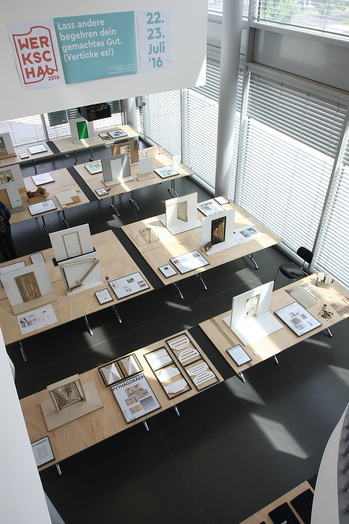
Amongst a wide rage of individual and group projects from the past year at the Fachhochschule Potsdam, including Vom Amtsschimmel zum Bürgerross, which sough ideas for making the council offices in the town of Gransee more welcoming and inviting for visitors and staff, Atelier Farbe, which explored various aspects of colours and asked students to "present" a colour in all its glory and as they saw best fit, or Neue Türen - PORTA Wettbewerb which presented the results of a design competition ran by the Polish door manufacturer PORTA amongst Fachhochschule Potsdam students, we were particularly taken with the projects Smart Lighting from Professor Jörg Hundertpfund and Desktop Wire Production from Professor Hermann Weizenegger. Two projects which produced three very interesting responses*
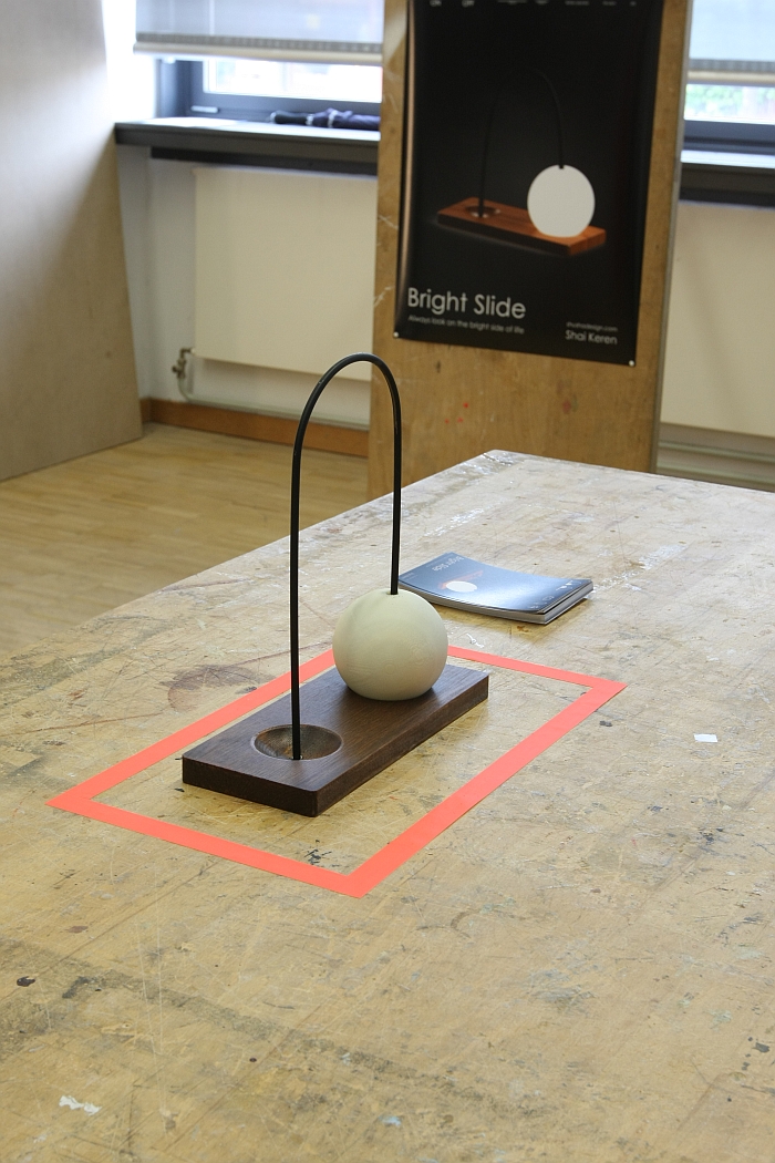
Organised in context of an eponymous student design competition Smart Lighting asked participants to design functional, contemporary "smart" lighting solutions, and amongst some more, some less interesting creations the highlight for us was without question Bright Slide by Shai Keren. We regularly see lighting design projects which use motion to turn a light on and off, generally in the form of a see-saw effect or where the on/off function is realised by turning the object over; Bright Slide's use of movement as a switch is however one of the more aesthetically and formally pleasing proposals we have seen. Presenting a mix of glass, wood and metal Bright Slide functions by moving the lamp head, in form of a glass ball, along a metal arch, thus transferring it from one side of the wooden base to the other. Left side on/right side off. Or vice versa depending on your perspective. A very sculptural object Bright Slide thus not only promises a pleasingly simple usability, but also to interact with a room through more than just illuminating it and thus to function as a decorative as much as lighting object. The emphasis being on "promises", for what was presented at Werkschau was but a model, and one with at least 8 million questions that need to be clarified before it can even make it to the prototype stage. And thus less a work in progress as an idea in progress; and one we hope Shai Keren gets that opportunity to develop further because as a project it was genuinely delightful.
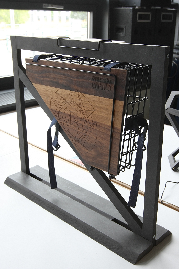
The project Desktop Wire Production from and with Professor Hermann Weizenegger sought to explore the possibilities of a recently developed computer controlled desktop wire bending machine; possibilities which in our fully subjective opinion Jonathan Wellmann and Melissa Kramer exploited particularly well.
The joyously named Wire We Knot Outside by Jonathan Wellmann is a "bag" for use on/with a bike and which hangs in the triangular space in the frame. And in that sense is and was nothing new. What however particularly appeals to us about Wire We Knot Outside is on the one hand the very strong formal language that arises from the chosen combination of wire and wood, but for all the method by which it is attached to the bike frame, stupefying simple, yet the sort of ridiculously obvious solution which one has to arrive at. And which you can only achieve when you understand the nature of the problem at hand.
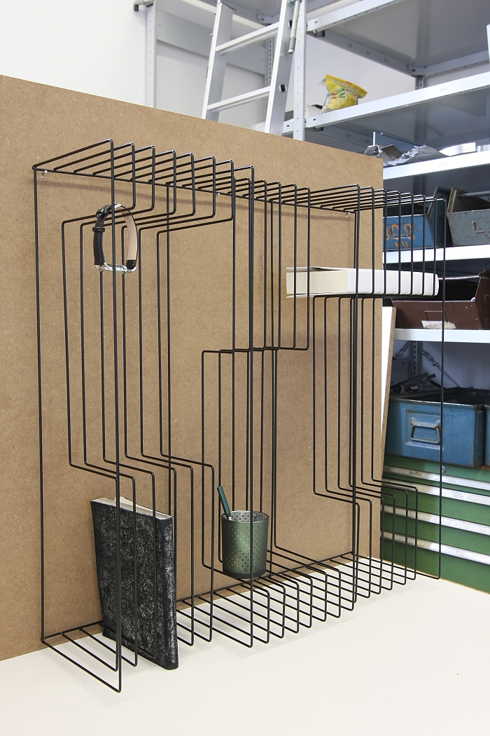
Similarly Skeleton Shelf by Melissa Kramer represents a very keen observation of the problem of desk organisation. Even if Melissa herself pitches it as a general wall shelf it is unquestionably, if subconsciously, a response to the problems of desk top storage options. And for all to the experience of knowing that that which you have is never enough, never correct, never that which you in that moment are looking for. Skeleton Shelf handles the problem by, in effect, ignoring it and offering the user forms which imply familiar desk storage tools, but which are just bent bits of wire and thus freely interpretable. And endlessly applicable. In addition, the use of wire means that the true volume of the object is concealed by its transparency, thus you don't, or at least shouldn't, have the feeling that you are placing the world on your desk: while giving yourself neigh-on unlimited options for the long and/or short term storage of folders, files, utensils, hardware, muffins and all those other contemporary office essentials. Yes, of late we've complained an awful lot about the number of filigree wire objects currently on the market, Skeleton Shelf isn't such, it is a practical, functional object, that just happens to be crafted from metal wire.
Further details on the design department at the Fachhochschule Potsdam and their courses can be found at: www.design.fh-potsdam.de

*As ever design college exhibitions are never about the results, but the way they are achieved. Sometimes however very interesting things are achieved.....