We're not going to claim that DMY Berlin 2016 was a vintage year, for us the 14th edition of the international design festival featured too little of substance, too much superficial, too little original, too much that was too obvious and far, far, far too many intricate filigree light bulbs. And nothing says "lifestyle", or winds us up, more than an intricate, filigree light bulb.
However our impression may have been partially clouded by the distraction caused by the large amount of open space in a, relatively, sparsely populated Kraftwerk Mitte. We may have been concentrating too much on the spaces in the space. We're all for space, we're all for monumental space that envelops and absorbs you; but sometimes, and as so often in a design context, less can be more. And a different venue advantageous.
However just as the vineyards of the Loire produce excellent wine every year, and not just in those the self-proclaimed experts deign to term "vintage", so to did DMY Berlin 2016 present some truly engaging and interesting projects. That our High Five! is in reality a High Four! is because on closer research a couple of projects we had considered including turned out to be less interesting than we had initially thought. In contrast to the following four.......
Workaround by Sofie Aschan Eriksson, Lund University School of Industrial Design
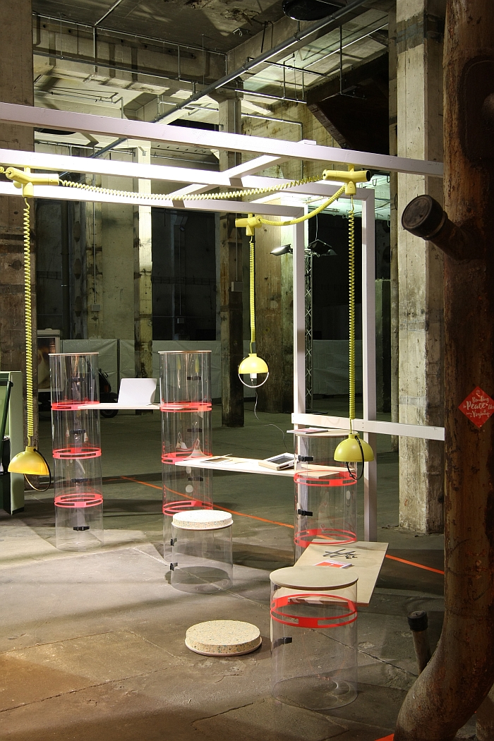
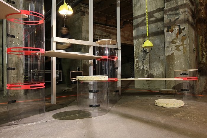
Although we visited the Lund University School of Industrial Design’s “In my Office” presentation at Milan, we somehow missed this gem from Sofie Aschan Eriksson. Essentially a variable modular desk system Workaround allows for working at various heights in a system that can be effortlessly adapted, extended or reduced as required. Or at least will/should be able to with a little further development: while in its existing form it can be adapted, extended or reduced as required, for us there are a couple of practical, operational, issues that need to be resolved before it becomes truly as effortless as we just claimed. As anyone familiar with us will understand, the materials are obviously not our thing, or at least not the “plastic with rucksack clips” that form the supporting columns. We like the transparency and lightness it bequeaths the system, we like the idea of informality, just feel it takes it a little too far, transports the mood, as it were, over the border from “informal” to “unserious”. And even hip new start-ups want to look serious. We do however see a lot of potential advantages of the plastic system in terms of branding, and we’ve already worked through some 8000 uses for the hollow interiors. Just feel that with a slightly more “refined” material solution one would have a more viable and universally applicable system; and not just in offices, but in a whole range of commercial, civic, academic, hospitality and industrial situations. All in all a very nicely considered and excellently worked through idea and one we hope Sofie gets the opportunity to develop further.
Prjcts - Modular Desk
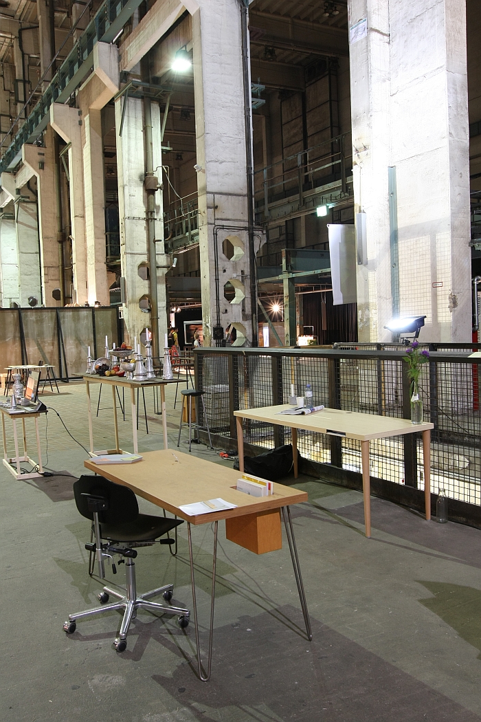
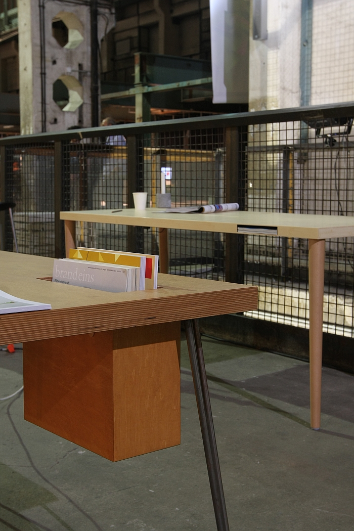
What initially attracted our attention to the Prjcts modular desk, and what we still haven't actually, physically, seen, yet are still actually, physically, obsessed with, is the pen storage module. Essentially a hole in the desk top into which a pen can be placed. So, vertically. We use pens a lot. Have on our desk and old earthenware pot thing containing about 25 pens. At least 8 of which don't work. We don't need 17 functioning and 8 defunct pens. We need one pen. One pen we can find when we need it. We need a hole in our desk with a pen in it. And this simplicity of function and obviousness of solution flows through the Prjcts concept. Good product design isn't necessarily about finding the correct answer, but of understanding the question. The Prjcts modular desk is an excellent example of that fact. We all have demands in terms of what our desks should offer, Prjcts responds to these demands with table tops and legs in a range of configurable sizes, materials and colours and into which various "modules" can be integrated, including amongst others a multi-plug, a storage box or an induction plate for wireless charging of mobile devices. And the modules are integrated, not added, they integrate with the table top. In addition one can order just the table top, should you have table supports you wish to continue to use or would prefer an option other than those offered. Which is a nice bit of customer friendly thinking. The system's creator Christian Knäbke didn't study design, Prjcts arose from his own experience of using desks, and arguably because it arose from a user's rather than a designer's point of view it is for us a more relevant, sustainable and interesting concept than many systems we know in which companies have invested thousands in adding all manner of complex technologies. Yet never considered a hole for storing a pen.
Marlon Lounge Chair by Alexander Rehn for Axel Veit
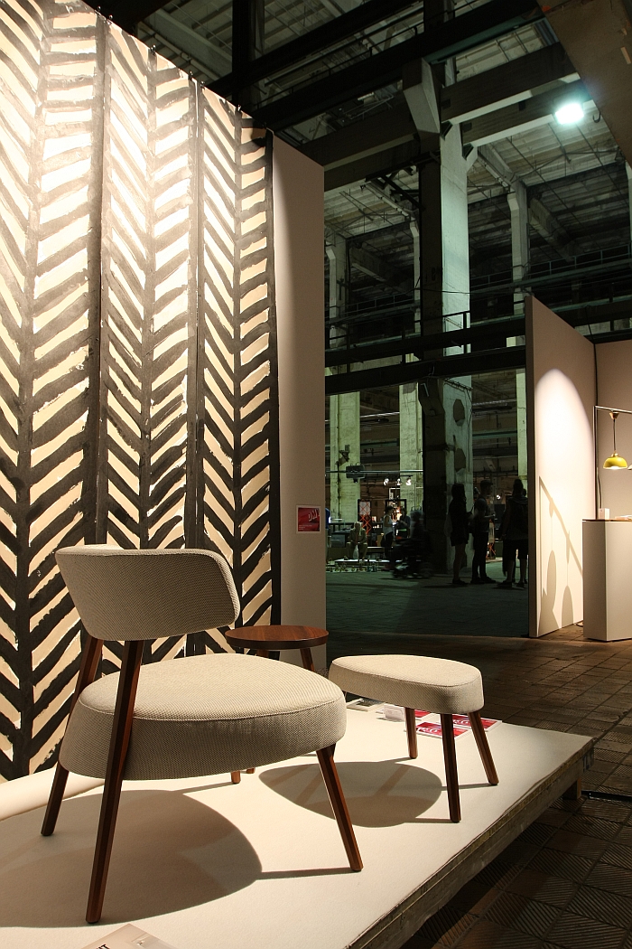
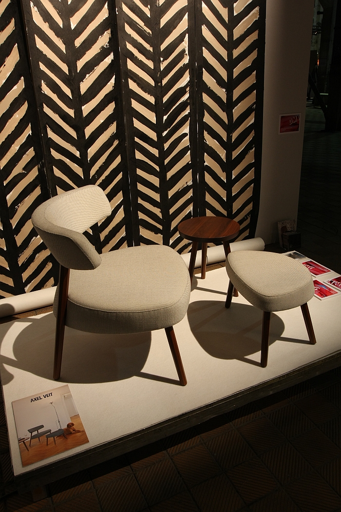
We first came across the Marlon Lounge Chair by Munich based designer Alexander Rehn for the Berlin based brand Axel Veit in context of the Berlin Design Selection showcase at Milan 2015. One of those, innumerate, Milan showcases which we planned to post about. Yet never quite got round to. The chance wiedersehen at DMY 2016 was thus very pleasing. Quite aside from its easy accessibility and formal grace what we really like about the Marlon lounge chair is the visual irritation, almost contradiction, provided by the backrest: without any warning it suddenly changes direction, yet does so in a very subtle and pleasing fashion, and also one which aids the sitting comfort and thus the value of the object.
Happarel Bicycles
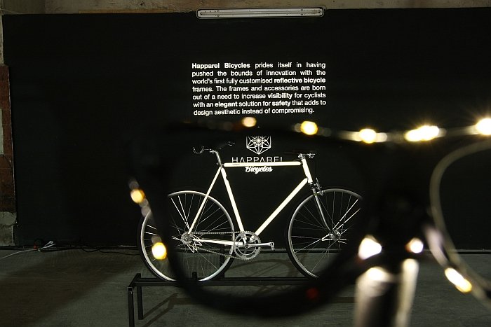
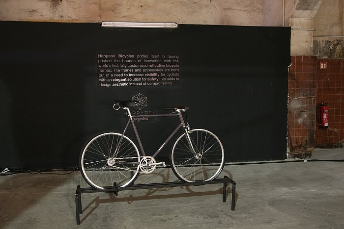
A few months ago Eberhard Schilling from Berlin based Happarel Bicycles contacted us to enquire if we’d be interested in their new reflective bike concept. Nice project we replied, one we find fascinating, but we really, really, really, really, don’t want to get started on bikes. Bikes and cycling are worlds of their own, worlds full of design, lifestyle, practicality, frivolity, honesty and show, and we simply do not have the time to even start contemplating and filtering the myriad topics associated with contemporary bikes and cycling culture.
Since when we’ve pretty much only written about bikes and cycling.
We’re not saying it's Eberhard's fault, we'd never say that, but we are saying that if he hadn’t contacted us…..
Happarel's concept remains as delightful, elegant, simple, and fascinating, as when we first encountered it. A specially developed material reflects car headlights in a way similar to road signs and means that by day you have a normal bike, yet at night you are illuminated by car headlights and thus visible. Yet only illuminated for car drivers, for all other, casual observers, your bike remains nondescript, normal. Or as Happarel so poetically phrase it, you are "only extra visible when you need to be without being a rolling christmas tree." In addition to providing their own custom bikes Happarel can make any existing bike reflective, and that in a way and with a design customised to meet your wishes. An awful lot of Happarel's marketing is, if we’re honest, a little too cycling lifestyle porn for our tastes, however as a concept and a product what Happarel offer is not only charmingly elegant and intelligently realised, but very, very important.
