Designer | Exhibitions and Shows | Fuorisalone | Fuorisalone Milan Design Week | Milan Design Week | Product
It's been a good long while since we last posted about the Hochschule für Gestaltung Karlsruhe's kkaarrlls collection, and thus ambling down Milan's Via Palermo towards the kkaarrlls 2016 Edition showcase we inevitably found ourselves querying why that should be....... Not least because ever since we stumbled by chance across the first kkaarrlls showcase at Milan 2009 it has been a project we have liked, enjoyed and followed. If latterly only from afar.
Given how much we admire kkaarrlls, we reasoned, our (un)enforced absence from their annual Milan exhibition couldn't possibly be attributed to us, and thus we choose instead to blame the pressure of time during Milan design week. One simply cannot see everything!
A cowardly excuse, and one which kkaarrlls 2016 Edition quickly reduced to shreds.........
Established in 2009 as a platform to promote both the students capabilities and the school's strengths, kkaarrlls presents selected projects by Hochschule für Gestaltung, HfG, Karlsruhe students either as prototypes or as limited edition series, however as kkaarrlls co-founder and HfG Karlsruhe Professor for Product Design Volker Albus was keen to underscore in our 2013 interview, "we call the objects “Editions” but the gallery market isn’t our aim", much more the aim is "to present the school and for all the students work better and in a more professional manner"
Something the 2016 showcase did with particular finesse.
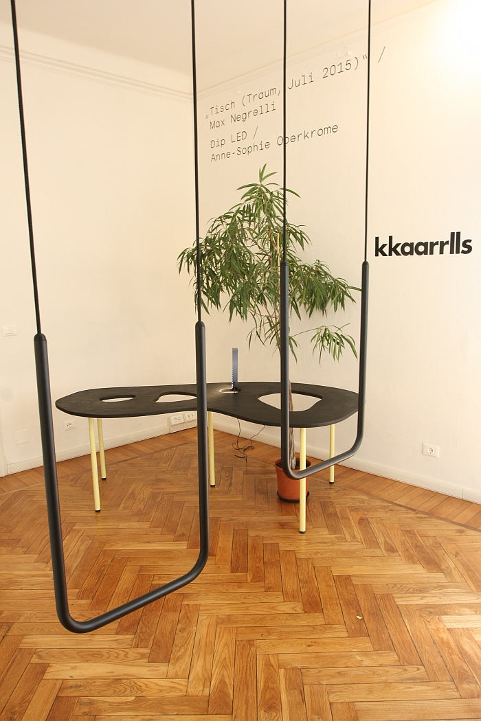
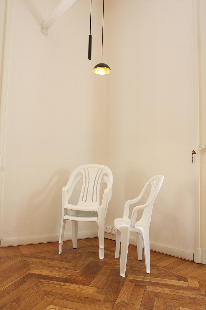
Selected, as ever and as only, by Volker Albus and kkaarrlls project manager Stefan Legner, the 2016 kkaarrlls collection presented twelve student projects, and a selection of objects from the Old World – New World cork collection as previously exhibited at Tendence Frankfurt 2015, a slightly cheeky decision in our opinion, but we see where they are coming from. And given the overall quality of the cork pieces eminently sensible.
As ever with such student showcases, they ain't no beauty pageant, there ain't no winners, there ain't no egos, that said there were a couple of projects which particularly caught our attention.
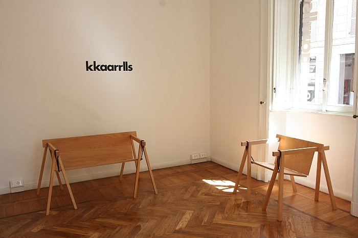
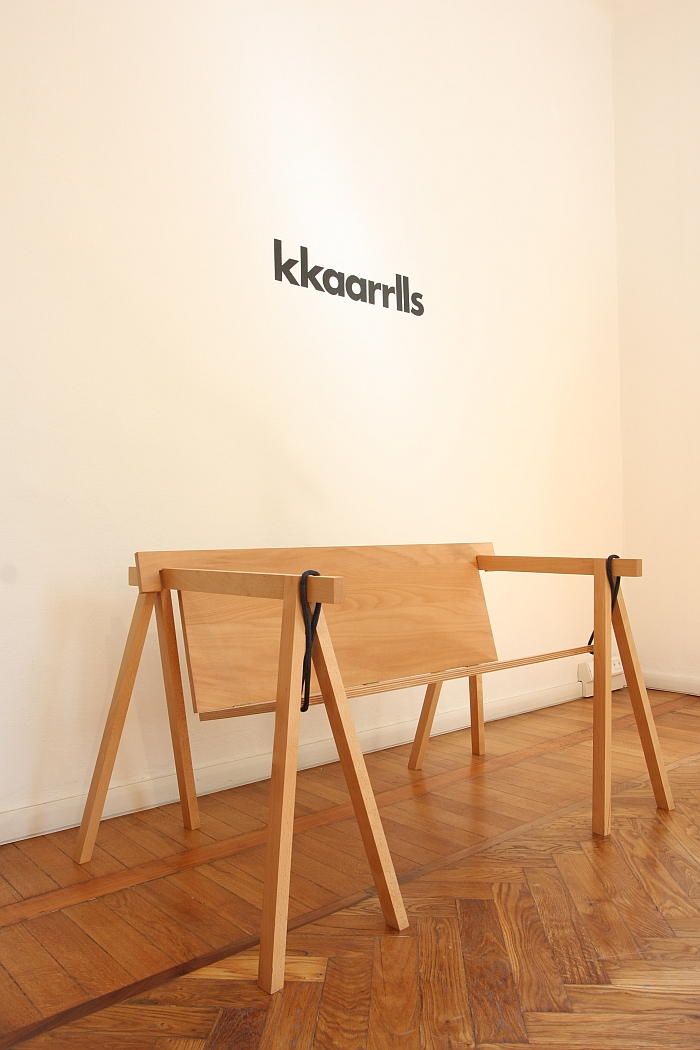
The Bockbank project by Max Guderian takes the familiar trestle but rather than use it as the basis for a table, uses it as the basis for a bench and a chair. Particularly pleasing is the way that has been achieved, namely two wood panels are joined with a hinge, hung between two trestles and fixed with rope, thus creating a collapsible, easily storable, formally elegant and unchallenging seating solution which has something of the feel of a porch swing, albeit without the false graces. For us just as applicable for indoors as out, in addition to the obvious use as garden furniture, in the catering/hospitality/event branch or as an informal office bench, we don't see any reason not to use it in a domestic situation: a few cushions and/or throws and Bockbank would work in any kitchen, bedroom or, and assuming there is space, hallway. All in all a very well conceived and realised project.
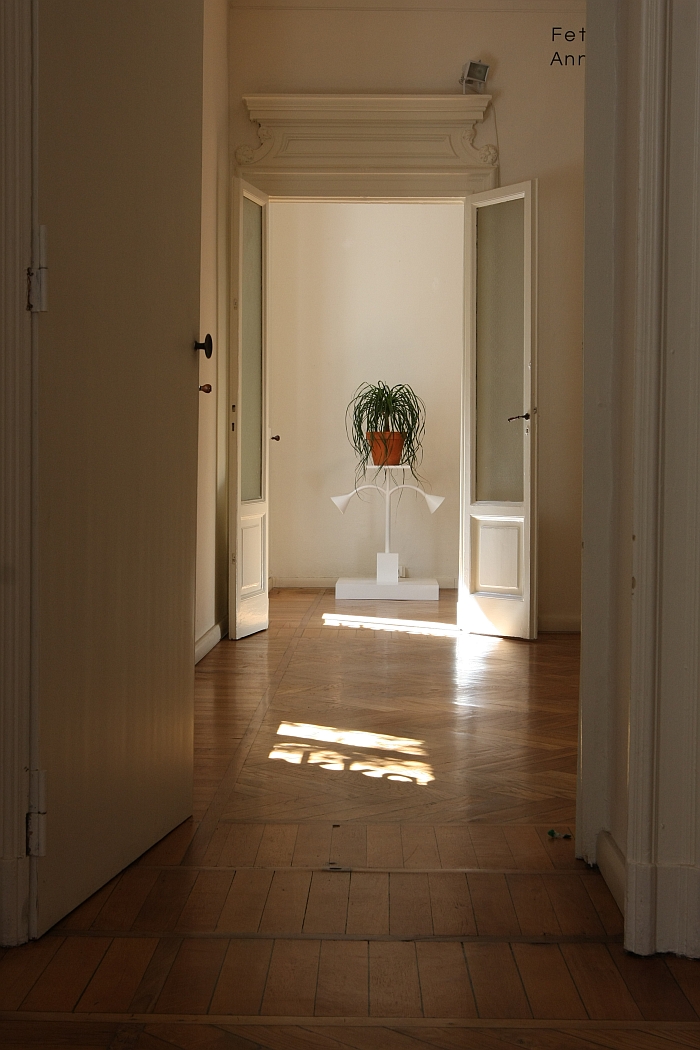
Normally we'd hurry past an object such as Fetter Schrank by Anne Tönsmann, invariably muttering something unrepeatable about student flats, that we didn't isn't because there wasn't any space to, but because something about the construction, or perhaps better put, the composition, appealed to us; it posses an unexpected and charming harmony and controlled authority. And then having noticed it, we began to appreciate its functionality. We wouldn't necessarily insert an umbrella at that angle chosen in Milan, but otherwise as an object for the permanent storage of plants, as demonstrated, or temporary storage of newspapers, clothing, books, umbrellas (vertically), mail, info flyers, flags, dog leads, etc, etc, etc... why not? Particularly as an alternative to a coat rack/shelf system in an office or shared work space. Yes, we're also sensing a potential long-term dust problem, but that is then a question of the chosen textile and cleanliness routine.
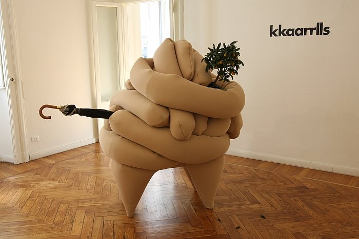
Only post Milan did we discover the background to the Fetter Schrank project: works by the Finnish photographer Iiu Susiraja in which she unashamedly exploits her excessive weight, and exaggerated figure, to transform her body into a multi-functional storage system.
Proof that design needn't always start with a problem.
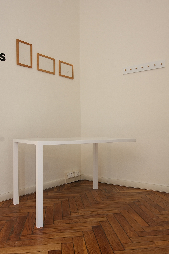
Or indeed a qualified designer, as eloquently proven by Clemens Lauer and his project "Design is 10 Years Old", in which a group of ten year olds were asked to sketch a piece of furniture, four of which Clemens subsequently realised. The results range from an abstract door handle, over a curious, almost baroque, lamp/side table and onto a dining table with legs at but three corners. You're thinking "nice playful take on classic table design", we're saying "barrier free table for unproblematic wheel chair use or ease of access for vacuuming. If, on account of the necessary counterweight, not so mobile."
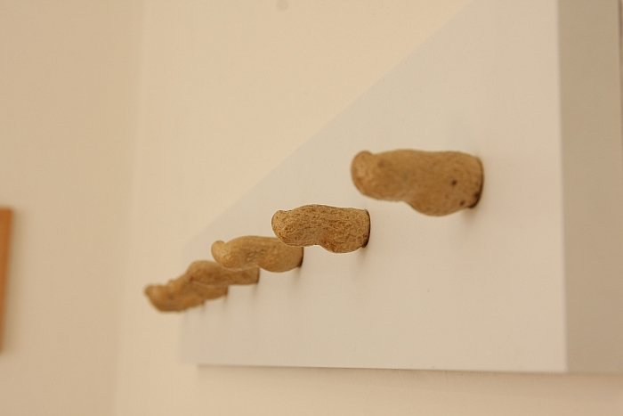
The highlight of Clemens Lauer's project however was without question the Peanut Coat Rack, an object which transports the eternal "My child could do that!!!" criticism of Modern Art into the world of Readymades and Post-Modern misappropriations. Which is of course more or less the genre(s) where Volker Albus's professional career began. Which kind of amuses us. As in, a lot.
The truth behind the old adage "absence makes the heart grow fonder" is questionable, the Irish band The Corrs, for example, recently announced a comeback following a ten year hiatus, our collective hearts barely missed a beat at the news; that said, having not seen a kkaarrlls showcase for a couple of years we had forgotten what an excellent platform it can be and what a good example it is of what can be achieved when a design school curates their students' projects rather than simply exhibiting them.
And also made us understand that if you don't do something, you've not only got no-one to blame but yourself, but ultimately it is you who misses out........
More information on the kkaarrlls 2016 edition, all previous editions and the project in general can be found at www.kkaarrlls.com
And for all who missed it first time round, here our 2013 interview with Professor Volker Albus on five years of kkaarrlls
