ClassiCon | Designer | Exhibitions and Shows | Fuorisalone | Fuorisalone Milan Design Week | Magis | Milan Design Week | Producer | Thonet
To the casual observer selecting five outstanding products from the Milan Furniture Fair is a neigh on impossible task, so great is the number of potential candidates. "How", asks our casual observer, "are you going to select just five?!?!"
For the seasoned attendee selecting five outstanding products from the Milan Furniture Fair is a neigh on impossible task, because the vast majority of articles on show are anything but outstanding. And those which are are invariably older, established products, and thus for the purposes of this column not applicable.
Milan Furniture Fair 2016 was an excellent example of just that: the majority of the new products were, for us, underwhelming, while many of those producers from whom one would/could have expect a shudder of illicit exhilaration mustered little more than a friendly, if knowingly apologetic, smile. Which isn't to say what was on display wasn't good, wasn't interesting, wasn't valid. It often was. Just rarely outstanding.
There was however outstanding, and here our High Five! from Milan Furniture Fair 2016*
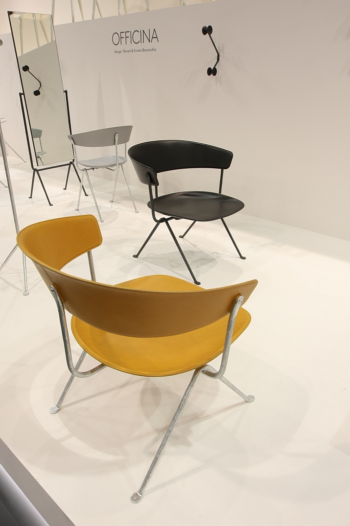
Officina Lounge Chair by Ronan & Erwan Bouroullec for Magis
At Milan 2016 Magis unveiled an extensive extension of the Officina collection by Ronan and Erwan Bouroullec, including what we're referring to as the Officina Lounge Chair: and for us an object which represents the ultimate expression of the ideas contained in the Officina Armchair. Don't get us wrong we're huge fans of the Officina Armchair, but with the extra width, the exaggerated proportions and the combination of leather and wrought iron the Officina Lounge is for us a much more natural, harmonious construction than the compact Armchair and one which has something primal, almost bestial, about it, albeit an unashamedly domesticated beast, and which makes it for us a very logical and appealing piece of work.

Stool 01 by Studio Daphna Laurens
Created as part of Eindhoven based design studio Daphna Laurens' contribution to the Passionswege programme at Vienna Design Week 2012 the subtly named Stool 01 is by no means a new design, but is one which for us remains as fresh and exciting today as when we first saw in Vienna. And one which we passionately believe more people should have the opportunity to experience. For us the attraction lies in the ambiguity inherent in the object. In essence a very simple stool, Stool 01 is anything but; presenting as it does no clear guidelines as to how or where it is to be used. That is up to you. A situation intensified by the fact that as an object Stool 01 not only invites interaction but continually reveals new facets of its character and new possibilities depending on the conditions under which you approach it. Over the years we've seen Stool 01 on numerous occasions and in numerous locations, yet still have no idea how one should sit on it. That isn't a simple stool, but is a very pleasing and rewarding piece of product design.

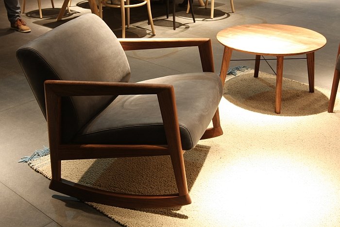
866 F Rocking Chair by Lydia Brodde, Thonet Design Team for Thonet
As a genre the rocking chair is largely defined by the classic "Windsor", spindle, form or its more quadratic cousin, as to be found per auto-stereotype on your average American porch. Or it is some horrendous contemporary abomination of the sort that makes you wish for a new law punishing those responsible with long prison sentences. Between the two there isn't a great deal of note to be found. The new-ish Thonet 866 F Rocking Chair offers just such an alternative. An extension of the Thonet 860 programme by Lydia Brodde from the Thonet Design Team, the 866 F benefits not only from the well considered and excellently proportioned form of the 860 collection, but also from Thonet's long experience with rocking chairs: Michael Thonet was responsible for numerous rocking chair designs, whereby in addition to investing time and effort in developing filigree bentwood structures he also paid careful attention to the radii of his rockers. Detailed research in the Thonet archives and workshops has thus resulted in a curvature based on this tradition and which allows for a stable, secure and for all very pleasing rocking action.

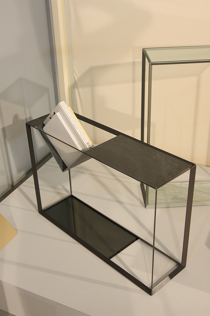
FRAM3 by Anna Weber
FRAM3 was for us one of those classic trade fair experiences. Walking around the stand where Burg Giebichenstein Halle Anna Weber was presenting her work, our attention kept coming back to it, yet we couldn't explain why. And thus couldn't decide if we liked it. Thought we probably did and so took a few photos. Away from the intensity of the fair and with the time and space to think about things we decided that, yes, we did and do like it. Or specifically we really liked/like one configuration of FRAM3. As an object FRAM3 is, as the name suggests, a metal frame which can used in one of three positions, and as a rectangular frame that means it can be used in any one of three heights depending on which edge is used as the base. A series of exchangeable inserts turn FRAM3 into a practical sideboard, table, etc..... and it was the metal insert with the indentation and thus an open invitation for book storage which especially caught our attention. We know, we know. Dust. Leave a book there for too long, it's going to get dusty. Then don't leave books there for too long. Life is that simple. Use it as space for temporary book storage, for example in the hall, kitchen, conservatory or office. And not just for books. The rim around the upper surface means that small items can be securely placed on top with the indent providing temporary ad-hoc space for scarves, jute bags, small packages, dog leads etc, etc, etc. Or books. In addition to the pleasing functionality FRAM3 is also an aesthetically pleasing piece of work; reduced without being unnecessarily filigree it has a robustness of character which it isn't afraid to transmit and which it does without appearing uncouth.

Ulisse Daybed by Konstantin Grcic for ClassiCon
One of the joys of Konstantin Grcic's work is you never know where it will take him next: something unashamedly, if competently, commercial; an artistic diversion; something that explores new formats, pushes horizons and thus expands the vocabulary of furniture design; or something that presents Konstantin Grcic the carpenter. The Ulisse Daybed for ClassiCon is a wonderful example of the latter. Presenting itself in an uncomplicated, reduced formal language, the real joy of the piece is the reclining mechanism; in essence a very simple, almost elementary, carpentry solution to a functional problem, yet one with a logical efficiency that is undeniably industrial. An excellently realised piece of carpentry, Ulisse, as with so much of Grcic's oeuvre, references numerous historic objects while offering a new interpretation of the elegance and functionality for which they are acknowledged and beloved.