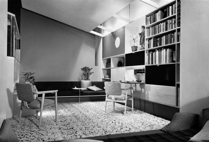
As has oft been noted in these pages, the years following the Second World War were years of quick, radical, fundamental social, cultural and economic change. Changes from which the then fledgling furniture design industry greatly benefited: and from which it continues to benefit with many of the popular mass market designs created back then becoming the design classics of today.
The design week having not yet been invented and those furniture trade fairs that existed being very much the preserve of the old guard and their hand-crafted solid wood objects, an important method of introducing the contemporary designs of the day to the buying public were exhibitions in museums. Often little more than sales and marketing events and regularly sponsored by local stores, the 1940s and 50s saw a plethora of such exhibitions including the 1947 "Good design is your business" at the Albright Art Gallery Buffalo, the Walker Art Centre's 1948 "Well-Designed Articles from Minneapolis Stores" showcase and perhaps most famously the New York Museum of Modern Art's "Useful Objects" series which ran from 1938 until New Year 1948/49 and which often featured in its title a conduit such as "under $5" "under $10" or in 1948 "under $100"
One of the more interesting, if largely forgotten of such events, was the exhibition For Modern Living which opened at the Detroit Institute of Arts on September 11th 1949.
Presented in cooperation with Detroit department store J L Hudson Company, For Modern Living presented some 3000 objects in an exhibition designed and curated by Alexander Girard. In addition to chairs, sewing machines, toys, lamps, crockery, cutlery and other necessities of contemporary life For Modern Living also presented a series of specially commissioned murals by Saul Steinberg which ran through the exhibition rooms and the pages of the exhibition catalogue. Very much akin to How to live in a Flat by W. Heath Robinson and K. R. G. Browne, Saul Steinberg's drawings poked gentle fun at contemporary living standards - the catalogue cover, for example depicting a man sitting on a sleek, reduced modern chair his feet on a heavily upholstered gilded throne - but in doing so also underscored the permanency of the changes. This was the future. Accept it.
The central, and most interesting feature of For Modern Living however was a presentation of seven idealised rooms, one each designed by Alvar Aalto, Charles Eames, Florence Knoll, Bruno Mathsson, George Nelson and Jens Risom. Rooms which in the words of Everyday Art Quarterly demonstrated that "there is no stereotyped pattern, no surface formula for the choice and relationship of objects", and that instead there is "room for individual preference, vagary or fantasy, restraint or austerity - with no sacrifice of good design"
Or put another way: the origins of what was to become the much celebrated American mid-century modernism. And indeed modern exhibition design.
For although clearly intended as a commercial presentation, J L Hudson's sponsorship wasn't some random act of good will, For Modern Living and its ilk not only helped promote new design and bring the ideas of the day to a mass public but also, as D.S. Defenbacher notes in his editorial in Everyday Art Quarterly, helped revolutionise ideas about how museums present their collections, how museums can motivate and inspire visitors rather than simply presenting objects on pedestals and in glass cabinets. Industry's money bringing show into the dusty world of American museums.
Something worth bearing in mind should you ever find yourself facing a tired, uninspired presentation of 1950s American product design.
