ClassiCon | Designer | Exhibitions and Shows | Magis | Nils Holger Moormann | Producer | Product | Vitra | Weil am Rhein
One of the first telephone calls Mateo Kries and Marc Zehntner made upon assuming leadership of the Vitra Design Museum in 2011 was to Konstantin Grcic to discuss the possibility of an exhibition. Grcic was, in principle, open to the idea, but, "I didn't want a static exhibition, something that froze my work in time, rather I wanted something dynamic"
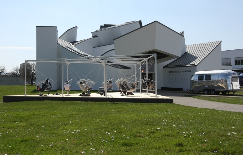
That "something dynamic" is the exhibition Konstantin Grcic - Panorama which opened at the Vitra Design Museum, Weil am Rhein on Friday March 21st 2014.

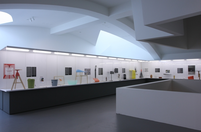
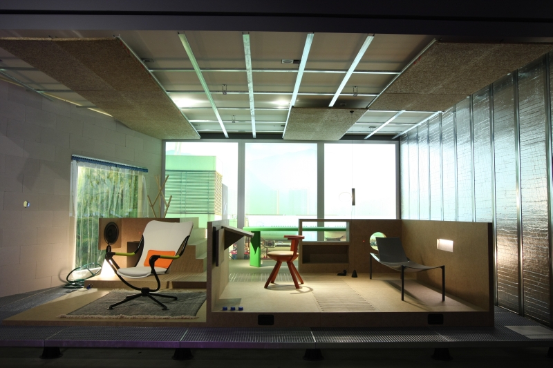
Presenting some 200 objects divided across four thematic sections, Panorama is, in effect, two exhibitions in one. The first, staged downstairs in the museum, addresses design themes of particular importance to Konstantin Grcic. And which Konstantin Grcic believes should be of importance to us as all. The exhibition opens with Life Space, a look at Grcic's considerations on the future of domestic arrangements before moving over Work Space, an exploration of Konstantin Grcic's own work process which doubles up as a discussion on the contemporary design process in general, and on to Public Space, which addresses the future of our urban spaces. The "second exhibition", staged upstairs under the title Object Space, looks at Grcic's oeuvre in more detail, presenting examples of Grcic's works, be they products for manufacturers as varied as Moormann, Magis, ClassiCon or Flos, objects created in cooperation with galleries or projects that have never had a life outwith Konstantin Grcic's Munich studio. Grcic's own work standing juxtaposed to and in context of other, third-party, objects that have a particular relevance to Konstantin Grcic, his understanding of and approach to design and which have inspired and motivated his own creativity.
The separation is not just spatial and conceptual but also stylistic. Whereas the first three sections are presented true to Grcic's position that "my designs do not immediately reveal themselves" and require the visitor to first identify the issues involved and then consider their own position to the questions raised, the final section is a classic example of dry, perfunctory, museal presentation.
Both Konstantin Grcic and Vitra Design Museum Chief Curator Mateo Kries speak of the fourth section as an exhibition within an exhibition. And of it having been deliberately conceived in such an immediate and unchallenging manner.
We can't help feeling it is meant ironically.
"Look at the Grcic retrospective. How cute!", the designati will no doubt squeal.....
It is a delightful, clearly structured presentation from which we learned a lot about Konstantin Grcic and how he works, but which we cannot, and honestly never will be able to, take seriously.
A state of affairs we thoroughly approve of.

As with the exhibition Lightopia for us the biggest problem with Panorama is the lack of space in the Vitra Design Museum. Konstantin Grcic speaks about Frank Gehry's building as being a challenge, of if it having a character, rough corners and how he likes that. In a building and in an object.
But there is no escaping the fact that one of the Vitra Design Museum's characteristics is a lack of space. It may suffice for the conservative exhibition format as represented in the Object Space section, but an ambitious project on the scale of Panorama simply needs more space.
Each of the four sections can make a valid claim to be an exhibition in its own right - in our time we've viewed exhibitions hung on much thinner premises - and despite the scaling back that has obviously been undertaken in the development of the exhibition concept, one still feels occasionally cramped, or at least a little unwelcome. As if you should read a text about the exhibition rather than trouble the aching, distended space with your bulk.
The Life Space section, for example, should, indeed must, be a display that one can walk around and explore, touch, sit on, inhabit, not just view at a distance from the comfort of a Bench B. While Work Space needs to offer, well, space to work, which it currently doesn't. The layout making it more reminiscent of a warehouse than a workshop; dormant rather than dynamic. And that not because the curators lacked the nous to think up anything else. But because of space issues.
None of which should be seen as criticism of the exhibition itself. Far from it.
Panorama is not an exhibition that is going to necessarily bring you any closer to Konstantin Grcic's work per se. Grcic himself yes. But not his work. But then that isn't the point. It is not really an exhibition about Konstantin Grcic's work. It is an exhibition about contemporary design and the contemporary designer. Konstantin Grcic is merely the conduit.
Design today is inflationary. There is ever more "design" because ever more aspects of our daily life are presented, sold and understood as design. Even if they patently aren't. Consequently the term "design" and the function of the "designer" become unclear, confused, contradictory and ultimately meaningless and irrelevant. Panorama helps focus the mind on what design really is. Or perhaps better put what contemporary design should be.
What is truly important for the home of the future? How can new technologies be best employed, rather than just employed? What forms will new technologies allow? And which are desirable? Sensible? What does it mean today to "live" some where? What is "work"? Are we prepared to sacrifice our privacy for domestic convenience? How can design help us achieve what we want and require? What, and how much, responsibility do designers carry in such processes?
Such questions are extended by a series of boards featuring snippets from articles and academic papers that approach and tackle related social, cultural and economic issues: Can deserts power the earth? Is a world without businesses and factories conceivable? Is the cloud polluting the air? The virtues of squatting......
The exhibition doesn't do anything especially deep nor does the exhibition tackle all issues in contemporary design far less raise any new ones, but also doesn't intend to: it is an exhibition by Konstantin Grcic about those things that matter to Konstantin Grcic and which Konstantin Grcic wants us all to consider more carefully.
And it does that very effectively, with very simple means and in a very accessible, if challenging, fashion.
Panorama also makes perfectly clear that the future is also about each one of us personally accepting our own share of the collective responsibility. And one can only take responsibility seriously when one appreciates and understands the world around you. Something made singularly clear in the exhibition segment Public Space. Housed in the largest space in the Vitra Design Museum Public Space is dominated by a 30 meter long, 4.5 metre high fantasy cityscape by London based artist Neil Campbell Ross. In front of this cityscape have been scattered a few Chair Ones on concrete pedestals and Grcic's experimental 2007 project Landen. That's it. There is also a fence. Which we thought was just for decoration, a 3D extension of the painting if you will, the actual thinking behind its inclusion is however depressingly clichéd. And so we'll ignore it. And in any case, the focus of the room is the cityscape and the questions it allows about the current state of our urban environments and how we want them to develop. On the information panels Grcic poses questions concerning, for example, ownership of urban spaces, the requirement for humane urban forms or future urban mobility. What do we want from our future cities? How each of us responds and reacts to such challenges will ultimately affect the nature of our cities, and so determine if we become the future we want. Do we really want to leave such considerations to designers? Who is actually paying designers? And so once again, do we really want to leave such considerations to designers?

Conceptual exhibitions such as Panorama always run the risk of becoming an intellectual emperors new clothes: the curators stare long and hard in their navels and devise a big concept composed of the finest theories elegantly stitched with doctrines and ideologies, the masses flock and announce themselves overwhelmed by the majesty of the spectacle. But ultimately all one has created is a vast excess of narcissistic pomp.
Panorama avoids such a fate by avoiding answering any questions, far less presenting a vision of the future. That's your job. "I hope", so Grcic, "visitors take the exhibition as the beginning of a discussion and reflect on what is presented and decide if one agrees with our positions. Or not."
Which all of course makes one thing very clear, Konstantin Grcic - Panorama isn't an exhibition for lazy Sunday afternoon with a hangover. Or at least the first three sections aren't. The fourth almost invites such a condition. But, and in all seriousness, if you want to get anything useful out of the exhibition you need to invest time and mental effort.
Or perhaps better put, if you want to get anything useful out of the exhibition you need to view it as dynamically as Konstantin Grcic conceived it.
Konstantin Grcic - Panorama can be viewed at the Vitra Design Museum, Charles-Eames-Strasse 2, 79576 Weil am Rhein, Germany until Sunday September 14th 2014. Full details including opening times, ticket prices and information on the accompanying fringe programme can be found at www.design-museum.de