Designer | Producer | Vitra | Weil am Rhein
In December 2012 Vitrashop, the shop fitting arm of the Vitra Group, and of course the original rock on which the Vitra seed germinated and grew, took formal occupation of their new distribution centre.
Conceived by Tokyo based architects Kazuyo Sejima & Ryue Nishizawa aka SANAA, the imaginatively titled "SANAA Factory Building" is the latest addition to the Vitra Campus and was officially presented to the public on April 19th 2013.

Vitra CEO Rolf Fehlbaum first approached Kazuyo Sejima & Ryue Nishizawa in 2006 to discuss the possibility of them developing a project for the Vitra Campus. Initially they were pencilled in to build what was to become the VitraHaus; however, Rolf Fehlbaum re-considered and decided that because SANAA had never developed an industrial space it would be an interesting idea to ask them to do just that for Vitra.
SANAA readily agreed, for in addition to the challenge of working in close vicinity to so many buildings from established architects, the scale of the project inspired and motivated the pair, or as Kazuyo Sejima puts it "....we could never build a house with such a large footprint"
And when one considers the construction's circa 160 metre diameter and total floor space of some 20,000 square metres, it's very hard to disagree.
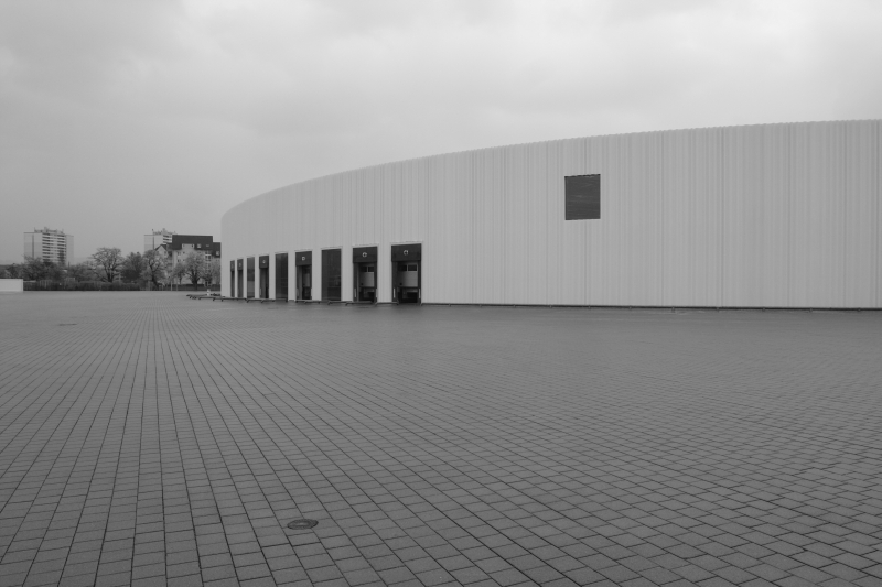
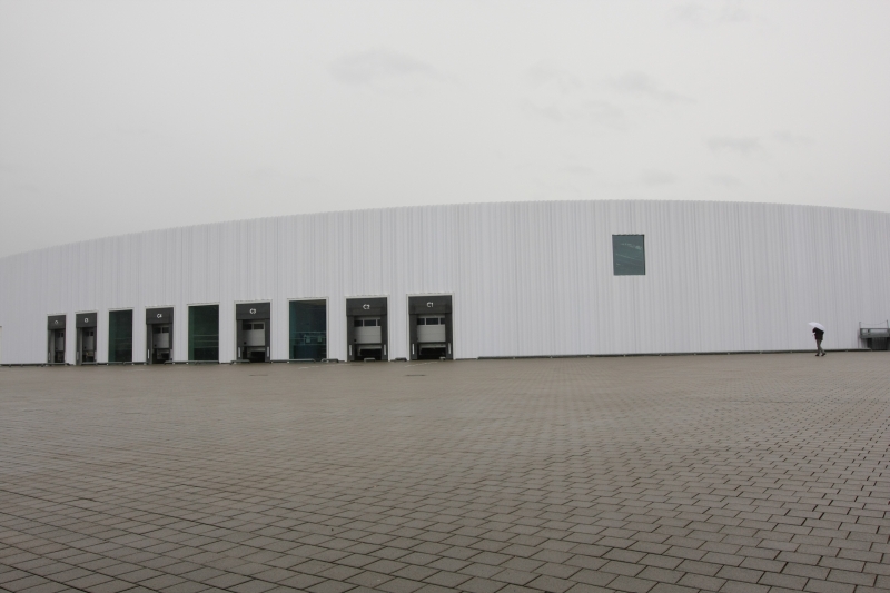
Aside from its size, the SANAA Factory Building is defined by two factors: Its shape and its outer facade.
The most most instantly striking of which is the outer facade. Created from double layered acrylic glass the facade is composed of 6 different "wave" patterns assembled to form a non-repeating, apparently random, facade much like a freely hanging curtain and conceived to give the construction a lightness that disguises and reduces its size.
We can't confirm if that works or not. On the one hand we don't have any other 20,000 sq metre buildings we can use as a ready comparison. But principally we are unsure as to in how far the curved walls aid and abet such an effect.
The SANAA building certainly doesn't appear noticeably larger than any of its neighbours, but they are all quadratic. And the SANAA Factory Building is round. In itself a small innovation for a distribution centre.
Initially SANAA developed quadratic and round models for the building, but ultimately decided on the round version in order to make the building on the one hand more accessible for lorries and on the other to improve the work-flow inside. The argument from SANAA being that for distribution centres circles are a better form that quadrats. A not illogical argument.
The SANAA Factory Building is however not a perfect circle, Kazuyo Sejima & Ryue Nishizawa have deliberately distorted the form a little to create a sort of squashed egg. Or perhaps given the way it is connected to the neighbouring Nicholas Grimshaw building, a slightly squashed penicillin fruiting body.
The motivation with the off-circle was to keep the building more organic, not so industrial: despite having finally completed an industrial project SANAA obviously aren't quite ready to be called industrial architects.

Anyone expecting to find in the Vitra SANAA Factory Building a repetition of the undulating floors of the Rolex Learning Center Lausanne or the almost completely transparent landscape of the Toledo Museum of Art Glass Pavilion will be disappointed. Sorely disappointed.
The SANAA Factory Building is an industrial facility and has been designed as such.
Indeed walking round the building we were reminded of what Antonio Citterio told us in relation to his own three Vitra factory projects "... Vitra don’t need a statement, Vitra need a productive space, a Vitra factory space"
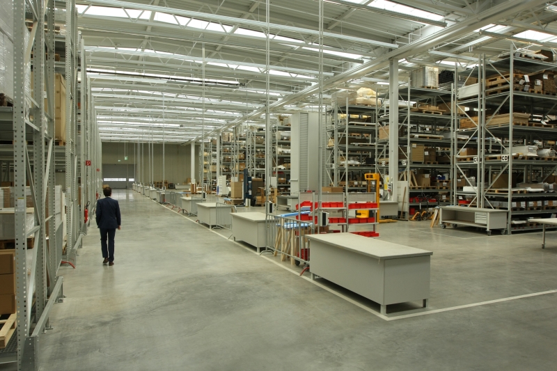
What SANAA have created in Weil am Rhein reflects that very well. It isn't arrogant, isn't vainglorious, it isn't a "statement", it is a space where Vitrashop can work, in the words of Sejima "... a very comfortable space for the workers". One of the major features in this context is the endless rows of skylights which flood the space with daylight to create a homogeneous working environment, and environment which ideally makes the factory interior appear smaller, friendlier, more personal.
On the day we were there there sadly wasn't any daylight flooding in, but even in Weil am Rhein a little rain must fall. And when no rain falls we see no reason to doubt that the sunlight will flood. And that it will create a pleasant working atmosphere.
In the past both Sejima and Nishizawa have repeatedly stated that for them making a structure clear is a central priority in their work. A philosophy they have remained true to with the SANAA factory building; the shelving blends effortlessly in with the structural beams, floor gives way to wall to roof, or as Rolf Fehlbaum puts it "...normally things are hidden, here you can see everything"
Almost.
For although we're not in the habit of contradicting Rolf Fehlbaum, there is one thing you can't see.
Outside.
Just as important as structural clarity in the SANAA canon has been the interaction between between a building's interior and its external environment. The SANAA Factory Building in contrast stands there very much as an object stubbornly determined to keep itself to itself. Even the windows as metaphoric eyes on the outside world are placed too high to allow any meaningful view in or out. Their sole function is aiding illumination.
As such the SANAA Factory Building would appear to be the first time that SANAA have found themselves limited by a brief. Or when not limited then at least forced to approach the project with a different philosophy.
On the one hand there are the economic limitations, an industrial building such as that in Weil am Rhein clearly has a much lower budget than the museums or housing projects SANAA normally develop, but also the practical limitations. Aside from the legal framework that such a building must conform to, especially in Germany, come banal points such as that, ideally, no one should be able to see inside a distribution centre.
The transparent restaurant kitchen or production facility may have become accepted standards, however which company freely presents to the world the contents of its warehouse?

With the completion of the SANAA Factory Building the Vitra Campus has not just been expanded by one building, but has one more Pritzker Prize winning architecture bureau to its name following on from Herzog & de Meuron, Tadao Ando, Avaro Siza and of course Frank Gehry.
Kazuyo Sejima & Ryue Nishizawa won architecture's most prestigious award in 2010 and in the citation the jury notes that "The buildings of Sejima and Nishizawa seen deceptively simple. The architects hold a vision of a building as a seamless whole, where the physical presence retreats and forms a sensuous background for people, objects, activities and landscapes"
A description that could also be effortlessly applied to the SANAA Factory Building.
Yes, it just looks like a steel warehouse and lazy scribes could portray the glass facade as an architectural Emperor's new clothes that cloaks an all too apparent conceptual nakedness. However start inspecting closer, analysing for example how the construction has been created, how the roof is supported or how the technology has been integrated, and you will discover a lot of hidden depth and fascinating detail.
SANAA Factory Building is unlikely to go down in history as Kazuyo Sejima & Ryue Nishizawain's greatest work, nor is it the greatest work on the Vitra Campus, it is however a captivating object that places it functionality unselfishly above all other considerations, an object that serves the workers rather than the architects, an object that attempts to go new ways and has the bravery to risk new approaches. And as such is a fitting addition to the Vitra Campus.
Below a few images of the SANAA Factory Building. And by way of short explanation, given the truly awful weather on the day we visited we spontaneously decided to start photographing the outside in black and white. Hence the mix. Seemed appropriate given the mood of the day.....