Designer | Exhibitions and Shows | Fuorisalone | Fuorisalone Milan Design Week | Knoll | Milan Design Week | Producer | Product
During Milan Design Week 2013 Knoll formally launched the "Tools for Life" collection from Dutch architecture practice OMA, a collection overseen by OMA co-founder Rem Koolhaas.
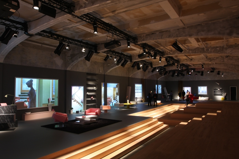
The collection had previously been previewed as part of the stage decoration for the Prada Fall Men's show in January, and was formally unveiled in the same location.... the Prada Milan HQ
A location that theoretically the likes of us should never be allowed to enter. But Design Week is Design Week.

The first thing to say is that the collection looks like it has been designed by an architect.
Just not in the easily accessible way we all know from the likes of Jacobsen, Eiermann or Haller. And certainly not in the tradition of the architects with whom Knoll's reputation was founded; Mies van der Rohe, Bertoia, Saarinen....
It's all very much the result of a conceptual thinker, a pure author collection from a designer working on the basis of a theory rather than a specific functional or aesthetic brief. Haute couture to misuse the Prada vocabulary.
For Knoll the signature piece of the collection is the 04 Counter. Three beams stacked on another, the top two can be rotated through 360 degrees thus allowing for a range of variable, fluid uses: seating, presentation, discussion. Innovative and interesting as the functionality unquestionably is, we're just unsure who actually needs or wants such. And certainly in an object that stands around one metre high and two metres long.
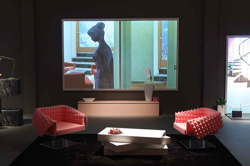
The 03 Coffee Table works on a very similar principle with similar mechanics; however, being smaller in scale the movement makes a lot more sense, is friendlier, more desirable and is something we can well imagine attracting a following. Albeit a very wealthy following.
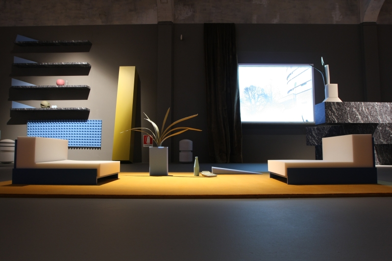
For us the highlight of the collection is the 11 Floor Seating, a legless chair that at first glance looks as if it is just for relaxing; however, in context of modern working with tablet computers et al, sitting low down, knees raised, slightly hunched is likely to become a much more common option. And high-quality, well considered chairs that allow one to, effectively, sit on the floor are about as rare as Prada jackets in our wardrobe. For us "11" just needs a slightly higher backrest to be truly functional.

Amongst the further objects the 01 arm chair has a not unappealing form language, albeit takes a little bit of getting use to. When we first saw them we didn't like them at all, felt they evoked an unpleasant Star Trek meets 80s Miami Beach Nightclub imagery indicative of a designer trying too hard. However, having let them work on us for few days, we are starting to understand and appreciate them a lot more. It's a bit like David Bowie. Didn't get him for decades, then suddenly a few years ago we approached his music in a different way and since then find it much more appealing.
The 05 Round Table and 06 Table are technically very, very interesting; however, the less said about their appearance the better. And no, we don't think we'll ever get used to them.
Although we imagine they'll be very well received in Moscow.
The real star of the launch however was Rem Koolhaas, who was followed round the Prada Cathedral by an adoring crowd, hungry for titbits of information, principally on his reasons for the choice of materials. A question he, patiently, answered at least a thousand times.
We of course weren't part of the mob. At that point we were busy in hospitality eating croissants with a proficiency that would have put Polar Bear Knut to shame.
They were Prada croissants. When are we ever likely to get the chance to eat Prada croissants again?
Never is the answer. And yes they were lovely.

Tools for Life is the first time Rem Koolhaas has taken on a furniture project. According to Knoll the first contact was made some 15 years ago, but Koolhaas didn't have any real interest, or perhaps better put the necessary motivation, for furniture at that time. Then a couple of years ago they started discussing the possibility again and Koolhaas said yes, "....because Knoll asked us to do a collection rather than a single object, and that made it an interesting proposition"
And regardless of what you think of the individual pieces or the form language, as a collection Tools for Life works very well. It has a unity, a solidarity that binds the individual pieces together.
In our post from the Museum für Angewandte Kunst Köln exhibition "From Aalto to Zumthor Furniture by Architects" we hypothesised that what makes much of the furniture designed by architects such as Eiermann, Jacobsen or Le Corbusier so appealing is that it was largely developed for specific projects, it originated in a specific context and so was influenced and formed by this context.
Furniture by Architects also showed what happens when architects develop furniture out of a fixed context, free as it were. Or at least showed what can happen.
Tools for Life by OMA for Knoll is a further good example. An interesting and not-unappealing collection it is, for us, driven too much by a desire to be an OMA furniture collection and as such lacks a certain nonchalance that is necessary to make furniture something that people want to possess and use.
As such we fear that Tools for Life is fated to become a historical footnote in the story of Knoll and OMA, good for a few glossy photos but otherwise culturally and economically irrelevant.
However there is enough genuine technical innovation and interesting new thinking in the collection to be fairly confident that if OMA and Rem Koolhaas are given a more specific brief, then something truly wonderful could result.
Or put another way, having seen the haute couture we can't wait for the prêt-à-porter