Designer | Exhibitions and Shows | Fuorisalone | Fuorisalone Milan Design Week | Milan Design Week | Product
More intuitive readers will have enjoyed our post on the exhibition "Objects for Neighbours" from IMM Cologne 2013 and for all our interview with the participants.
To be fair you'd have to very intuitive as it hasn't been published. Yet.
We are however working on it.
You can therefore imagine our absolute horror on bumping into two of the participants at Salone Satellite during Milan Design Week.
There being little worse than admitting that you still haven't finished something.
Fortuitously, not only are Thomas Schnur and Karoline Fesser very amiable and forgiving characters, but the work they were showing in Milan was of a quality that meant we could easily negotiate the conversation away from Cologne.

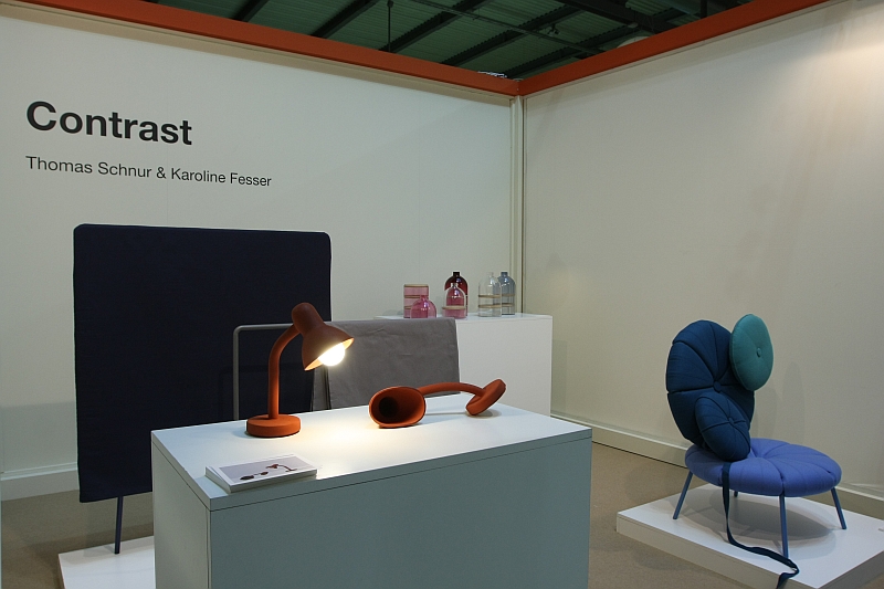
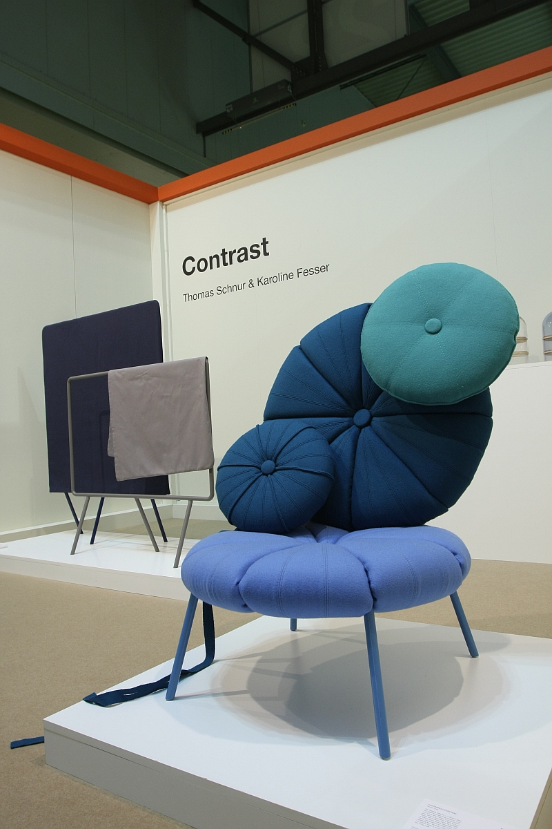
The Woonling Collection by Karoline Fesser is a modular seating system based around a simple single element: a round cushion. The design in the concept comes in the form of a connection system that allows the cushions to be freely connected vertically or horizontally to create the seating system you need/want. And then re-configured as your needs/wants change. Stools, armchairs, sofas are all possible.
The system is still in development but we really liked the freedom involved, the possibilities for further development and also the way it plays with a visual image more akin to very stable, very inflexible sofa systems. And so we're really looking forward to seeing where Karoline takes it.
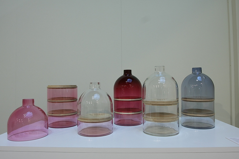
Sample Avenue is a collection of glass vessels. Developed for the aforementioned Object for Neighbours exhibition Sample Avenue has been conceived to reflect the socio-macro architecture that can be found on every street. Created from one glass bell cut into three units and then separated by wooden trays, Sample Avenue is a flexible, modular storage system for all those things that deserve to be on show even when not in use. Or cupcakes.

As the old saying goes "Good fences make good neighbours!"
But temporary ones?
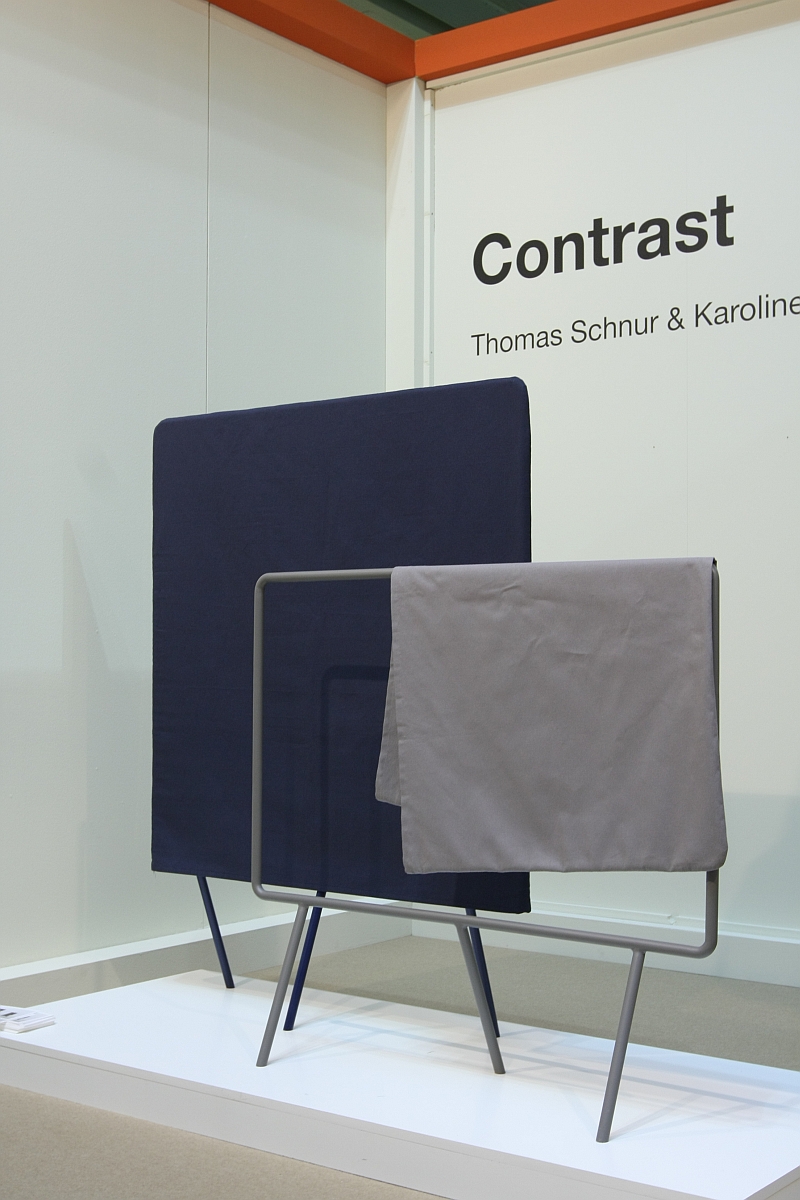
Such or similar could be considered as the context for Thomas Schnur's Barrier. Again developed specially for the Objects for Neighbours exhibition, Barrier is a room-divider that tackles the idea of creating your own space, your own territory, in an otherwise open, free space dominated society.
We don't all want or need a solution as all encompassing as Workbay by Ronan an Erwan Bouroullec, often it is just about temporarily separating oneself from part of a room; for example work done for the day, physical separation from the desk. Or your better half is still working away in a corner and you want to read.
Comprising a steel frame and a removable cloth cover Barrier is a phenomenally simple object that when not being used as a room divider can be "opened" by removing the cloth. Over long periods you can use the open structure as a hanging system. And over shorter periods as a friendly reminder of the room divider it will soon again become
In addition to Barrier Thomas Schur was also presenting Rubber Lamp, an equally simple yet much more technically involved object. Curiously resembling the comedy rubber chicken that was popular in certain circles in the mid 1990s Rubber Lamp isn't as rubbery as it initially looks. Or indeed feels. A central steel rod running through the silicon body allows the bulb to be freely and securely positioned as required. Just a delightfully simple, playful product.
More information on the complete portfolios can be found at www.karolinefesser.de and www.thomasschnur.com
And for all who've now got a taste for the delights that were on show at Objects for Neighbours. Our post is on its way.....


