Designer | Exhibitions and Shows | Fuorisalone | Fuorisalone Milan Design Week | Milan Design Week | Producer | Product
Ahead of Milan Design Week we received an email from a Belgian designer of our acquaintance letting us know where we could view their work. The email ended with a euphoric "This is finally Belgium's year!"
A thought that really appealed to us, because as we wrote last year Belgium has the potential to be every bit as successful as Holland. And indeed should be.
And so with an optimistic heart we set off to the Triennale di Milano to view the exhibition "Belgium is Design"
And experienced our first disappointment of Milan 2013.
Belgium is Design was one of our highlights at Milan Design Week 2012, their 2013 show was at best a jumbled, incoherent mess.
Presented under the title "The Toolbox - Belgian Design & the Art of Making: A Tribute to Henry van de Velde" the show promised to present "... a portrait of the mastery of Belgian design"
It may very well have done.
If you could find it.
For much like locating anything useful in our toolbox, Belgium is Design 2013 forced the visitor to root through interminable chaos on the search for if not the Holy Grail that at least the correct screwdriver.
We didn't. Life is far too short to spend foraging in the aftermath of an over ambitious exhibition designer.
What's really disappointing of course is that following on from "Henry van de Velde. Leidenschaft, Funktion und Schönheit" in Weimar "Belgium is Design" is the second exhibition in a month associated with the name Henry van der Velde that lacked a sensibly executed exhibition concept.
Henry really deserves better.
Fortuitously that was to be our first and last experience of poorly organised Belgians in Milan.
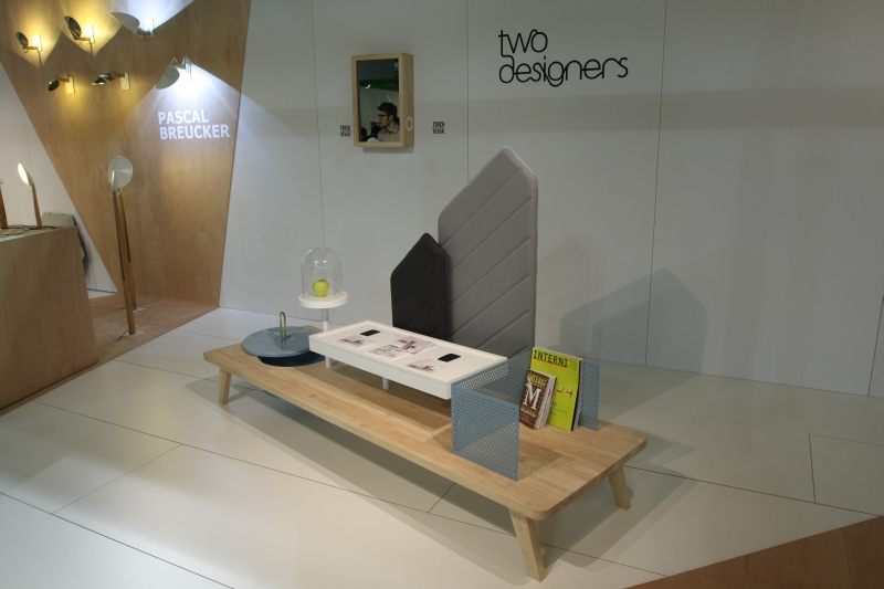
As with 2012 the second part of Belgium is Design was on show at Salone Satellite. And as with 2012 the highlight for us was design studio Two Designers.
Specifically their "island" Curiosity.
We are at a real loss to find a term to succinctly describe Curiosity and so will have to make do with the less than snappy "A sort of tray, shelf, table, storage box, fusion thing. With some material."
Basically an object that stands in a room and fulfills several functions in one, while itself being an optically pleasing structure. A device to aid domestic organisation and give an impression of increased order.
Just delightful.
We admit to knowing very little about Two Designers; but having attracted our attention two years running that may soon change.

In contrast to Belgium is Design the show from design platform "De Invasie" at Ventura Lambrate was a real pleasure to peruse.
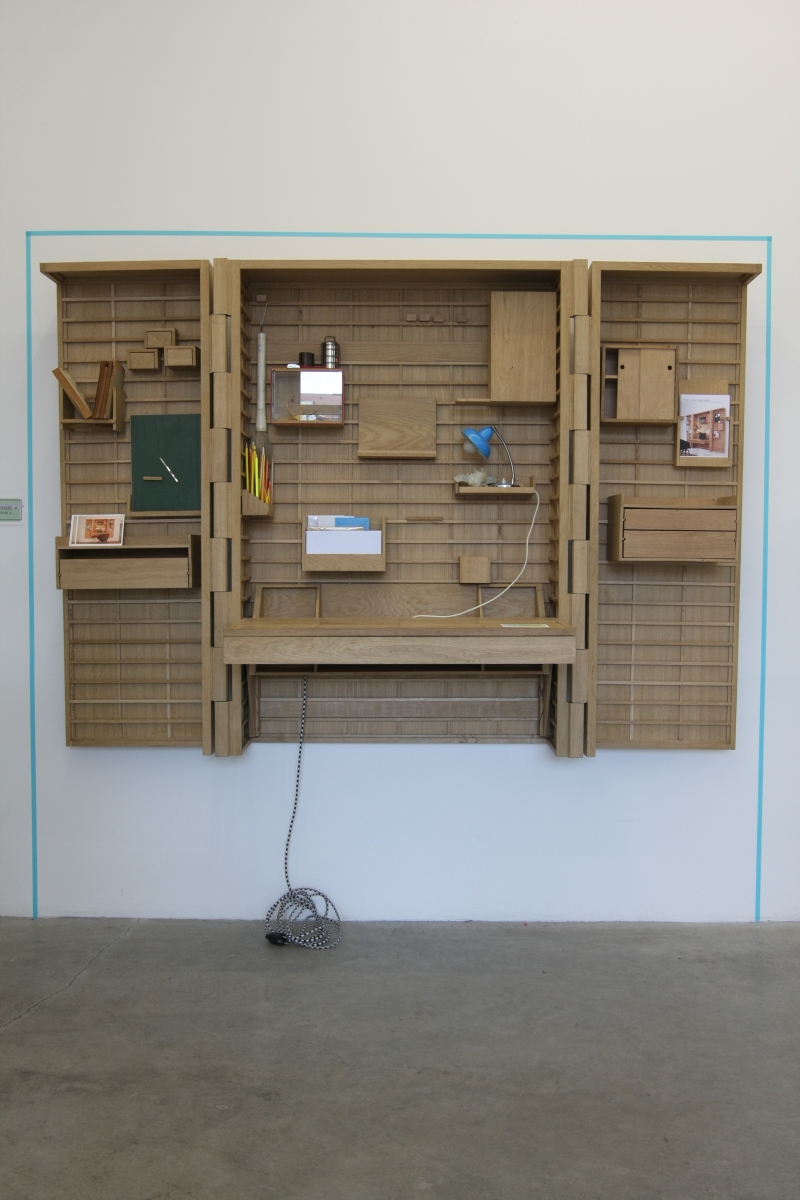
Featuring a nice mix of Belgian design studios the highlight for us was without question Collectionnaire by Moupila.
As with Curiosity it's hard to find an easy term to describe Collectionnaire. A modular storage cabinet Collectionnaire has a form language all of its own, a functionality all of its own and a size that means it will make any room its own.
As a concept we found the idea fascinating, and the realisation in wood works perfectly. In metal, for example, one fears a loss of the personality. Collectionnaire is not an object for everyone or every room. But where space and bravery collide, it should more than justify the, almost certainly, not inconsiderable investment.
Notable mentions must also go to Atelier Belge, a company whose development we have been following for several years and who never fail to produce. The Animal Desk by Fermetti on show at De Invasie perhaps not being being the newest object, but a delightful example of what they are capable off.
In addition we were very taken with the imaginatively named Coat Rack by Bram Vanderbeke, an adjustable coat rack system that can be stored in its own base, and and it was nice to see objects from Tim "Interror" Baute being shown in such a context
Tim Baute himself was presenting his latest collaborations with the graphic artist Stefaan de Croock round the corner at "Ventura at Work". But more on Tim later.

Our final meeting with Belgium in Milan was "Landscapes for living in" by Muller van Severen at LAP Lambretto Art Project.
Premiered at Interieur Kortrijk 2012 Landscapes for living in is the first collaboration between the photographer Fien Muller and artist Hannes van Severen, son of Maarten.
We missed it in Kortrijk and so were all the more looking forward to seeing it in Milan. And it was every bit as delightful as we'd hoped.
Conceived in response to a brief set by the Kortjek curators "Landscapes for living in" is a collection of objects that combine several functions in one unit: for example bookcase and chair or table and lamp. In many ways similar in concept to some of Verner Panton's later work, no honest, "Landscapes for living in" has been realised with a charming clarity and honesty that endows it with a real familiarity.
A genuine joy to behold.
And despite the fact we've listed three projects here that could be described as being "fusions". You're not going to get the T word out of us.....
Against the bold claims of our communicant, 2013 was not Belgium's year in Milan. It was however a further year that demonstrated the strength in depth and variety to be found squeezed in between Holland and France.
A strength in depth and variety that truly embodies the spirit of Henry van de Velde.