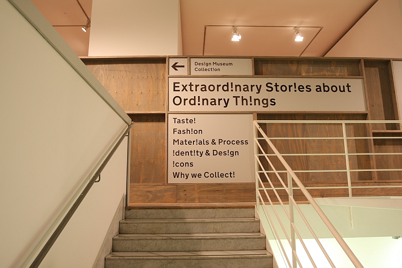
In 2015 the London Design Museum will move to its new home in West Kensington. Ahead of the move the museum have taken the opportunity to re-design their permanent collection exhibition, and from Wednesday January 30th 2013 are presenting it in the context of a series of explorations of design themes under the motto “Extraordinary Stories About Ordinary Things”

Extraordinary Stories About Ordinary Things is organised in 6 themed installations: Taste, Why We Collect, Icons, Identity & Design, Material & Process, and Fashion.
Six thematic explorations as fascinating and justified as the other, and which all suffer under the one common problem: lack of space.
Noble as the Design Museum’s intentions unquestionably are, the second floor at the current location in Shad Thames simply doesn't have the space to do more than graze the surface.
Which at times can be irritating. Really irritating. You just know there is more, you want to know more, but……
Now we know people who would cite such as evidence of an essential problem with the exhibition concept.
We however know that presenting a permanent collection as extensive as that possessed by the Design Museum London in the 500ish square metres available is pretty much a thankless task.
You are never going to get something that pleases everyone.
But you’ve got to try.
We know other design museums that choose to focus on what the visitor knows. Give them what they expect and don't tax them too much.
Which is, if we're honest, lazy.
The concept chosen by the Design Museum is ambitious. Which is to be praised. But in the current location it just doesn't quite work. We hope that in the new museum they have more space and can extend and deepen the presentations.
But regardless of the space based shortcomings, Extraordinary Stories About Ordinary Things is to be thoroughly recommended.

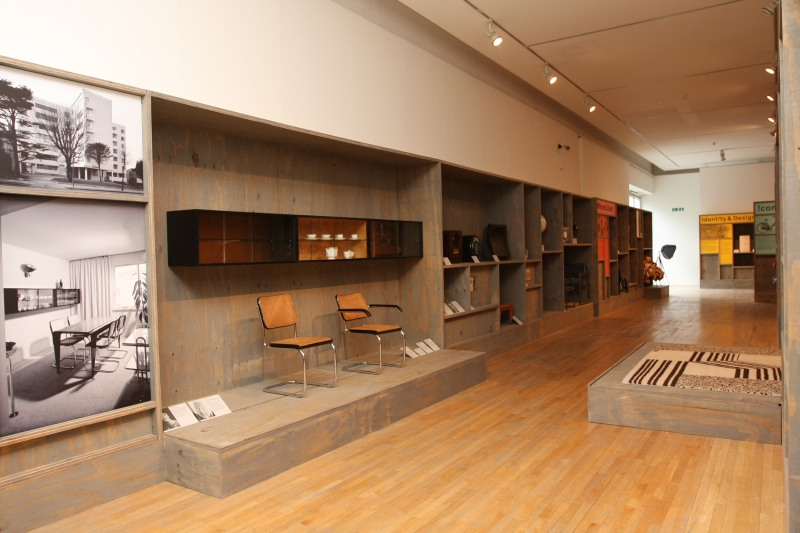
Chronologically, Extraordinary Stories About Ordinary Things opens with "Taste" and the arrival of modernism in the UK, a decision which of course means they ignore the Arts and Crafts movement. Valid. And interesting.
Featuring, or better put, briefly referring to – as we say, space! – the contribution made by the likes of Marcel Breuer or Erno Goldfinger the section provides a nice overview of the uniquely British interpretation of modernism, something which was completely missing from the recent “Bauhaus: Art as Life” exhibition at the Barbican and which was pretty much reduced down to Brutalism at “British Design 1948 – 2012" at the V&A, and is therefore all the more welcome.
Having effectively defined when, in their opinion, the story of design begins, the exhibition then moves on to “explain” why they collect.
Except is doesn't. There is no attempt to start a discourse on design as something that can and should be collected; on author design versus commercial design; on the current explosion in design galleries; for whom collects one?; what is even worth collecting? What counts as “authentic”? With art it’s all relatively simple. But with design?
And so despite presenting the most delicious assortment of objects including Jasper Morrison’s 1983 Handlebar Table and Rover Chair by Ron Arad, for us they could/should have omitted it and devoted the space to the remaining sections.
Such as those that follow: “Icons” and “Identity and Design”, for us two of the most fascinating aspects about design.
We know. Sociology.
Honestly we missed our calling, we really did. No normal person should ever get as excited about sociological theory as we do.
The “Icons” section has been especially well conceived, concentrating as it does on one Icon of British Design – the Anglepoise lamp. Not only is the Anglepoise lamp a true design icon, but by both looking at the development stages leading to the Anglepoise lamp and also juxtapositioning the Anglepoise with other lamps, one sets the Anglepoise lamp in a context that makes it both easily understandable and at the same time unapproachable. Which of course is how we want our icons.
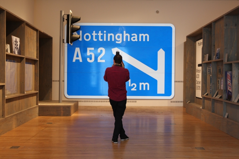
The Identity and Design section is dominated by a blue motorway sign and a red telephone box.
For all the inclusion of the red telephone box under “Identity” is a stroke of genius, underlining as it does the difference between an icon and an object of identity.
As anyone who regularly travels from Gatwick Airport to central London by train will be aware, not far from the airport one passes what can only be described as a red telephone box graveyard. Dozens if not hundreds of rusting phone boxes standing silent in rows like some apologetic British equivalent of the Terracotta Army.
We can only assume they are the innocent victims of someone’s attempt to cash in on the “iconic” status of the red phone box following the decision to decommission them and switch to plastic phone boxes.
The only problem is, they’re not iconic.
The red phone box on the corner represented for many generations something quintessentially British; but what was important to the public was less the box and more the telephone in it.
Removed of its function it becomes purely symbolic. Something of which we have fond memories and with which we can all identify. But not something iconic. And certainly not an object worth owning.
Which, and to digress, is something we’d like more East Germans to realise in the context of “DDR Design”. It may be cute and familiar, but no, it’s not iconic.
The motorway road sign meanwhile may seem like the most undesign thing you could imagine, being after all – a road sign. However, through the standardisation of road signs one not only has a wonderful example of how design can help make our lives easier, but also a strong symbol of national identity. A design led symbol of national identity.

The decision to include a section devoted to materials and processes shows a museum that understands the important role both will play in the future of design. Indeed, in many ways the future of design is all about materials and processes, of improving the existing for the benefit of all. It also neatly underlines that museums aren't just locations for collecting and archiving, but locations for sharing knowledge, exchanging ideas and helping us make sense of the here, now and future. The decision only to include synthetic materials is however a real shame as it pushes the belief that only new is relevant and so denies centuries old process and materials any say in design’s future. And that is a dangerous position to take.
The final section is devoted to Fashion; but as older readers will be aware, us and fashion!
All in all Extraordinary Stories About Ordinary Things offers a compact overview of design in its wider sense, with background information sensibly and realistically presented. At times the “objects in boxes” presentation concept grates, you long to view things in 360 degrees, to understand the objects in their entirety - we can get 2D in photos, show us the joints! - but on the whole the exhibition is, as we said, to be thoroughly recommended.
Just don't expect to come away from it understanding very much more about design; unless your lucky enough to view it with a guide who can explain in more detail what you're looking at and why it is in the exhibition.
However if you are just looking for a collection of important design objects, clearly displayed and which provide a quick overview of and brief introduction to important design themes, then you won't be disappointed.
And for our part, we're already looking forward to viewing it in its new home in West Kensington in 2015.
Extraordinary Stories About Ordinary Things can be viewed during normal opening hours at the Design Museum, Shad Thames, London SE1 2YD.
In addition the Design Museum Collection App allows an overview of 59 objects from the museum's collection including, for example, the Dyson vacuum, the Thonet chair, the Vespa, the Anglepoise lamp – and of course the British red telephone box.