The MoMa in New York famously houses some of the most famous works of Pop Art. And just as famously some of the most famous pieces of mid-20th century design. They are only separated by one floor; however, the layout and curation are very much of the infamous "ne'er the twain shall meet" style.
And given the size and configuration of the MoMa it is inconceivable that any normal visitor would be able to consider what they are currently viewing on one floor in the context of what was viewed half a lifetime ago on another floor.
As such those visitors who do visit both floors view them, and understand them, as two separate entities. Two unconnected worlds. Here George Nelson, Charles & Ray Eames, Eero Aarnio. There Andy Warhol, Claes Oldenburg, Roy Lichtenstein.
The Vitra Design Museum in Weil am Rhein understand things differently and until February 2013 are presenting "Pop Art Design", not only the first exhibition in the Vitra Design Museum to feature works of art as a central focus, but also one of the first major attempts anywhere to investigate how art and design in the "Pop Art Era" interacted with and reacted to one another.
Co-existed, as it were.
Featuring some 140 works of art and design from the 1950s, 60s and 70s, Pop Art Design presents a comprehensive overview of the major players, themes and achievements of the period; with the art explored in the context of the design and the design explored in the context of the art.
As far as we understand the exhibition concept there is no attempt in Pop Art Design to form direct links between the artists and designers of the period, to imply that one protagonist directly took on the work(s) or idea(s) of another for their own creations; rather, it is much more about examining how both groups reacted to the age and the prevailing political, social and technological conditions. But for all the nature of the dialogue that existed between art and design.
In his introduction to the exhibition catalogue Vitra Design Museum Chef Curator Mateo Kries describes this dialogue as being a "central characteristic" of Pop Art.
If we're honest we've never considered the situation in such terms.
Having viewed the exhibition we now understand the nature of this dialogue a lot better. And the exhibition concept is such that we believe all visitors will leave with a similarly extended horizon.
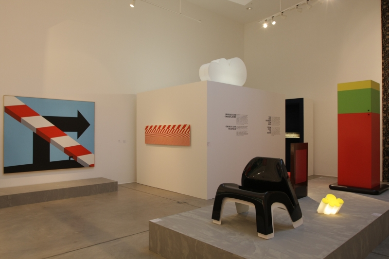
The artists of the post-war era had the rise of the global celebrity and the fledgling advertising industry to play with; the designers had modern materials and the pioneer spirit of a new consumer generation buoyed by the increased financial stability and security of the age. All had the post-war political and social realities.
And so, in effect, both groups reveled in the creative freedom afforded by the prevailing situation(s) and the increasingly global nature of society to reflect upon and respond to what was happening around them.
The results are surprisingly similar; not just in terms of form or tone, but also in their long-term influence.
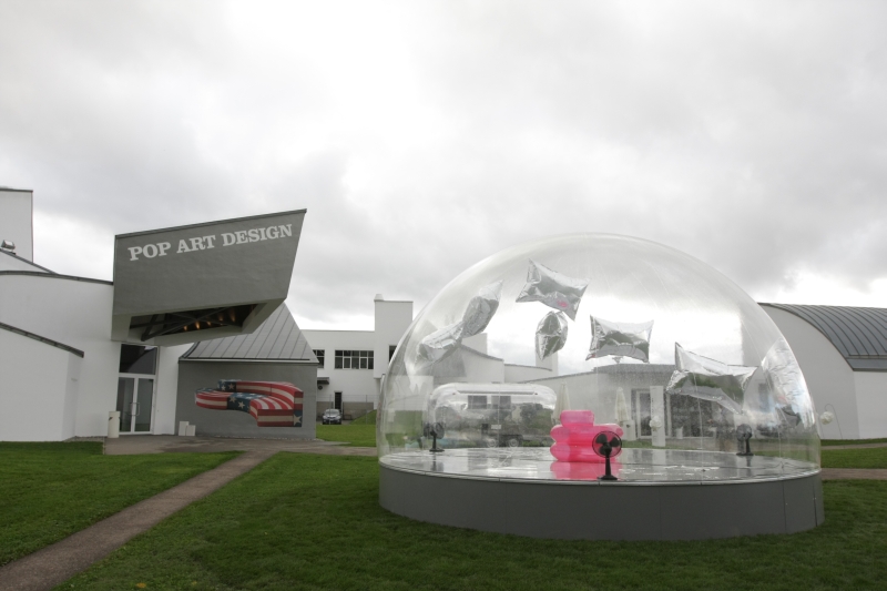
One of the best examples of this can be seen before you even enter the exhibition. In front of the Vitra Design Museum stands an installation featuring the 1967 "Blow Inflatable Armchair" by Paolo Lomazzi, Donato D'Urbino and Jonathan De Pas juxtapositioned with an abridged version of Andy Warhol's 1966 work "Silver Clouds"
Inflated, volumeless objects as a medium to challange convention and force debate. One unmistakably art. One unmistakably design. Both unmistakably from the same gene pool.
"Inflated, volumeless objects" in contemporary art and design? Did anyone say Jeff Koons? Oskar Zieta? Philippe Starck? And where are we to place Asif Khan's "Clouds" from Design Miami Basel 2011? Architecture?
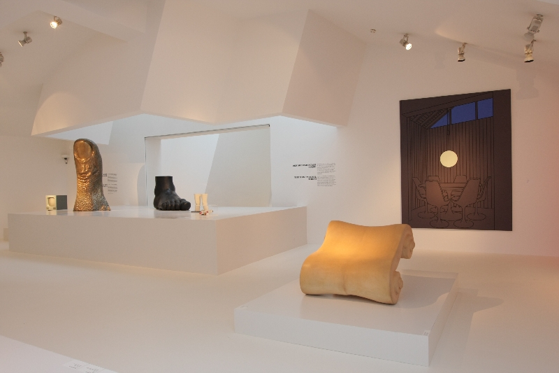
Pop Art Design also deftly illustrates that the influence of Pop Art can be felt today in more indirect ways. Standing before pieces by, for example, Ettore Sottsass one is made all too aware of the link between Pop Art and Postmodern Design; the later in effect taking the whole demystifying, debunking and democratising as preached by the Pop Artists a step further. And with a lot more vigour and purpose.
As Pop Art Design makes very clear, this progression was greatly assisted by the dialogue that was taking place during the Pop Art years and the blurring of the lines between what is art and what is design as designers started using ever more artistic techniques and artists turned to, previously, exclusively design processes.
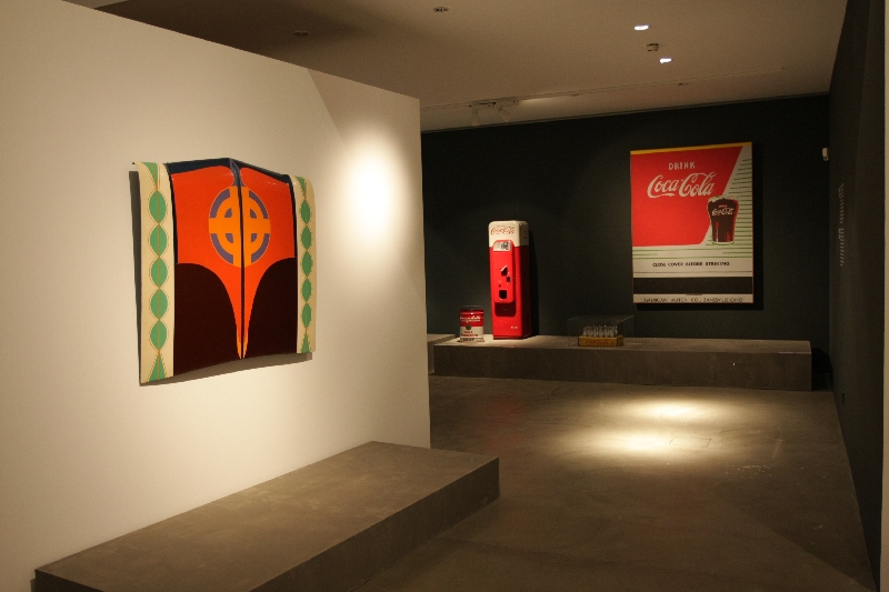
The one aspect of the exhibition that really surprised us was the number of works by Alexander Girard on display. We yield ground to no man in our admiration of Girard and his canon, but had never considered his work in the context of Pop Art. And so the chance to spend a Friday morning idly comparing Alexander Girard's works with those of Andy Warhol was as unexpected as it was deliciously satisfying.
The curator's intention is not to show that Alexander Girad is Pop Art, but to show the similar lines of inspiration between Girard's Folk Art inspired works and certain motives and motifs in Pop Art. Or put another way to show how Girard's fascination with Folk Art as the basis for his designs was no different from the artist's infatuation with branding and commercialisation.
Just one of several common threads of thought highlighted in the exhibition.
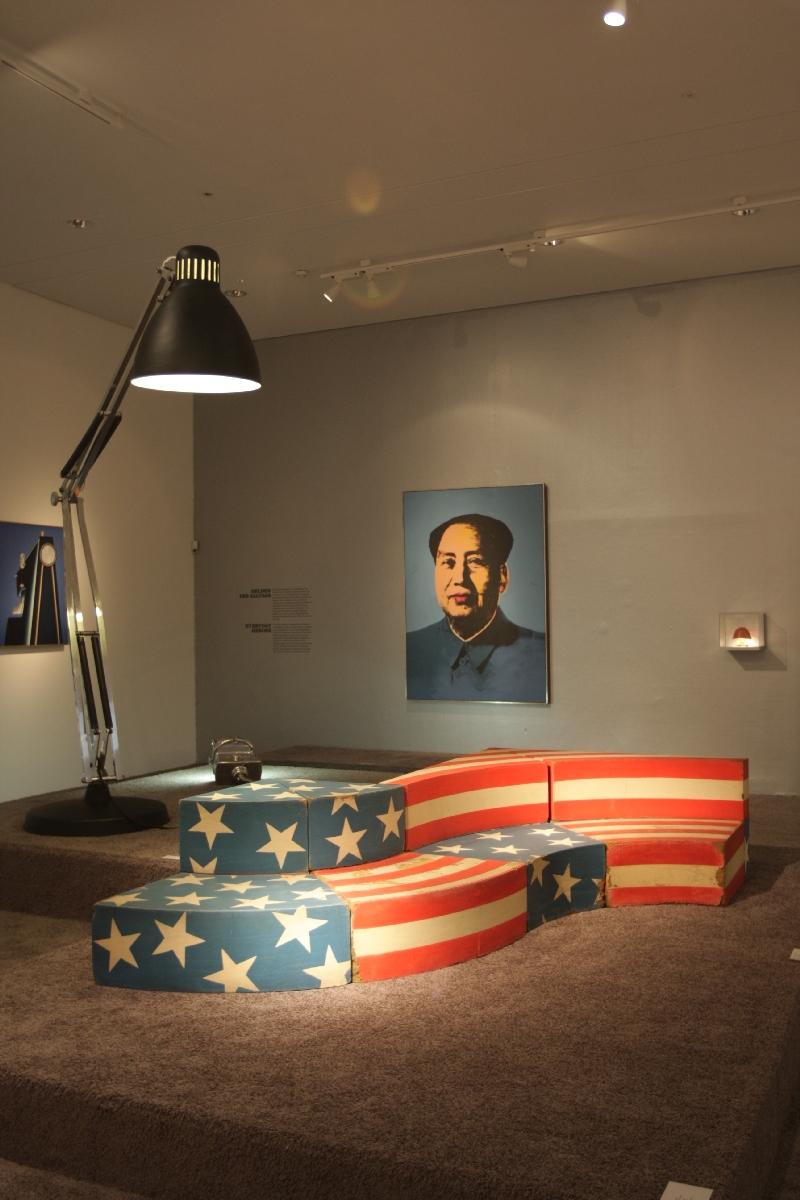
A second thread worth mentioning, because it is given high prominence in the exhibition, is politics. Jasper Johns' "Flag" might not be on show, but an equally compelling questioning of American's most scared symbol can be seen in Studio 65's "Leonardo Sofa". A work placed provocatively next to Warhol's portrait of Chairman Mao. And quite brilliantly next to Gaetano Pesce's Moloch Floor Lamp - a curatorial decision that seems to heap even more derision onto poor Old Glory.
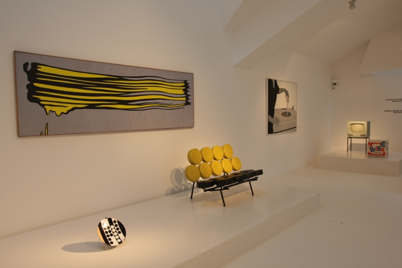
At the opening press conference curator Mathias Schwartz-Clauss stated one aim with the exhibition concept was that the design and art should be presented as equal partners, that one should not overshadow the other. For us his chosen concept works.
The lines between the genres are simply not there, one crosses between art and design as easily as one can cross from France to Switzerland at Basel Airport. Yet one never loses sight of where one is and thus has the opportunity to compare, contrast but for all to follow and understand the two way dialogue occurring in the exhibition rooms.
Pop Art Design isn't an exhibition for those looking to lose themselves for an hour or two in bright colours or abstract objects. For that you would have to go to MoMa. It is however an exhibition for all those wanting to better understand not only what the essence of the Pop Art era was, but also what Pop Art gave us, where Pop Art took us and where much modern design originates.
Enter the exhibition with the same spirit of adventure as those artists and designers featured and you'll leave with a much richer understanding of a period that is so much more than famous paintings of soup tins or famous sculptures of hamburgers.
Pop Art Design can be viewed at the Vitra Design Museum Weil am Rhein until Saturday February 3rd 2013. In addition to the exhibition itself the museum is running an extensive supporting programme featuring talks, workshops, films and even a concert.
Full details can be found at www.design-museum.de
