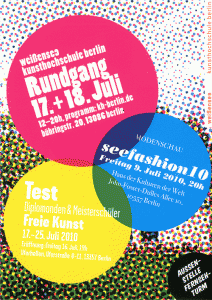
The last stage of the (smow)summer tour 2010 took us across Berlin to the Kunsthochschule Weißensee. Established in 1946 the Kunsthochschule Berlin Weißensee was without question the youngest design school on our tour - and was also the location where the most English was spoken.
Every corridor, every landing, every exhibition room straining to the tones of American and other non-native English.
Combined with the preferred clothing order the impression was much more Berlin-Mitte than Berlin-Pankow.
And, and although we know much better, we did spend most of the journey home discussing the possibility that a secret international community of thin, painfully fashionable, creative types may have existed in East Berlin; cleverly subverting the socialist dictatorship through the juxtapositioning and fusion of design conventions. A bit like Jurassic Park, just with typographers, fashion designers and architects.
Actually, there may be a novel in that. Watch this space.
As with the UDK Rundgang the focus at the Kunsthochschule Berlin Weißensee was very much on the regular course work. There was however a lot more vehicle design, interactive design and other similar branches of product design that generally fail to attract our attention. We know it's an important part of the learning process, but we just find it difficult to concentrate when faced with computer generated images of a vehicle or shoe that will never be produced. And why are they are always green and orange?
Plus it had been four very long days. Four very long hot days, four days full of exhibitions, interviews, discussions, beer, late nights and early mornings.
We were tired.

However, with the couple of days distance we see that there were a couple of genuinely interesting ideas on show.
All from the one commercial cooperation project class, but as already said, more on such later.
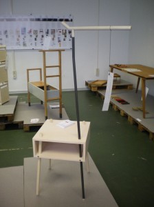
Kirin by Dörte Ahlgrimm and Kathrin Scheidt is one of those products that we often ignore; we were however won over by the quality of the construction and the cheek of the design. And if we're honest it also appealed to our preferred approach to order and tidiness. In essence a side-table with a rotatable hanging arm. You need never use a coat hanger again.

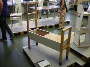
Centaurus by Johannes Grune resembles something that you would expect to find in the locker room of the NYC Fire Department. Part chair, part storage, part hanger we were genuinely drawn to the ingenuity of the concept and also the number of possible uses. Not just for firemen, but also in childrens rooms, garden sheds, gyms or indeed in a weatherproof version on a balcony or in garden.
In contrast, what really got our goat was the results of the "Greenlab" project. Subtitle: "Sustainable design strategies"
We have never left an exhibition room more disappointed.
Or just plain angry.
"Sustainable design strategies". Not on any planet we we have ever visited.
But then such isn't only a problem at the Kunsthochschule Weißensee. Daily our RSS and Twitter feeds jam up with people who really should no better informing us over the latest" Green" product, that invariably isn't.
Rather just a plain arrogant concept or something cleverly greenwashed by a marketing department before being released virally over specially chosen channels.
The first question with "green design" or "sustainable design" is ... no we'll do that later.
For us "Greenlab" was a wasted opportunity.
In general however the Kunsthochschule Berlin Weißensee Rundgang 2010 was a delightful, thought provoking and highly entertaining and informative end to the (smow)summer tour.
And then we went home. Tired, but happy.
Some more pictures from the Kunsthochschule Berlin Weißensee Rundgang 2010 can be found on (smow)flickr