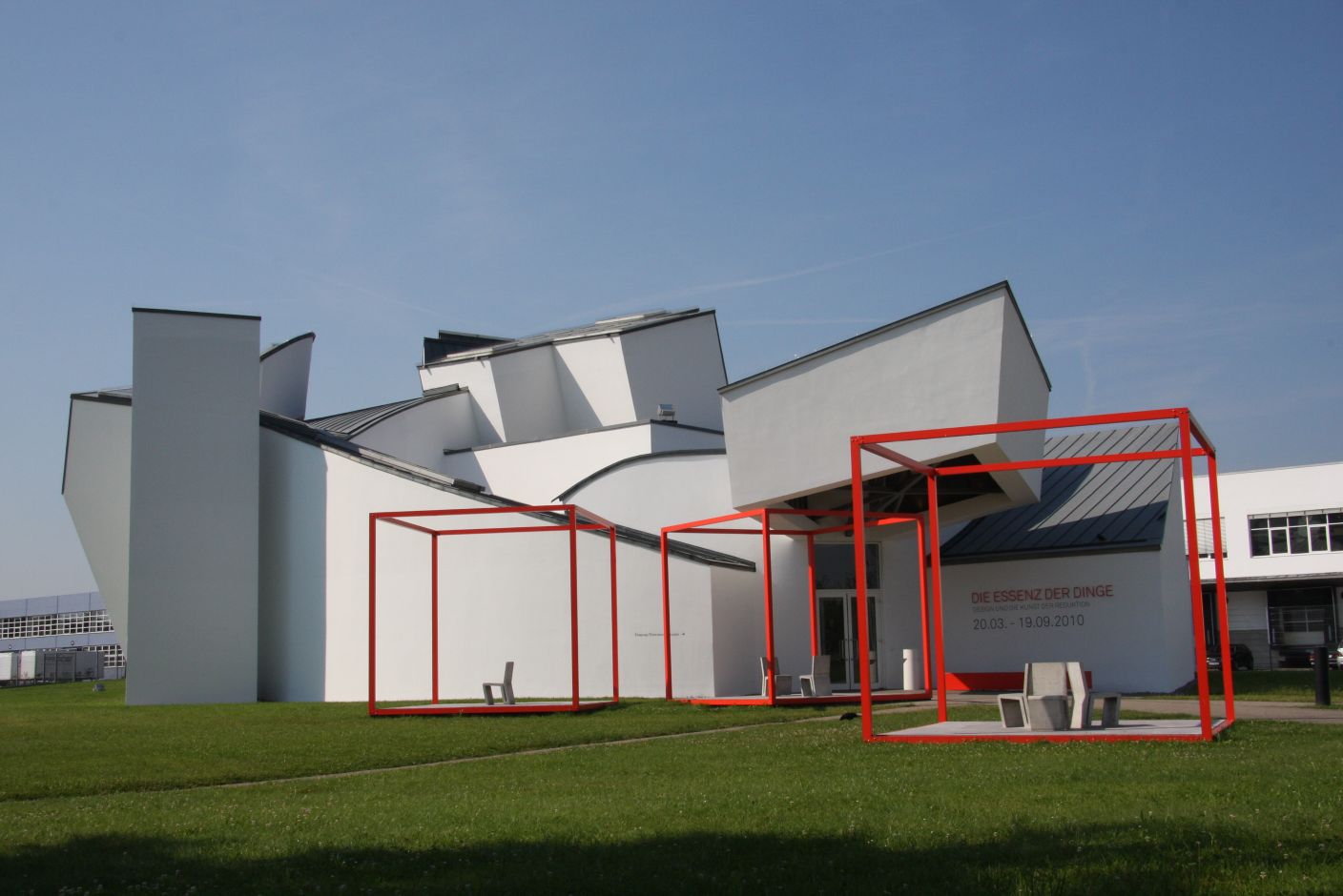
The (smow)blog team outing to the cardboard furniture workshop was coupled with a visit to the current Vitra Design Museum Exhibition: The Essence of Things. Design and the Art of Reduction.
We must admit to finding it more than a little ironic that an exhibition on "Design and the Art of Reduction" should be taking place in a building designed by Frank Gehry, especially when Tadao Ando's Conference Pavilion is only some 10m away.
And after the long journey to Weil am Rhein this thought honestly kept us amused for about 4 hours.
The exhibition itself is divided into 12 thematic sections each of which deals with a different aspect of "reduction"; be it elements that the end customer is aware of, for example, geometry or lightness or those that remain hidden from the customer, for example reduction in logistics.

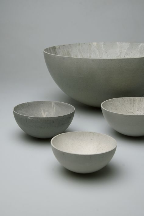
Some 160 objects illustrate the various themes ranging from design classics such as Michael Thonet's Chair No. 14 or the Ant Chair by Arne Jacobsen for Fritz Hansen onto objects that are less well known - if every bit as interesting - such as Stephan Schulz's concrete bowl or Marcel Wanders' Knotted Chair for Capellini.
Good design needn't be complicated, less but more, form follows function - the number of design theories that encapsulate the practice of "reduction" are as numerous as they are legendary: yet at design show after design show we are confronted with products that attempt to win us over through their complexity and extravagance.
We also don't know why that should be, but we suspect it has a lot to do with a saturated market and the associated increasing role that the internet plays in ensuring that your - probably completely superfluous - work is seen.
Which design blog is going to feature Jasper Morrison's Ply-Chair when they have photo of a bookcase that looks like to two paradise birds engaging in a mating ritual atop Carmen Miranda?
Ok we would. But not many others.
For us the true art of reduction in design is when the designer reduces the volume of the product down to the absolute minimum - be it through the use of a new material, innovative joining of the individual elements or through reducing the exterior measurements.

One particular example that occurs to us being Maarten van Severen's' .03 with its integrated compound spring supports that give the chair its comfort and stability without unduly adding to the weight, volume or outer dimensions.
However as the exhibition "The Essence of Things. Design and the Art of Reduction" ably demonstrates reduction can involve other processes.
Joe Colombo's No 281 lamp, Wilhelm Wagenfeld's tea service or Donald Judd's Chair 84 proving nice examples of what can be achieved with the necessary talent and motivation.
On the negative side we must add that for our taste the exhibition highlighted the work of Charles and Ray Eames a little too heavily - specifically the dedication of the complete section "development" to their work looks suspiciously like a bit of editorial shoe-horning on the curators part.
That aside, for all interested in the design process, and especially where the difference between "designer" furniture - i.e. those furniture pieces where a targeted design process occurs- and cheaper, generic products lies, the Vitra Design Museum exhibition "The Essence of Things. Design and the Art of Reduction." is definitely worth the trip. The Essence of Things. Design and the Art of Reduction at the Vitra Design Museum runs until September 19th 2010. More details can be found at http://www.design-museum.de