Some 285 journalists were present for the press preview of Herzog & De Meuron's new VitraHaus in Weil am Rhein on February 12 2010.
285 journalists who were then obliged not to breath a word about what they had experienced until Saturday 20.02.2010......
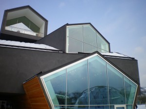
Lets get the obvious point out the way first. The VitraHaus is magnificent.
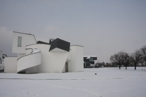
We approached Herzog & De Meuron's construction on foot from Mühlheimerstrasse and the first view over the car park was every bit as wonderful as we had expected.
Like 10 year olds on a school trip we spent the first two hours photographing the VitraHaus from outside, driven part by fear that it would vanish and part wanting to avoid that stomach sinking feeling of getting back to the office and realising that we really should have taken that shot.
Walking around the outside of the VitraHaus, however, it is easy to understand from where the complaints originate.
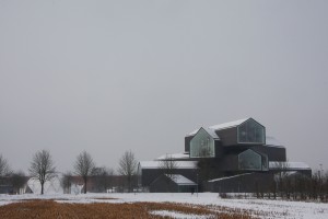
The building stands not only on the very edge of the Vitra Campus, but also on the very edge of Weil am Rhein. And so just as the town gives way to the gentle, rolling countryside one is confronted with this huge, chaotic, brooding, dark structure.
Herzog and De Meuron may claim that "[t]he charcoal colour of the exterior stucco skin unifies the structure, 'earths' it and connects it to the surrounding landscape". For us that is architect speak; the building is immense and we can well imagine it will take a lot of getting used to by those motorists who drive past or those "Weilers" out walking their dogs.
Which isn't to detract from the architectural splendour of the construction. As we say. Magnificent.
Then after failing to find any further angles from which to photograph the VitraHaus .... we went inside.
And found it good. But not as good as outside.
Inside looks like a Vitra showroom.
Which is of course what it is.
Just we didn't expect it to look so much like a Vitra showroom.
The longer we spent inside the less it felt like a Vitra showroom. But it still looked like one.
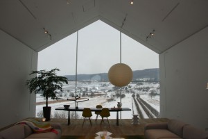
Not being the brightest peas in the pod, we viewed the VitraHaus in the wrong direction.... We started at the bottom. Only later on the train to Aschau im Chiemgau and Moormann, did we realise that you are supposed to start at the top ... and work down.
Had we started at the top our first impression would have been an absolutely gorgeous view across the immediately neighbouring vineyards and orchards, over the Tüllinger Hill and on towards the Black Forest.
And of a Spin Table Candelabra by Tom Dixon. A product not produced by Vitra.
We were very impressed to regularly find items on display that aren't made by Vitra, and can only express our admiration to Vitra for taking the brave step. But then those who have studied, if not personally followed, the "careers" of Rolf Fehlbaum and Vitra know that for them the quality of the work is always, always, more important than any potential financial gain. In addition to the Tom Dixon Candelabra we also spotted "non-Vitra" works by Konstantin Grcic and Ronan and Erwan Bouroullec.
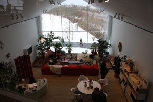
Each "room" in the VitraHaus is given over to a different style of room design/room usage. Room layouts that will hopefully change with the seasons to best optimise the light and backdrop in each location.
For as you move through the VitraHaus - downwards in the correct direction - you are presented with continually changing views of the surrounding landscape; not just new views, but the same views from different perspectives. We cant agree with Rolf Fehlbaum when he said that he had received wonderful new perspectives of the views over Weil am Rhein and surroundings countryside thanks to the VitraHaus.
But that's only because we haven't seen Weil am Rhein as often as the Vitra Chairman.
That said as one moves through the VitraHaus, the borders between inside and outside really do melt into one another and the surroundings do become part of the building.
It's an old architectural trick, but a good architectural trick. And an architectural trick that makes the VitraHaus a truly wonderful experience.
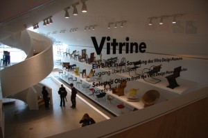
As you move through the VitraHaus - downwards in the correct direction - you are also actively encouraged try out all the products on display. Despite offering a true journey through post-war furniture design, the VitraHaus isn't a stuffy furniture museum. Rather visitors can sit in the chairs, lean on the desks and wrestle with the Eames Elephants. More practically you can also examine quality of the craftsmanship and experience the haptics of the articles.
Something which we found good.
What we didn't find so good was the fact that the press conference took place in the from Hella Jongerius designed Vitra Colour Laboratory.
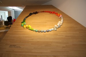
To judge from the amount of coverage Ms Jongerius has received, the Vitra Media Moles have clearly been very busy placing the Vitra Colour Laboratory in the international, for all the American, press. But then with over 250 journalists and photographers in the VitraHaus, not only can no one see and experience the Vitra Colour Laboratory. But there is also no information on it in the press kit.
Rolf Fehlbaum did make mention of the Vitra Colour Laboratory and his hope that it would encourage people to be braver in their use of colour, if not as brave as when Verner Panton furnished one of Herr Fehlbaum's previous flats.... but at that moment the laboratory was packed away and we all sat on elephant stools not really knowing what to expect.
Which was a real shame.
Otherwise we had no other real complaints.
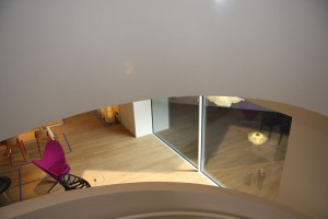
Architect Jacques Herzog stated that for him the user experience is more important than the architect's description of how the building functions and what it should be.
And we couldn't agree more.
VitraHaus is not for everyone.
A lot of people will just find immensely dull and pointless. We didn't.
Nor is it particularly worth the trip to Weil am Rhein just to see the VitraHaus.
However, as an extension to the Vitra Campus and as a further reason to spend time in and around Weil am Rhein, the VitraHaus is fantastic.
And personally we can't wait for SANAA's new production building to be finished later on this year.
Some 50 years ago Rolf Fehlbaums mother, and Vitra co-founder, Erika Fehlbaum bought the land on which the Vitra Campus now stands, and so in effect created the conditions which have allowed not only Vitra to expand, but have given Vitra the space on which to create their homage to modern design.
It is therefore more than fitting that the new VitraHaus is dedicated to Erika Fehlbaum.
The VitraHaus opens for the public on February 22nd 2010 and is open Monday - Sunday from 10am to 6pm